When you have made a good website design, you might think that everything ends there. Not yet. There are still lots of things you need to look into. Part of that is your call to action. Call to action is important for a website because it encourages the users to do something for the benefit of the website like to acquire information for a mailing list. Of course, it also offers some benefits to the users as well. Call to action causes conversion but when wrongly done, it might increase bounce rates instead. Hence, it is vital to make sure that a call to action is placed properly.
Designing an effective call to action means that you have considered well everything pertaining to its usage. You have to take note of some mistakes that are commonly committed by some designers. These happen because the designer might be so focused on the design of the website that he overlooks some significant considerations for creating a call to action. To help you check your site if it has these mistakes, we have listed some of them below. Also, take a look at some websites that make use of effective call to action.
1. Have prominent positioning.
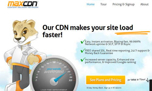
Site: Max CDN
You will only waste your call to action if you place it in an area where it will not be noticed. Avoid placing it at the back of something very bright when your call to action button has a light color. You have to make sure that there is contrast of colors. Also, place it in locations that can easily be seen.
2. Place it above the fold section.
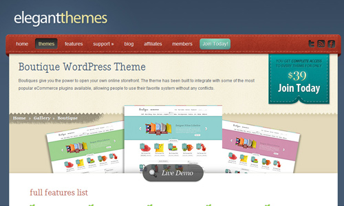
Site: Elegant Themes
Important parts of the site which needs to be seen at once by the users should be placed above the fold section of the site. You can place it at the right side or left side of the fold. If one fails to do that, then the call to action would not get the attention of the readers and would not work well.
3. Separate it from other design elements.

Site: Spinen
If you insert your call to action to the area where there are too much design elements, there will be a tendency that it will not be noticed by the users. You do not want that to happen. Your users will surely be lost. It is not a maze or a spot-where-the-call-to-action game. So, place it well where it stands out.
4. Do not use unclear text.
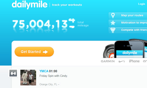
Site: Daily Mile
Do not mislead your users by using unclear text. Be sure to use the right words for your call to action so that it would be easier for the users to know what they are about to do. Like if you merely place “Click Here”, the users will be confused why they are supposed to click it. You have to be clear like “Buy Now” or “Contact Us”.
5. Not offering something for the users.

Site: Apps Templates
Your call to action could be more effective if you tell the users what they get in return. They would not waste time to be giving away some personal information if you will not offer something. This way, they will be encouraged more to click on your call to action.
6. Do not overdo.
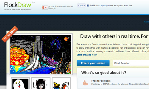
Site: Flock Draw
It doesn’t mean that just because you have to get the attention of the readers that you have to place a lot of designs for your call to action. Do not overdo it. Do not make it look like it is the most important element in the website. If you do that, you will not be able to drive the users into your more important parts like the contents of the site. Be sure to balance everything.
7. Using bad color combination.

Site: WP Zoom
In order to give emphasis to your call to action, you have to make sure that you are using good color combinations. If not, you will spoil your call to action button for it will not get noticed or might even look distractive to the eyes of the users. Look into the basics of colors so that you can review on what colors look good together. Also, see to it that your text will be clear and readable by using the right color.
8. Having lengthy call to actions.

Avoid using long text for your call to action. It will sound less urgent and less important. It will also have a weaker impact. Use proactive words like Now or Today in order to establish a sense of urgency. You have to be direct in your words.
9. No variation.
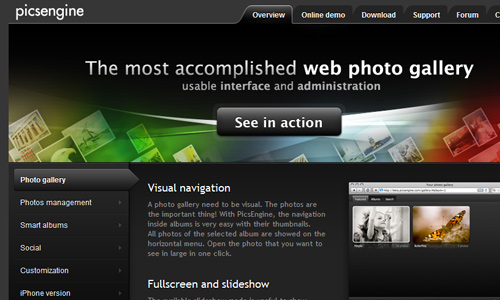
Site: Pics Engine
You may place a call to action in every page but it will no longer be effective if it is still the same. There should be some variation on your text so that the users will still get attracted to it. It will no longer be appealing if it is still the same in the entire page.
10. No clear direction.
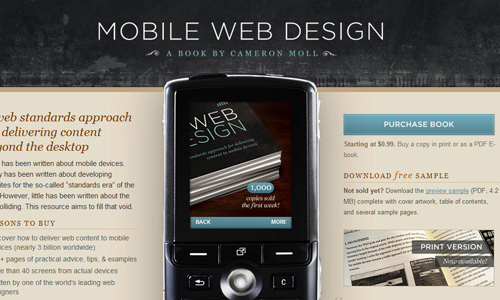
Site: Mobile Web Book
Be sure that your call to action leads the users rightly. You will confuse them if they land on a wrong page or your process is puzzling. See to it that your call to actions are not just clear and direct but will also guide the users well. You can do that by placing a call to action in every page.
It’s Your Turn Now
So, if you noticed that some of the items above are seen in your call to action, maybe it is about time to make some change in order to increase conversion. Remember that a call to action greatly help for the success of your website. Aside from your website, there are also other conspicuous places in the internet where you can make use a call to action. You might want to add something to our list above. It is now your turn to say something.


I want to add:
– Avoid any spammy language or cliche like “Win Now!” and if you have a FREE offer it should be real and sounds real- If it is too good to be true (even if you really want to give it out) people think there is a trick somewhere and don’t respond. I had a client that his real offer about “Giving money to people requesting estimate” didn’t get ANY respond.
-And most importantly your call to action should relate to your target market, because if they don’t use it or need it what is the point!
Thanks for the nice article Kareen.