Patterns are combination of tiles, templates and cells arranged together. Most patterns are based on repetition and periodicity while others use magnification and scaling. There are patterns used in cloths and other materials that symbolize a tribe or culture. But these days, patterns are used in different manners and are not merely limited to flowers, swirls and lines. There are already hundreds and thousands of designs created by various artists which can be used in many manners.
Background patterns had been used in designing various graphic materials and websites. We can see this in wrappers, wallpapers, business cards, web designs and others. In today’s post, we will give you crisp tips that can be your guide in using patterns in web design. Also, we will feature some websites that uses patterns in their design so that you can see how effective background patterns could be.
1. Know the target audience.
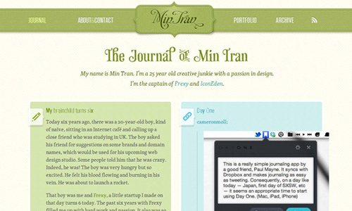
Image: Mintran
In web designing, it is always important to know who the audience are. The pattern that you will apply should suit to their taste and would urge them to go through the website with just one glance at the design. A website’s design greatly affects the interest of the readers. It drives the readers to dig deeper into the contents of the site with a brush of curiosity as to why said design was opted by the website owner.
2. Make sure the contents are visible.
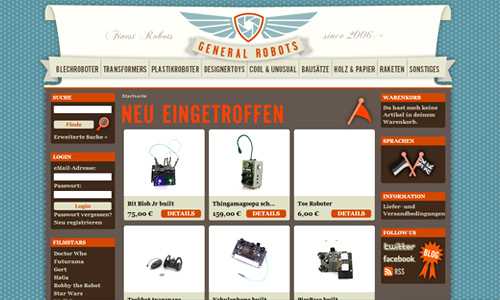
Image: generalrobots
When you use patterns, make sure that the text and the images are clearly visible. Do not let the pattern drown the contents. Let it give emphasis to the contents. Remember that it is the contents that matters most. A well designed website is futile if the contents are not clear.
3. Try using heavy patterns for more emphasis on content.
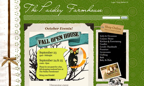
Image: Paisleyfarmhouse
You may try using heavy patterns with dark colors and dark lines which could give more prominence to the contents of the website. Bear in mind that when something dark is placed at the background, it could give emphasis to foreground when proper colors and design is used.
4. Use patterns in selected areas.
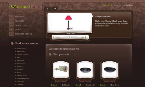
Image: uniquexports
It is not really necessary to fill the whole design with patterns. You may also use patterns in some areas only. Minimal patterns could also add a different appeal to the web design which makes it attractive and impressive.
5. Use pattern for the entire page.
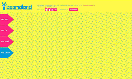
Image: booreiland
You may also use patterns for the whole page of the website. It will still work well depending on how you do it. This will also help in directing the reader’s eyes towards the content and would give more emphasis to it.
6. Let it jive with the sites’ theme.
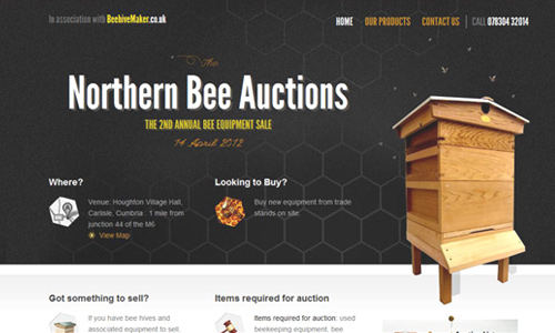
Image: Northernbeeauctions
Of course, it is important for the pattern to work well the other elements in the design. It would even be better if it goes along with the theme of the website. At least, one look at it, the reader will know the relevance of such to the entire site.
7. For simple designs, use lighter patterns.

Image: edenorganix
Lighter patterns look great, too especially when you opt to create a simple design for a website. Light lines and light colors make the design look professional and clean yet still striking.
8. Do not use too much patterns.

Image: thrivesolo
When using patterns, avoid overdoing it. Too much of something is always bad. It would look heavy to the eyes when you use too much patterns. You have to learn when to use heavy patterns and when not to use too much of it. You have to take into consideration the elements that you will place in it.
9. Use it to direct the reader’s eyes.
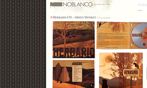
Image: Noblanco
It may also help in directing the reader’s eyes right into the contents of the site. Most patterns play this vital role only that there are different ways in using that. Some may use it as a background while others use it as a border. In that manner, it could easily allow the reader’s eyes to determine the contents of the site.
10. Combine patterns with textures.
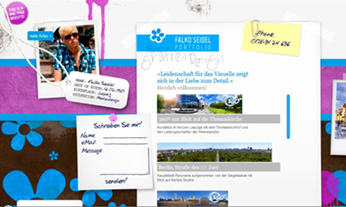
Image: fseid
Textures and patterns are both great stuff for designing. Some websites could even effectively use textures in their design. But there is also a good impact when you combine the two. Try the combination of patterns and textures. For sure, you’ll find it truly appealing. You just have to choose the ones that complement the other so that it will look well together. Learn how to choose the right combinations.
11. Combine different patterns.
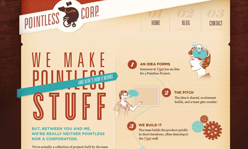
Image: pointlesscorp
Background patterns could also look well with another pattern. Like combining it with textures, you just have to be sure that it will complement each other. Simple patterns work well when combined with more complicated ones. You also have to consider the color of the patterns so that you could make the right combination. You will be amazed to see how the design will come out with this combination.
12. Keep the design fresh.

Image: lifetreecreative
It is also important to have a fresh web design by using patterns. When we say fresh, it could mean that the design is updated every now and then but it could also mean that the design has a refreshing impact to the eyes of the readers. There are websites that update their design after years but still use patterns. Some merely changes the color while others entirely change the site’s design. Whatever you do, just keep the website look fresh and new even if it is actually there for years.
13. Use it to make sites look more professional.

Image: ideaware
Some may think that patterns are eye-sores and are sometimes distracting especially for business sites. But it actually gives more professional touch to a design only if you choose the right pattern to use.
Background patterns are indeed useful in web design. As seen in the above examples, we can certainly say that these design elements can truly add appeal to a website. If you haven’t tried using patterns in designing, you may try doing it now.


Seriously i’ve learned a lot from this tips you delivered it well. thanks.
Keep sharing such a great tips like this your are the rescuer to the newbies such as myself. 😛
Comprehensive information surely just getting started will get ideas from this article.
crap almost everyday i visited this site and always updating with your daily article-getting obsessed .