Typography has been part of designing. Hence, there are people who make use of it in a truly artistic way not just considering aesthetics but also making sure that an important message is being conveyed. No doubt, typography as an art is effective and is also appealing to the audience. That is why, through the years, it has been used by many designers in various ways.
The creative manner of using type has inspired many designers to explore and discover ways in using type for their designs. Some people might not be able to appreciate it but as one look deeper into their works; you will come to realize that typography is more than just type. In this article, we will show you various manner of using typographic art so you will see how effective it is.
1. Posters.
Typography art is widely used in posters. Posters are any piece printed on paper and installed or attached to a wall or any vertical surface. These are designed to attract the eye and relay information. Most posters use images, text and other graphic elements. These are used to convey a particular message to the audience. This is used for campaigns, propagandas, advertisements, advocacy work and many other purposes. Posters are also used to reproduce artworks. There are also education posters used as visual aids to educate people. There are posters of movies, of famous people, of artists and many others. They come in various sizes and designs.
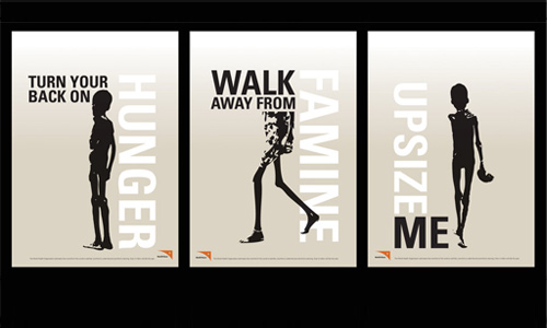
Image: blaze-01
Starvation posters that uses typography to relay the message.
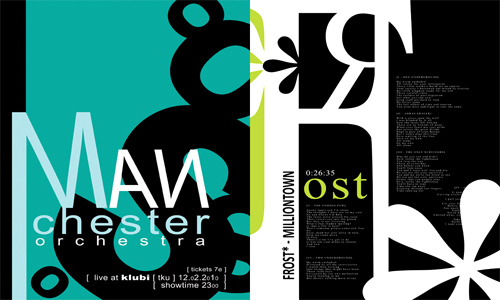
Image: Pau-Norontaus
A unique poster using typography made in Illustrator.
2. Web Designs.
You will also find websites that uses typography art in their designs. Web designing involves the process of designing a website in order for it to be unique. Here are some websites that uses great typography in their sites.
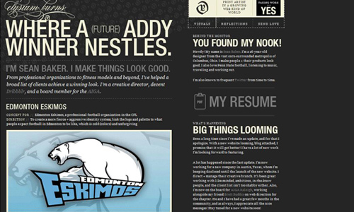
Image: elysiumburns
A website owned by designer Sean Baker that uses good typography.
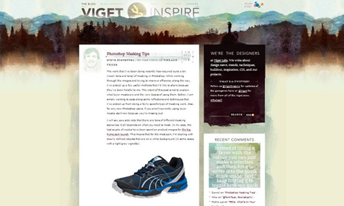
Image: viget
A group of designer’s had the initiative to make this website where you can find design news, trends, tips, techniques and others.
You can also view more Typography Inspired Websites in this site.
3.Logo.
Logos also use typography in a creative manner. Logos are emblems or graphic representation of a company or an individual. Logos give an identity or brand for companies. It is one way of promoting a business or an organization to the public. There are various ways of making a logo. But in this article, we will show you how typography is used effectively in a logo.
Image: Neverdone
A chief logo made from pure vector. No one will ever misinterpret this logo for the information is pretty obvious.
Image: Dizaynizma
A unique logo design for a band using typography.
You can find more inspiration in 40 Cool Typographic Logo Designs .
4. Business Cards.
Even business cards use typography. Business cards bear information about a company or an individual which is one way to introduce their business and be remembered by prospect clients. Business cards contain an individual’s name, company name, contact information and other necessary contents. Some designers manage to work on a business card effectively using typography.
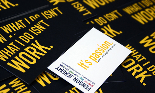
Image: Fensonjeremy
A neat looking business card using type. The client will surely remember you if you have this type of business card.
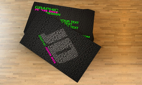
Image: Freshbusinesscards
Obviously, this is indeed a typography inspired design for it filled the entire card with type but managed to emphasize the important parts.
You may want to see Typographic Business Card Designs that will give you an idea on how to use typography in business cards.
5. Ascii Art.
Ascii art is a graphic design technique that uses computers to create an image. In doing this, one could consider the use of negative spaces, perspective and other design elements like light and shade. Some people can work on this using the typewriter. It is lovely to look at especially if the artist is really good.
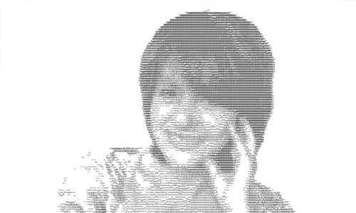
Yes, even a human face can be done in Ascii and you’ll be amazed to know that type fills this portrait.
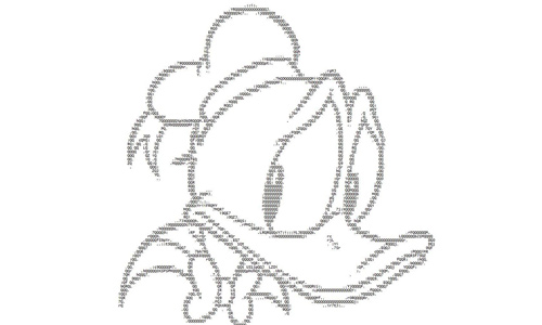
Image: ibx93
Who would not recognize one of Walt Disney’s most famous character? Isn’t this Ascii art of Donald Duck cute?
6. Typographic Portraits.
You will surely be amazed to see some portraits made using typography. It is indeed very impressive that characters can be used to portray human faces. The designer usually uses different typefaces, various font sizes and several colors to make the portrait beautiful. It really takes a talented person to do this.
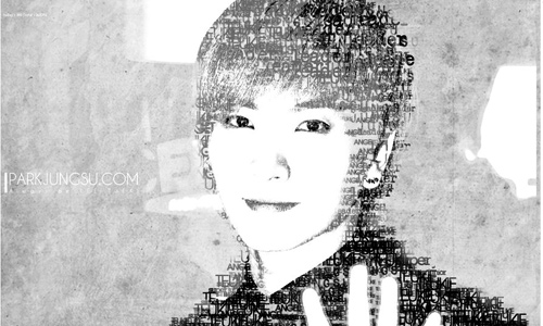
Image: 7even-is-jet
A fan made this one and for sure Jungsu Park will like it.
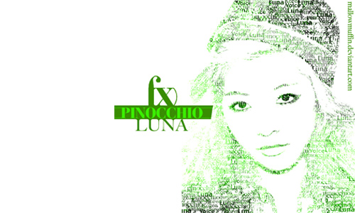
Image: mallowmuffin
Another great exmaple of typography portrait that uses the color green in various shades.
See more fantastic Typographic Portraits that might move you to make your own design.
7. Street Art.
Graffiti artists commonly use text to communicate to their viewers. You’ll find these scrawls interesting especially if you’ll see how pretty and cool it looks with the variation of strokes and colors that they use. Some people cannot appreciate street art thinking that it is only a distraction to a beautiful city. But if you will look into it, you’ll realize that there is a deeper meaning on their works.
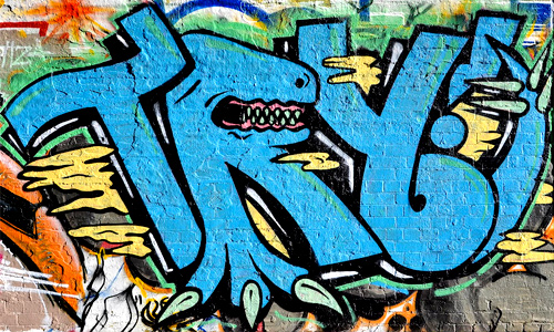
Image: bristol-street-art
Graffiti uses a bit confusing letter styles but this one is much clearer yet still artistic.
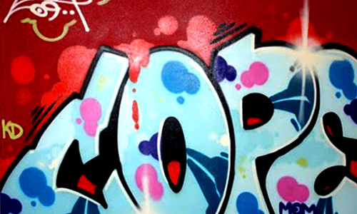
Image: trendgrafity
A graffiti using bubble letters with a lively combination of colors.
8. Typography Picture.
Type can also be used in creating images. It is arranged in different manners with different sizes, type face and color. To add effects, it uses various shades and contrast of colors. Like the typographic portraits, this one is also done by individuals who love to play with type and the outputs are truly impressive.
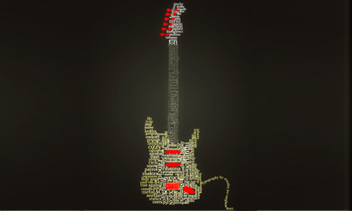
Image: kodereaper
Done in Adobe Photoshop CS5, this guitar will surely rock your world!
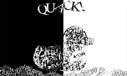
Image: undefinedRomance
A duck made using type with black and white contrast.
9. Billboards.
Like posters, billboards are installed vertically but these are larger than posters. You can see them along the road or in tall buildings. Billboards are made for advertising and promoting a product, a company or just anything. Most of them use eye-catching and striking images to get the public’s attention. But sometimes, the designer uses type to relay information. There are times when this is more effective than images, depending on how it is designed and what the text says.
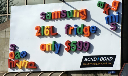
Image: tomgooday
A unique billboard that shows giant fridge magnetsto advertise special whiteware deals of Bond+Bond.
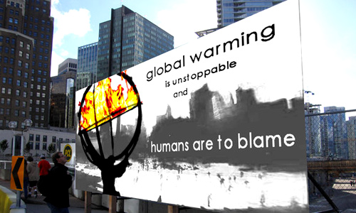
Image: waiting4cadence
One’s attention will surely be attracted to this billboard which instills awareness to people about global warming.
10. Book and Magazine Covers.
Some books and magazines use typography in their covers to impart uniqueness and creativity. Sometimes, it is really more interesting to look at books with a different cover design rather than using images and the usual text. With typography art, it could be eye-catching and it would immediately get the interest of the readers.
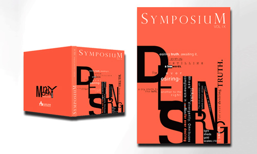
Image: Strangerka
A Symposium Book Cover that will surely arise interest for the readers.
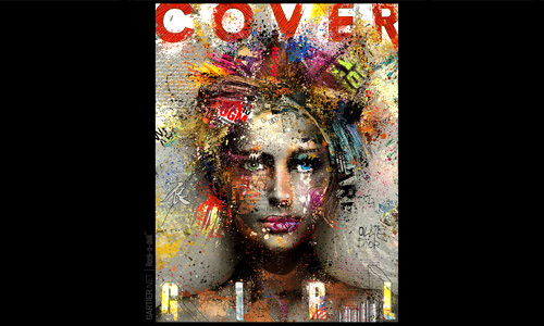
Image: gartier
Wow!Look at how great this magazine cover looks. This will surely attract thousands of readers.
11. Album Covers.
Several albums cover uses images. Usually it would be the picture of the artists posing according to the theme of his album. Then there would be a text stating the album title. You’ll seldom see an album cover that uses purely typography. Others may think that it is less attractive and is merely a minimal design. But they are wrong. Let us look at the examples below.
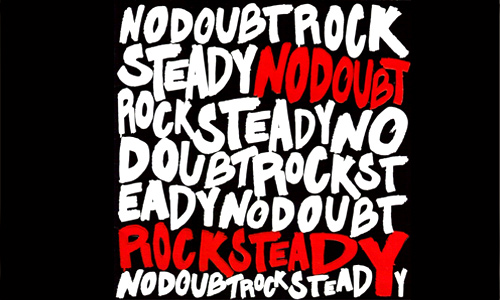
Image: inspiredology
An album cover of No Doubt with the title “Rock Steady”.
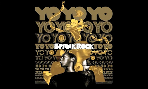
Image: inspiredology
Spank Rock’s Yoyo album that uses typography in its cover.
12. Graphic Design Experiments.
Apart from those mentioned, designers also use typography in different ways. They experiment using typography and convey messages in a unique manner. Some people are looking for ways in order to express themselves through typography art and here are some of their works:
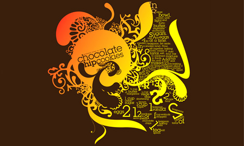
Image: Postpwned
This is a conceptual design for a chocolate chip cookies recipe.
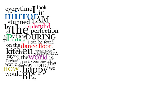
Image: kathleenshay
Looks like poetry arranged differently but still conveys the right message.
Typography can actually be found anywhere. You see it every day only that you do not really notice the creativity of the designer because it becomes a common sight for you. Try looking for some unique usage of typography and for sure you’ll be able to appreciate it. Who knows, it might even inspire you to work on something in relation to typography. There are so many influential uses of typographic design and most of them are truly fantastic. Have you tried using type in your designs? Did you find your usage effective?


love it
Loved typography! these list are so cool.
awesome collection, thanks for sharing!
Cheers for having such a great stuff like this..
WoW! great collection Typography, i like this very much.
Thanks for sharing……..(-_-)
Great and inspiring. Thanks for sharing.
Article is pretty nice.
I really wish that I was creative enough to design websites/logos like the ones seen on this page. They look awesome.