In this tutorial we are going to make an iBook inspired bookshelf. Just like in the previous tutorial, this bookshelf will be customizable, which means that we can change a part or several later after finishing it. Check out the final outcome of today’s tutorial down below.
Final Result
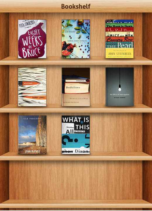
Now, Let’s get started.
Step 1
As usual, create a new document with the following dimensions: 800×1000px (300dpi).
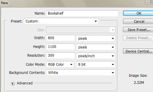
Create some guidelines to help us drawing the shapes.
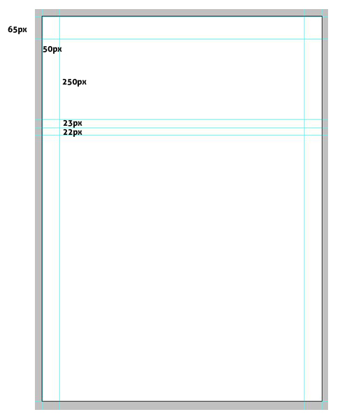
Step 2
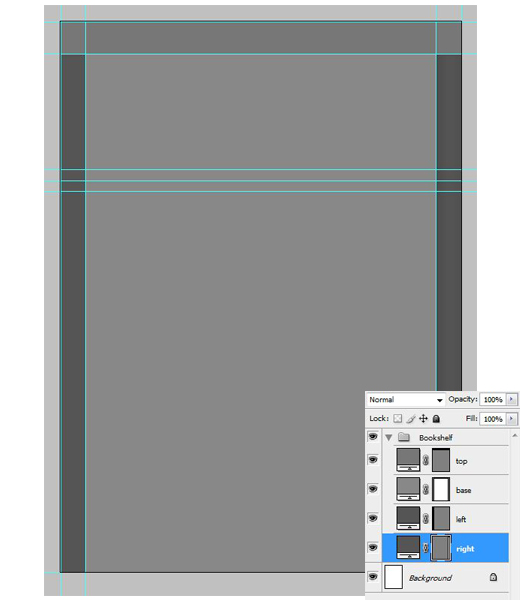
Now, create new Rectangle Shapes in accordance with the guidelines
(look at the following screenshot).
Step 3
In this step we are going to make wood material. First set the Foreground color to #e6d27d (Foreground) #f4e4b3 for the background. Go to Filter > Render > Fiber.
Set the following value for Variance 16.0 and 4.0 for Strength.
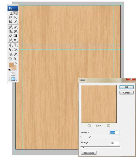
Convert the wood to Smart Object.
Step 4
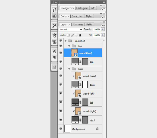
Duplicate the wood and place it above all the shapes. Clipping mask all the copied wood with the shapes except for top (shape & wood) and group them base on its position. Top layer and wood (top) would be in the “top” group, while base, left & right layer along with all the woods are in “base” group.
Step 5
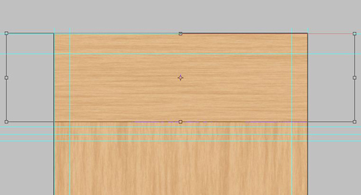
Rotate the wood (top) for 90o and shrink its width and Clipping Mask it like the rest of previous wood & shapes.
Step 6
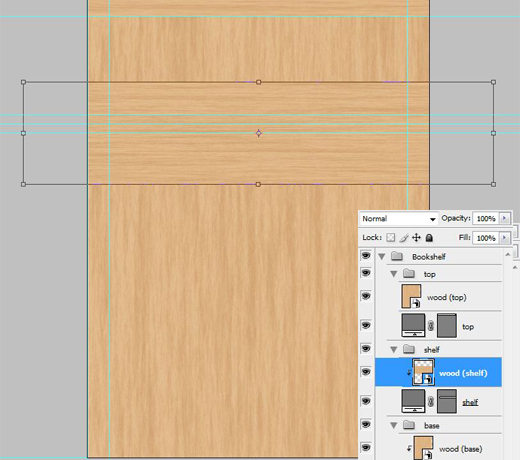
Draw a custom shape using Pen Tool (P) for creating the shelves. Also organize this layer by putting it in the shelf group like in step 4.
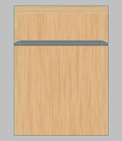
Copy one of the wood, place it above the custom shape. Rotate 90o and shrink its width. After that you can apply Clipping Mask on it.
Step 7
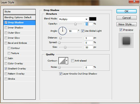
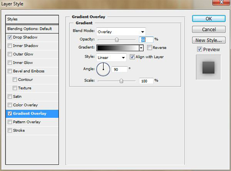
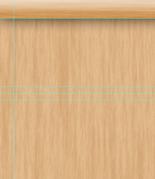
Now go to top layer. Add Drop Shadow & Gradient layer style.
Step 8
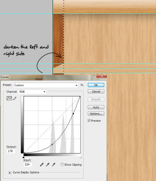
In this step we will make the left and right side become darker. So, let’s create a selection from them. You can achieve it by pressing and hold Ctrl + Right-click on the both left and right shapes or simply use Rectangular Marquee Tool (U).
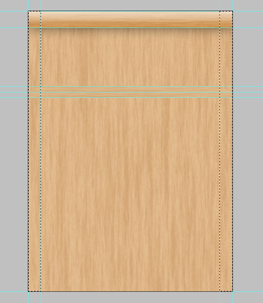
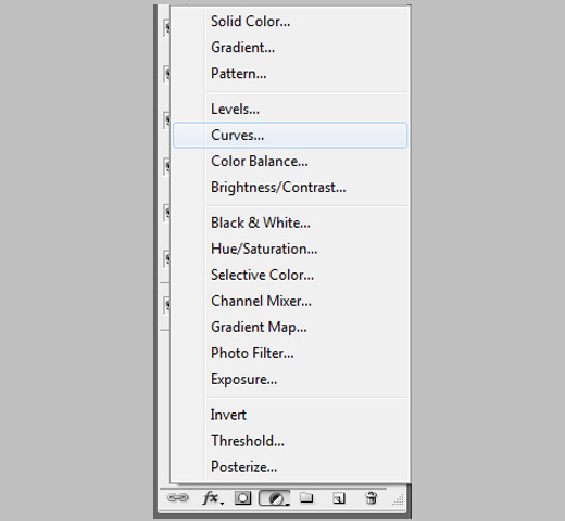
After that, create a new Curve Layer. The purpose we are using Curve layer is so that we would not alter its original form.
Step 9
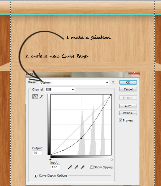
Repeat the same technique to wood (base) to make it darker.
Step 10
Add Drop Shadow to base layer.

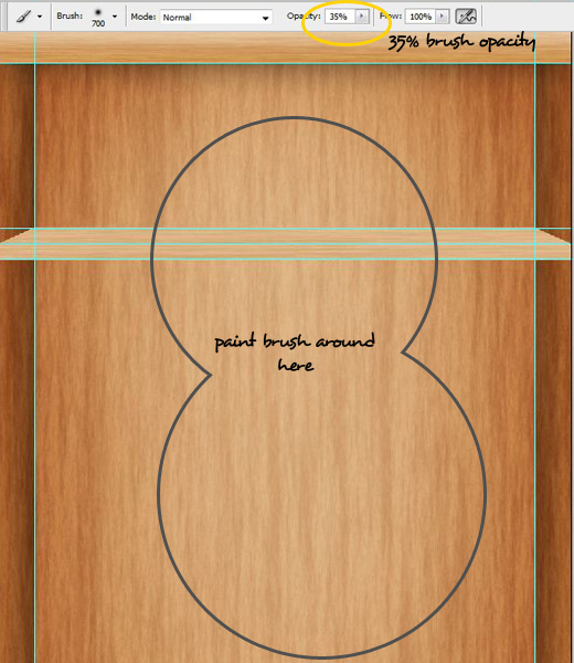
Pick a circle 0% hardness Brush Tool(B), set its opacity value to 35%. And paint the brush slowly, carefully in the Curve layer mask.
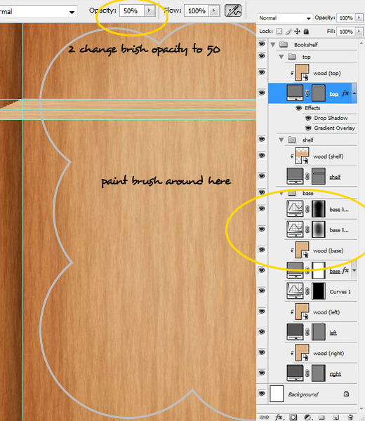
We are still in the Curve layer. Duplicate the Curve layer and repeat the same step, but this time change the brush opacity value to 50%.
Step 11
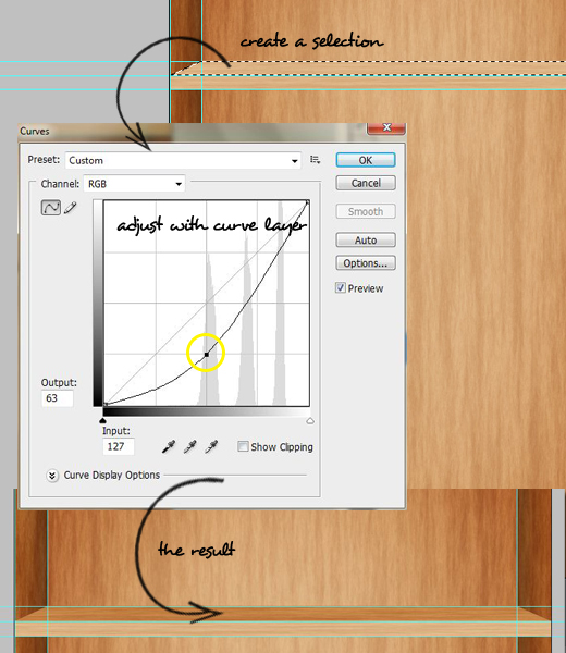
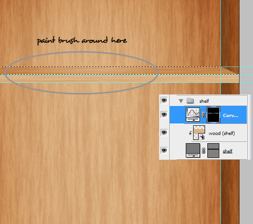
Apply the same technique to shelf layer.
Step 12
Create New Rectangle shape name front (Well, you can name it as you want)
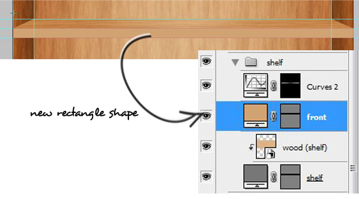
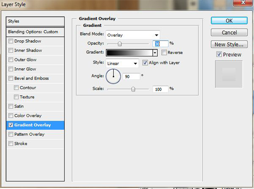
Add the following Gradient Layer Styles.
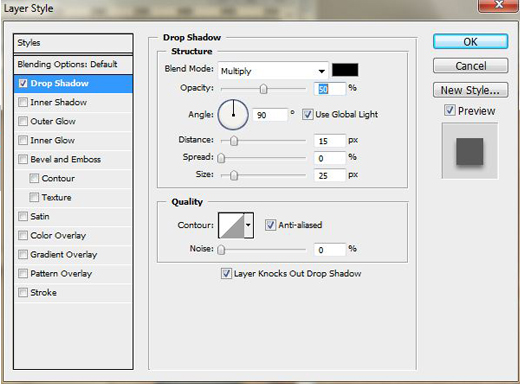
Apply Drop Shadow on the shelf (shape) layer.
Step 13
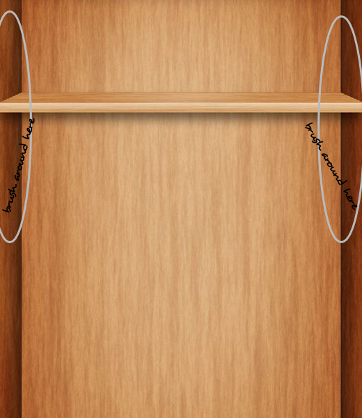
For the last details we would make slightly lighter in upper side of right and left layer and slightly darker in the lower side.
Duplicate the Curve layer we previously made for right and left layer and adjust the value as seen in the screenshot below.
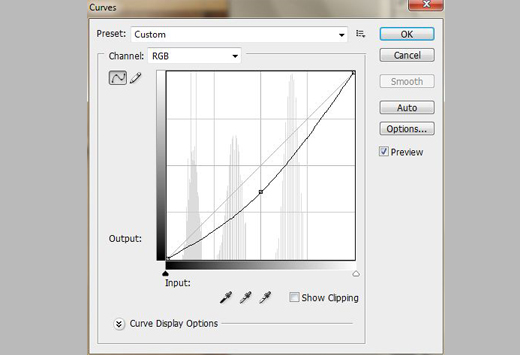
After that with a 50% brush opacity paint the upper side or half of the left /right height.
Step 14
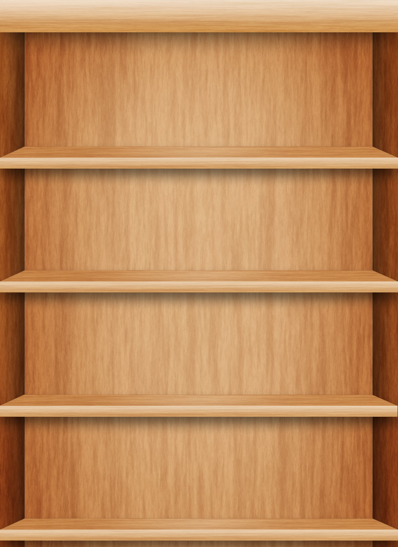
Now duplicate the shelf and arrange them in order. You may also rename the shelves orderly like shelf 1, shelf 2 and so on.
Step 15
In the top group, write a Title of this file. In this case we write “Bookshelf”. You may write as you like.
Probably, “My Books” is also a good choice.
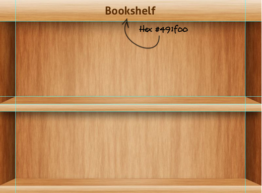
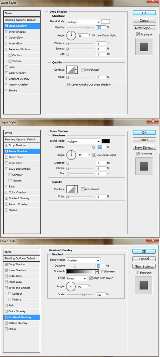
Add this Text layer the following Layer Styles:
- Drop Shadow
- Inner Shadow
- Gradient Overlay
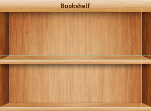
Step 16
From this step we are going to make the book cover mock-up that we will put on the bookshelf.
First create a New separate file size of 350x350px (300dpi).
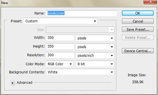
Copy one of the Wood material from the bookshelf.
Step 17
Secondly, create some guidelines in the file. Then, draw a new layer with Rectangle shape size of 146x200px. Convert it to Smart Object.
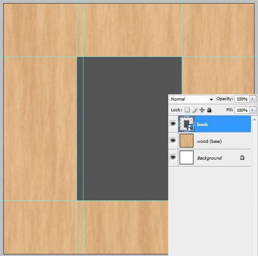
Step 18
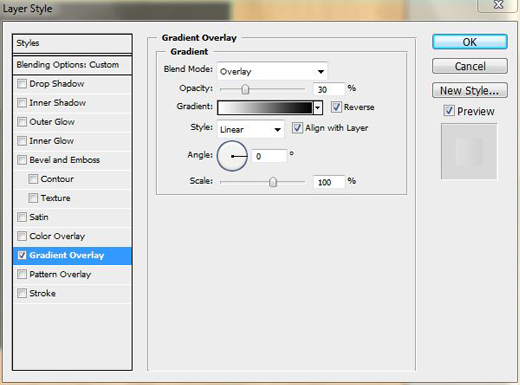
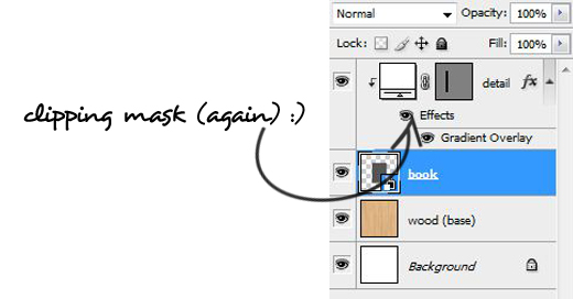
Draw another rectangle shape (look at the screenshot below). Set its Fill value to 0%.
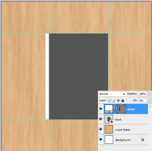
And add this Layer style.
Step 19
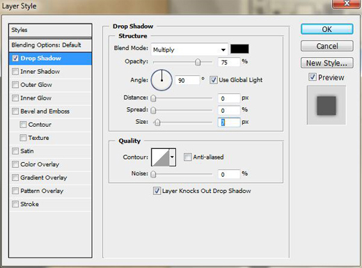
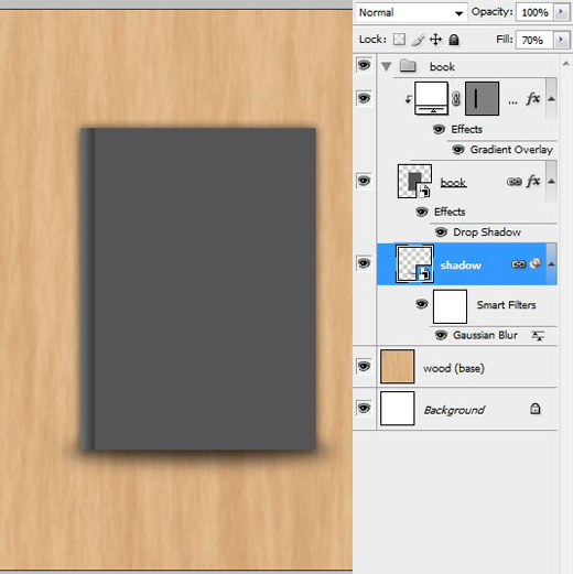
One of element that makes an object look real is shadow, so in the book layer we need to add a Drop Shadow.
Not only a drop shadow but a shadow that make us think the book is standing on something.
So we need create an Ellipse shape put it under the book layer and don’t forget to convert it to Smart Object.
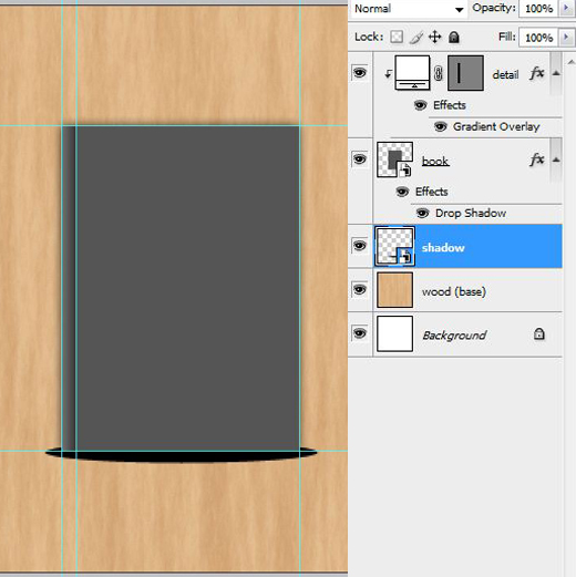
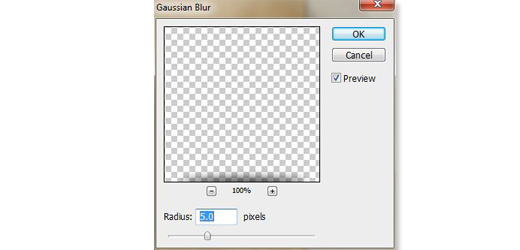
Add a Gaussian Blur to this shadow layer.
Step 20
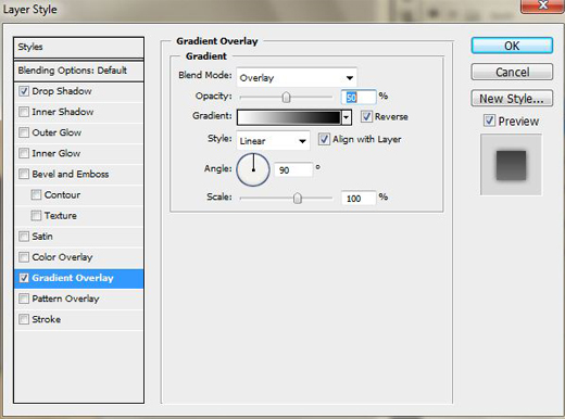
As the book will be standing between two shelves so the upper half of the book should be a bit darker. In this case we apple Gradient layer style.
Step 21
Drag n’ drop the book cover from bookcover.psd to Bookshelf.psd file.
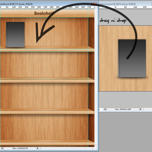
Double-click the book layer. Or Right-click on the book layer and choose Edit Content… This will open a new window.
For example, we want to put a real book cover, for that we will borrow one from bookcoverarchive [Link] for a while.
Put the cover in it and save, it will update the Smart Object in Bookshelf file.
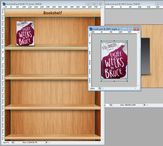
Repeat the same steps to add another book covers.
Book covers can be found here:
- gabriel_garcia_marquez
- strange_bedfellows
- the_short_novels_of_john_steinbeck
- resistance
- an_ethics_of_interrogation
- silk_parachute
- what_is_all_this
Final Step
And, this is it, our new Bookshelf mock-up inspired from iBook.

Download Source Files
- iBook-PSD (10.2MB)


When I get the hang of the Coca-Cola can tutorial, will try this one too dude! Thank you!
Looks great! Awesome tutorial, and easy enough to follow. Thanks a bunch! 🙂
Very articulate Thoriq. I hope there’s more of this in the coming days.
More of this pls thank you brother
Good job!
Wow! Can you imagine i was able to follow all these?? Thanks man!
will be checking for more tuts from you dude. thanks
Fantastic! I want to put my own collection of books! 😀
Step 19 to 21 was tough but i did it!
Starting to learn PSD now. Thanks for sharing this!
Thanks for your appreciation guys and stay updated with our next tuts. 🙂