
In designing, there are certain things that one needs to know before he can actually jumps into the design process. Before starting, one has to acquire ample knowledge about what he is working on. In this case, one has to study well the do’s and dont’s of designing a mobile website before starting. There are many differences from designing a full desktop website from a mobile website. That is why, one needs to conduct research well. Doing this can also help the designer do away with some common design mistakes one may commit.
For today’s post, we will give you the common design mistakes for creating a mobile website. Committing any one of these points can hinder the effectiveness of your mobile site. Hence, it is important that you take note of it before starting. You can also look into our tips on how you can create an effective mobile website design so you can be guided. Now, read on the points below.
1. Not considering the size.

Site: Dreamworks Animation
It is very important to consider the size of your website. You have to bear in mind that in mobile, the website would need to look smaller since the screen of mobile devices are smaller. Without considering the size, your site will not look good on mobile. Set your mobile website’s width to fit in a mobile screen and make sure that all the elements will appear in a proper size along with the site.
2. Having too small buttons.

Site: Racks by the Tracks
Remember that the buttons in your site has be tappable or clickable by a single finger. Do not ever forget that you should use at least 30-40 pixels that fits the finger. You should also have enough space around these buttons so that other elements won’t be included in the clicking.
3. Placing too many and too heavy images.

Site: Juicy Couture
If you place too many images in the site with huge sizes, it will load so long. Some users will no longer continue to visit your site because it’s a waste of time for them just to wait for mobile website to load. Hence, you should avoid these two things instead you can optimize the images and make the size small so that the site will load easily.
4. Not simplifying contents.

Site: Advantage Bridal
The content is of course very important. When designing a mobile website, see to it that the contents are not crowded and that the users will be able to read them clearly. You do not have to include everything that you have in your full site. The contents of a mobile site are more limited. But be sure to place what are needed.
5. Creating long forms.
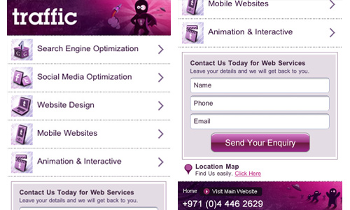
Site: We Want Traffic
Long forms would certainly not be proper for a mobile website. You would give the users a tedious job filling out forms on mobile if they are too long. Create simple forms that do not require much information from the users. You can also set the type of inputs to numbers or letters only depending on what is required for a certain field. This will be much easier for mobile users.
6. Having poor usability.

Site: Glucone
Aside from the right sizes of buttons, one should also consider usability on other parts of the site. That includes forms which should have large input fields that fits in the viewport and links that are easy to click with about 32 pixels of space. You should also consider good navigation as part of the site’s usability.
7. Not giving the option to see full site.

Site: In Buza
There are instances that the user would like to access the full site. You should let them do that. So, provide that option for them. They might just feel frustrated if you will not provide a link towards it when they want to view it.
8. Not using collapsible navigation.

Site: London Tourism
It would be a lot easier for your users if the site is done in this manner. With a collapsible navigation, they can easily look for the categories they needs and into the information they want. It would be much simpler for them to use a vertical hierarchy of the categories.
9. Having a complex layout.

Site: Take Me Fishing
In mobile website designing, it has to be simple. Do not make it too complicated because it might just take time to load and it might only look crowded on the mobile screen. The rule in mobile website design is to keep it simple all the time. You can still do some creative work though but you need to limit that.
10. Failure to test the site.

As always, you need to test your mobile website on different devices and by different people. Get feedbacks from them so that you can still fix that when there is a need to. Testing is the key for you to check every single detail of the site. So, never ever skip testing and asking for some feedbacks from users.
It’s Your Turn Now
One can actually easily do away with committing these design mistakes for a mobile website if he just looks into all the details of designing before he begins doing it. It is also important to have a thorough study and reading in order to be well acquainted of what really needs to be considered in designing a user-friendly mobile website. Have you tried designing a mobile website? What were the mistakes you tried not to commit?


Thanks for your post, great analysis.
For me, point 4 is the most important one. Simpler designs work best at mobile devices. Users need agile interfaces in order to repeat their visit.
It’s also interesting to have a look at responsive designs that work fine in all kind of devices.