Handwriting fonts are just one of the many font choices a designer can use in creating a design. It could enhance a web design with its proper usage and can also give a little frivolous touch making it totally unique. Many designers have used it in their designs and have successful y reached their goal to make it look appealing.
There are many benefits of using handwriting fonts in designing which some of us could be oblivious of.
Yet, even without knowing these benefits, a designer still experiment with using it.
As many designers come to love handwriting fonts, we will give you some tips on how to use handwriting fonts in web design. It is important that you could effectively use it so that the readers won’t navigate away from your site.
Here are some tips in using handwriting fonts for web design.
1. Use the right handwriting font.
It is important to use the appropriate handwriting font for your website. A script or a cursive handwriting that looks feminine is apt for websites that showcases stuff for females. But not all cursives are feminine in appearance. If you want to have a bit childish touch, you can opt for single stroke handwritings or other uniquely made handwriting fonts.
2. Use it to tell what the site is about.
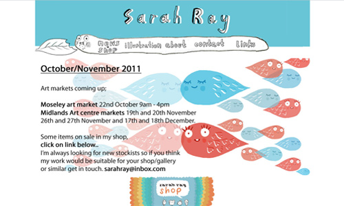
You can use it to show what your website is. Handwritings can easily tell that a particular site is for children. It can tell if you’re selling children’s books, toys and others. It can also tell if you are an artist, you could be a cartoon illustrator or a designer. Handwriting fonts are more inclined to the world of arts.
3. Use minimal handwriting fonts.

You may also opt to use a little of it. You can use it on some parts of the design like in RSS Feeds only. This will still be effective for it can easily catch the attention of the readers. If you used a different font for the entire website and then use handwriting fonts on the other parts which you want them to see, you will surely succeed in driving their eyes towards it.
4. Use it for introductions.
One of the trends in web design is the use of introductions. This is mostly used in portfolios and blogs. Designers use this to tell them who they are and what they do. These are brief introductions that make readers know the basic things they would want to know. Since they will be spending only a little time, you will be able to relay the message at once.
5. Use it in headers and footers.

A website’s header is important for it bears the name of the website. You can use handwriting fonts to tell readers what the site is or who you are. This will make your site unique and attractive at the same time. You can also use it in footers in any manner you want as long as it looks appealing.
6. Use it to for navigations.
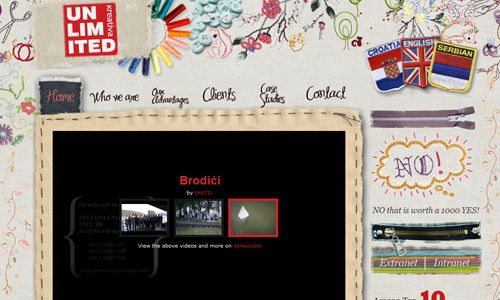
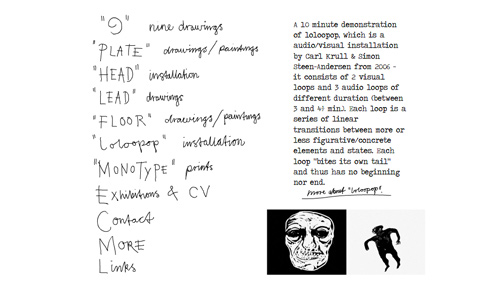
It would be easier for readers and users to navigate your site if you have certain instructions on what they need to do especially if your website has a unique design. Use handwriting fonts to easily get their attention and to easily tell them what needs to be done. This would be very helpful for your website and for readers, too.
7. Use it in most parts of the website.
You can also use it as a primary font in your website. Just make sure that it is readable. You may also use it in most parts of the website like in the header, footer, call to actions, and other parts. The use of handwriting fonts makes a different impact to the readers. It can even make your contents look more interesting.
8. Use it for children’s website.
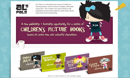
Children’s websites can make use of handwriting fonts. This is more effective for this sites for some handwriting fonts really look childish. But despite that, it can still give a professional touch to the website. The important thing is that it doesn’t look silly and it can speak for itself even without reading the text yet.
9. Use it for call to actions.
It is important for web owners to get the attention of the readers to their call to actions in order to make sure that they will do something or they will be urged to do something that will help the website. An example of that is when you urge them to share or tweet your post to other people. That would be helpful in increasing the amount of traffic for your site.
10. Use if for labels.

There are websites that use labels for their images or for other parts of the website. You can also use handwriting font for them. As what we’ve said, it can always help in attracting readers.
It can also give the effect like someone really wrote something there to make an instruction or to make some matters clear to you.
Using handwriting fonts can certainly create a distinct impact to your website. You will surely love the outcome of your site especially if you tried experimenting with it.
Have you seen other websites that use handwriting fonts in their design? Would you like to share them to us? Or you might have some additional tips to share to us. We would love to hear from you.


Nice post!
I’ll try this! Thanks!
I’m just starting my own site. This is helpful. Thanks a lot!
It makes the site look really inviting!
I can’t believe I am a couple of days late on this post! thanks again for this!
I was thinking that handwriting fonts were so gay lol.
But it’s rather cool!
In my next design, i’ll try this. thanks by the way
Won’t this make my site look a bit, yeah Ajhan, gay?
I’ll find the coolest one! 😀
Yes, good for highlighting stuff