Every type of business needs a business card for it is part of marketing and in promoting their products and services. There are different ways on how one can make it look unique and appealing but its appearance can also depend on the kind of industry or niche. When it comes to photography business cards, you would usually see pictures personally taken by the company owner or the photographer. This gives their business card a personal touch and would also make it recognizable.
Designing a business card for photography can also be fun. This is due to the various ways you can create it. You can be as creative as possible. You can even go beyond the limits of photography but still show the people that you are in a photography industry. Think well of your design concept before you start working on it. So, if you are into photography business and you want to design your own business card, we have here some tips for you. Read on and discover vital tips in designing business card for photography.
1. Know your target audience.
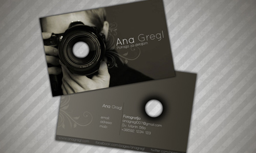
Image: Ana Gregl
It is always important for you to determine who your target market is. Doing this can help you think of a good idea on what you should do with your business card design in a manner that it can attract to the certain group. If you are into wedding photography, you can make it look inviting and romantic for couples. If you are into child and baby photography, then give it a bit of childish and fun touch. Doing this can help you have an effective marketing for your photography business.
2. Place a picture.
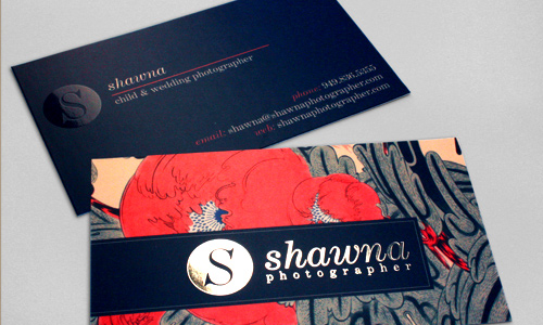
Image: Shawna
Well, it isn’t actually a must to place a picture in your business card. But you could do that. Most photography business cards place pictures which is also a manner of showing how good they can be in taking pictures for their clients. If you decide to place an image, choose something that would best represent you and your business.
3. Look into your type.
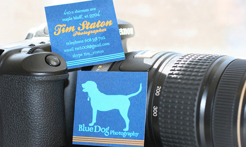
Image: DilemmaStudio
Some may opt to use a big picture for their business card or they do some impressive designing on some parts of it. But of course, type will always be there. A business card will not be a business card without some text on it. So, consider the kind of type you use for your business card. It would be an important part of it because it would show the vital contents of a business card. You can also make use of typography art for your business card.
4. Place multiple pictures.
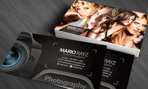
Image: Lemongraphic
You can also place different pictures on the business card. You can have multiple pictures for one business card only. Or you can also place a different picture for every business card. This makes each one unique and your client will also be happy to see that your business cards are unique from each other. You will also not get sick looking at it because the pictures are all the same. This could give you the chance to use your recent works for every business card.
5. Use good paper.
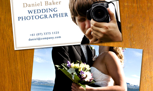
Image: Danbradster
Paper is very important because the client will of course be able to feel the paper’s texture. Also, the quality of printing will be greatly affected on the quality of the paper. So, use a good paper that would be suitable for your business card. If you are printing at home, you can use specialty papers for it can easily be cut with clean edges. If you are planning to place photographs in it, then use glossy paper or photo paper for best results.
6. Create a mini-portfolio.
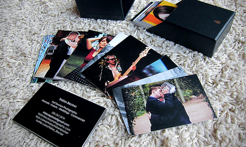
Image: ThirdMeaningPhoto
Another effective way of making a business card is through a mini-portfolio. You can show your works there only that it is not as big as an ordinary portfolio. It is much smaller than that. But of course, you can’t make pages and pages of that. It has to be short and brief. Show your best works there. That would be a double purpose. You can place 3-4 images. Just see to it that they don’t look small.
7. Try die-cut business card.
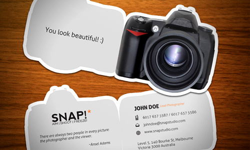
Image: Kaixer Group
You can also make use of die-cut business cards. Use different shapes and styles. You can make it square shaped, circle and many others. Some even customize it in a shape that they want. It can also be an effective way of making a unique business card.
8. Use black and white picture.
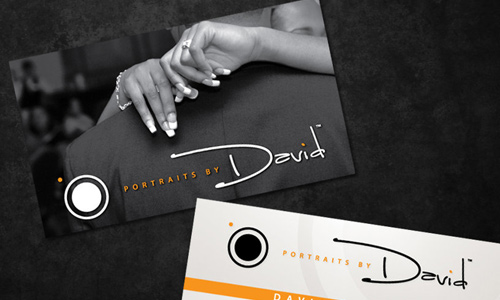
Image: Portraits by David
Your business card can also look great with black and white picture. It would look elegant or classic but truly professional. Just choose a picture that would look good on it and would help you promote your business. Let it deliver the message you want the clients to get.
9. Add some texture.
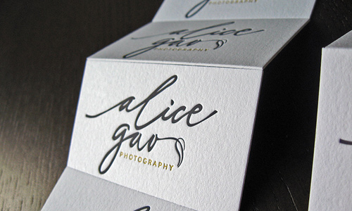
Image: Dolcepress
Adding texture to your business card can make it look a lot better. You can use textured papers for that. Or you can also have a picture of an image with good texture. That will also give your business card a different touch. Some also do some crafty touches to it in order to make it appear more 3D. Any of those works look good when it is done well.
10. Incorporate a hidden meaning.
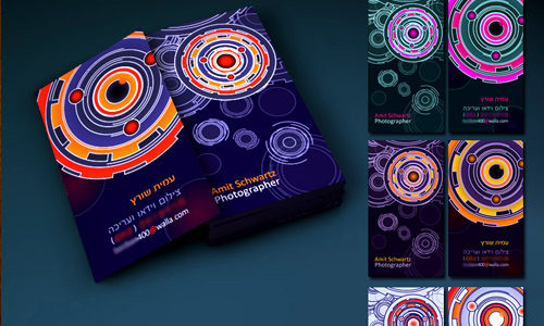
Image: Maigrane
Your business card will look more interesting if you add some abstract into it. You can incorporate a hidden meaning into it. It can intrigue the clients and would look more into the card in order for them to get what you have placed into it. Try to use colors of good combination so that it will look more attractive.
It’s Your Turn Now
Like other business cards, a photography business card has to contain what is needed to be seen in it. Without the complete the details, it will still be useless no matter how appealing it would look. So, aside from the looks, the contents should also be given attention. Part of that is having readable text. If you want to add some tips to what we have listed above, feel free to do that.


Simply awesome, just googled for some designs here,a guess what this website has a lot stuff the i should learn!!
Thanks Kareen liez
Regards,
Aditya Chintha