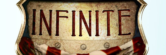
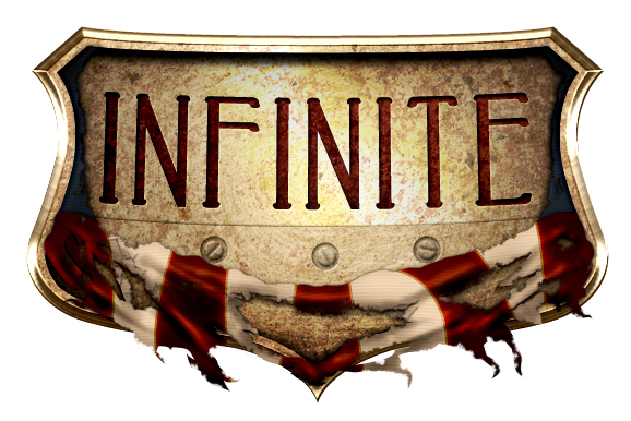
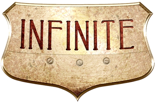
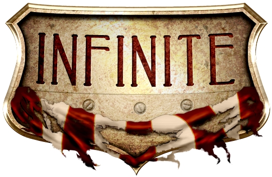
Bioshock Infinite is one of the most anticipated video games of this year. It’s so artistic that got our attention from the very first moment. In this article we’re going to create a steampunk logo that looks like the original. Please keep in mind that we’re not re-creating the original one. Therefore, we’ve changed the main font and made some minor adjustments.
Tutorial Details
- Program: Adobe Photoshop
- Version: CS5
- Difficulty: Advanced
- Estimated Completion Time: 3 hours
Tutorial Assets
- Untitled Texture CXXXXXXXXVII by aqueous-sun-textures
- DistortedLines pattern
- Rusty Iron Texture by arkaydo
- Wall Texture by shadowh3
- Abrasion Texture 4 by Yulia-Textures
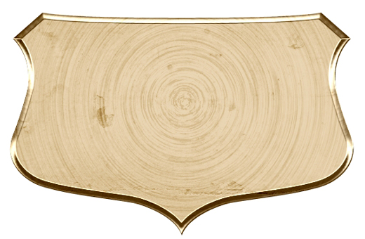
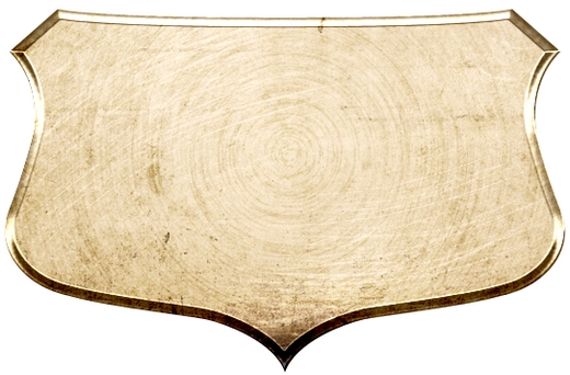
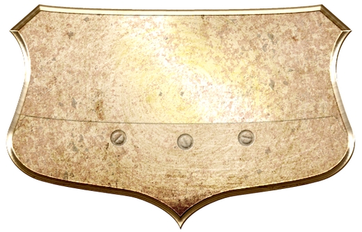
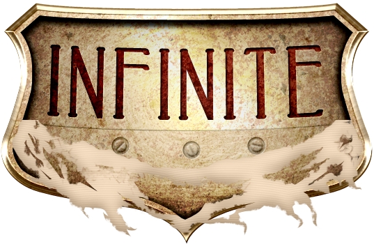
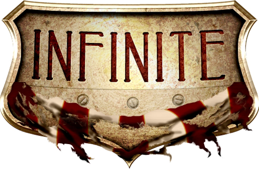
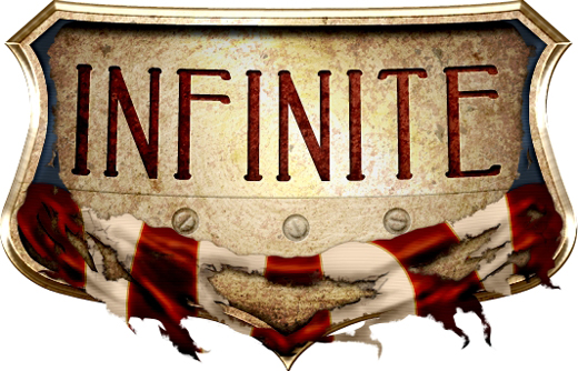
Final Result
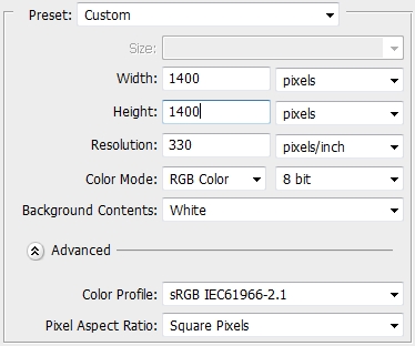
Step 1
Create a new file in Photoshop. Then create another file (600×400) and place the Untitled Texture CXXXXXXXXVII. Rasterize it, desaturate it and go Edit->Define Pattern. Save it as “Wall1”.
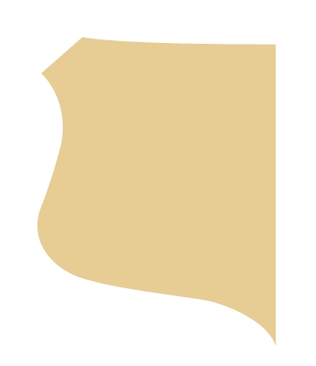
Step 2
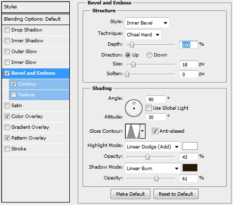
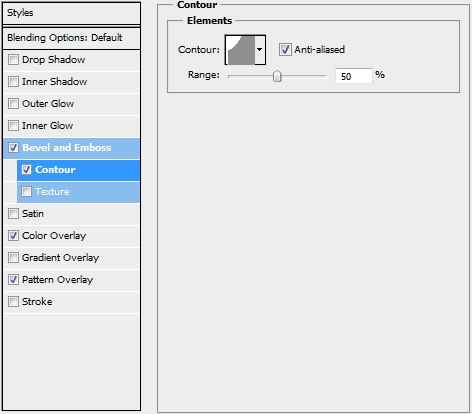
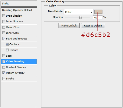
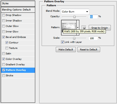
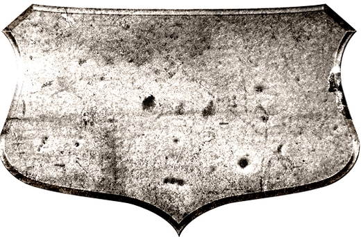
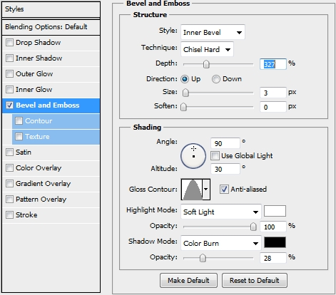
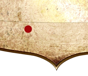
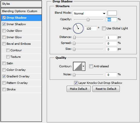
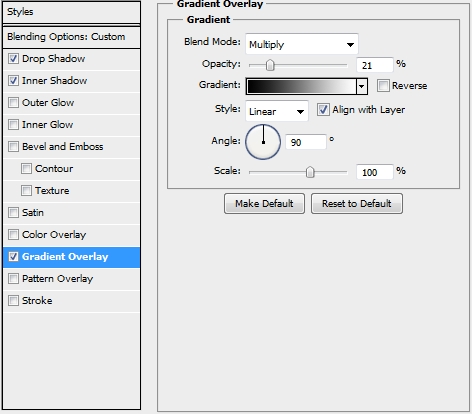
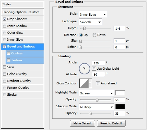
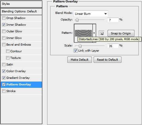
Grab the Pen Tool (P) and draw the shape of a shield. You need to draw only the one half and then duplicate it, flip it horizontally and merge the two layers. Fill the shape with #e7cd94 and apply the following styles.
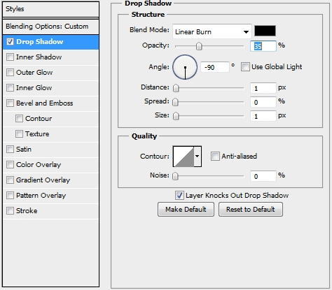
Step 3
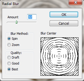
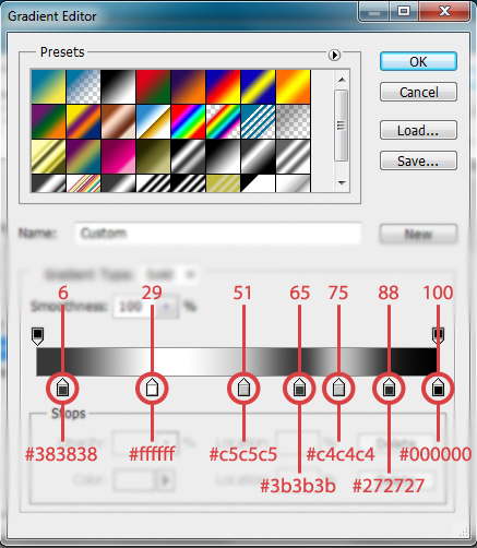
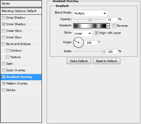
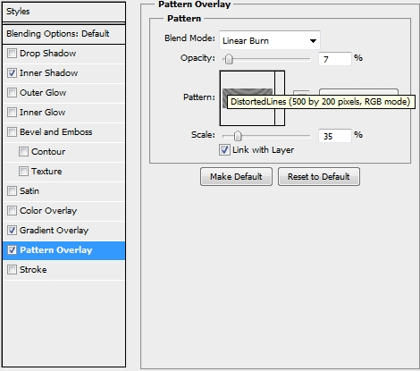
Create a new and make it a clipping mask to your original shield shape. From now on every layer created has to be a clipping mask to this shield shape. Select the shield shape’s pixels and paint the selection white (#ffffff). Then go Filter->Pixelate->Mezzotint and Filter->Blur->Radial Blur. Change the Blend Mode to Color Burn and the Opacity to 33%.
Step 4
On a new layer place the Abrasion Texture 4. Scale it down and change the Blend Mode to Overlay and lower the Opacity to 80%. Add a mask to erase some unwated parts.
Step 5
Duplicate the Abrasion Texture 4 layer and rotate it 180 degrees. Move it to the other side of the shield. Increase the Opacity to 90% and modify the mask a bit.
Step 6
Create a new layer (don’t forget to make it a clipping mask) and place the Wall Texture (shadowh3). Change the Blend Mode to Hard Light.
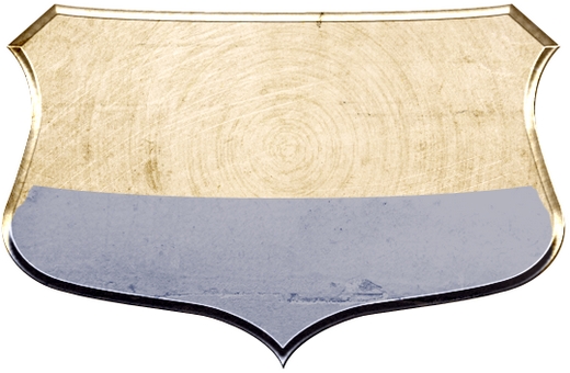
Step 7
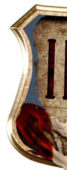
Pick the Pen Tool (P) and draw a shape like the one on the image below (it doesn’t have to be perfect). Then apply the following style and turn the Fill to 0%.
Step 8
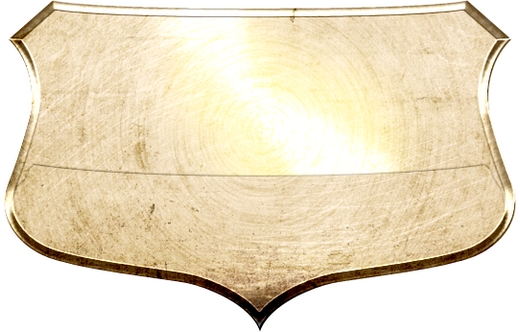
Create a new layer and add some highlights with a soft round brush (colors: #ffffff, #f0e6a5). Make sure not to overlap the shape created in the previous step (delete the parts inside it).
Step 9
On a new layer place the Untitled Texture CXXXXXXXXVII and rasterize it. Desaturate it and increase the contrast using the Levels (or Curves, whatever you prefer). Change the Blend Mode to Color Burn and the Opacity to 45%.
Step 10
Place the Rusty Iron Texture, change its Blend Mode to Pin Light and lower the Opacity to 40%. Duplicate it and place the copy on the other side. Try to give it a random look by rotating a bit the textures.
Step 11
Create a new layer and select the pixels of the original shield shape. Fill it with #e7cd94, and go Select->Modify->Contract and set the radius to 8px. Hit Delete to erase this part. Then simply turn the Fill to 0% and apply this style.
Step 12
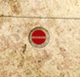
Group all the layers created so far and name the group “Base”. Create a new layer above this group and pick the Ellipse Tool (U). Draw a small circle, fill it with a random color, turn Fill to 0% and apply the following styles.

Step 13
Draw another circle, only this time make it a bit smaller. Add a mask, change the foreground color to black and using a hard round brush draw a thin line (2px). Then turn Fill to 0% and apply the following styles.

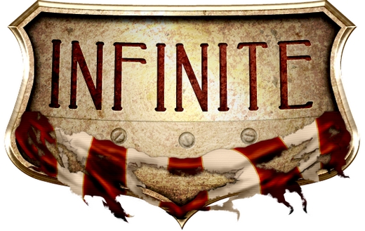
Step 14
Group these two layers and name the group “Screw”. Duplicate this group twice and rotate them a bit to give it a random look. If you’ve done everything properly, your design should by now look like this.
Step 15
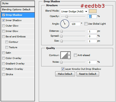
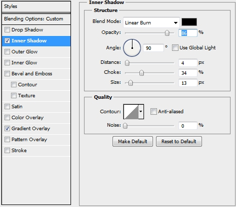
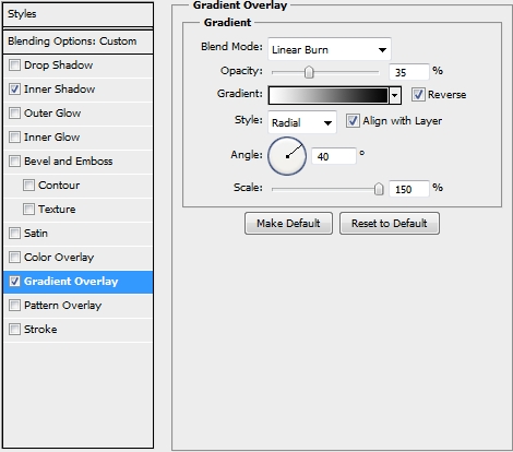
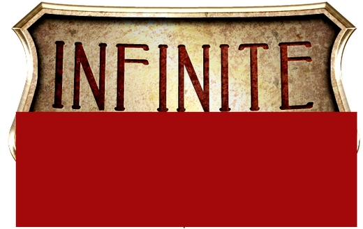
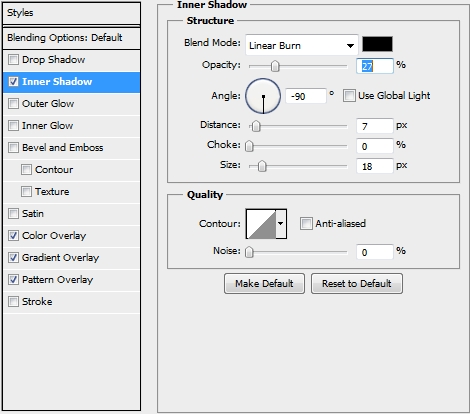
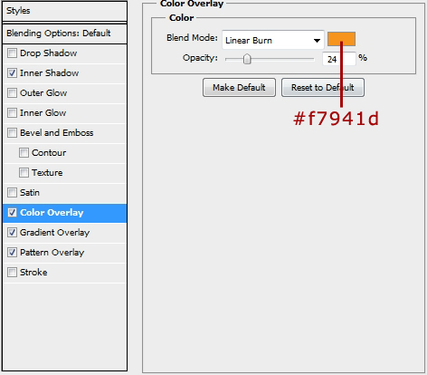
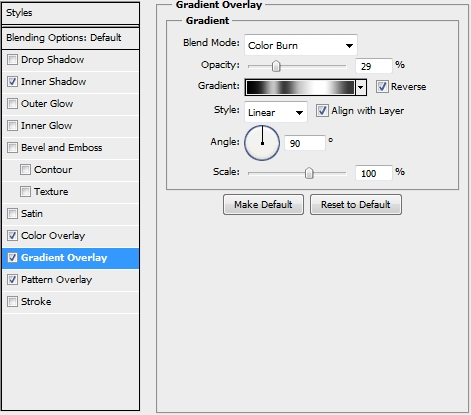
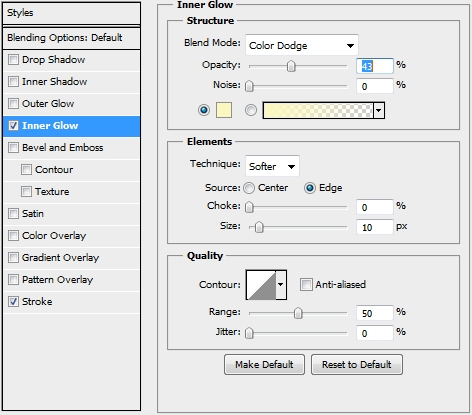
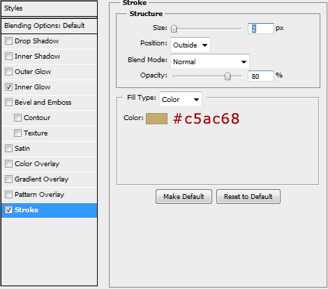
Create a new layer and select the Type Tool (T). Write “Infinite” or anything else you want. The font used in the tutorial is called Peake (size: 34 pt, tracking: 80, color: #a3080a) and can be found at dafont.com. Change the Free Transform Mode to Warp Mode and select the Arc from the list (bend: -3). Then apply the following styles.
![]()

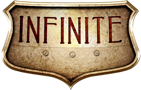
Step 16
Place the Wall Texture right above the text layer and make it a clipping mask to the text layer. Change the Blend Mode to Overlay. Then place the Rusty Iron Texture and desaturate it. Change its Blend Mode to Soft Light and make it a clipping mask to the text layer too.
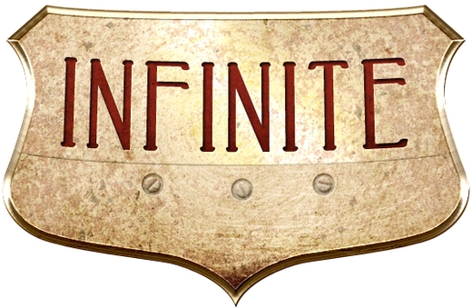
Step 17
Group these three layers and name the group “Text”. Create a new layer and select the original shield shape’s pixels. Go Select->Modify->Contract (14px). Paint the selection with a random color and apply these styles.
Step 18
Duplicate this layer and replace the existing styles with this one.

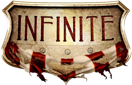
Step 19
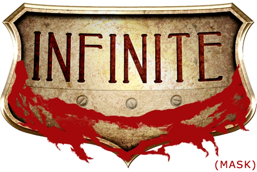
If you’ve done everything properly, your design should look something like this.
Step 20
Now it’s time to create the torn flag. Draw a rectangle using the Rectangle Tool (U). Change its color to #ffffff and apply the following styles.
Step 21
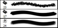
Add a mask to this layer and using the Pen Tool (P) and a couple of brushes create a nice torn effect.
Step 22
Create a new layer and make it a clipping mask to your flag layer. Using the Pen Tool (P) create some stripes. Fill them with #a3080a and apply the following styles.
Step 23
Create a new layer and make it a clipping mask to the flag layer. Select the previously used brushes (step 21) and draw some shadows. Change the Blend Mode to Linear Burn and lower the Opacity to 40%.
Step 24
Repeat the previous step, only this time add some highlights. Change the Blend Mode of the layer to Overlay and the Opacity to 60%.
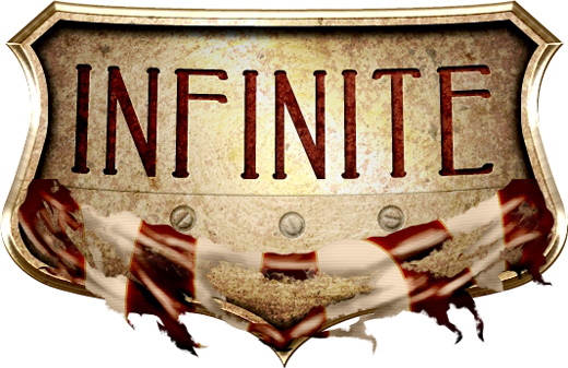
Step 25
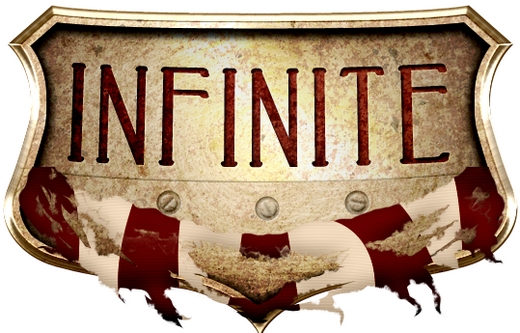
Your design should now look like this.
Step 26
Group all the layers created in Steps 20-24 and name the group “Flag”. Duplicate your flag layer and clear its styles. Change its color to black (#000000), go Filter->Blur->Gaussian Blur (2,5px) and place this layer inside the “Base” group (place it right above the Untitled Texture CXXXXXXXXVII). Change the Blend Mode to Linear Burn and lower the Fill to 80%.
Step 27
Add some more shadows beneath the flag.
Step 28
We need to create the second part of the flag now. Select the Pen Tool (P) and draw a torn-like shape (color: #415266). Then apply the following styles.

Step 29
Do the same on the other side of the shield (don’t forget to change the Angle from 180 to 0).
Step 30
Add some shadows.
Step 31
Repeat Step 26 to add some background shadows for the second part of the flag.
Conclusion
That’s the end of the first part. In the second one, we’re going to create the remaining parts. We hope you enjoyed the tutorial. If you have any questions, post them in the Comments section and we’ll answer asap.


pretty good…:)
nice but it’s a long tutorial for the 1sdt half..
is it not hard to learn this tutorial?
Thank you for posting this tutorial! Definitely very challenging, but I learned a great deal.
It seems to me that the tutorial is missing out some steps or at least some valuable information, because I followed every instruction carefully, but some things turned out completely different. For example the circles created on Step 3 weren’t nearly as visible even BEFORE I changed the blending mode to color burn. After that and reducing the opacity to 33 %, they were invisible. Also I don’t quite get if the Untitled wall texture has to be resized down to the 600×400 pixels mentioned in Step 1 or not.
Too bad, because I really wanted to try this bad boy out, but on the highlights in Step 8 I was completely lost because the tutorial does not mention what blending mode should be used, whether it STILL has to be a clipping mask of the shield shape layer and so on. I just couldn’t get the outcome right.
Can you make video how to make it for this tutorial ?