Single page websites may be described as websites that constitutes all of its features in one page. In this kind of design visitors need not to load different pages just to find what they are looking for and this can give your website an advantage to the rest. But to make this effective, it is of importance to have a creative design to your website to make it more fun and lively.
In our next post, we will be showcasing examples of Beautiful Single Page Design. We have collected different creatively made single page design websites to give you an overview on this interesting concept. Come, take a peek, and be inspired.
You may want to take a look at the following related articles:
• 40+ Examples of Horizontal Scrolling Websites
• 44 Examples of Nature Inspired Website Designs
• 45+ Inspiring Examples of Vintage in Web Design
• 30 Beautiful and Illustrative Website Footers
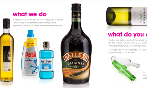
We Shoot Bottles
View Source
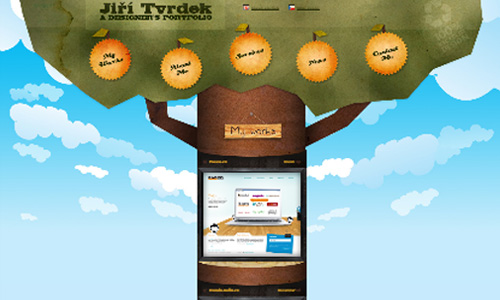
TV Rdek
View Source
Simon Edamico

View Source
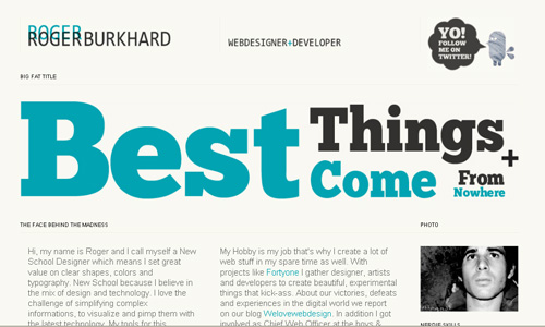
Roger Burkhard
View Source
Almeyra

Bit Bots

View Source
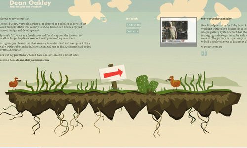
Dean Oakley
View Source
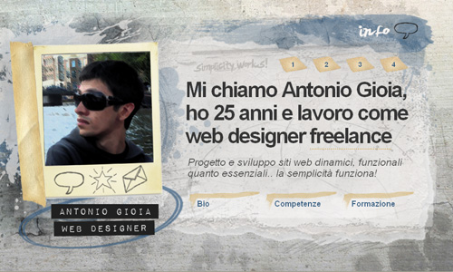
Antonio Gioia
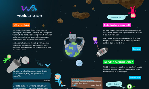
World-Arcade
View Source
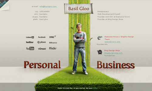
Basil Gloo
View Source
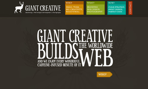
Made by Giant
View Source
KZ Xtreme

View Source
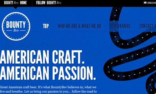
Bounty Bev
View Source
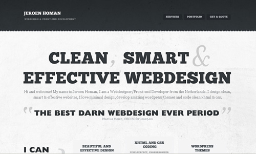
Jeroenhoman
View Source
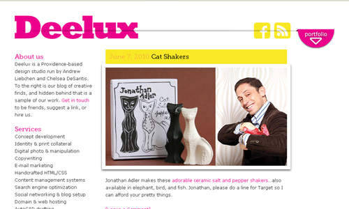
Deelux Design
View Source
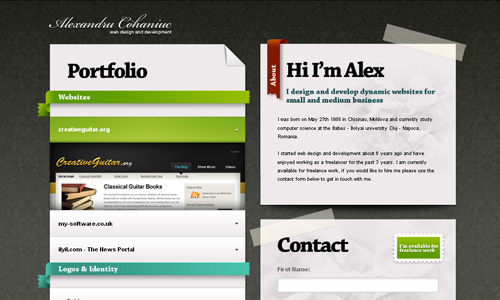
Alex Cohaniuc
View Source
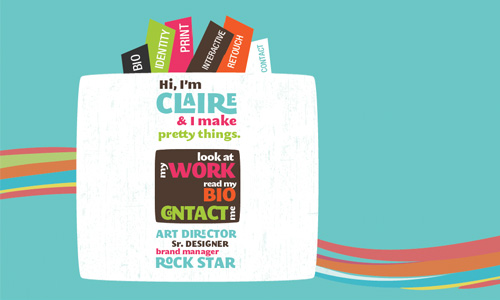
Vanity Claire
View Source
Macaw Scarlet

View Source
Amo Digital

View Source
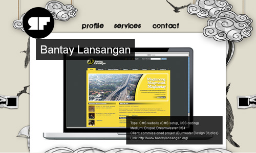
Ralph Flores
View Source
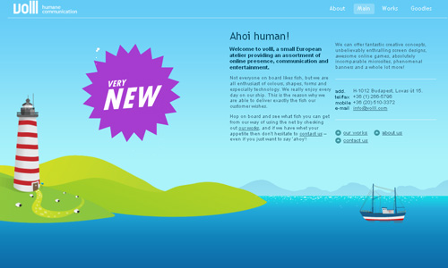
Volll
View Source
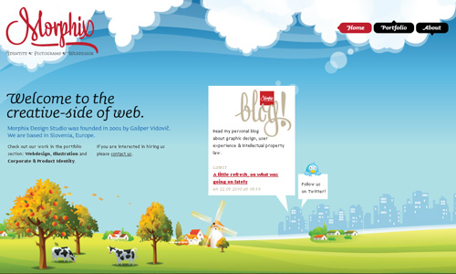
Morphix
View Source
Camp Firebelly
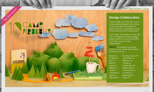
View Source
My Brain Art
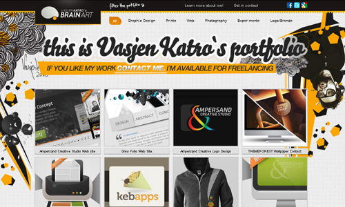
View Source
Kinoz
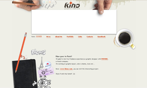
View Source
Yeezy Display

View Source
Icon Sweets
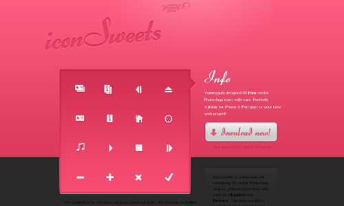
View Source
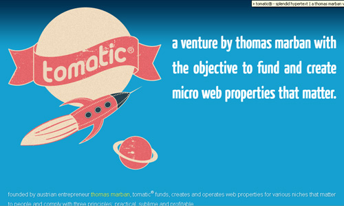
Tomatic
View Source
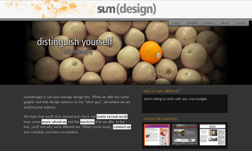
Sumdes
View Source
Salon Lafolie

View Source
Professagrafix

View Source
Mutant Labs

View Source
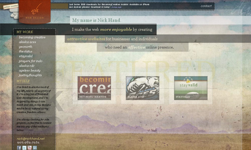
Nick Hand
View Source
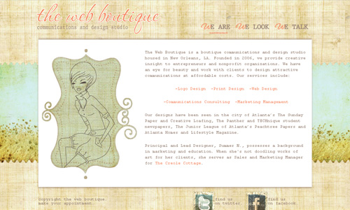
The Web Boutique
View Source
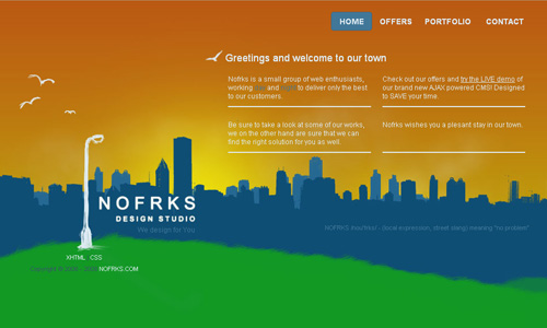
Nofrks
View Source
Adami Design

View Source
Charle Selena

View Source
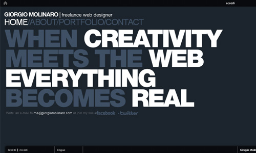
Giorgio Molinaro
View Source
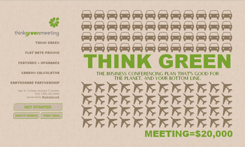
Think Green Meeting
View Source
Leukocyt

View Source
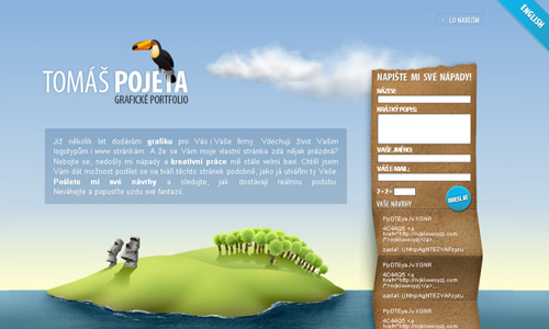
Pojeta
View Source
Get Pepperminted
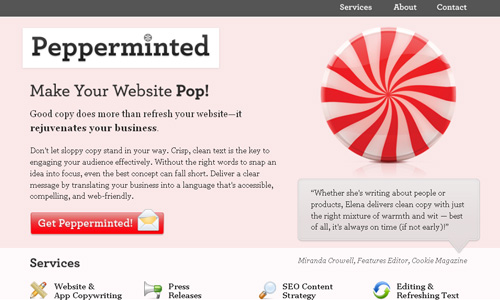
View Source
Doddle Media
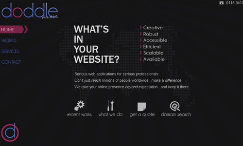
View Source
CycleByCycle

View Source
Woo Concept
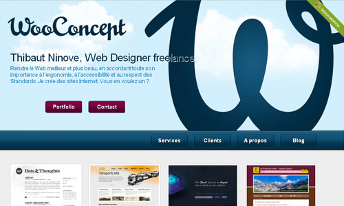
View Source
Ascii Events

View Source
Jedansest

View Source
Emrah Duzer
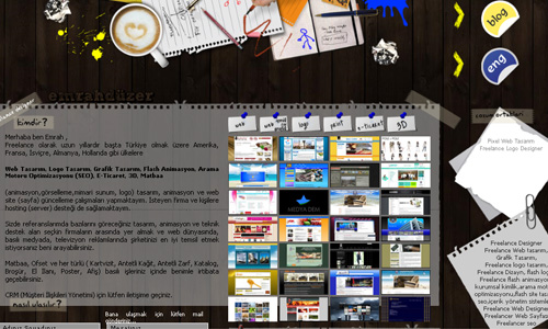
View Source
Jai
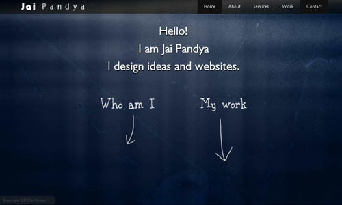
View Source
Clive Spies
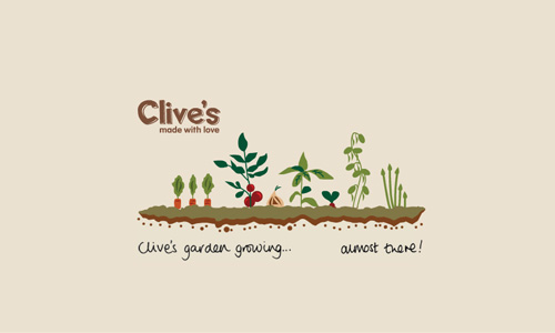
View Source
Brizk
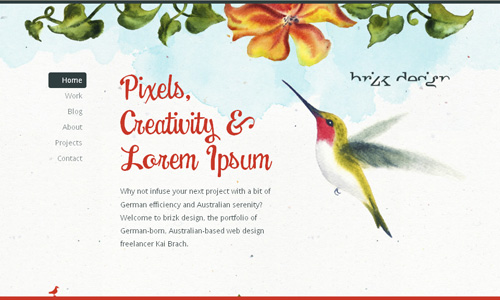
View Source
Crush Lovely

View Source
Appiarius
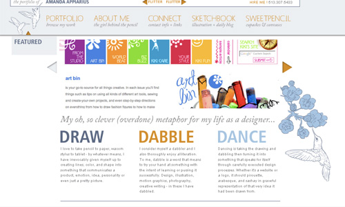
View Source
DayTrip

View Source
Riot Industries

View Source
About the author:
A Graphic Designer and the founder of Naldz Graphics. He launched Naldz Graphics to help the Design Community in providing quality design resources and tutorials.


Very nice compilation here. I get inspired by these single page designs!
Maybe my site is not as popular as the ones mentioned in this article, but I’m proud of it and I believe it is unique. It was built a year ago and I was aiming a “real magazine” look and feel.
Check it out!!!
Makes me want to take every design a step further and then 12 steps after that!
Was checking out NOFRKS. Really amazing site!. The navigation is awesome – probably the best I’ve ever seen!
thanks 🙂
all website is really good looking…….
Very good compilation! However I think you forgot about my site 🙂
Nice list, for the most part. Feels like this could’ve easily been a 50. I mean, emrahduzer.com for example is a nice try but the typography is horrible and it doesn’t add anything to the list. Why include it?
Thanks for added my portfolio but my name is Simone D’Amico, not Simon Edamico 🙂
Thanks again 🙂
This showcase is fantastic, I didn’t know many of the sites you entered!
Great work!!
Wow nice Choice..
Great to see that a holding page can be beautiful too!
Lots of nice designs here. Several of them I have not seen before. I’m a big fan of the single page site.
These websites are amazing! This is definately getting my creative juices flowing! My favorites are the brightly colored ones without too much clutter. my favorites are: Tomatic, Jai, Morphix and Simon Edamico
Cool! i love one page designs & those are some great exaples 😀
Great list! Nice to see some fresh additions to the list.
You may want to check out the one-page gemms of Ricardo Mestre (duplos.org) and Eric Steuten (ericsteuten.nl).
Nice Collection here
Scott Dylan
Good point, not every site needs a base of 6 pages, in fact, I would say half the small business sites out there only really need one or two. The problem is that clients see value in page quantity, a big misconception.
Marvelous collection of applications Thanks for sharing with us…
Awesome post!
I always like those giant headings and logos, now it’s a trend and you can see such thing anywhere.
It is a well-compiled designs. it has a great quality of designs.thank you for sharing it with us.
this is a great post
Pretty neat stuff, at least most of them. Some are still really hard to navigate though.
And most seem to be made for the designer’s screen res. On a netbook or a cinema display some of them fall apart quite dramatically. Imagine them on a mobile device.
Still, good and inspiring overview.
This is proves that one page websites can be very effective and attractive.
Thanks for posting the ProfessaGrafx website. That one was a fun site to design.
It’s tricky to talk about if this is very good, nonetheless only time will tell, as with most superb design.
thanks for featuring our work.
for the record its Clive’s Pies.. not Clive Spies… that would be completely different.
Cheers