Most things, especially designing and illustrations, start from scratch, but when diligently worked on develops into an astonishing masterpiece. Even in today’s digital era, artwork designs and illustrations still and often starts to be translated into its physicality with the use of pencil. Today you are about to witness some simple yet cool sketches turned into amazing typography illustrations.
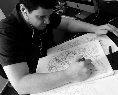
The following illustrations are all created by Marcelo Schultz. He is a Brazil-based designer who apparently loves typography design and illustrations. Marcelo has co-founded the DDQ Design and is presently working there as an Art Director. Below you will see how he starts his works in scratch by using pencils and markers and finishes wonderfully by using photoshop to come up with its amazing effects. Come, take a peek, and enjoy some of his typography and illustration designs.
Dr Custom Motorcycle
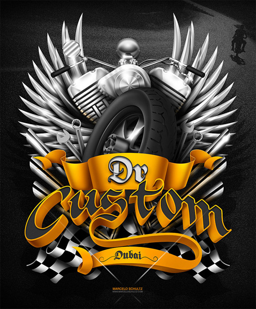
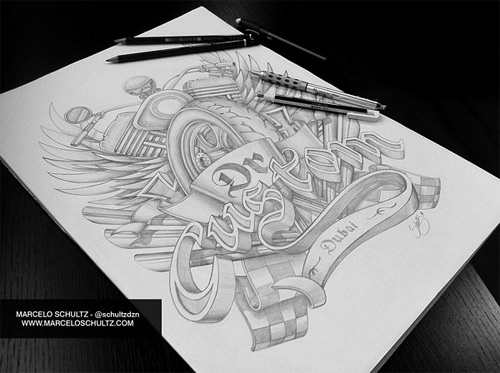
In this work he made an illustration with some motorcycle elements to be used for t-shirt.
Cover designs – Cuadernos Quick
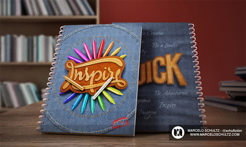
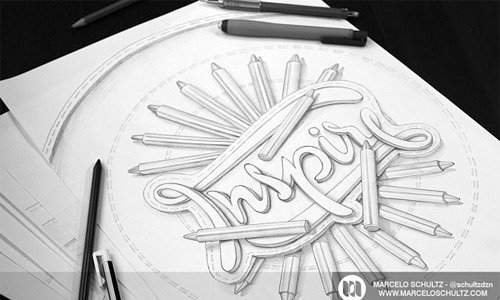
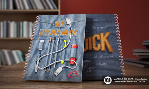
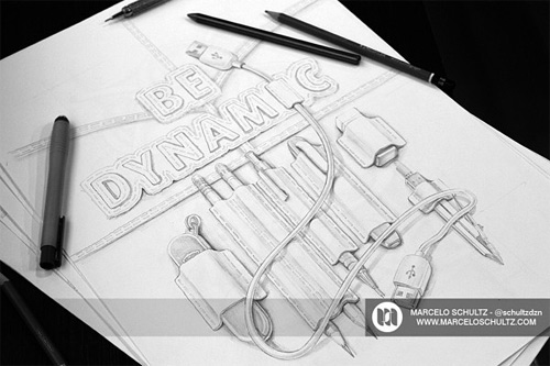
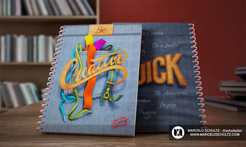
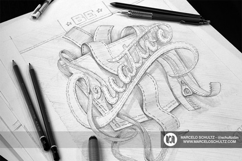
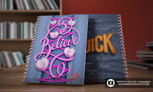
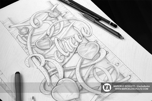
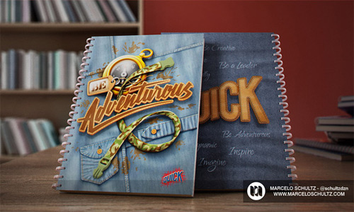
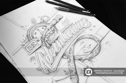
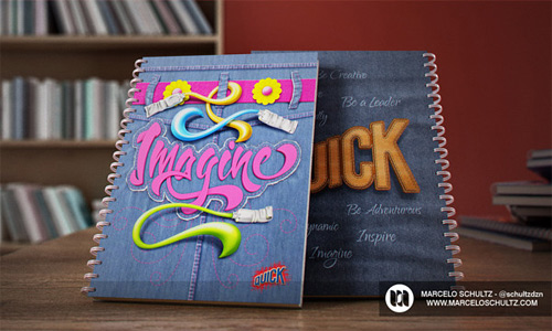
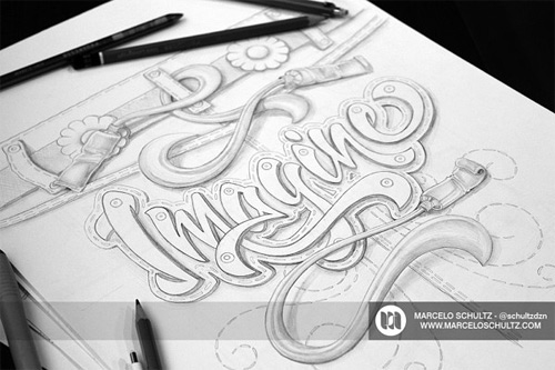
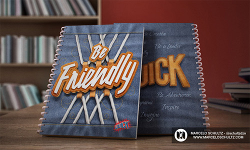
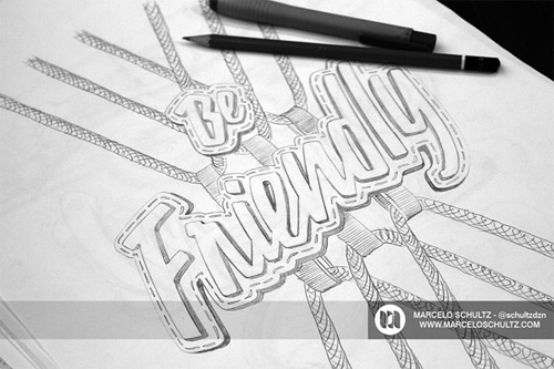
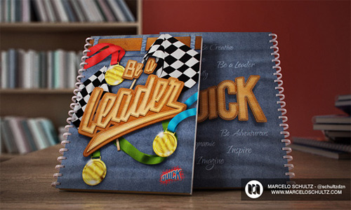
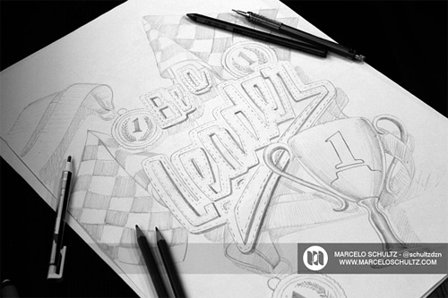
Here he incorporated eight various typography designs for a notebook cover series.
Nike – Futura logo
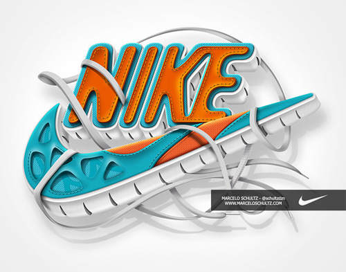
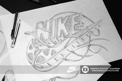
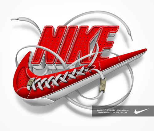
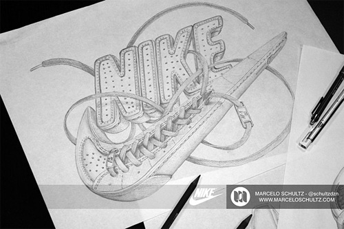
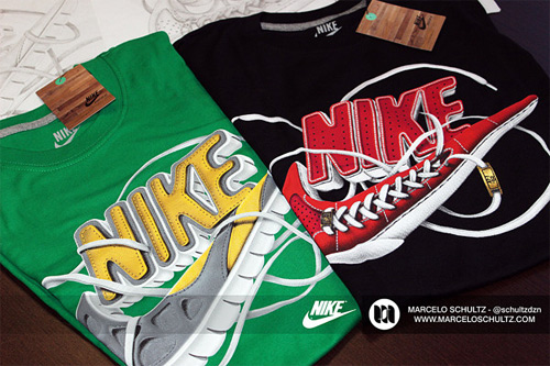
Marcelo recreated the Nike logo in this design, he added a highly dimensional effect by using a footwear texture.
Harley Davidson Poster
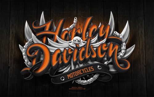
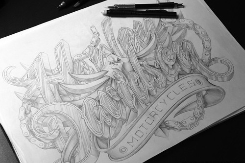
Harley Davidson is one of the brands people love, In this illustration Marcelo made his own personal artwork for this brand.
Nike Just Do It
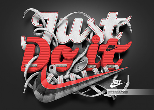
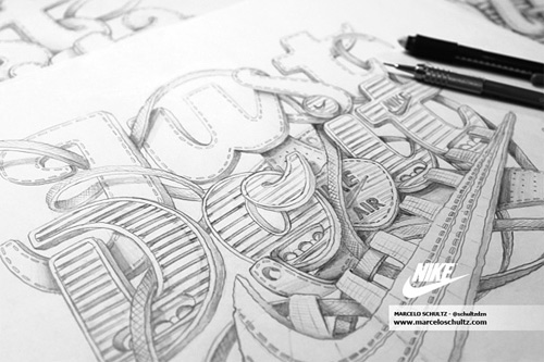
One of the commissioned T-shirt design he made for Nike.
Nesian Street
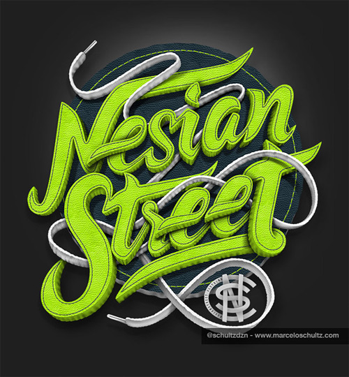
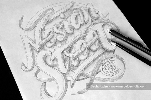
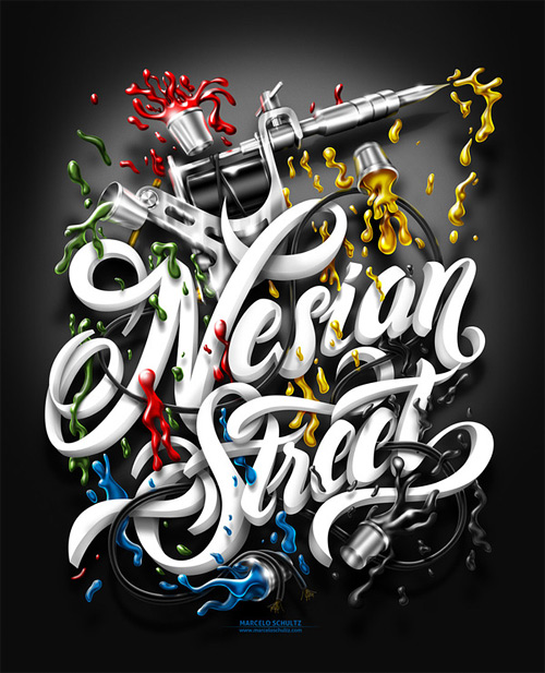
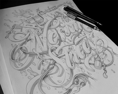
A collection of amazing T-shirt design he made for Nesian Street.
Grape Fever
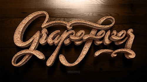
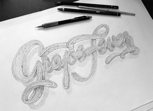
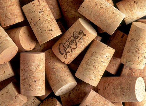
A logo design typography he created where he added cork texture to amplify a cool result.
San Francisco
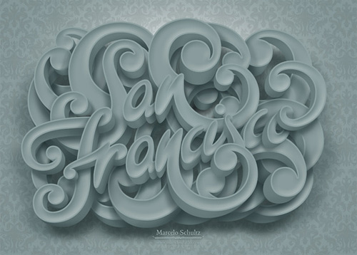
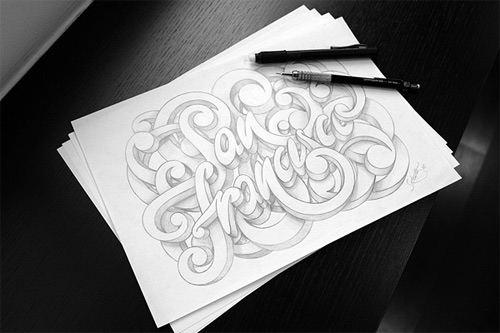
This work was inspired by his trip to San Francisco. He loved the place, especially the architecture there. It was then he decided to make this one as his sign of appreciation.
Friday Type
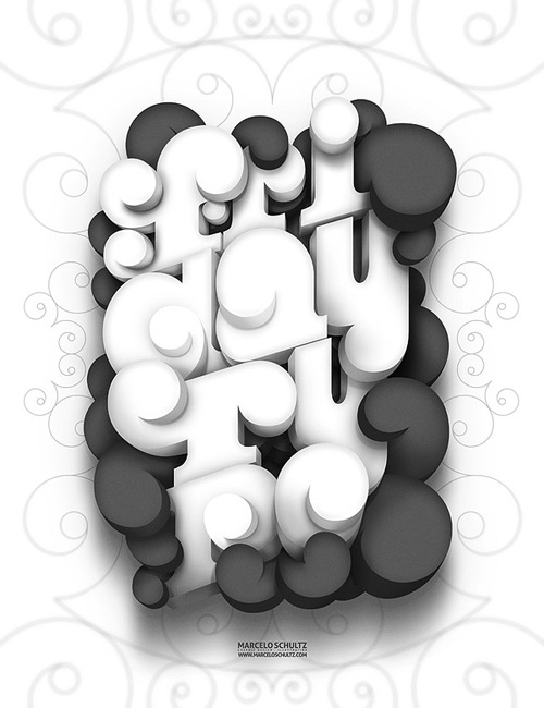
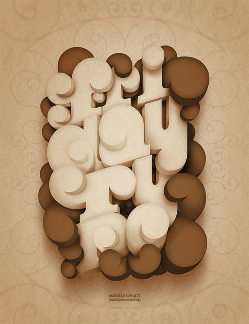
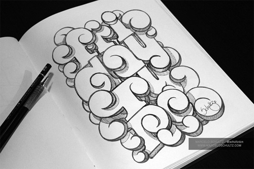
This was a personal project he decided to make to celebrate one of his greatest day of the week.
The Skull of Rock!
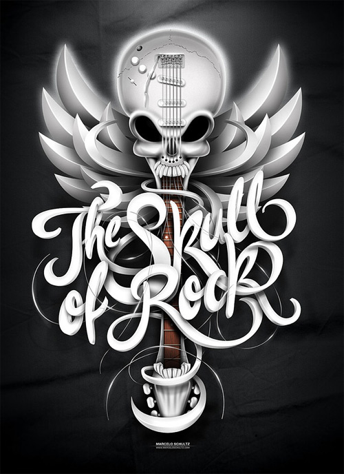
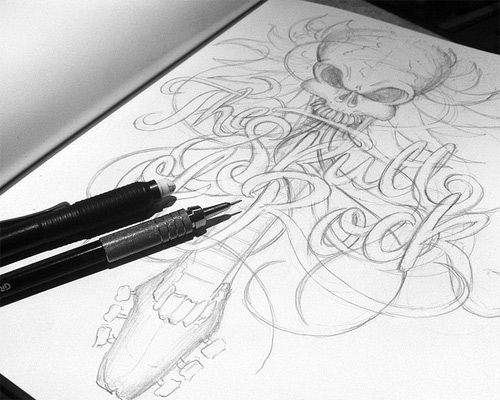
This rock n’ roll illustration was based on a movie “School of Rock”, giving it a pun side. There are white and brown versions of the typography.
Coffee Lovers
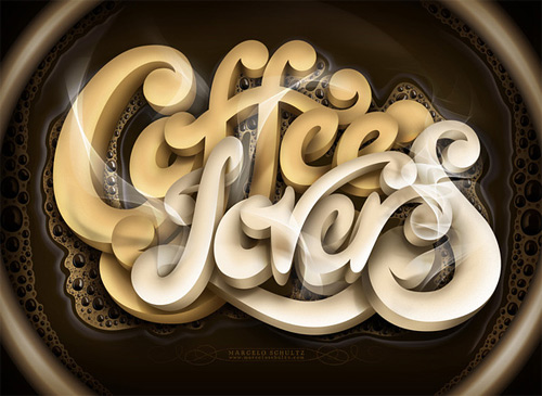
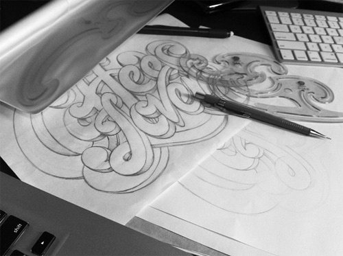
As Marcelo is a great fan of coffee, he created this yummy coffee typography with a background of a delicious cup of hot coffee.
Save the Nature
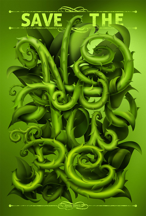
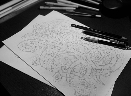
In this illustration, he incorporated a very nature-like typography design that perfectly fits with the message.
What do you think? You can share what you think on Marcelo’s works by leaving a comment below.
Conclusion
Have something in mind related to web design, freelancing, and other awesome stuff? Let us know and maybe we’ll feature it on our next post. All your comments and opinions are appreciated. Let us hear em up in the comment box. Thank you and see you again mate!


