Graphic designing is an avenue for one’s creativity. It is a creative process which may be called as visual communication through the use of typography, visual art, layouting techniques and others. This involves logo designing, advertisements, publications like magazines, product labels, business cards and web designing. In this genre, there is oftentimes a communication between a client and the designer. Putting into consideration the client’s preference on designs is therefore important without sacrificing the quality of your outputs. When looking at a design, one client might say “oh, there is so much wasted space!” or some might say, “the colors are great but I think we need to put something to make it look lighter for the eye”. Both of them are referring to one thing:White Space.
Oftentimes, white spaces are overlooked. It is even known as a negative space which refers to the open space between design elements. These are the spaces not occupied with text, images or other visual elements. But it doesn’t mean that negative spaces are all white in color. If we go back to the description, it refers to a SPACE regardless if it is white or not.
- 1.Active White Space: Space intentionally left blank for a better structure and layout. It also gives emphasis to the content area. It leads a reader from one element to another.
- 2.Passive White Space: Empty space around the outside of the page or blank areas inside the content which is the by product of the layout process.
There are two types of white spaces.
Most people would consider white space as merely a waste of printing materials which makes them opt to have a full-colored page thinking that printing with begative spaces will just squander their money. But if we try to consider the Gestalt Principle which discusses the way humans interpret the visual stimulus, we have the so called parsimony which means “less is better.” This means that the human eye would prefer to look at things which are not crowded and heavy to the eyes. The use of white space paves the way to a better understanding, clearer communication of ideas and effective graphic designs. Let us consider some advantages of using white spaces in designing.
1.It Signifies Space for More Creativity.
Painters would spend some time staring at a blank canvass, so eager to see a new work of art that would fill the white space in front of them. White spaces manifest the conception of another unique design. It implies another opportunity for new designs.
2.White Spaces Attract the Eyes.
Consider the poster below. This is a poster used by a group of young people to boycott USA products. But the purpose of the ad doesn’t matter here. It is the design that matters. With the use of a plain background, it attracts those who could see it even in a distance.

Effective use of white space in an advertisement.View Source
3.There is Always a Positive Response Towards a White Space.
First impressions are never given second chances. So make sure that your designs could make “good impressions” on the first look. To do that, try using white spaces for it can easily attract the eyes. It also creates a clean and relaxing visual effect.
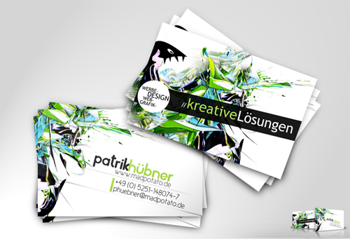
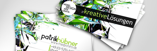
A business card using white space.View Source
4.Used to Create a Balanced and Harmonious Layout.
Spaces create a balance in your output. Without white spaces, your design or the texts you use will seem to create unsteadiness in the eyes. Imagine reading a magazine or an advertisement with no spaces between letters and images. You wouldn’t want to read that anymore! These spaces could also show the relationship of one element to another. Look at the layout below.
Despite the use of full colored pictures, the designer used negative space for the text and this balances the entire layout not making it look so crowded.

A magazine design using negative space in black color to balance layout.View Source
5.Increases your Layout’s Appeal.
Of course, the entire layout of your work will give a visual impact. Negative spaces are important aspects for interesting and operational designs. Take a look at the different layouts below and see how white space creates a huge difference.

A layout in full page.

A layout using a little white space.

A layout using more white space and image is much smaller.View Source
6.Improves Readability.
We can observe that books and other printed materials always have white spaces in order to allow the reader to read and understand the text well. The same is true with online reading and designing. A research shows that more white spaces give more reading comprehension.According to the research entitled “Reading Online Text: A Comparison of Four White Space Layouts”,the use of more white space between each lines in a write-up is more favorable to readers. It recommends for designers to be aware of the influence of white space in reading performance.
See Research
7.Creates Professional, Sophisticated and Elegant Designs.
Generous white space is used in the luxury market. Advertisements of expensive and branded items usually come with white spaces. Most of the time, cosmetics use posters that have more white spaces to show that their products are of high quality and expensive. If you are observant, most local and cheap products come in colourful packages but expensive ones use minimal colors.
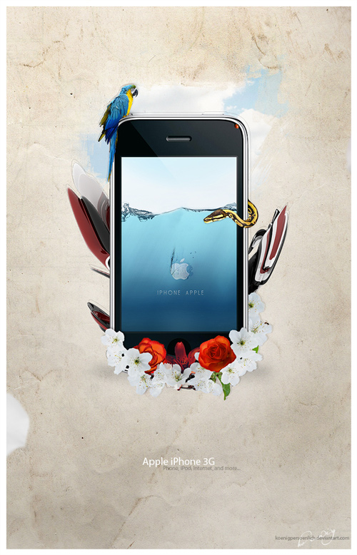
Notice how the use of white space made this iPhone Advertisement look professional and elegant.
8.Gives Focus and Emphasis to an Object.
Go back to the USA Products Ad poster. This uses a generous white space for emphasis. Another way of doing that is to use white or other colors as a border for your pictures so that the viewer will look inside the border, thus emphasizing your subject.
An example of a design using white border. View Source
9.Directs a Viewer’s Eye.
Eye flow is very important. The use of white space directs the reader or the viewer as to where he could view next. Consider the picture below. It used a huge space in order for the reader to look directly into the text. This is catchy for anyone would be curious as to what the long vertical line of words is trying to say.
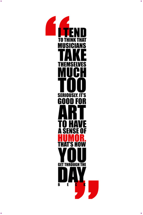
A design which directs the viewer’s eye flow.View Source
10.Acts as a Separator.
It separates unrelated elements in the design.Take for example the magazine layout below. It uses white space thus separating the images from each other and giving emphasis to the pictures.It also separates the images from the black background used by the artist.

An example of a design using white space as a separator.
11.Signifies Location, Movement, Importance and Relationship between Objects.
Negative space works in a manner that it gives a different meaning on the content depending on its usage in the layout. Take a look at the pictures below. Observe how the object is placed. As you look at it, you would see the difference on how white space can affect your designs.Here is Fred Showker’s Demonstration for Negative Space location and movement.
See Negative Space Demonstration
White space is as important as content. Visually, white spaces give an intelligent organization of our layouts. It gives a visual relief to the viewers and readers. Although, there are some instances when lesser white space are needed for your designs, still take into consideration into using even just a little space which serves as a breathing room. But the excessive use of this could make your designs look boring while the generous and proper usage of white spaces could be effective and impressive. What is important is the proper incorporation of negative space in your designs. So, when you are working on white spaces, bear in mind that “nothing says a lot.” It may be an empty area but it will never make your design look empty.
We hope that this article will help you in your own graphic designs and web designing. We will be giving you more valuable inputs that could be your guide in your works.
- On White Space in Graphic Design by Keith Robertson
- The Good Thing About White Space in Graphic Design by Key Zetkinn
- Negative Space: Nothing Says a Lot by Fred Showker
- White space and simplicity: An Overview by Vitaly Friedman
- White Space: How to Get it Right by Mark Boulton


Hey liez, its really a good article with some useful tips, thanks for sharing your experience with us..
Great article, I always loved white space in design but never thought more deeply why it is so appealing.
Hey great article. It’s so true that many people think that white space is a waste of space…especially in print design. If you need to communicate a specific message, whitespace is essential to direct the eyes of the consumer.
Great Reference Link. All but #5 exemplified perfectly. I love white space, wish more customers/clients did too.
Great article about an often overlooked aspect of design.
White space also gives a sense of luxury. The luxury to leave all that valuable space alone.
No doubt, white color is a favorite color for almost designers..It’s really eye catching if we use big white space in our designs. It makes our design looks bigger and can see from far..
Nice content.Loved reading.Very informative.
A senior designer used to always tell me to use some white space in my designs, but I never really got it until I read this … great article ^_^
Nice explanation of leaving white or blank spaces in design. Without this space design looks too much scattered and hard to focus on specific things.
Really interesting! You don’t normally look at the white spaces on your design as apart of the design, just some space that may need filling up. I will certainly look at this in a different way!!
Thanks for sharing!
Hello Liez,
Thanks for a nice and useful artical. It is really guide line satter and knowledgeful for amatures like me.
Thanks again. wish your knowledgeful new artical soon over this turorial site.
I loves Naldzgraphics dot net.
Nandkishor
Very true. I love your tips. Mabuhay ang pinoy.
Nice, in depth, article! This has really inspired me to explore my use of white space (less is more after all!)
After reading this article, i am very inspired indeed.
A bit complex but interesting….. 🙂
thanx a lot liez….for it ….i love white space …..