Whenever you visit a website, you can notice that there are forms in which you can input some information about yourself. Having web forms is vital for every website for it creates interaction between the users and the site. It can also help to create effective conversions which can be a benchmark of the entire site’s success. People spend time in filling out forms in a website. Hence, one has to see to it that there is a good user experience in order not to waste the user’s time.
Part of that is by considering some elements which are needed in creating a web form design. Since, ever website needs this, it is important for all designers to take note of it. So, today, we will be giving you a list of some things that one needs to consider in creating a web form design. Also, take a look at some examples of these forms for each item below:
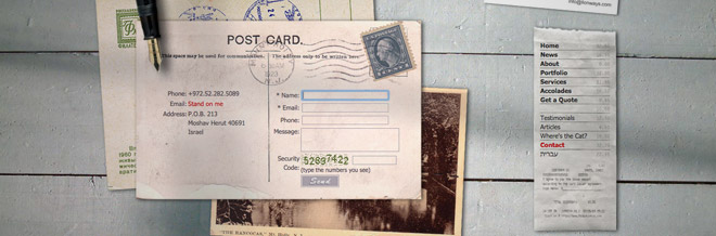
1. Know what to use.
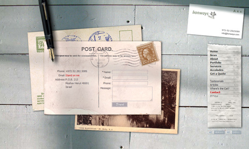
Image: Lion Ways
Of course, before you start working, it would always start on how you will create the website form like a contact form. Try to assess yourself on what best works for you. Choose the coding language where you will be best comfortable of and then use it. Try to know also which one is more effective and could give you the kind of form that you need. You have to know on how to make your design work. If you do not know how to, then look for someone who can help.
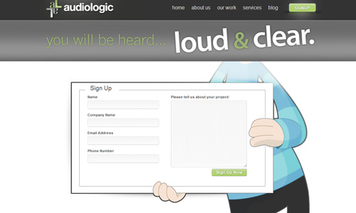
2. Be creative.
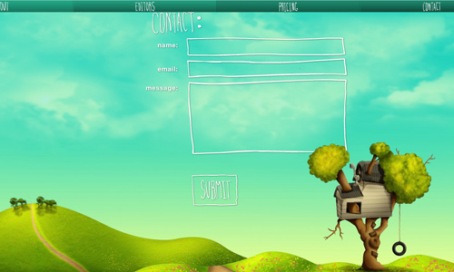
Image: Tree House Editing
It doesn’t mean that just because you are designing a website form that you are limited to those things that your users have to input. See to it also that you make it look fun and inviting. Give it a touch of fun and it would look friendlier. Let your web form appear that it is part of the entire site by creating a design that shows the same personality. You can place some illustrations and other elements to make it look exciting.
3. Use simple language.
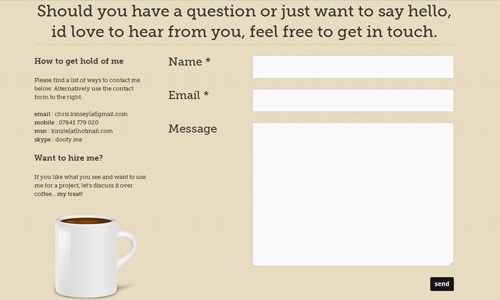
To avoid confusion for the users, use simple language. Let them clearly understand what you are asking for. Do not use words that will make them think a lot or would make them skip that part just because they were not able to understand it. Also, your readers might not provide you the information you need if they cannot understand your words. So, be straight to the point and be simple.
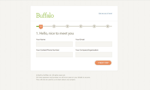
4. Make it manageable.
If you are asking for a large amount of information, do not make your form appear too bulky and too hard to fill in. One look at it might drive away the users thinking that they will be spending a lot of time just filling up the form. Hence, you should make it look manageable by breaking it into sections. This way, your form will look simple and organized. Your users will not have a hard time filling out the information you are asking for.
5. Organize it.
See to it that the information you are asking for are arranged properly. Do not scatter the blank forms. Make sure that you have carefully chosen what to ask and you have placed connected information near each other. Like, it would always be proper to ask for the name first before the email address. Look into the relevance of every information you will ask.
6. Prompt users for errors.
It is also important that you inform the users that they have done some mistakes while filling out the form. If they have skipped some items or have placed some errors, you can help your users by validating the information. It would also be an advantage to you. There are certain ways on how web developers do that.
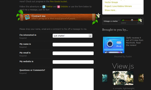
7. Preserve user’s data.

Image: Vimeo
Even if the user has made a mistake with the entry of data, make sure that you have saved the other information which is correct. The user will feel irritated when he has to fill out the form once again. There are really people who are impatient when it comes to filling out forms. So, see to it that you have this for your website form.
8. Be clear on the entry fields.
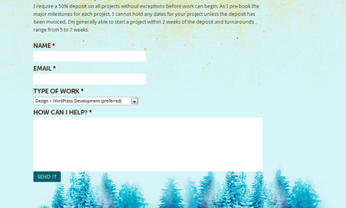
Image: Shawn Johnston
Your users should not be confused on which area they are already filling in or interacting with. Make your blanks clear enough and aligned to your labels. Also, if you prompt errors, see to it that it would be pointing to the right boxes or spaces where the error was made. This will make it a lot easier and comfortable for the users.
9. Use readable fonts.
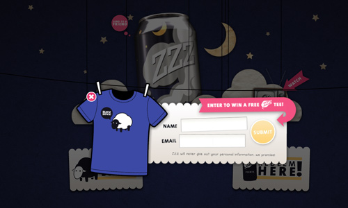
Image: ZZZ Drinkzzz
Of course, since the users will be reading what you have in your form, you should use a font style that can easily be understood. See to it also that the size is readable for the readers. Do not give them a hard time reading your website form or else, they might not push through with filling it out. Do not use fancy fonts and make use of the right color combinations that could emphasize the text.
10. Use a clear end button.
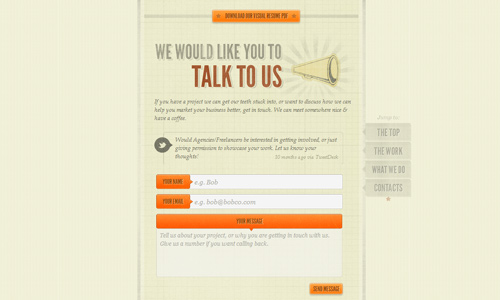
Image: Visual Republic
After filling out the form, see to it that you have a confirmation button at the end which tells the users that they have finally finished filing it up. Make sure that your button has a clear language. You can merely use the word “Submit” or “Send”. This way, you can tell the users what exactly they will be doing.
It’s Your Turn Now
The things we have above are some of the important things that a designers needs to look into when creating a website form. These things could assure website owners that the users will have an easy access towards the form and would have a clear understanding about it. Have you designed a website form? Would you like to share some more points to us? Or would you like to show us your design?


