Designing a website is indeed a challenging task. One has to look into so many considerations in order to come up with a successful website. Aside from that, one also needs to make sure that he meets the client’s needs and requirements. But above all, it is the readers and audience that needs to be considered. A website with good user experience design can surely be successful for it would be easier for the users to get the information they need.
Hence, apart from all the things that are valuable in designing a site, the user experience should be highlighted. Your great web design would be futile if your readers are not able to get anything from your site. Some users are also impatient for sites that load for a long time or have complicated navigation. They do not have time to look for ways on how to navigate a site or to study how a certain site works. So, to make sure that the website has a user experience design, here are some tips for you:
1. It can communicate effectively.

Site: Unmatched Style
If a website fails to give a clear message, then it would not reach its goal to give some vital information to its target audience. There are really websites that focus more on the design yet were not able to communicate effectively. If you consider your audience, you need to make sure that the message is sent to them clearly on the first look. Also, be sure that the message is consistent all throughout the site.
2. Its design can be suitable to the audience.
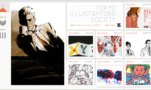
Site: Tokyo Illustrators Society
One look at your site can easily tell the audience what kind of website it is. So, see to it that you are using the right designs. You have to know when to use a formal and elegant design. You should also know the right color usage for it can deliver a different message to the audience.
3. It is easier to navigate.
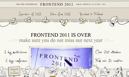
Site: Front End 2011
A website can only be helpful and easy for the users if it has good navigation. If a website is hard to navigate, there would be a tendency that the users will immediately leave the site for they cannot get into the areas where they want to see. Some websites may use a unique navigation but the designer needs to see to it that it can be easily understood by the users. But it would be a lot better if you make your navigation simple.
4. It cannot interfere the users’ attention.

Site: Pieoneers
When we speak of interferences, it refers to anything that could be distracting to the eyes of the audience. It could be advertisements that are distracting, pop ups and some flashy stuff. You might think that it looks great for your site but for the audience, it would be distracting for them when they read the contents of the site. Make the user experience simple by creating a simple site.
5. It can give apt contents to the audience.

Site: Camera +
A good website that considers the users has to see to it that the target audience can understand and grasp your contents. If your audience are designers, then have contents for designers. Designers should be able to relate to what you have in your site. In any type of contents, it is your audience that matters most. But you should also see to it that when the article is read by non-designers, they can also understand it. Doing this can make your site look interesting to all the audience.
6. It can deliver clear contents.
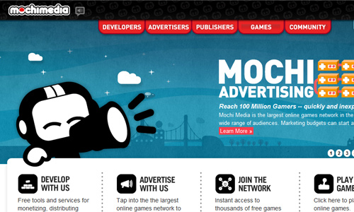
Aside from the message that the entire website can give, the contents of the site should also be clear. It includes the blog posts, videos, tutorials, descriptions, images and all types of contents. You need to make sure that it can effectively communicate a message and it won’t create misunderstanding and misinterpretations.
7. It can be readable.

Site: Made by Fudge
When you design a website, you have to make sure that it is readable. If not, you are not taking into consideration the readers of your site. Hence, in your design, choose the colors, font style, layout and other design elements so that the contents are legible and readable. Format your site well for readability.
8. It gives the audience what they want to know.
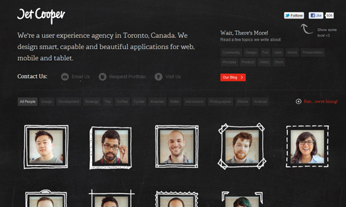
Site: Jet Cooper
. You have to anticipate on what the readers want to know. That is why you have an about page where you can tell what the site is and who owns it. You also have other needed areas like the contact page and others. You may also post topics which you think your readers want to know.
9. It can be accessible.
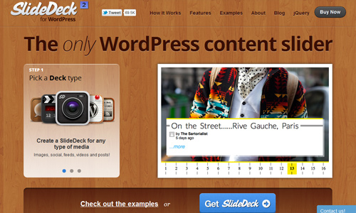
Site: Slide Deck
A website won’t be considered with user experience design if it doesn’t have good accessibility. Your site has to load fast so that the readers can immediately get the info they want. Make sure that your site is accessible for your target audience so you will not fail to get to your goal.
10. It can create a bridge between users and website owners.
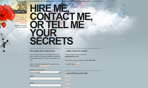
Site: Gummisig
Make it easy for the users to get in touch with you. Provide your contact information or you can also provide a contact form. Do not be placing too many entries for the users to fill in for it won’t be easy and comfortable for them. Make it simple, too. This way, your audience can easily reach you; give you feedback and even inquiries.
It’s Your Turn Now
A site’s usability is very much important to ensure that the users could get the information that the website would like to deliver. So, while you are trying to make a good design, see to it also the users will be able to have a good and easy experience while looking into the site. If you would like to add something to our list, feel free to write it in the comment section below.


