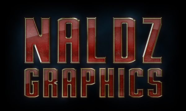
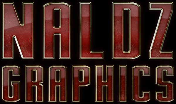
In this tutorial we’re going to create a nice and simple text effect that looks like the one used in the Iron Man movies.
Tutorial Details
- Program: Adobe Photoshop
- Version: CS6
- Difficulty: Beginner
- Estimated Completion Time: 30-45 minutes
Final Result
Tutorial Assets
Step 1
Create a new file in Photoshop and paint the canvas black (#000). We want a colour (ok, I know black is technically not a colour) that has big contrast. Download the “Stark” font from here.
Step 2
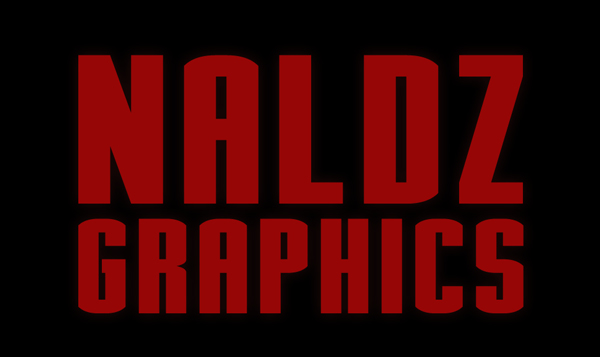
Select the Type Tool (T) and write anything you want. The size we chose is 350px for the “big letters” and 223px for the “small” ones (two separate layers). The font’s colour is #b10a0a.
Step 3
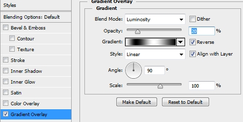
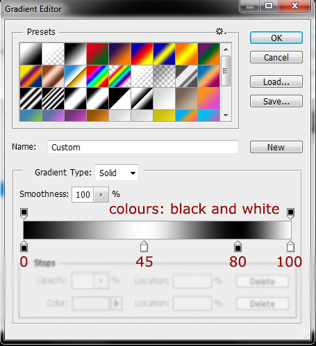
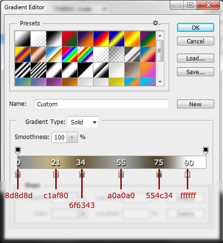
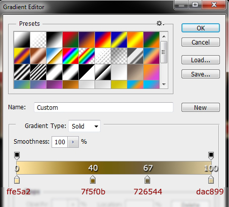
Ok, we’re going to concentrate on the big text layer now. Duplicate the “big letters” layer twice, so that you have three “big letters” layers. Select the first of these layers and apply this gradient.
Step 4
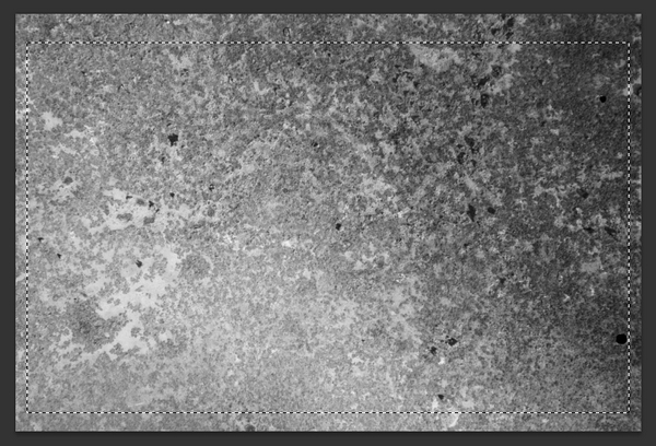
Open the rusty iron texture in a new file. Desaturate it (Ctrl+Shift+U) and select a big portion of the texture (not the whole image) with the Rectangular Marquee Tool (M). Go Edit->Define Pattern and save it.
Step 5
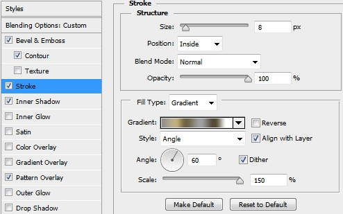
Select the second “big letters” layer, turn its Fill to 0% and apply the following styles (the pattern is the one you saved in the previous step).
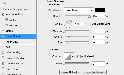
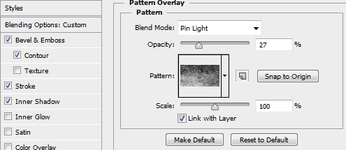
Step 6
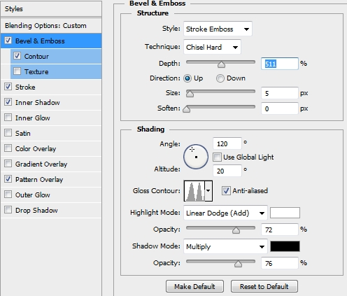
Select the last “big letters” layer and once again turn the Fill to 0%. Add this Bevel & Emboss style.
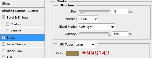
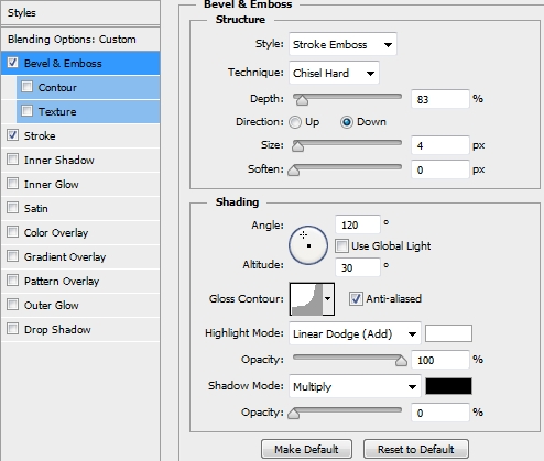
Step 7
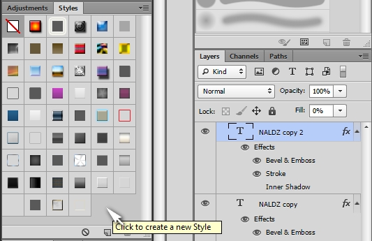
Now, select each of the “big letters” layers and save their styles (highlight the layer in the layers stack and simply press inside the Styles box). If you can’t see the Styles box, go Window->Styles.
Step 8
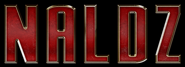
Place the Rusty Iron texture on a new layer. Change its Blend Mode to Multiply and lower the Opacity to 25%. Make sure the texture covers all the text. Select the pixels (Ctrl+Left Click on layer’s thumbnail) of any of the “big letters” layers and click on the “Add Layer Mask” button.
Step 9
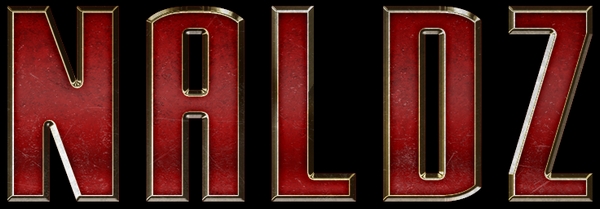
Next, place the Metal Scratches texture and repeat the previous step. However, this time change the Blend Mode to Pin Light and the Opacity to 10-15%.
Step 10
Add a Gradient Map layer and change its Blend Mode to Color and the Opacity to 20%.
Step 11
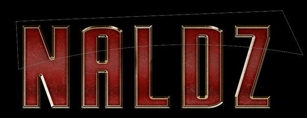
Create a new layer and pick the Pen Tool (P). Draw a shape like the one on the first image. Then, right click anywhere on the canvas and select Fill Path (make sure you have selected white as your foreground colour). Next, select the pixels of any of the “big letters” layers and contract the selection (Select->Modify->Contract) by 9px (since the Stroke we used in the “big letters” is 8px, you need one more spare pixel). Use the Blur Tool to make the edges smoother and lower the Opacity to 20%.
Step 12
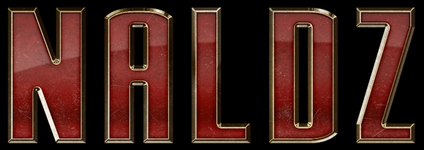
Group all the layers created so far (except from the small letters and the background) and name the group “Big letters group”. Apply these styles to this group.
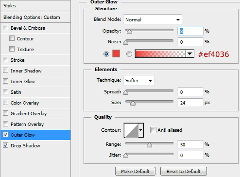
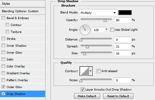
NOTE: You may notice a red outline around some of the letters at random places. I don’t have any idea why this happens, but you can easily mask it by adding an Inner Shadow effect to you group.

Step 13
Repeat the process for the small letters. You don’t have to re-apply all the layer styles. Simply select a layer and the appropriate style from the Styles box. However, you’ll have to make some adjustments regarding the Stroke’s size (reduce all the Strokes by 3px; eg: Big Letters Stroke: 8px-> Small Letters Stroke: 5px, BG Bevel&Emboss Size: 5px-> SL Bevel&Emboss Size: 2px and so on).
Step 14
Create a new layer and add some highlights using a soft round Brush. Change the Blend Mode to Soft Light and the Opacity to 50%. Add a layer mask if you want.
Conclusion
That’s it, your Iron Man-like text effect is now ready. Add any effects you want to make it look even better and if you have any questions or tutorial requests post them in the Comments Section below. We hope you enjoyed the tutorial.


Something is not right i checked everything 5 times everything is a match. Letter size, everything, still the bavel is like 10 px thick…it’s too thin barely noticeable….
Something is not right i checked everything 5 times everything is a match. Letter size, everything, still the bavel is like 10 px thick…it’s too thin barely noticeable….
You can adjust the size of the Strokes if you want, but the strokes are supposed to be this thin. If you choose a bigger stroke, don’t forget to adjust the other styles too (eg the Inner Shadow).
Here’s the effect with its original size: http://www.flickr.com/photos/igraph/8680763410/sizes/l/in/photostream/
Cool,you’ll really inspired by Iron man.
It looks like you made this tutorial very simple,right?Good job Allan.
Impressive! Are you sure this is just for a beginner?