There are really different techniques in designing a website but one cannot just opt for a design if it doesn’t fit the site. With the large number of websites, it is a challenge on how one can stand out and get the attention of the readers. Some choose to use single-page websites to be distinct and direct on what they want to offer to their target audience. Many websites have made use of this but not all were successful. This is because there are some things that need to be considered in designing a single page website in order for it to be successful and effective.
Single page websites can only become useful if it is designed in the right manner. No doubt, single page websites give a challenge to the designer on how it can still be effective despite some limitations. Part of making these types of sites functional is by using unique designs, photos, good color combinations and others. But there are still lots of things that one needs to know with regards to it. So, we will give you some tips on how to design an effective single page website. Take a look at it:
1. Know the purpose.
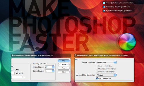
Image: Make_Photoshop_Faster
It would always be important to know what the purpose of a website is before you start designing it. Understand the purpose so that you can create the right website. It would be different if you will have a website for an advertisement of a product and a site to promote your design works. You should know if the site owner wants to sell some products or offer some services. This way, you will be able to apply the right design.
2. Take note of the basics.

Image: The Cybertouch
Remember that a single-page website is still a website. Hence, you have to take note of the fundamental rules in web designing. Never forget it because it can help you achieve an effective website. See to it that your website doesn’t lack anything to make it complete. Always consider usability and accessibility.
3. Have a logical structure.
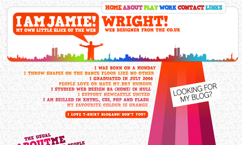
Image: I Am Jamie
It would be much easier for your readers to understand the contents if they are arranged logically. Determine what needs to be presented first and what other things will follow. This way, you can elaborate what needs to be given emphasis and add other things in support of it. Part of being logical is to include a contact information and social media plug-ins.
4. Focus on a topic.

Image: Zitrusfrisch
Single page websites have to be focused on a certain topic especially that there is limited room for it. Everything that is in the site should be on one topic and it should not go far from that. This way, the audience could clearly get the intention of the site and could clearly acquire the information the site intends to convey. Make use of the space wisely by placing only those which are necessary.
5. Be straight to the point.

Image: Latin Rogue Cleaning
Do not run around the bush when you are creating a single page website. Include those which are necessary. When you are writing your text, be sure that you could immediately send the right message to the readers. Do not waste your reader’s time by letting them think of what you are really trying to say. Aside from the limited time they have, you should also consider the limited space you have.
6. Have an interesting layout.
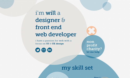
Image: Will Forsyth
Well, it doesn’t mean that just because you are using a single page website that you will limit your design already. You should even be more creative. Have an interesting layout that can capture the attention of the audience. Let your purpose be clearly seen in the layout and be sure to properly lay down the vital contents of the site. Also, you have to use the right color combinations that could tell your site’s purpose and could attract readers at the same time. Choose fonts that are readable and effective for communication.
7. Have a clear navigation.

One may think that the navigation can be taken for granted. That shouldn’t be the case. There are instances that sites display some links leading to another site. When you do that, be sure to clearly inform the audience that they will be redirected to another page once they click on the said link. Doing this can be helpful for the users so that they can decide if they want to be redirected to another site or not. Also, always see to it that the navigation is simple and clear.
8. Make it look neat.
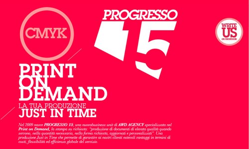
Image: Progresso 15
A cluttered layout will not make it attractive for the readers. Since you only have a single page, see to it that you have everything properly and neatly arranged. This way, it will not look confusing for the readers and it will also look professional. You might also lose the purpose of the site if it is cluttered. So, be sure that the design of the single-page website is neat and clean.
9. Be creative.

Image: Davide Baratta
Show your creativity on a single page website in order to make it look attractive yet simple. It would indeed be challenging to do that but you will surely be able to think a lot on what needs to be done in order to make the site look creative. You can play with colors if you want to as long as they are of good mixture. Go wild with your imagination to come up of a great site.
10. Give life to your site.
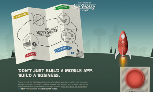
No one would like to look into a website that is boring and dull. Give it some life by having a great design. You can also add some transitions or animations to make it look exciting. Let it appear like a dynamic site which can interact with the readers. Doing this will surely give it life and you will succeed to get the attention you want.
It’s Your Turn Now
There is actually more challenges laid before a website designer when a single-page website is being done because of the limitations. But still, the designer should not forget that the fundamentals of web design should still be taken into account. Would you like to share other single page websites that you find functional and impressive? Or you might want to add something to our list above.


Nice Collection 😀