Every design project would always use typography font. It is part and parcel of designing and it will never be outdated. Creating a design would always involve choosing the right colors, choosing a good layout, choosing the right font and many others. These are vital aspects in the design process because without this, a design project will not be considered effective and successful. Since it is important to look into these, we will discuss one of the valuable parts of designing which is the typography font.
Some might say that you can just choose a font according to the design you want and that you merely have to consider the visual appearance of the design. But that is not true. There are many important points why it is relevant to choose the right typography font. Knowing this will give designers more reasons to seriously choose a font for the design project he does. So, for this post, allow us to give you ten points on the reasons why it is important to choose the right typography font. Read now so you will know.
1. Gives more value.
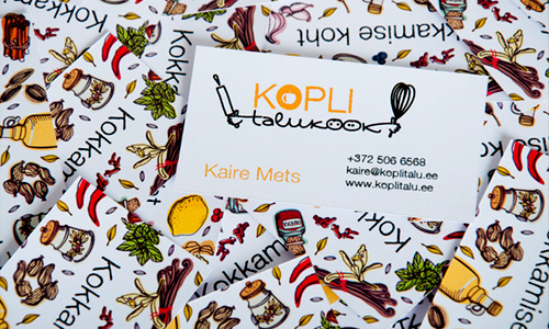
Image: Ossi Gustafsson
Using the right typography font gives your design work more value. Once it is well fitted to the industry and the product, it will be easily associated with it. Also, if a font is similar to the font used by other products or companies of the same industries that had already been successful, the users will also look into yours that way. It will be given more value and would have more chances to exist for long.
2. Gives the right message.
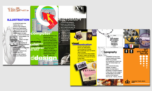
Image: Brad Colbow
Another reason why it is important to use the right font is the deliverance of the right message. You wouldn’t like to mislead the readers by using the wrong font. You cannot use a fancy font that looks childish if you are making a brochure for a bank. Since every font has different representations and impact, you have to use the right one that suits the industry in order to convey the right message.
3. Projects professionalism.
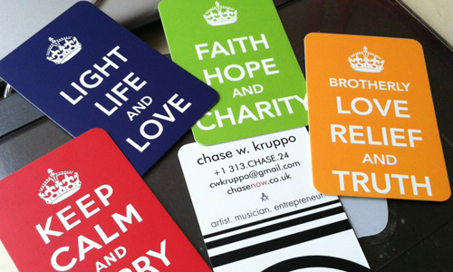
Image: Chase Now
A design work that uses the right typography font shows professionalism. When everything is well done and suited to the type of project, then it will gain the trust of the readers. Along with that is its being professional in appearance. It would be much easier to encourage the audience to patronize your product or service if you come up with the right design.
4. Adds more appeal.
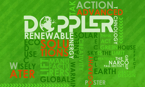
Image: Paul Hectort
Of course, appeal would always be included in the list because it is always one’s aim to make a project look good in the eyes of those looking at it. Aside from the right contents, it is significant that the output would like good. No one wants to look into a badly designed work and a badly chosen font.
5. Enhance presentation.
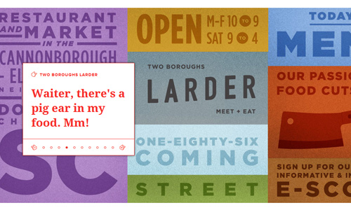
Image: Fuzz Co
When a client asks for a brochure design, or a CD cover design or maybe a business card design, he is actually asking you to create a good presentation for him. So, when you work on the design, you have to use a font style looks appealing, readable and clear. Let your font add style to your work for a good presentation.
6. Makes information interesting.
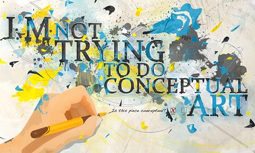
Image: Aagaardds
Some information is really boring and most people might not be interested to know about it. This is true especially when you are promoting a product or a service. It would be a challenge on how you can make it look interesting. Using a good typography font would make your information a lot interesting and worth reading.
7. Reflects personality.
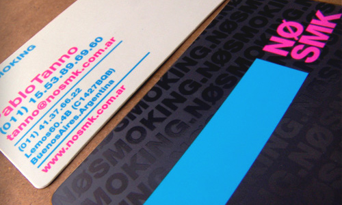
Image: No Smoking
When you make a design for a website portfolio or a business card, you need to know the owner first. Doing that will allow you to create a design that suits to their personality. That is important because these design projects you make are their representations in order to get a client and to promote their business.
8. Gives more clarity.
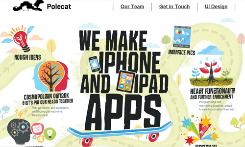
Image: Ipolecat
Of course, clarity would be very necessary. Making a design project with an unclear text would be a bad move. You will be wasting your efforts and your time because you will not be able to convey the information that needs to be conveyed. So, see to it that you have chosen the right font that is not just appropriate to the project but is also readable and clear because it is the primary element that informs the readers.
9. Establish branding and identity.
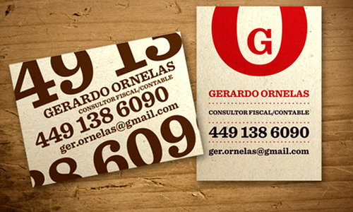
Image: Gerardo Ornelas
Part of branding is the font that one opts to use. When creating a logo design or a web design, there are certain font styles that they use for it. When you use a different font the next time, then it is no longer associated to the brand. Hence, you have to choose a font that could stand the test of time and be an effective branding for a website or a company.
10. Makes it catchy.
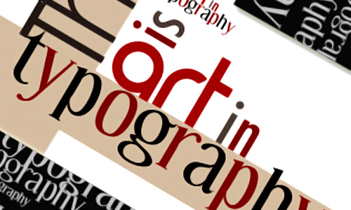
Image: Rach is My Name
You will not be able to effectively communicate to your target audience if you will not make the design catchy. Using the right font can make one look into the output and then they would start reading what is in it. With that, you have succeeded in your aim to get their attention merely by using a good typography font. But of course, it also includes good color choices and lay-outing.
It’s Your Turn Now
Choosing the right typography font is very important for a design project to be effective. Hence, a designer should not just use any font he wants but also have to consider lots of things before he finally opt to use one. It is not only the visual impact that is important but how it can be effective to reach the goals of the project owner or your client. So, now that you have known the reasons why it is important to choose the right font, you will surely give it more attention now. You can also add something to our list if you want to express yourself.


