Before you decided to opt for graphic designing as a career, you could have done some preparations to it. Part of that preparation is having an online portfolio and an graphic design resume. Both of them would go together when you apply jobs online and offline. But it would be more advantageous for you if you apply jobs only. If that would be your choice, you can design a graphic design resume that would look good online and offline.
Having a well-designed graphic design resume with the right contents would be your key in getting the job you want. Getting your dream job begins by having a good resume. Hence, we will give you some tips that would be of great help in creating your graphic design resume. This can help you to get a positive impression on your personality. Who knows, you might get the job if you take note of the things we have below.
1. Make it unique.
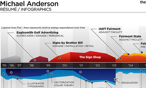
Image: Emilie Ogez
Your graphic design resume is all about you. Give it a personal touch so that it can really show them who you really are. The way you design it can tell them your personality and your traits. So, see to it that you will design it in a manner that it can give a positive impression to those seeing it.
2. Your design layout.
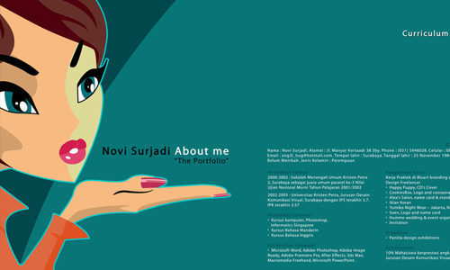
Image: Novisurjadi
Be sure that your layout won’t be distracting to the eyes and would give direction to the reader. It is okay to show your creativity but do not overdo it. Do not make the design so wacky that it would be so distracting to the eyes. You can do that to your portfolio but not to your resume. There should be good balance in the layout. Make sure that you use enough negative space to make it easier for your prospect employer to read it.
3. Try printing your resume.
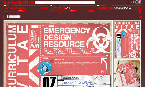
Image: ~Jonny-Rocket
Before you actually send it, you have to try printing your resume on how it will look. This way, you can still do some necessary adjustments. You also need to try printing it in a low quality and in black and white. Assume that you are the employer and try different possibilities in printing your resume. This can help you to make sure that your resume will be read, increasing your chances to get hired.
4. Send a resume with good print quality.
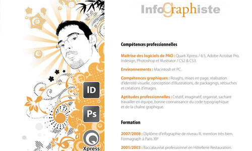
There is a possibility that your prospect employer would print the resume you will send them. Hence, you have to send a resume that has good print quality. It means that it is readable and not pixelated. If that happens, you will surely loose the job. So, see to it that your resume has good print quality.
5. Show your work.
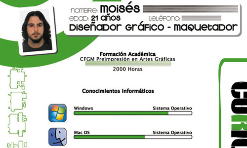
Image: Uito2
Well, it doesn’t necessarily mean that you have to show them pages of projects you have done. You can simply place the link towards your online portfolio. Knowing that you are a designer, it would be good that you have made an online graphic design portfolio even before you have decided to apply for jobs. This way, you can show your works and your skill as a designer. This could be your ticket to getting the job you want.
6. Recheck your resume.
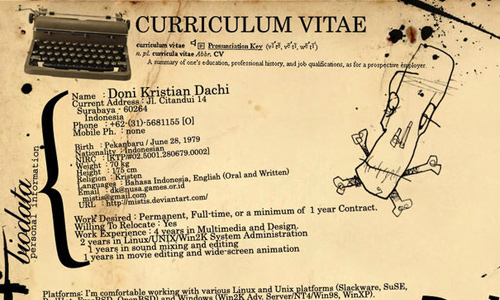
Make it a habit to recheck the details in your resume. You might have done something wrong while you were working on it. It would also be wise if you let other people see it. Show it to a friend so that they can help you recheck it and improve it if needed. This can assure you that your resume will look good for your prospect employer.
7. Review grammar and spelling.
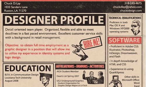
Image: ChuckDLay
There are people who are very particular about grammar and spelling. So, you have to be careful about it. Seeing errors in your resume won’t give a good impression to your personality as a designer. If you are not good at that, then ask someone else to check the grammar and spelling for you.
8. Avoid long pages.
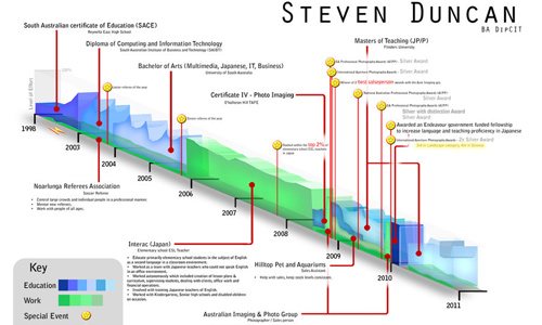
Image: Heeeeman
When creating a design resume, you have to avoid making so many pages of it because no one would spend a lot of time reading your resume. They are not interested to know so much about you. They are only interested to know if you are qualified for the job. Hence, create a one page resume. But if you think that it is not enough, two pages will do.
9. Place your name as file name.
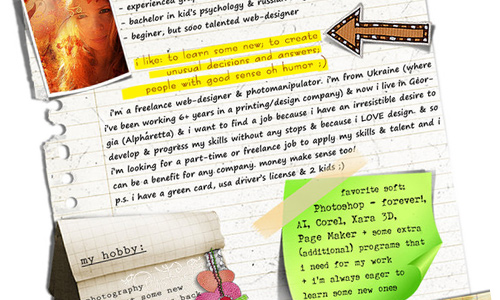
It would be good if you include your name in the file name. This way, the employer can easily find which resume is yours. There would be many applicants who will also be sending their graphic design resume. So, it would be wise to create a file name that bears your name.
10. Make it simple.
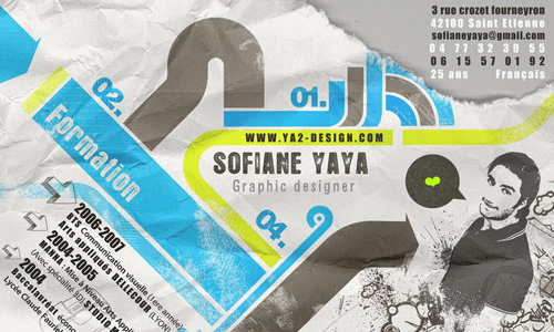
Being creative is different from being simple. When we say simplify, you have to place only the contents that are necessary and you have to make a design that will allow comfortable reading. Make good use of white space. Use a simple font style that is readable. Your typography is very important for it is what employers will really look into. Of course, your entire design would also matter like your layout, color choices and others.
It’s Your Turn Now
We hope that the points above would be helpful in creating your own graphic design resume. Designing one is actually as challenging as doing a design project. What makes it different is that you are advertising yourself through it. Have you made your own graphic design resume? What were your considerations in creating it?


Thanks for this guidelines I never thinking of these ideas before. Now I realized that I have to consider these. Great job!
Well, I had to consider how to stress out
A simple can resume can also attracts the HR or the manager because he can easily read the contents on the paper. I will note this tips here.
It’s good to read this article! I’ve learned a lot from this. I’ll tell my friends to check this site and endorse this to their list of friends too. Great article from you guys!
These look nice, but you also need to do a traditional resume in Word format, especially if you try to get work through a talent agency. Even some regular employers want to see a plain resume that is easy to print and hand out to colleagues that might be part of the hiring process.
I’ve tried creating a fancy resume showing off my skill set, but I always get asked for a plain one.
Now, it’s more easy for me to submit my resume. Thanks for these ideas!
Yeah, agree! These tips were really helpful!
As much as possible I avoid long pages because some of the HR will just look the front page and the 2nd page. So it would be better if we will create a short pages of resume.
Yes, it is indeed very helpful! Thank you!
This is a great article. I also use a small space in the bottom of the page with some logo samples…it give the employer a glimpse of your work.
I disagree with the need for having a very graphical resume – and I agree with Anita.
Having a basic textual resume will get you an interview faster than the graphical resume. If your skill set is up to par with what your resume says then you’ll get the interview. Save the graphical works for your interview or for when they ask for samples along with a cover letter and resume.