For sure, you have seen different icon designs in every website that you visit. You can notice that each one is unique from the other. There are also different usage of these icons and it is amazing how these icons which are most of the time the small elements of the site, can add beauty to the entire website. Some designers place icons on website headers. This is one creative manner of using icons. Headers are important for it carries the valuable parts of the site like the site name, navigation and others. Users can immediately see the header once they get to a site’s homepage.
One can creatively use icon designs for the header. It can bring the site’s look to the next level and can even be a key to better site usability. So, for today’s tip, we will give you some points on how to create icon designs that are apt for a website header. These could aid one to do away with certain icon design mistakes and achieve an effective icon design . Look into these tips and if you feel that we have missed something, you can add that below.
1. Choose a design that suits the site.
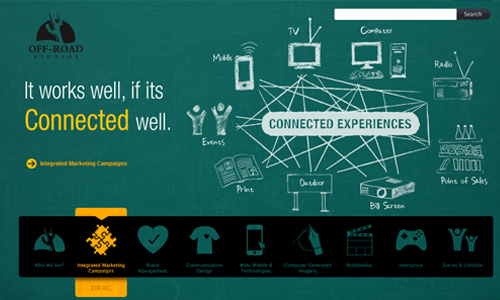
Site: Off Road Studios
Every website has its own design concept and theme. Make sure that when you use icons, the manner of designing them would look appropriate to the entire site as well. Doing this would make the site look more appealing and would even make it more attractive to readers. The purpose of using an icon may vary but you still have to see to it that your icon design looks one with the site.
2. Use colors that would emphasize it.
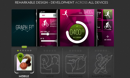
Site: Worry Free Labs
Part of the website’s design elements is the use of colors. There would surely be a color palette that you use for your site. See to it that your icon could be easily noticed with the choice of colors you used. You can use contrasting colors or other colors that would match the site’s colors. Some even use plain or monochromatic icons to make it look more eye-catching. This would be necessary to consider especially when the icons are placed on the header.
3. Use simple icon designs.
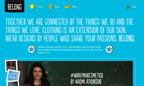
Site: Wear You Belong
If you want to go minimal, you can create icons that are simple yet recognizable. Simple icons can still stand out even in the header especially if the colors used could highlight them. Most sites use shapes, or silhouette-like images as icons and they are no doubt effective. They can draw the eyes of the readers towards it due to its unique and sometimes mysterious shape.
4. Add more details to it.
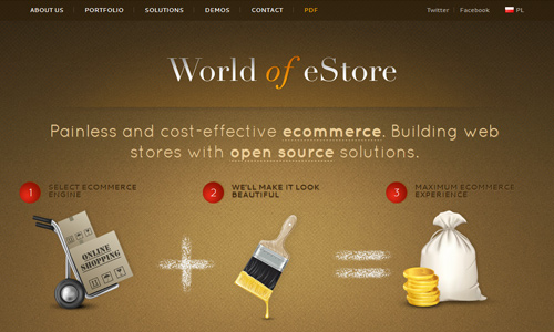
Site: World of eStore
While others are using simple icon designs, some choose to make it detailed. It also looks good for the site but it would be recommended to use detailed icons only if they are to be used in bigger sizes like what you see on the sample above. If used on smaller sizes, the details will not be seen and it would be futile to design icons with many details when it cannot be visible.
5. Use it for visual interest in navigation.
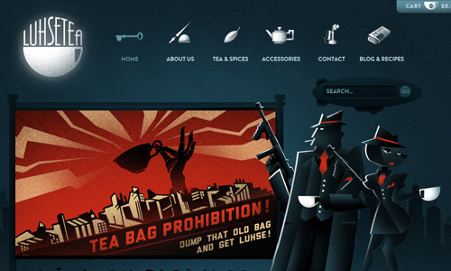
Site: Luhse Tea
Navigations are most of the time placed at the header. Make it look more visually interesting by using icons and not merely text. Doing this would surely give your site a great look. See to it that the icon designs you use for your navigation would represent it well. Like if you use an icon for “Home”, make sure that the users can recognize it that it leads to the homepage.
6. Use it to highlight some elements.
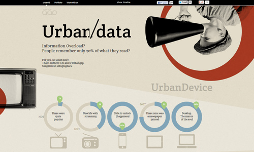
Site: Urban Gap
In the header, some items would also be included that needs to be given emphasis. Use your icons to lead the reader’s eyes towards those elements that you want them to see at once. Using icons would not just make it look more attractive but will also make readability easier. It can also be an added factor to easily inform the users what your site really is.
7. Create icons for social media.
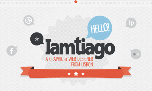
Site: I Am Tiago
Another smart way of using icons is by using it as buttons for your social media promotion. It can actually be part of the header. It can add beauty to the header and it is also functional at the same time. Design icons for social media and see to it that it looks familiar and recognizable for easier social media promotion.
8. Design it as part of branding.
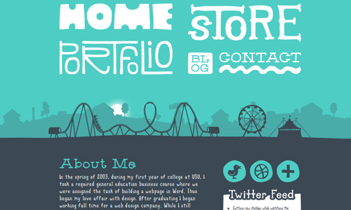
Site: Denise Chandler
Aside from your logo, colors, company name and font styles that you use for the site that can be part of the branding, you can also include the icons. Icons can best represent your site, too. Some even use mascots as icons which is even more effective. You can do this by creating icon designs that not just represent your site and its categories, but would also tell a message and a personality regarding your company. Let it easily tell the users the kind of niche you belong and the kind of services you may offer.
9. Design icons to represent a category.
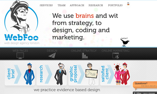
Site: Webfoo London
Categories can also be placed at the header. Instead of merely using plain text, try using icons. Just make sure that the icons you used are suitable for the category. Design it in a manner that would immediately let the users know what kind of category they are looking into. This will not just make your site appear good but it can also lead to good website usability and easy navigation.
10. Create an icon with a message.
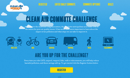
Site: Clear Air Challenge
Every element in the website are important. Some may merely add beauty but some would really be there for a certain function. Some icons are placed in order for the readers to know what the site is for and what it is about. Like the example above, one look would let one know that it deals with clean air depending on the usage of a certain kind of transportation.
It’s Your Turn Now
The header would certainly look much attractive with icons on it. Of course, the icons has to be designed in a good way so that it can be an added beauty and not merely a distraction to site’s look. If you have seen some sites that make use of icons for the header, you can share that to us. Or you can also add some points to what we have mentioned above.


Definitely worth reading, thanks for the tips…
Nice tips. Thanks for your guidance.