Obviously, every website that you see has its own layout and design. This is not just part of aesthetics but also of branding, good readability and usability. Hence, website layout is very important. You cannot just pick up all the elements of the site and scatter them anywhere you want. You have to arrange them in a manner that it would be pleasing to the eyes and be a good aid for reading. You always want to give the users a good stay in your site. Have a good website layout so you can make them stay.
Website layout is a significant aspect to avoid eye strain for the users. This can also aid to have increased traffic for the site. So, if you are having a hard time layouting because you do not know what needs to be considered, we will provide answers to your question. For today’s post, we will give you tips on how to achieve a good website layout for better user experience.
1. Place important elements above the fold.

Site: True Tea
This is a must in order to make sure that the viewers will be able to see all important elements of your website. This is also true when we speak of newspaper lay-outing. It is the same with website lay-outing. When the user looks into your website, they will immediately see the upper portion. Place your important stuff there so that the users do not need to scroll down in order to see it.
2. Remember that less is more.
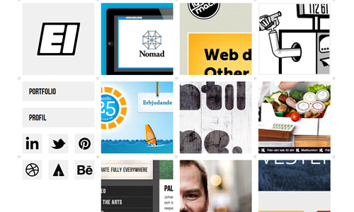
Site: Erikiggmark
Keep your layout simple. Doing this will make it a lot easier for the users to navigate your site. Do not try to put every information in a single page even if it is no longer enough. This will only cram your layout and it will no longer be easy to read and understand. You can look into how other websites did their layout and use it as inspiration to layout yours.
3. Place graphics and images aptly.
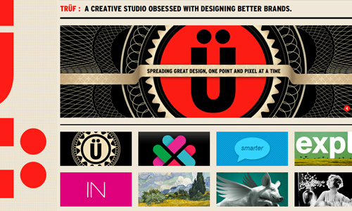
Site: Truf Creative
Do not just place your images and graphics anywhere you want. See to it that it is also properly placed to avoid distraction from reading the context. Let it support the context of the site or you can also let it stand alone. Choose your images well. You can place them on headers, part of a post, or even as a featured graphics. Most of the time, featured graphics come above the fold. It could be a logo, a company mascot or anything significant for the site.
4. Observe proper alignment.
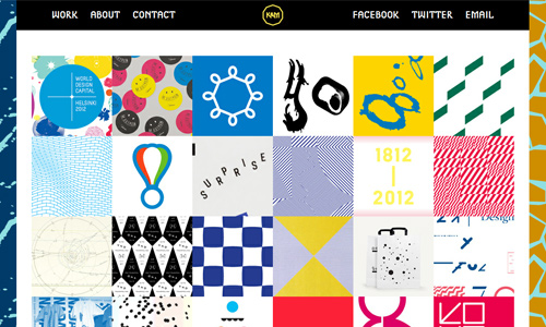
Site: Kokoromoi
Alignment is important in order to make your site look neat and organized. You can do that by using a grid. Most sites make use of a grid in order to make sure that their layout is balanced. This can also make it a lot easier for you to do your layout. The gird could be a vita guide in your layouting.
5. Organize information.
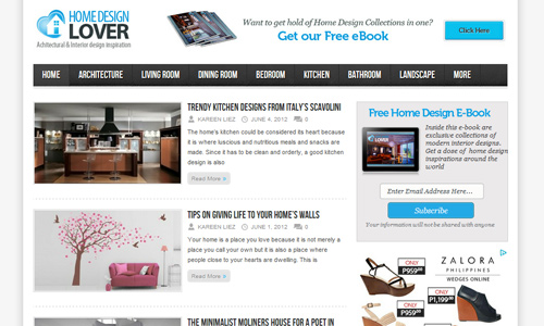
Site: Home Design Lover
When lay-outing, you also have to see to it that you could show which ones are more important and which ones can be placed under it. You should have a logical flow of information and present it in a logical manner, too. You can make use of colors and fonts to identify the value of every element. This means that you need to have clear headings, sections, titles, categories and others.
6. Limit your web page dimensions.
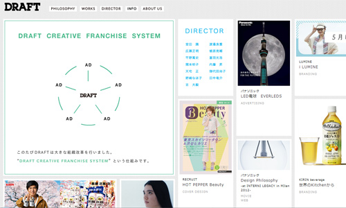
Site: Draft
You would not like it if your website is viewed differently on other computers. So, be sure that when you design your site, you have observed the right width. Limit it to no more than 775 pixels to prevent horizontal scrolling. Your website will be seen entirely with one look. When the users scroll down, they will be able to see even more interesting elements and contents. But be sure to retain the more important ones on the fold.
7. Do away with distracting elements.
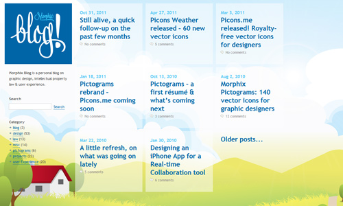
Site: Morphix
Part of having a good layout is by getting rid of elements that would be distracting to the users. Like too many adds on your fold. It might hinder the comprehensiveness of your articles and might even drive users away. That is why it is recommended to carefully place your ads to avoid distraction. You can also lessen the use of flash or even a horizontal scroll because it is irritating for some users.
8. Follow website design protocols.

Site: Cheetos
People tend to stick with what they normally see. So, stick with the norms of website lay-outing so that you will be patronized by the users. Part of that is using underlined words with different color as a link. They already know that once it appears like that, it would lead them to a different web page. Also, include the usual and important contents like the About page, Contact page, Home and others.
9. Observe right color combinations and contrasts.

When lay-outing, you also have to see to it that you used good color combinations and you observe contrasts. Doing that would make it a lot easier for your users to read your headlines, titles and text. It can also add to the appeal of your entire website layout. Choosing colors is also part of your branding. So, choose colors well.
10. Use white space.
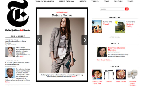
Site: T-magazine
Using white space or negative space for lay-outing is very much important. This gives a breathing space for all your design elements and it makes your site easy for the eyes of the readers. If you do not use enough white space, it would be heavy to the eyes and would be good for reading. So, make use of negative space for a better layout.
11. Lessen loading time.
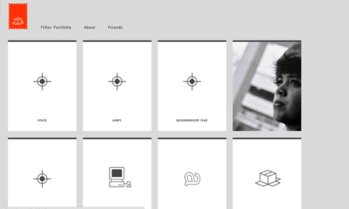
Site: Haikavanian
It is very significant to lessen loading time of your website. This allows the users to immediately see the vital contents of the site. Some users are impatient and would leave the site if it takes long for it to load. You can do that by not using flash, too much images and videos. Lessen the size of your files while retaining good quality so that it can load well.
12. Observe reader’s eye flow.
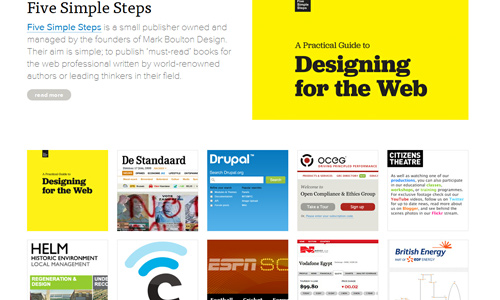
Put yourself on the shoes of the readers. Be the reader for one time and you will know what you should do. Observe how you will look and read a site. This way, you will be guided where to place the elements in the site while taking in mind its value. Observe how your text, images and all the content arrangements can be friendly to the users.
It’s Your Turn Now
Web layouting is an important thing. It is where the look of the entire site relies on. So, make sure that you have done a good layout to make sure that it can be easily understood and navigated by the users. This can also increase your chances of being visited by more users. Do you design websites? What are the things that you usually put in mind while doing it? Would you like to share that to us?


I think it’s important to mention advertising placement once more, it’s something I think a lot about when designing a site.
By this I mean, don’t go to mad and plaster your page with intrusive ads. Like this post, it has ads in the sidebar not spread throughout the content – I think it takes the focus away from the post if there are ads all over it.
I have left sites immediately due to heavy ad content – I’m there to read, not buy something – I think some publishers forget this sometimes!
Awesome post. All the points mentioned are realistic. Thanks for it.
Thanks for the tips.They will help me a lot.