Billboards are large advertising structures placed alongside busy roads to be noticed by drivers and passing pedestrians. It is sometimes called hoarding in other parts of the world. These billboards could attract pedestrians not only because they are large but also due to the variety of designs that it posses. It gives a designer so much room for customizing by using extensions and embellishments. No doubt, billboards are one of the best ways of reaching a large number of people in your area.
Designing a billboard is quite challenging not to mention its size, there are lots of things that one needs to put in mind while making the design. Unlike business cards or logos, designing for billboards require more creativity and great ideas in order to attract the attention of the people. In this article, we will give you designing tips in creating billboard advertisements.
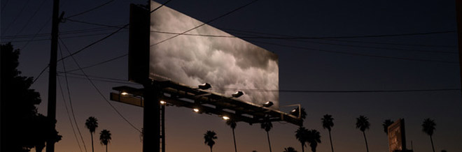
1. Know your product.
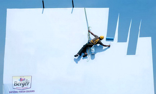
Image: mymodernmet
Before you start with the design, you have to know everything about the product first. Know the target audience and what kind of message they want the audience to get. Knowing your audience will give you the idea on what kind of design to make. Sometimes, it is you who will pick for the location of billboard but there are times also that the client already have a place for that. You need to know the location, too.
2. Showcase the product.
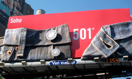
Image: artatm
What you are advertising should be the biggest image or text in the ad. Remember that a billboard is viewed for a few seconds only. You have to relay the message for a few seconds. You cannot tease the viewers like television ads could so it is a challenge for you on how you’ll let them remember your billboard.
3. Billboard text.
Since billboards are viewed for a few seconds only, you have to make your message quick. You can use 8 to 10 words only which can easily be read by people even those driving a little fast. You can include the company name, contact information, direct information of the product, and a slogan. You can also place the benefits of the product in the billboard. But you should always remember that your text should be easy to read, catchy, simple and will be easily remembered by the viewers. Do not forget to use a few words as possible.
4. Text styles.
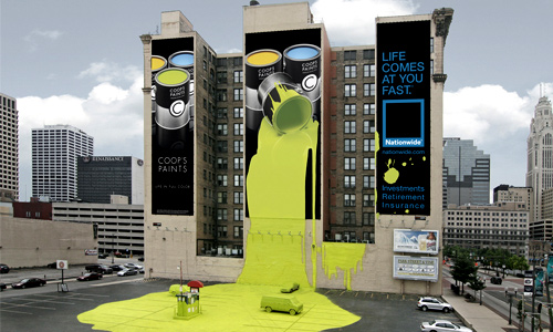
Image: adsoftheworld
Use a font that is easy to read. Do not use fancy fonts that are not clear. You may use thicker letters for it is more effective. The font size is also important. It should be big and clear. Make the name of the product you are advertising at least 3 feet tall and the rest of the text could be at least 2 feet tall. That way, people could see it and read it clearly. But you have to be creative with your fonts, too despite all those things that you need to consider.
5. Billboard graphics.
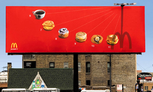
Image: Dsgnwrld
It is common for billboards to use images. Choose a good image that can make people stare at it and turn around just to look at it. Usually, photo shots are conducted for the billboard. Hence, you have to think of an idea for the design of the billboard so you can choose the right picture. Once you have chosen an image, make sure they are big enough to be seen by people. In areas where there are higher speed limits, you have to make larger graphics so they can see it even if they are very fast. Complicated and detailed images need to be big but those which can easily be recognized don’t necessarily be so big.
6. Colors.
Image: billboardom
In designing a billboard, you have to choose a good color contrast. Yellow and red could get the attention of the viewers but black and yellow are even better. Use colors that can get the attention of the viewers. They key is just to use the right contrast of colors for the background and the text. Do not use similar colors together like red and orange or blue and green. It will make the text unclear. You can use alternate colors, too like a line of light green and then next would be a line of white colors then light green again and then white again. You may also blend your background or use outlines or drop shadows. The important thing there is to make your text readable. Always be creative in choosing your colors. Try to know also if the company wants to use their colors for the billboard. Then it is up to you to play with the design.
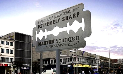
7. Simplicity and creativity.
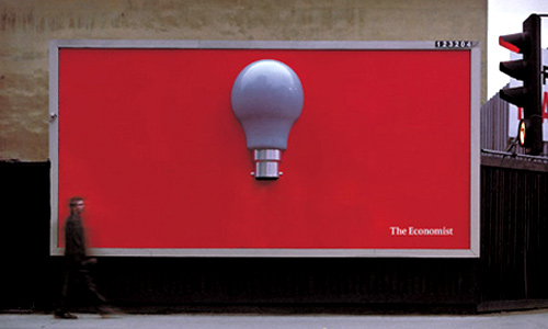
Image: adpunch
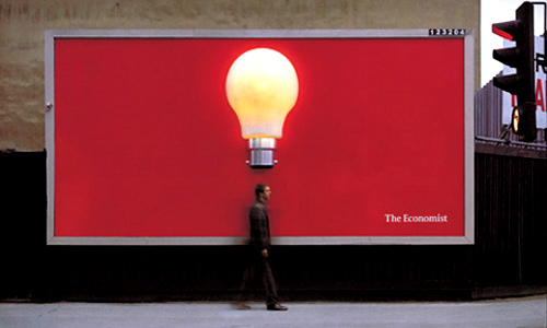
Image: adpunch
Make your design simple and creative so that you can get the attention of the viewers. When you simplify, you are choosing what to prioritize. Choose the most important things that need to be in the billboard. The simpler the design, the easier it will be remembered by the viewers. But despite that simplicity, you have to be creative, too. You can think of different ways on how to make a simple yet creative design. Unique billboards make people turn around no matter how simple it looks.
8. Let it stand out.
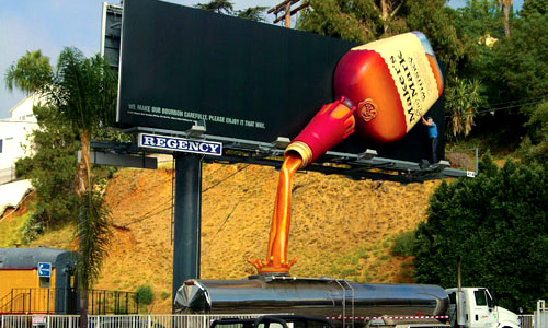
Image: artatm
For sure, you would like your billboard to be noticed. So, do not let it blend with the surroundings. Let it stand out. Make sure it is highly visible so that people can really notice it. There are different ideas on how to make a billboard stand out. If you want your ad to be noticed, the billboard can’t blend in with its surroundings. Use bright vibrant colors with a high contrast so it will be highly visible.
9. Check for errors.
Image: yumsugar
Before you make the final presentation, check it for errors especially typos and grammatical errors. Some people are very particular on these aspects. To be sure, you can ask someone else to look at your ad and ask for feedback if it is clear and if there are mistakes. Ask them what kind of information or message they get upon seeing the ad. Take note of their comments and do some improvements if necessary. Remember that billboards should give great first impressions.
10. Deliver the message.
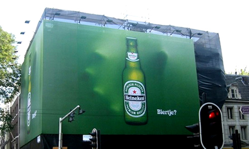
Image: creativecriminals
Above all, make sure that you give the right message. In making your design, use a short message that will be remembered by the viewers. Some even use humor in their works which is most often effective. Some billboards are even intriguing. Like the 3d billboard of Heineken, the hands that came from the back gave the message that one will really want to have a Heineken. It depends on how you make your design. Just make sure that no matter how creative it is, the message is still there.
Indeed, no matter how simple a billboard will look, it still came from a creative, artistic and brilliant mind of a designer. It is not easy to come up with a billboard design especially that a particular message needs to be conveyed. Yet, no matter how challenging the task is, designers still manage to make a billboard that not just looks great but also has a big impact to the viewers with a message that will surely stick to their minds for a long time. Have you ever designed a billboard? What were the things that you considered in your design?


Great samples to include in the piece. Well done.
Nice samples. Thanks Ronald 🙂
wow, they are some great designs.
but must be a costly affair… can’t get such designers here. 🙁
Fantastic article. Great examples of good billboards that use different techniques to attract attention!
Question is: is there any metric which shows that these billboards actually generated revenue for the companies, as opposed to just be “award worthy” for great design?
Its really usefull and amazing tips. Thak you so much. I will make it practical