People these days no longer go to libraries to do research since most of the books they need are found on the internet. Actually, there is so much information available on the internet. Just type in the keyword and what you need will be placed before your eyes. No need to burrow in a dusty library shelf and look into thousands of books just to get what you need. Well, in this modern time where the internet is available anywhere and where many people own gadgets that could allow them to access it, ebooks are the star.
But an ebook will seem to be wasted when they are poorly designed. The writers might be able to put in valuable information to it but if the designers fail, the ebook will still be useless since the readers will not have a good reading time. Hence, it is important that designers will avoid some ebook design mistakes commonly committed. Awareness is the key. So, to help you, here are 10 ebook design mistakes that every designer has to be aware of.
1. Color overuse.
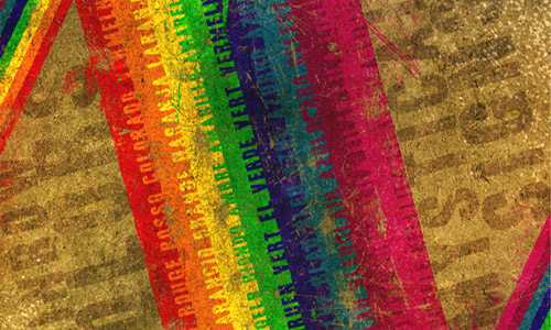
Image: Torsten85
Well, don’t get too excited in the design. You can actually just choose certain colors that would best suit the kind of ebook you are designing. Do not seemingly shower your work with rainbows. Aside from giving your readers a headache, it can also be appalling for those who would like to print it. If you placed a solid background of colors behind the text, it might not be that readable when printed. It wouldn’t be good also to read an ebook full of color. It is a distraction to reading and is also heavy for the eyes. Use white background for text and use minimal amount of colors. After all, it is the text that matters.
2. Common cover design.

Image: Home Design Lover
It wouldn’t be inviting to read an ebook who has a cover that is like any other ebooks on the web. Make the cover unique and let it send a message to the readers as to what your ebook is about. Let it develop curiosity in them so that they will be eager to get a copy of the ebook. The cover will be your marketing strategy to get your readers. You will not be able to do that if you will have an ordinary design. Let it stand out. Consider our example of an ebook cover above that shows a unique and attractive design.
3. No page numbers.
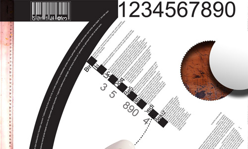
Image: Omerfarukciftci
Have you seen a book without page numbers? Oh, well, when we speak of ebooks, some really do not have one. This causes problems for readers especially when they want to go back reading it. They will certainly get lost and it would take time to find the right page. Also, if they will print it, they will find it hard to arrange to pages since there are no numbers. Bear in mind that an ebook is also like the printed books that we have. It has to contain page numbers.
4. Placing page borders.
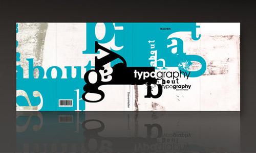
Image: Themetamy
This was the trend so many years ago when everyone was still new in computer design. But these days, people have learned how to create better designs that are easier to read. Avoid using page borders. Good ebook designs are those which look simple like the way books are. It is printed without borders, headers and footers.
5. Wrong font size.

Image: Alienbiru
Do not make your font size too large or too small. If it is too large, it would like be shouting to the readers. If it is too small, then it is like whispering the information making it unclear to them. Use the right font size. Professional typography is set at 11 or 10 point. This can make it easy to read without eye-strains. Do not use 12 point for it will look like a school project.
6. Lengthy text lines.
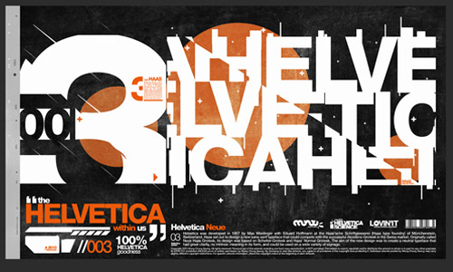
Image: Louiehitman
It would be eye straining to see long lines of text resulting into small margins. Anyone would not like to read an ebook that looks confusing when it comes to where the next line is. It is said that the average number in a single line that is healthy for the eyes is 40-45 characters. You really do not need to count it but it would be better if you just follow the regular margin width.
7. Wrong typeface.

Image: Jennvt
One can choose from a serif, a san serif and a decorative typeface. Using decorative typefaces is only good when an image is more important than the text. It can be used in packaging and logo designs but not for ebooks. Maybe it can be used for covers but not for the contents. Serif types are good for extended reading or for lengthy materials for the serifs can make it easy for the reader’s eyes to connect one letter to another. Sans serif typefaces are clean, legible, simple and easy to read.
8. Overusing centered text.
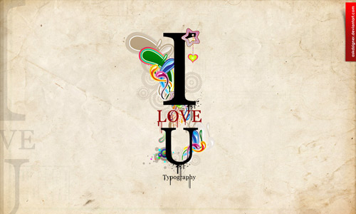
Image: Askdzigner
Some ebooks make use of centered text thinking that it would best get the attention of the readers. Well, it can look good when you are making other projects but when it comes to ebook contents where large blocks of texts are involved, it is not advisable to use it. It creates a rugged look and may also appear amateur. Also, it is not perceived well by the readers. You can align your items to the left which is better for reading.
9. Poor heading formats.

Image: Carpet Crawler
Headings are important for an ebook since it can let the readers know which part of the ebook they already are. It has to have a strong visual contrast with the paragraph in order for it to be noticed. It can be larger than the adjacent paragraphs or it can be in bold letters. Do not underline your subheads because it will be harder to read. You can combine a bold sans serif type with serif body text or vice versa.
10. Improper spacing.
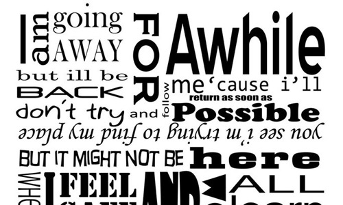
Image: Lizzmont
Spacing in every entry of your ebook has to be observed well. That includes kerning, leading, and tracking. Kerning is the space between two words. Leading is the space from one line of text to the next line of text. Tracking is the spaces between every letters. These are all important for the ebook since it would contain a large amount of text. Give ample negative space to the ebook especially that it is intended for reading.
It’s Your Turn Now
The ebook design mistakes above can actually be easily avoided when one is aware of it. These could merely be simple stuff but when missed, it can create a huge difference. Bear in mind that the readers are very important. If these mistakes are done in an ebook, its creation would be futile since it will not be able to reach the readers the way the writer wanted to happen. Hence, in whatever designing one is doing, he should be extra careful to do away with mistakes like the ones we have mentioned. The designer should carefully look at the typography since it is important in ebooks. Are fond of reading ebooks? What are the points that you have observed in the ebooks you have read that needs improvement?


Thanks for these tips. Now I know 3 of my mistakes which I need to correct in my designs.