Brochures or pamphlets are types of leaflet that is seen in racks or stands featuring various information. It is frequently used to give information to tourist, to advertise products, to give health advices and many others. There are times when it is given to people who attended a seminar or a convention to give them information in a capsule. Brochure can be a single-sheet that is bi-fold or tri-fold. Bi-fold brochures have prints on both sides and are folded into halves. Tri-fold are also printed at both sides but are folded into thirds. Other brochures are “Z-folded” or “C-folded”.
An effective brochure can educate the customers, give a good identity and credibility to the company, expand the market and encourage customers to take action. For graphic designers, creating a great brochure is a challenge. In this post, we will provide you simple techniques to help you create a great brochure design.
1. Decide on a concept, theme and structure.
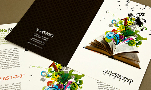
Image: inkdphotos
Before you start with your design, determine how the brochure will be used. Is it for direct mail marketing or for information or to advertise products? You need to know the purpose first. Also, acquire all the needed information for the brochure so that you can choose the appropriate design for it. You should also bear in mind that graphic designing is communication design. Makes sure that you are able to give the message directly to those who will receive the brochures.
2. Be unique and creative.
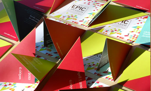
Image: TWHP 2010 EPIC Awards
This is important. Your brochure design should be original and unique so that people could easily recognize it with one glance. Look at the competitor’s approach in designing their brochures. Think of a design that will stand out and outshine the rest. Use your creativity to make it unique. Your client will surely appreciate it if you can offer them a great design that is original and will give them a good identity.
3. Know the print size.
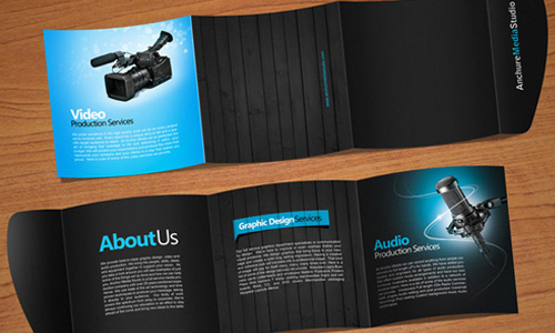
Image: Ahmed Othman
In designing, it is important that you know the print size. You might create a brochure in an 8.5 x 13 layout but the paper your client opts to use is 8.5x 11. It will ruin the entire design. The same thing will happen if you do your layout in an 8.5 x 11 but it will be printed in an 8.5x 13 paper. The paper will be wasted. So, make sure that you will use the right paper size in making your layout.
4. Use print bleed.
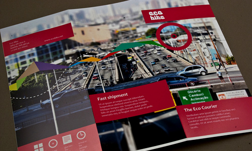
Image: Octavian Belintan
Bleed refers to the part on the sides of the paper that gives a small amount of space. This is an assurance that it can be trimmed well and all parts of the layout will be printed. Brochures are printed together in sheets and it needs to be sliced according to the right form, shape and size. It is always advisable to use bleeds in lay-outing.
5. Use high resolution.
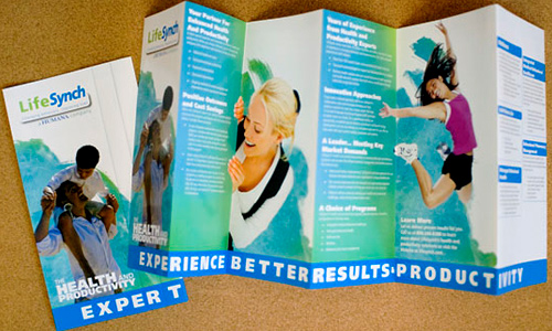
Image: Multiple Owners
Your design will look pleasing if you will use high resolution in your layout. If you print a design with low resolution, it will become blurry or pixilated. It may look fine on the monitor but it is a different thing if we speak of printing. You should use at least 300 dpi to have a sharp and crisp print output.
6. Usage of fonts.
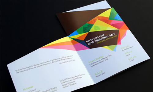
Image: NSF 2010 Community Gala
Selection of fonts is important. Choose the ones that will fit the purpose of the brochure and the company. Remember to use the right font sizes, too because brochures are meant to deliver information. Hence, it should be readable and legible. Use bold fonts for headings and do not make your text too large or too small. You can add glow, bevel or drop shadow to highlight important text.
7. Use headlines, bullet points, charts and images.
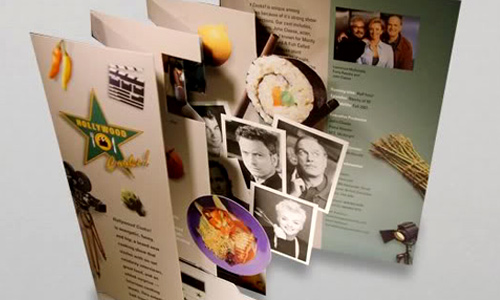
Image: hallographix
You need to simplify what is written in your brochure. No one would like to read massive blocks of text in a small sheet of paper. So, to make it easier for the eyes, use headlines and bullet points. You can also make use of charts and images. images should be good and of high resolution. Choose appealing images because the readers will first look at the image before reading the text. This will grab the reader’s attention especially to the important points of the brochure.
8. Include a call to action.
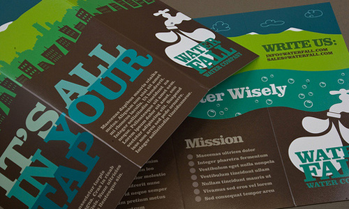
Image: inkdphotos
Since brochures will land into the hands of the readers, do not forget to ask the customers to take action. You can do that by inviting them to see your showroom, place an order, schedule an appointment, and others. Your brochure will be pointless if you do not have this call for the customers to do something in response to the information they received through the brochure.
9. Make attention-grabbing designs.
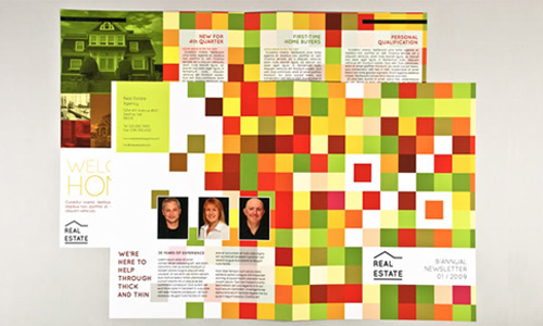
Image: inkdphotos
For whatever purpose your brochures will be used, make sure it is an attention grabber. Use your creativity in doing this. There are times when brochures are left in counters and labelled “get one”. Costumers will surely want to get a copy if they find it interesting. So, make sure you will make an eye-catching design.
10. Make an interesting cover.
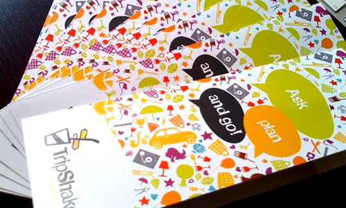
Image: Antonio Bonanno
The cover is an important aspect in brochure designing. It attracts and welcomes the customer to enter your world of vast information. It should use minimal words and vibrant imagery. You should bear in mind that the front cover is the first thing that the customer will see. Make your cover appealing so that customers will have that urge to pick it.
11. Use the correct paper.
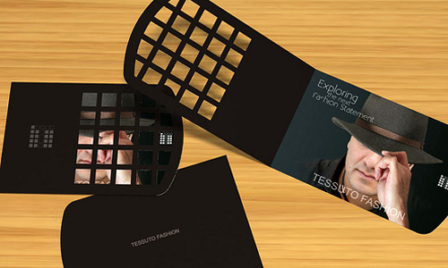
Image: gcann
Even if the client merely asked you to make the design, you should also suggest and consider the paper that they will use for printing. Your brochure design will be useless if you will not use a good paper. There are so many paper types that you can choose from. Choose the appropriate paper. Glossy papers give more appeal to the brochure and using thicker or heavier paper makes the customer think that the company is more professional.
12. Make it worth keeping.
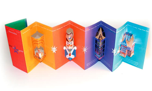
Image: zillerdesign
If you had a great design for the brochure and it also contains vital information, the customer might love to keep it. There should be something in the brochure that will increase its value and will make it worth keeping. You may want to use pop out images or make a different shape for your brochure to make it unique. Be creative to give it more value.
In making a brochure design, these are the things that you need to keep in mind in order to make it noticeable. Since you are the designer, it is your obligation to impress the client and to put into action their ideas for a great brochure. Your client relies on you to achieve their purpose. Hence, you have to give your best into it. Have you done a brochure design? Can you share to us the design you have made?


Very nicely written, thanks for the useful tips..
Cheers for this, looking to put together my own brochure design and sometimes you forget what needs to appear on the brochure. Thanks for reminding me.
Darryl
Nice brochure design.