If you come to think of it, a user would not be pleased to look into a website that looks unorganized and confusing. That is why every designer has to see to it that every single aspect and detail of a website is being taken into consideration. Apart from the good design, it also needs to have good website navigation. Without good website navigation, the good design will still be useless for the users will not be able to look into the site’s content. Navigation leads the users to pages of the website that can provide them vital information.
Hence, one has to make sure that a website has a good navigation system. It will not be user friendly if navigation is hard and it takes time before the user can get to the information. Since users will surely look around your website, you have to lead them and guide them towards your site properly. So, to help you, here are some tips in order to have better website navigation. This will not only improve your website’s usability but it can also help increase your site’s traffic. Read on and know what these tips are.
1. Think of your users when planning.

A good navigation starts with good planning. While you are planning, think of your users. Put yourself on their shoes so that you can design your navigation according to how your users will navigate it. Just see to it that they can get to certain pages as quickly as possible.
2. Make it simple.
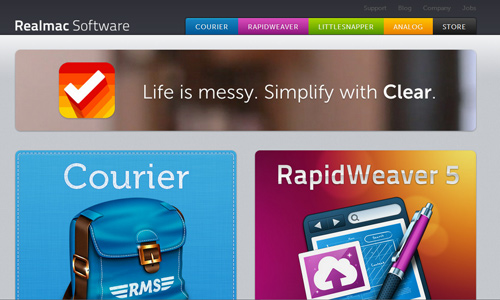
Site: Real Mac Software
It doesn’t mean that just because your site is huge that you will make many categories even if it can be merged with others. If you do that, your navigation will look crowded. Do not place a huge menu of items. Have a primary category where your other sub-categories will be placed. Arrange them well, too. This can be a lot easier for your users.
3. Consider prominent locations.

Site: Huxley Prairie Fest
For every page of your website, the navigation has to be clear and prominent. User’s attention span is very short. Hence, you have to make sure that the location of your navigation will easily be seen. Some leave the website immediately if they cannot find where they are going. Primary links should be placed on top so that one doesn’t have to scroll down to find it.
4. Let the return Home easily.

Site: Made in Cima
We all know that the home page is the central area where all the other pages are connected. So, be sure that you will make it easy and quick for the users to know how to go back to the homepage. You can include a home button on your navigation bar. Usually, it is the first that can be seen among the others. You may also use a logo of your site which can also help you establish your brand.
5. Have organized links.
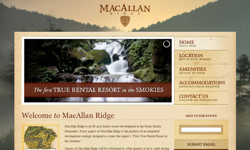
Site: MacAllan Ridge
See to it that you will not confuse your users by having organized links. Organize them according to the order of importance. Make sure that your categories are clear and those under it are the right items and links. Aside from placing the right links under a main category, you can also have related links for your posts because the readers might also be interested to read more about the topic.
6. Be consistent.
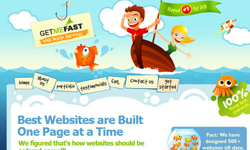
Site: Get Me Fast
Do not place your navigation anywhere you want for every page. You should be consistent by placing it on the same spot as where you have placed it on other pages. It should also be of the same order. It has to use consistent colors, design and fonts. You will only confuse the users if they appear in various designs or be placed in various areas.
7. It has to be easy to understand.

Site: Rockatee
Make it easy for the users to use your site by making it easy to understand. Make it easy for the users to know where they are going. Use simple words to direct them. Make the wordings accurate to what your category is.
8. Minimize clicks.
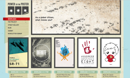
Site: Power to the Poster
Your aim is to have easy navigation for the users in order for them to get to information as fast as possible. You can do that by having simple navigations and minimizing the number of clicks. If you will let your users look for contents for more than a minute, then you are about to lose them. Improve this by using pull down menus, sitemap, anchor text and tables of contents. Avoid complicated navigation for it will only confuse the users and might even drive them away.
9. Have clear pagination.
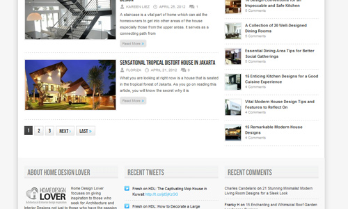
Site: Home Design Lover
There are websites that doesn’t clearly show the page numbers. This is important so that the user will know where they are. This can also let them find posts easily by looking into the page number. Others merely use next and previous buttons without a clear pagination. Be sure yours have one. You would not like your users to get lost.
10. Use a sitemap.
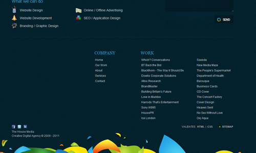
Site: The House Media
Part of a good website navigation is using a sitemap. Site maps can be a big help for SEO and is very helpful for navigation. Place your sitemap link on an area that it can easily be found. Most of the time, it is placed at the bottom of the page. Aside from easily finding the information they need, users can also take a look at the site’s architecture which can make them appreciate your site even more.
11. Have a search tool.
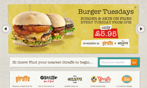
Site: Giraffe
Providing a search tool is like offering assistance to the users. You are making it quick for them to find the information they need. Most visitors would use this because they wouldn’t be looking at all the pages of your site just to get info. They do not have so much time. They will prefer to use the search tool. So, have one.
12. Test your navigation.
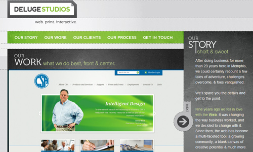
Site: Deluge Studios
The only way to check if your navigation system is okay is by testing it. Try it on different browsers and screen resolutions. This can ensure you that anyone browsing it will be able to view the page the way you made it and the way you want them to see it. You can let your friends try it and ask for their feedback. After that, take note of what needs to be improved. When you are done with the corrections, then test it again.
It’s Your Turn Now
Having good website navigation is indeed important to ensure that the users can easily and quickly browse every page and get the information they need from your website. This is done through good planning and testing in the end. For sure, you will be able to arrive to a website with good user experience design. So, how about you? What are the things that you considered in designing for your site’s navigation? Would you like to add some points to the list above?


