Some websites opt to have a complex look with lots of graphics and text. It does look attractive and are also effective. But some designers and website owners would choose to have a simple website. They are thinking that in this manner they could deliver information more effectively. There is truth to that statement. A minimal web design can certainly achieve that goal while retaining creativity.
It is indeed impressive how designers make use of minimalism but still make the website effective. There are different ways to create a minimal web design. We will share to you some minimalist website design ideas and trends that you can use in your own web designs. Come take a look at our list and on a showcase of website with minimal designs.
1. White Space.
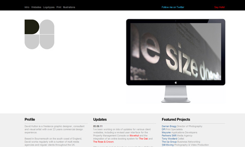
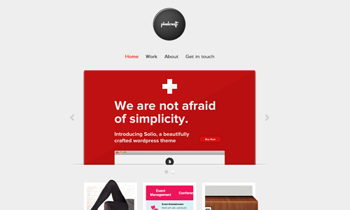
Instead of complicated web designs, you might want to use a design with wide negative spaces. This looks minimal and gives more emphasis to the relevant contents of the site. It also looks clean and light. It makes the website easier and lighter to the eyes of the readers. It also makes the content clearer and memorable. White space makes a design minimalist to a totally large extent.
David Hutton
Pixel Craft
2. Text Navigations
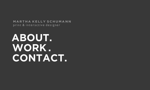
This is indeed simple for you wouldn’t see any images or other stuff but merely text for its navigation bars. Other designs would have some effects for navigation but this one is so simple that you would only see text for the website. Some use this design with navigations horizontally placed while others use a vertical format. Whichever layout is used, it would certainly look simple. This is the type of trend that shows that it doesn’t really need to complicate things in order to guide the people in navigating your website.
Martha Kelly
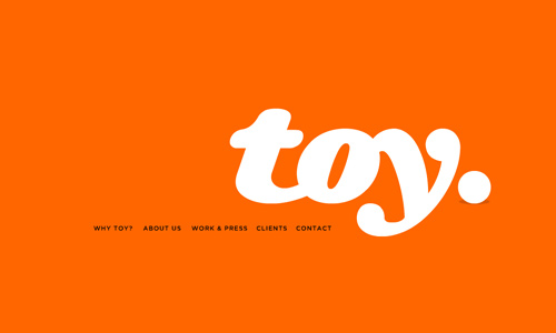
Toy NY
3. Gray Color Scheme
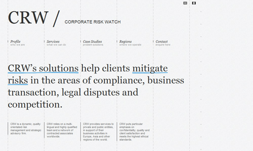
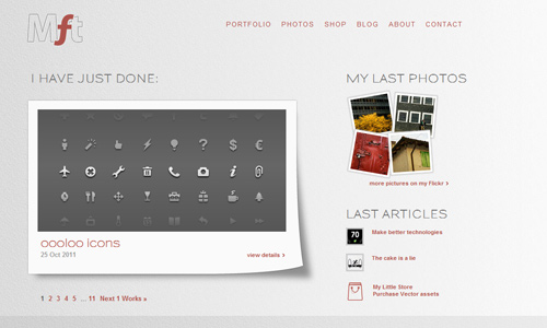
Many minimalists make use of gray in their designs. The gray palette is effective when used as background, in texts, in images and to all other aspects of the design. Gray websites are minimal sites for it usually uses only few colors to match with it and it usually uses large white spaces. It can be used as an accent to your typography, a background to your image or to your entire website. You can also use contrasts and shades of gray although out the design.
Coroprate Risk Watch
My Favorite Thing
4. Minimal Color Usage
You really don’t have to use so many colors in your design. Minimal colors can still do a great job. Some even use the gray palette or white and black alone. There are times when simple designs with fewer colors look more attractive. It just depends on how you make your layout. You can apply some colors on important parts of your website which you would like to give emphasis like headers, navigations, and others.
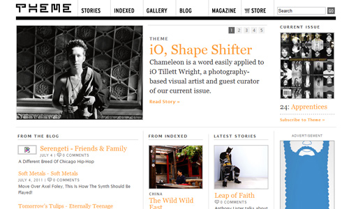
Theme Magazine
The Creative District
5. Fascinating Typography
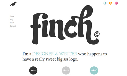
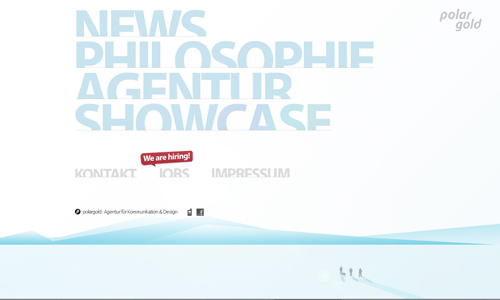
There are times when the use of type is also effective. You don’t have to place graphics because type will do the job. Use it artistically and you’ll surely get a unique web design. Typography has gone a long way and its usage has impressed so many people that it became a trend in designing. Use unique fonts so that your design will look interesting. There are thousands of font types you can choose from. You can even create one for yourself. Use huge type for your web design or use typography art in creating some images.
Finch
Polar Gold
6. Graphics
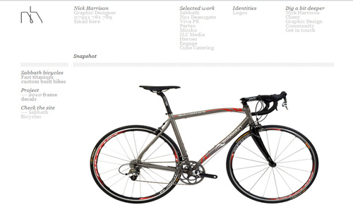
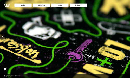
You can also emphasize images in your design and use lesser text. The adage that a picture paints a thousand words is indeed true. Even if you use only a single picture, it can already tell the readers what you want them to know. Choose the right picture that will fit the topic and theme of your website. There are many ways to use graphics in designing. Whatever way you use, it will surely turn out really captivating.
Nick Harrison
Up Struct
7. Minimalist Creative
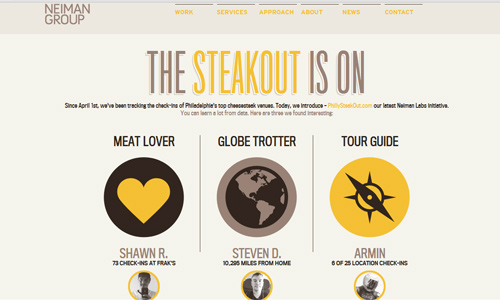
It doesn’t mean that you’ll forget about being creative just because you wanted to create a minimal website. The more that you need to be creative because you need to give a great appeal despite being a minimalist in your design. You can play with layouts and placements of navigation bars. You can play with minimal colors and typography. There are different ways to show your creativity in a minimal web design.
Neiman Group
Free Faces
8. Exaggerated Minimalism
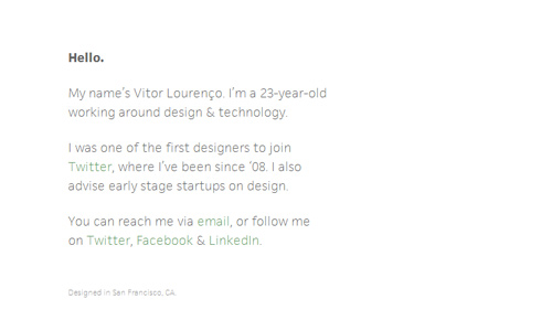
Other designers are way too minimal in their designs. They use short words and just one or two colors. It is very simple that it would surely load fast and the readers could immediately see the site. It is an advantage for the readers ‘coz they won’t wait for a long time in order to see what the site is about. Some would really appreciate its being straightforward and focused on a message.
Victor Lourenco
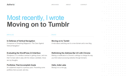
Astheria
9. Simple Grid
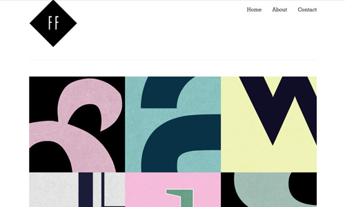
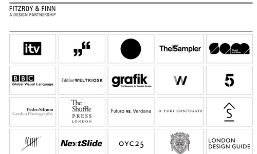
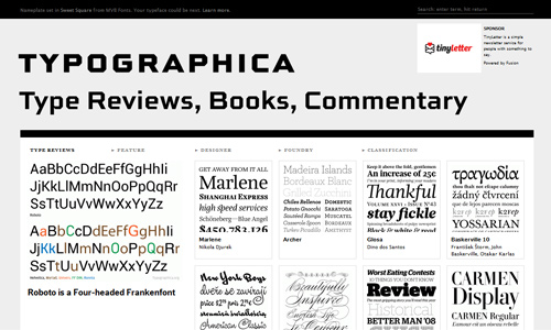
Although it is not really minimalist in nature, it can still be used for a minimal design. Grid layouts make your web design look organized. It makes things look in a proper order, giving it a simple and clean look. You can use it for images with the same sizes and organizes those with different sizes. Use white space with it to make it look lighter to the eyes. It can also lessen complexity in the website.
Fitzroy and Finn
Typographica
10. Single page layout
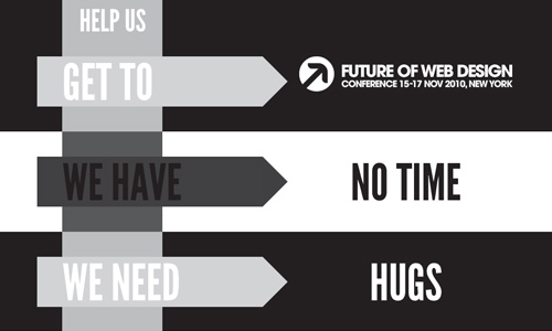
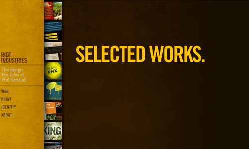
This is applicable if you do not have much to say and if you think a short information is already enough to get your readers. Well, if you really do not have a lot of things to place there, then opt for a single page website. Do not waste a lot of pages if you can make it effective in just one page. If you are afraid to discourage readers, it actually won’t. So, don’t hesitate in creating a one page website for it is even more effective at times.
We Less Than Three
Riot Industries
Minimalism is still great no matter how simple it looks. This is even more challenging for designers because they have to think out of the box in order to make their sites look attractive and appealing despite its minimal design.



beautiful professional web designs.
This is what’s “in” now. 🙂
a lot more easy to understand ;-D
Yummi, I love mnml! Nobody needs High-End-Hyper-Super-Extreme-Layouts like all the battle.net sites or similiar!..
Less is more…Nice websites