Online selling is the trend these days for it can reach billions of people around the globe and could also allow them to be available any time of the day. For sure, having an online store is a great help for a business. It can even lead to more sales and success. But we also have to bear in mind that having an ecommerce site is not just about making money and having more clients. There are things that one needs to look into in order to have an effective website.
There are certain mistakes that online sellers or website designers commit in creating an ecommerce site. These mistakes are actually avoidable if only there is awareness regarding this matter. Aside from the success that one will always be eyeing for, there should also be a high consideration in order to do away with these design mistakes. Take a look at the list we have below on the different ecommerce design mistakes commonly committed and what you need to do in order to avoid it.
1. Lack of product details.

There is a great difference between buying in a mall and buying online. When one buys something in the mall, they could look into every detail of a product and could choose which one they would buy. But online, they rely on the specifications and details of the product posted in your site. If you do not place enough details, there would be a great chance that the client will not buy the product. They would be hesitant to do that since they are uncertain if the item is the right product they need. Hence, include all needed info like size, materials, dimensions, weight and others.
2. Failure to include shipping rates.

Image: Free People
The client would also be interested on how much they will need to add for the shipping. So, include shipping rates. If it is free shipping, then you’d better emphasize that. It can even bring in more clients. Clearly state the shipping rates so that your client will not have a problem determining it.
3. Unclear contact information.
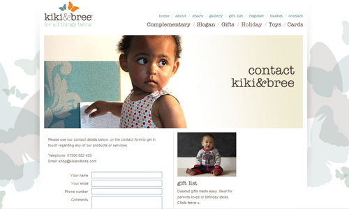
Image: Kiki and Bree
One of the things your client will look for is the contact info. Be sure to place it in an area that it will immediately be noticed by the users. Include all necessary contact information like the email address, contact number, office address and others. This way, your client will be able to reach you whenever they want to. You can also have a customer service area where the clients can reach someone who can help them with their queries.
4. Few payment options.
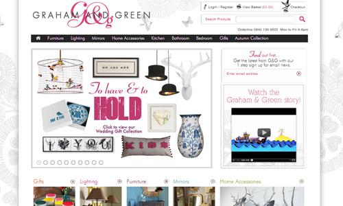
Image: Graham and Green
In your site, see to it that you will provide different payment options. Remember that not all people would like to pay by using PayPal. Not all people use credit cards because some actually wants to pay in the bank. Use different payment services so that the customer can choose which one he is comfortable with.
5. Low quality Images.

When you are selling products, see to it that you are using images of high quality. If not, your clients will be discouraged to buy. It can also degrade the impression on your site’s products. So, do not just place any kind of photo. It has to look good and should be of high quality. The angle of the photo also needs to be good. If possible, show different angles so that the client will be able to know the details of the product.
6. Lengthy process to checkout.
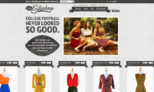
Image: Twelve Saturdays
Anyone would be tired of filling out long forms and giving too many personal information. Hence, do not make it long. Only include those that are necessary. If a certain item is not needed, then do not include it anymore. That will only add hassle for the user. Also, make the process short so that they users can immediately purchase items or avail of your service.
7. Poor site search engine.
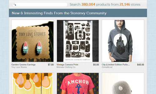
Image: Storenvy
If you think that the users will not be searching for items, they actually will. They will do this in order for them to get the item they want without looking at all the items in the site. This can let them save time in searching for items. So, be sure that your search engine is working well. It would even be better if you can allow them to sort their searches well like what categories, price range, new items and others.
8. Small product images.

Image: Manufacture Dessai
Some ecommerce sites make use of images that are so small. The clients will find it hard to look into the site’s details. You can either provide large images or you can let them view the image on a bigger size by clicking on the image to zoom in. This way, they can look at the product closer and could zoom in on parts that they want to look. Hence, you have to prepare an image that can still look good even when enlarged.
9. Failure to have FAQs.
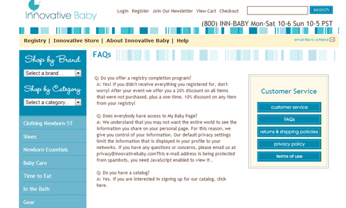
Image: Innovative Baby
It is important to include this in your e-commerce site. This would allow the clients to look into some questions which they most likely would be asking. This way, they will find answers immediately and would be able to get information about your site at once. They will appreciate it a lot if you have anticipated their queries and have provided ready answers for them.
10. Using tiny fonts.

Image: Burberry
Of course, this wouldn’t be good for your site. Be sure that the font sizes you use are readable. Your client will surely want to read on the information for every product. You can only provide them apt details if you will present it in a readable manner. Also consider the color of your text and the font style that you will use.
11. Failure to post store policies.

Well, some ecommerce sites might be too excited to put up their online store that they fail to include the store policies which is actually very important. This goes along with the FAQ. Without this one, the users will not know what they could do and what they could not do. Also, this will provide them a guide as to what will happen upon purchasing an item from you.
12. Hard to find cart.

Image: Talking Donkey Shop
Do not make it hard for your buyers to shop. Make sure that your cart can easily be seen. Most sites place it on the upper right corner. You can do the same. Also, opt for a good shopping cart design for it can also be a factor to encourage the users to purchase your items.
It’s Your Turn Now
Aside from those mentioned, designers should always bear in mind that usability including good website navigation should also be considered in creating an ecommerce site. When good usability is being considered, the rest will then follow. The above things should be properly taken into account so that it will be avoided by designers for it can greatly affect to the success of an ecommerce site. What else did we fail to mention? You can add some points by writing in the comment section below.


Brilliant! But many people use mobile devices, what do you think about that? does it make sense to do responsive web or mobile version of e-commerce site? I mean that you can’t see products images big… what do you think do people use smartphones to buy clothes ?
sorry i have no english very well 🙂
It gives a big advantage to have a responsive or mobile version of website.
Impressive subject! Ecommerce is all about simplifying the sales-purchase transaction as one has the liberty to buy stuff within the comfort level of his or her home. However, design mistakes like these may make ecommerce a dreaded experience for a consumer. Transparency, genuine and descriptive process is what we need. Every product should be presented with apt and precise images along with a to-the –point description for the convenience of the customer. Making the website responsive is a not a bad idea at all as we are in a modern era wherein we have smart devices other than desktops and laptops available.