Most of our site’s visitors are readers. And when they do come and visit, the odds are they’ll be focusing, or at least look for, the texts. In that logic, it’s a no-brainer to have the idea of making it more attractive.
What better way to make texts more attractive to the readers than make a typography design?
Typography has become an integral part of web design. It has proven again and again how it is such a good tool to be used in making an amazing presentation with words and letters.
Today we have gathered some of these websites that you’ll surely love. They are designed with the modern techniques and the result is note-worthy. Go ahead and check them all out below. Come, take a peek, and enjoy.
Tennent Brown
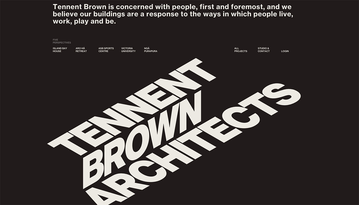
This first feature of the list is from an architect. The site has a witty typography that is designed to look a bit 3D. As you scroll down, the words follow the same pattern as if it is sliding on a box.
How The Party Started
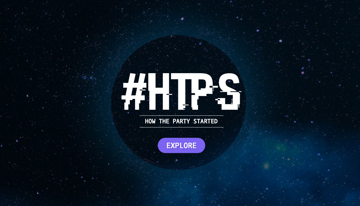
This site’s landing page brings you to a spacey place. It is then overlapped with a circular element and sans font with additional glitch effect for a technological/futuristic theme.
Toyota Barista
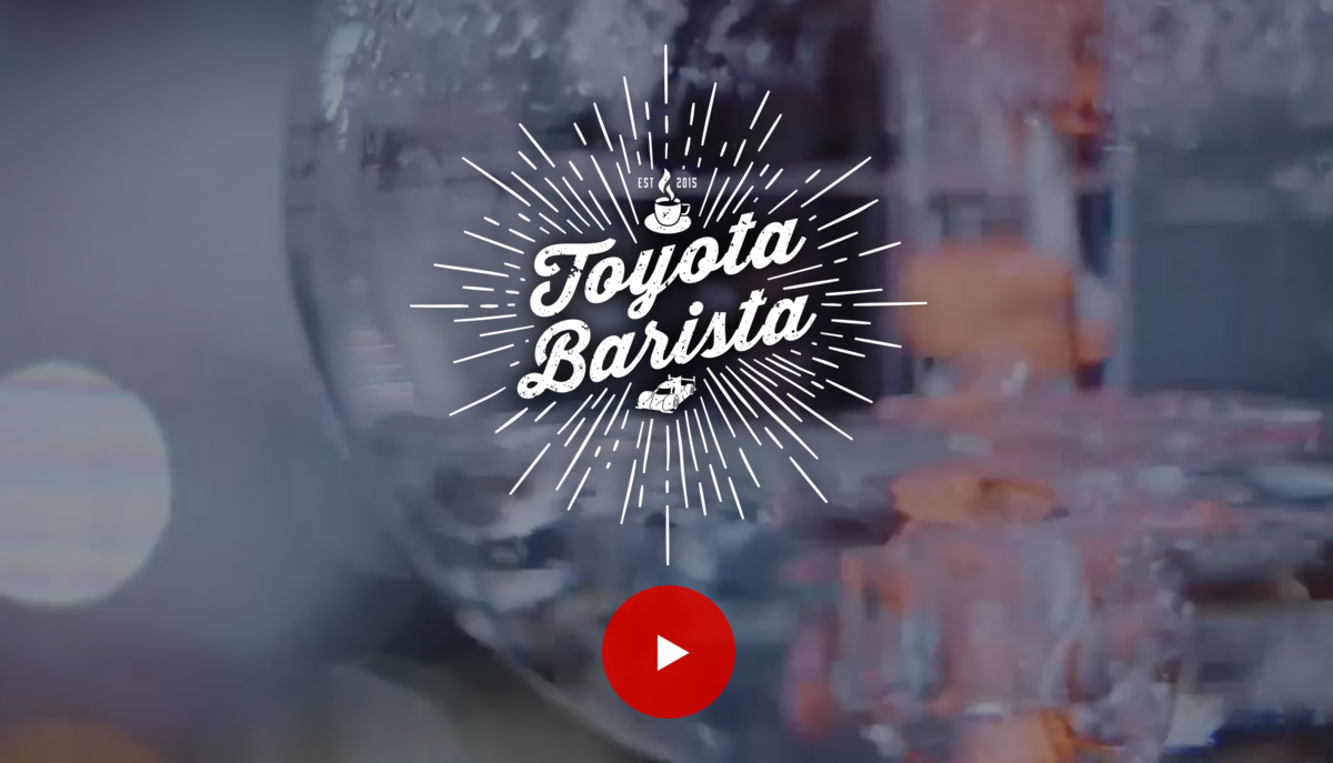
Toyota Barista incorporates a video header and is overlapped with a badge-style logotype. The typography also has a grungy effect to kick it up a notch.
Block16
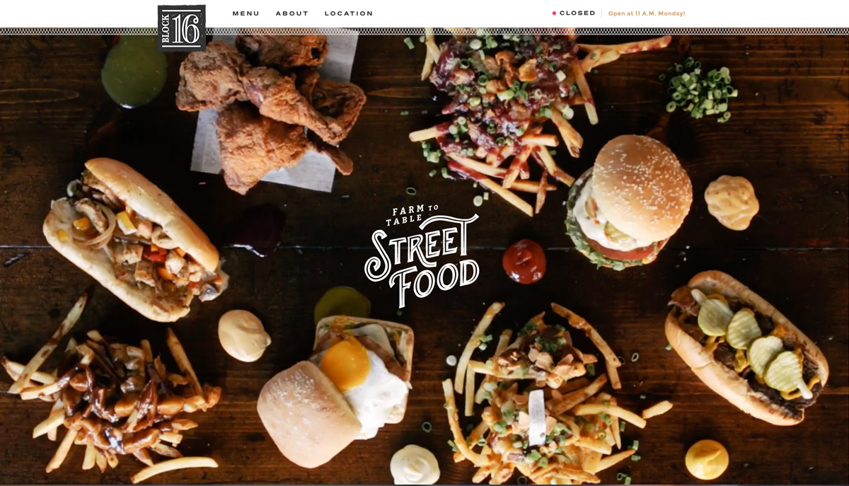
Block16 utilizes a white inline typeface that nicely contrasts on the background video of the header.
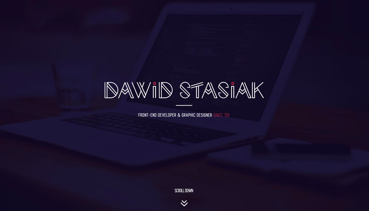
Dawid Stasiak
Here is a graphic designer portfolio that displays an elegant and artistic double stroke typeface. The font style gives a unique and creative impression to the visitors.
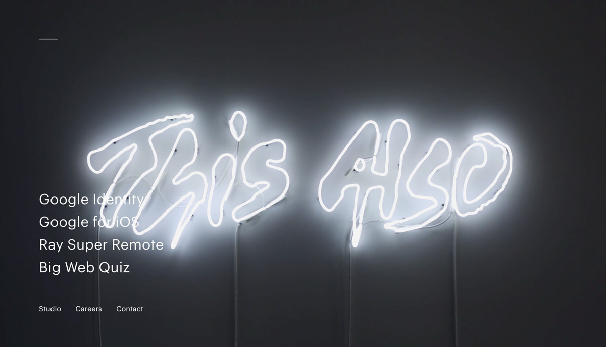
This Also
This Also is a creative studio that is based in New York. Their website also utilizes a video header and their title displayed in a customized fluorescent light.
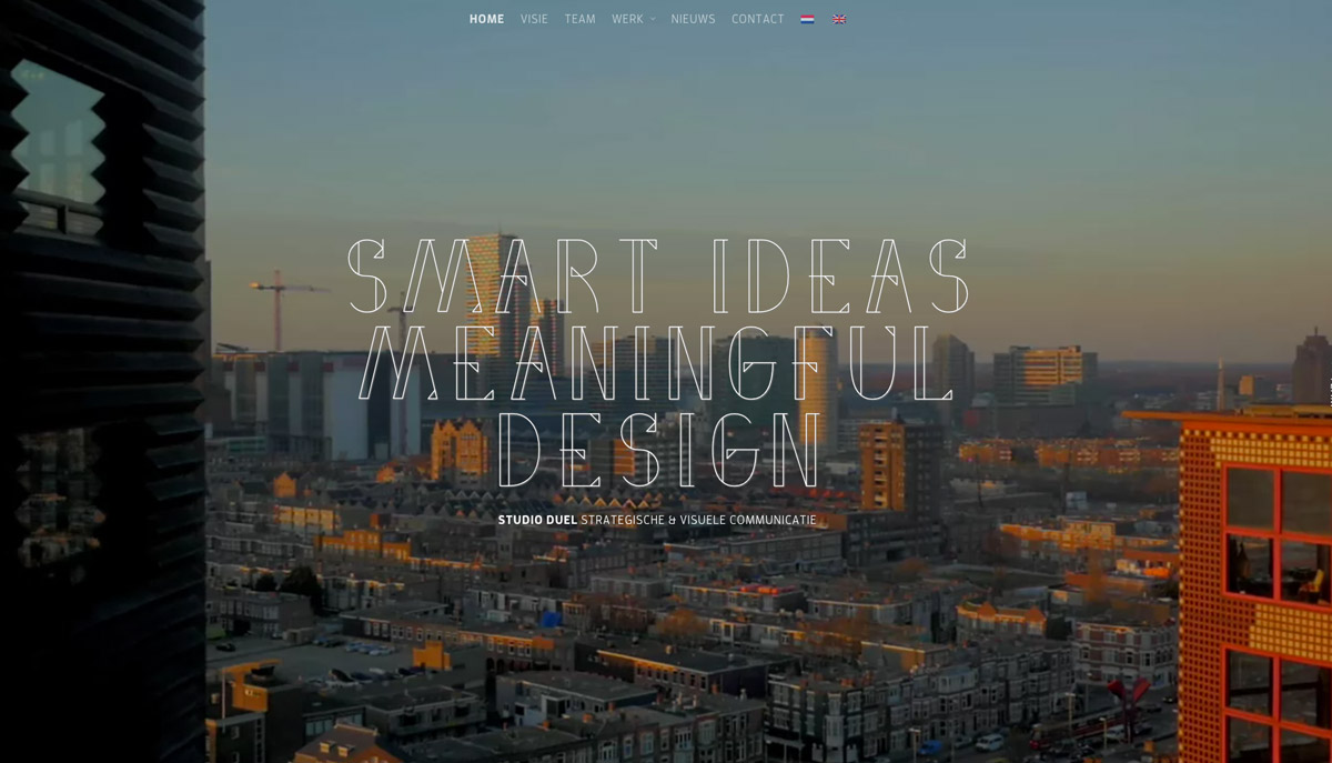
Studio Duel
Studio Duel welcoming page has a serif font style with a cute and pretty thin line design.
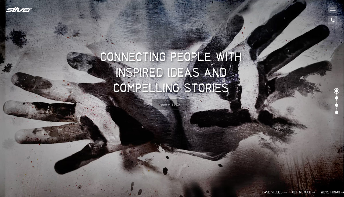
Silver
The typeface in this site has a grungy effect that fits nicely to the whole metallic design of the website.
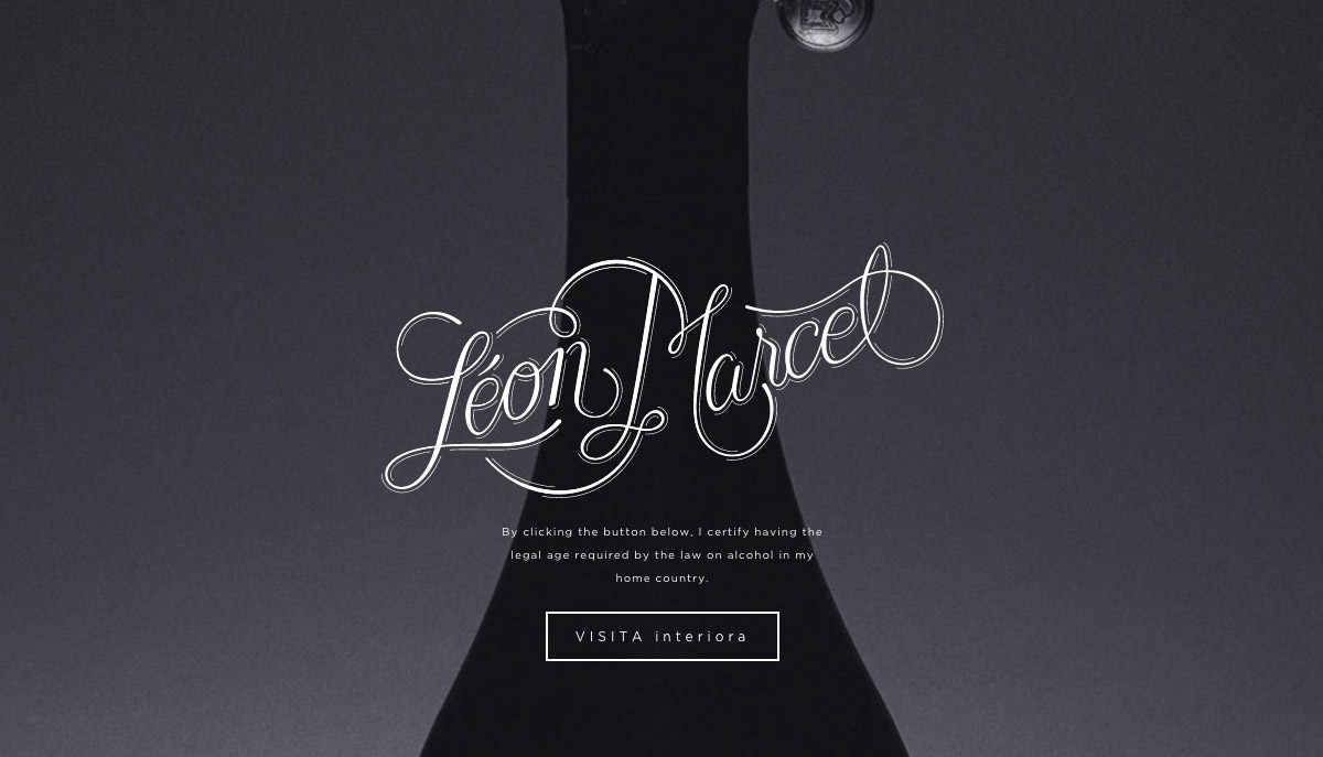
Leon Marcel
Leon Marcel website has a script style typeface that effectively brings a luxurious feel and elegance to its visitors.
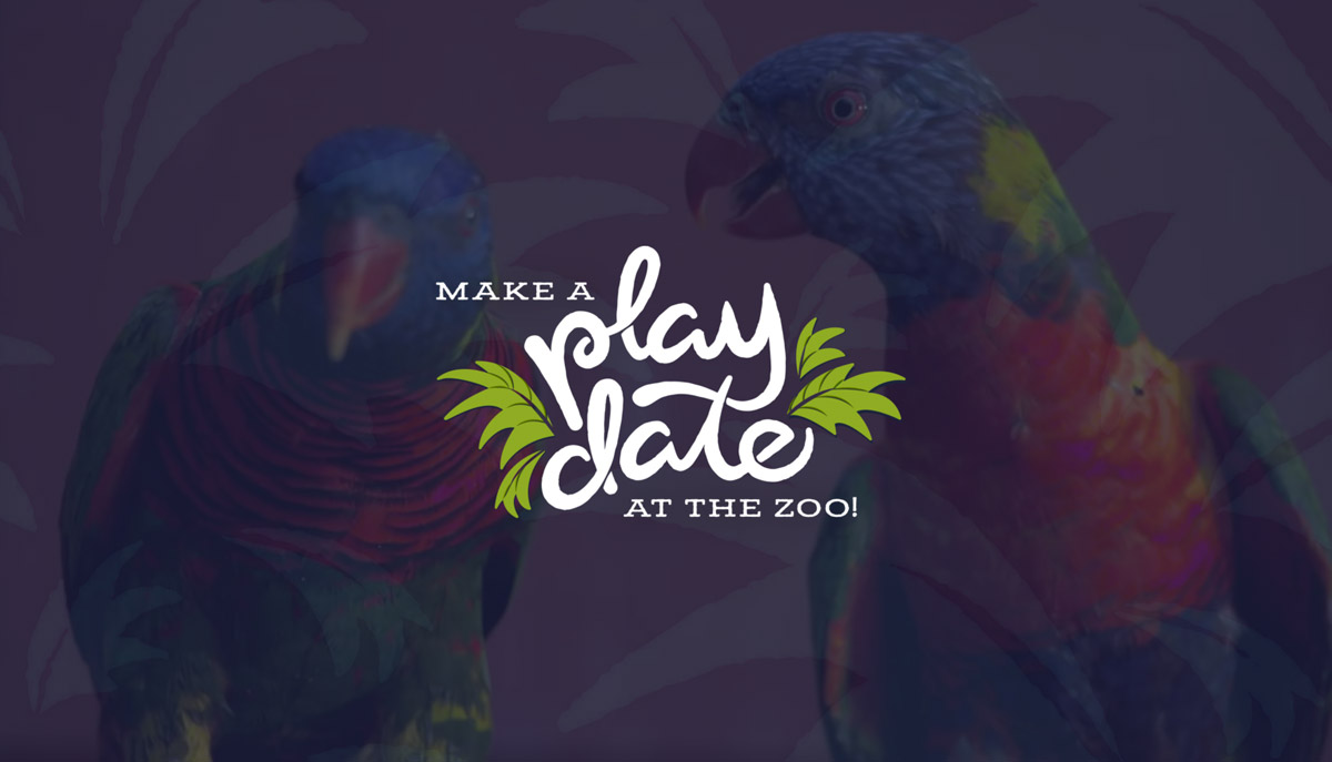
Zoo Play Date
Here is a cute typography that sets the mood for the website. It is even made more fun and exciting with the background videos of various animals.
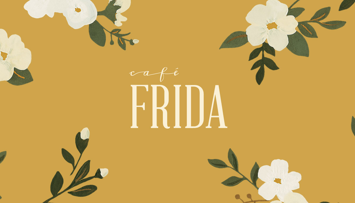
Cafe Frida
The website delivers a care-free design and nicely accented by the perfectly picked font style.
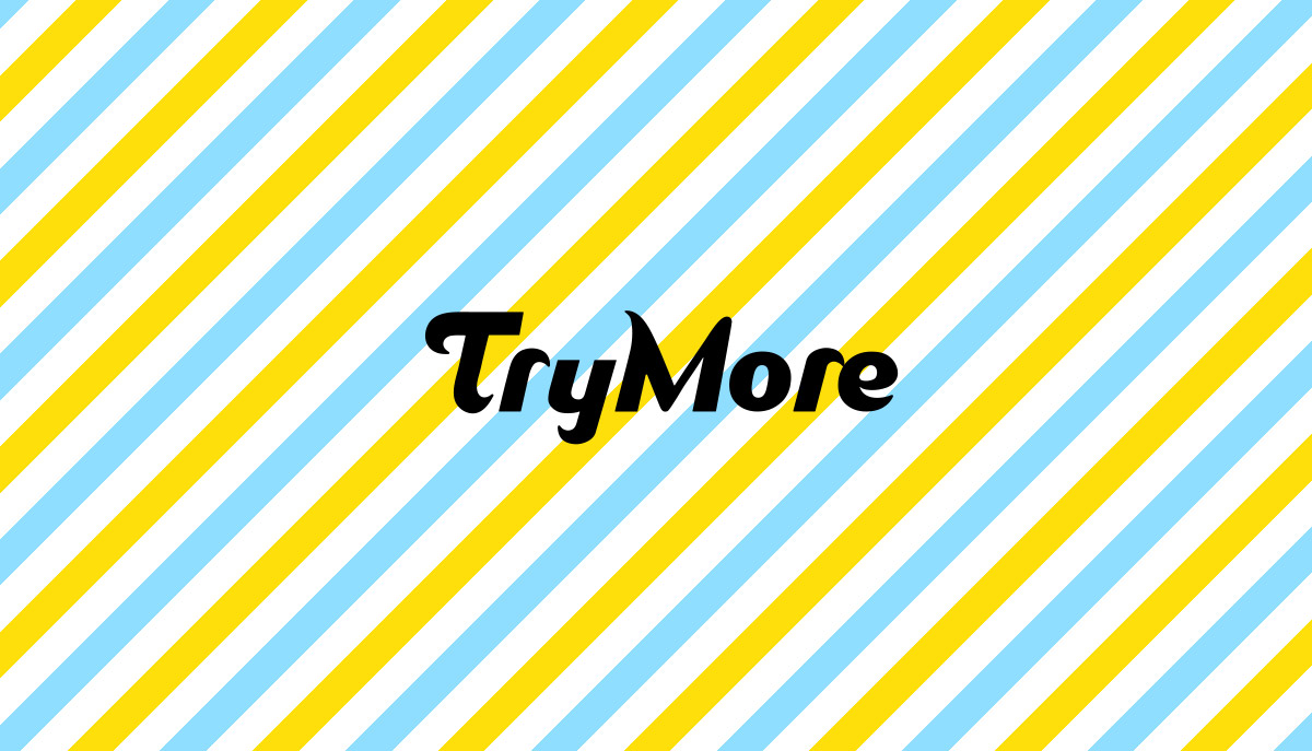
TryMore
Here is a fun and light-hearted sans serif font style that was used t the primary headline. It is even made animated to welcome you in an entertainingly creative way.
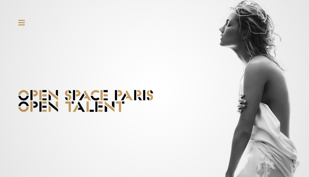
Open Space Paris
This next website features a stencil font style in two colors.
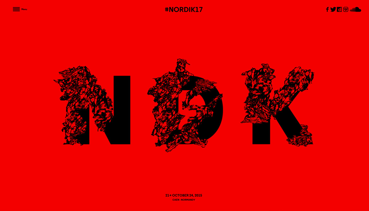
Nordik
Nordik’s website design goes for a minimalistic approach, making the necessary elements more noticeable. The typography in the middle brings the design up a notch with its abstract, fluid-like effect on the letters.
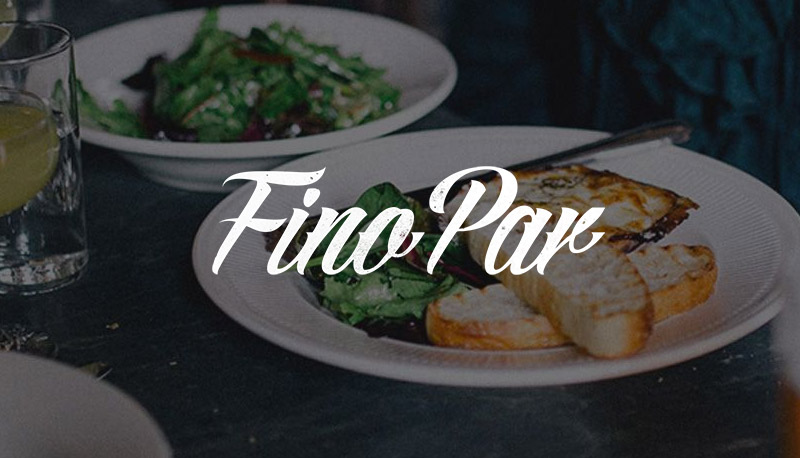
Fino Par
Fino Par is a restaurant based on Sydney, Australia. They’re one-page website utilizes a trendy design of using a big image for the header and overlaying it with a fine typography.
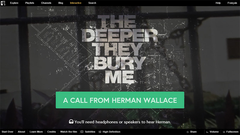
NFB/Interactive
Here we have another grunge style typography that is matched with an eerie audio to add to the total ambiance of the site.
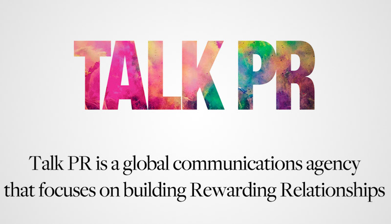
Talk PR
The bold sans font in this title is made very attractive with the image overlays.
Note: All visual content above is copyright to its respectful owner. Please read the Terms Of Use of these resources before using to prevent unwanted occurrences. NaldzGraphics does not claim credit nor responsibility for any images/videos featured on this site unless otherwise noted.
Have something in mind related to web design, freelancing, and other awesome stuff? Let us know and maybe we’ll feature it on our next post. All your comments and opinions are appreciated. Let us hear em up in the comment box. Thank you and see you again mate!


