Business’ etymology states its relation to being busy, may it be individually or as a group doing work to profit. With this thought, it would at once come into someone who’s business-minded to improve and make his business look appealing and will surely catch the attention of its target market. A Square-Type Business Card is one good answer to this when you just want it small, detailed yet appealing. So to profit, to gain and to always drift away from the old and welcome something that’s new so to improve and succeed.
Here’s something new for your business, 33 Collection of Square-Type Business Cards to give you more power to do better than best not just in your designs but in your business as well. People may have been used to looking at the usual business card shapes and for sure, they’d take a look at it and everything will follow! Enjoy and good luck for your Busy 2011!
You may want to take a look at the following related articles:
• A Showcase of Inspiring Business Card Illustration Designs
• A Collection of Photoshop Business Card Tutorials and Free PSD Files
• 30 Unique Examples of Transparent Business Cards
• Creative Examples of Round Die Cut Business Cards
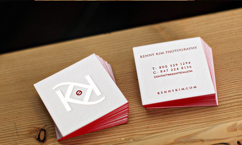
White on White Lettra Paper
White and red goes along very well and this is one perfect example of it even in business. A card as said by the artist must represent with all art the work you are into.
View Source
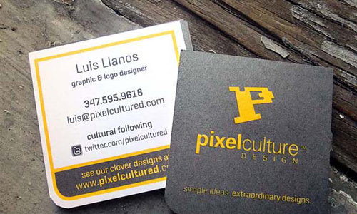
2×2 Square Business Cards
When you play with colors, it should blend with the others. This card emphasizes the details as having the font colored yellow and perfectly styled with round corners.
View Source
Slide Film Business Card
The uniqueness and own style of presenting your card captures viewers even investors. This opens the door to interest and query. A combination of a few images and some colors to blend makes it something to look forward to.
View Source
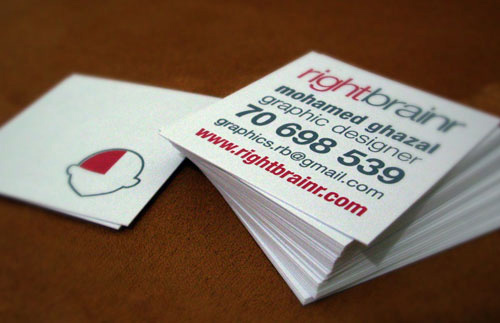
Rightbrainr Business Card
Kept simple yet attractive as the designer says and also the reason why there was the use of contrasting colors and topography as well.
View Source
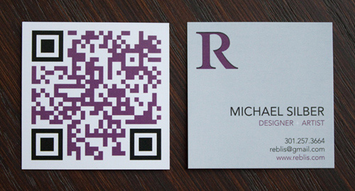
Reblis Business Card
Technology is indeed felt and seen which inspired this part of our collection. Simple but could capture clients.
View Source
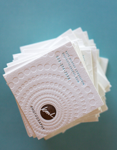
Dingbat Letterpress Card
Letterpress creations are good especially when you are branding a package. They leave a mark not just on the card but on the viewer’s creative minds.
View Source
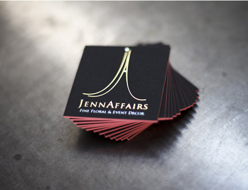
Foil Stamped Business Card
There is an advantage to thick business cards. They don’t get lost easily especially when the receiver or the viewer of the card really appreciates its quality. In foil stamped business cards, you may get the chance to put your own logo to leave a colorful and unique mark for your business.
View Source
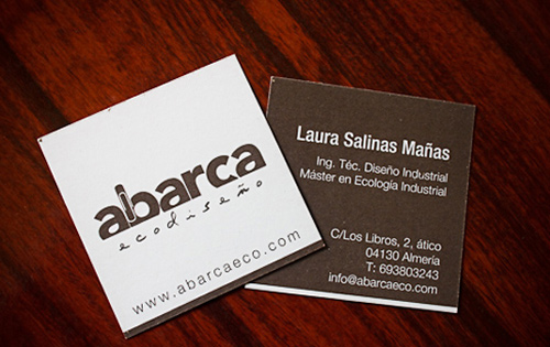
Eco-Friendly Business Card
Sometimes, clients have preferences for their business cards and usually, some who have that passion for design and the love for the environment, would take this design.
View Source
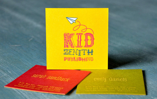
Kid Zenith Cards
Primary colors, when mixed and put into business cards look nice, don’t they? Not very usual but captures the eyes at once.
View Source
How I Made My Own Business Cards
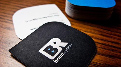
The author said it right when he said that business cards are very much essential as a part of communicating, networking and marketing. If you want it to earn good, you’ll want it look good too.
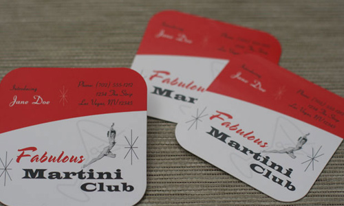
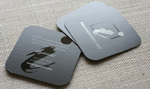
Cocktail
Cocktail designs doesn’t have to have much but just enough to make it look elegant and presentable. In photography however, art goes along with it. Simplicity and suspense brings curiosity to customers.
View Source
Chef Boulder
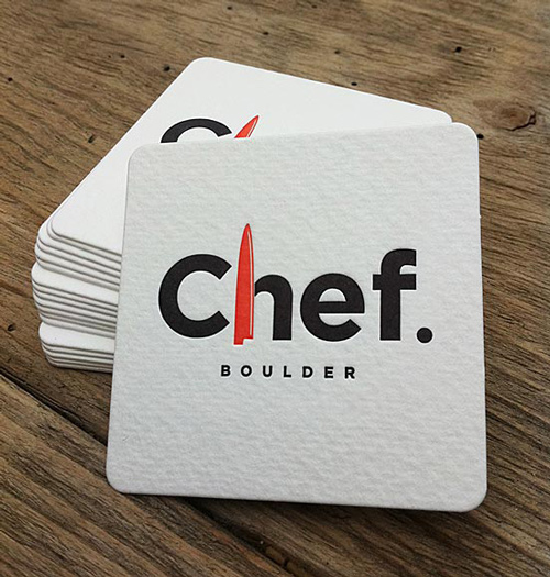
Textures and simplicity of designs couldn’t just cut the cost but could also create a good impression. Could also use letter press. A chef like designers have their own creative way of presenting their personalities and so do you.
View Source
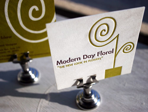
Modern Day Floral
You could both touch men and women by trying to be neutral in designing even if the business sounds feminine especially when it’s a flower shop. Target market of any business could be any gender too depending on the presentation of style.
View Source
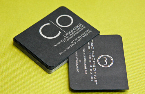
M3C Business Card
This design inspiration for a business card aims to target those who could dearly appreciate art and design. Again, simple but worth keeping.
View Source
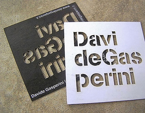
Davide Gasperini
When creativity is the topic, the art of subtraction and addition will also be good. All you just have to have is patience and determination.
View Source
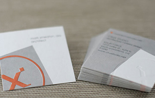
Crux 24pt Square Business Cards
Another work of art with only a few colors to make it look presentable and holiness with the cross at the corner. Orange will always be good in trying to emphasize something on your business card.
View Source
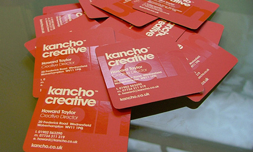
Kancho Creative
Red and yellow to make it look as though it were a poster, just small. In productions, there must be a drift from the usual for people to still take a look and even keep your business card.
View Source
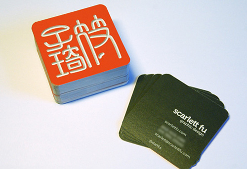
Scarlett Fu Business Card
Graphic designers don’t have to lavishly put many details for their business cards. Just something to capture, be understood and be able toinvite, you’ll be good to go.
View Source
GloCrazy Business Card
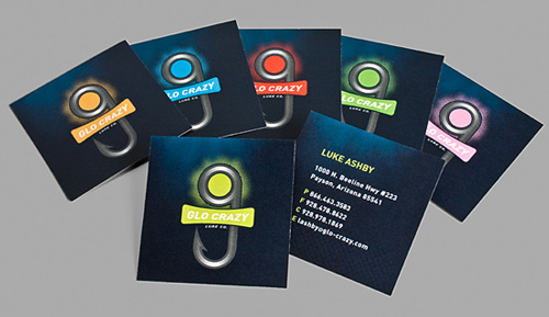
Business cards may also vary in colors so to cater to customers who love to collect items in color. Another diversion to what has been the usual and this one is a good example.
View Source
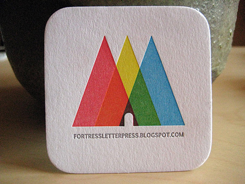
Fortress Letterpress
Another example of a letter press business card to market a site. It doesn’t have to be filled with so much style to be able to convey what’s there to promote so to give an element of surprise also to those who might want to check your site.
View Source
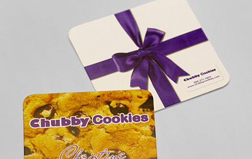
Chubby Cookies
Cookie sellers now also have their own ways in marketing their luscious products. Perfect combination for this one. Something that’s really inviting and could send your stomach to hunger…
View Source
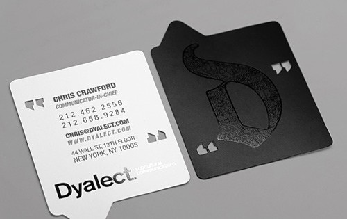
Custom Shaped
Symbols are a good emphasis in creating a square-type business card so to leave an impression and something to look for aside from getting just the number and the address to your office. Still square but a little customized.
View Source
DI MarQues
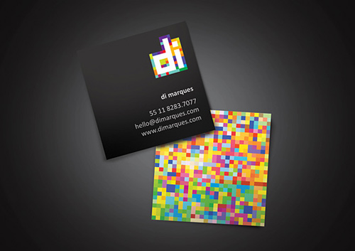
There are color lovers all around the globe. This design could reach out to them and push appreciation all the more. When you know how to really combine colors, that’s a big plus for you.
View Source
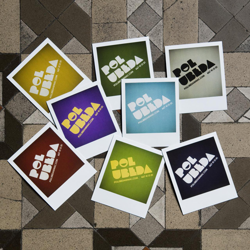
Pol Ubeda
Your business or even your design is worth an investment since it becomes the face of your passion. Should the cards differ in color, it already becomes the prerogative of the artist. Anyway, many customers or viewers would go for various colors. It seems happy to look at.
View Source
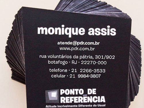
Brazilian Business Cards
This could have something that resembles with others but the author calls it “so yesterday” and what brings its uniqueness is what is called “what’s up!”. Once you’re a designer, you are able to interpret what this means and be inspired to even get a touch of the past and put something that’s new.
View Source
Square Business Cards
Creating designs could also be used as gifts and good for our sweet author of this design she gave us this idea. Love plus design equals masterpiece.
View Source
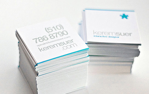
Square Business Card
The artist for this design calls this part of our collection as aesthetically pleasing. Simple yet the use of colors give comfort to the eyes.
View Source
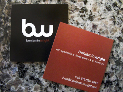
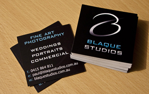
Square Business Card
Black is said to be beautiful and they mostly give appeal to those who look at them. Our 28th part of this collection did not miss this meaning. To make a difference, make it square.
View Source
Harry Potter Business Card
There are times when we need to get a glimpse of what’s hot on the movies or in bookstores to be able to invite. This “Harry Potter” themed square business card is not that stylish but meaningful.
View Source
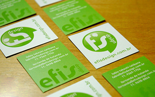
Efis Design Bussines Card
Lovers of green and modernity would dearly take hold of this design at once and may just add a few or make the same but a bit of a difference.
View Source
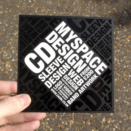
Cool Zaum Business Card
Typography still is good even in business cards especially when they are squared and more looked forward to by people not just by the size but because of its uniqueness.
View Source
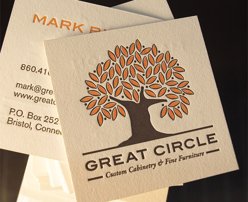
Great Circle
When trying to put weight on a product, you don’t have to hesitate to have it placed on your squared business card because it looks better having placed at the center. It is more understood what it’s all about the first glance.
View Source
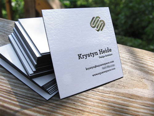
Squarespace
Another drift to uniqueness as the designer describes as a tool for self-defense because of its thickness. Another card worth keeping.
View Source
Only one word to describe this collection. A set of uniqueness that is. Looking at these designs, have you thought of your own to inspire and succeed?



Very cool, I’ve never seen a square business card before. They’re kinda like beer matts but with much better designs on them! Really like the Custom Shaped cards like Dyalect. Thanks for opening my eyes to something new.
wow a unique design of business card..cool list..
Best business card article, well done.
These is too cool and creative design of card, you just me an idea. Thanks for posting, cheers!
Cool cards, but what on earth does this mean, “Business’ etymology states its relation to being busy” ?
Seriously, who talks like that?
cool…. how to make it ya? is there any tutorial to make it?
very nice, elegant and practical card designs
coolest!!! i wish i could design my own style too
Thanks for featuring my business card! 🙂
Thanks for posting some of our business card printing
These are great – thanks for sharing them!
Thank you so much for featuring my card! I feel very privileged to be here 🙂
Thank you for the honor of featuring two business cards we printed at Studio Z Mendocino. Kenny Kim designed his own logo and I designed JennAffairs’s card and letterpress printed them. Bot have edge painting, which is such a flash of beauty. Thank you … Thank you!
From a design point of view I think some of these are outstanding, I especially like the texture on the Chef card – it smacks of quality. From a practical standpoint though, these would be tricky to use as many people use Business card holders to keep their contacts together, and these wouldn’t fit properly. Is that not a worry with square business cards?
Awesome collection! We have been visually inspired.
Most of these designs are really inspiring. I am very fond of paper with rich and natural textures. Thanks for sharing!!