In the business world, a logo is very important. It is an emblem or a graphic mark for a certain business and it is important that each logo is unique, memorable and original. Hence, they seek the help of logo designers who are well versed in the field with the hope that they will be able to give them a truly genuine design that reflects the nature of the company. Designers should be very careful then. But designers are humans and therefore commit mistakes. Here are common logo design mistakes that some of you might be guilty of.
1. Not making original designs.
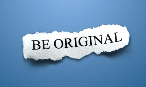
Image: ¡Hola! Oi! Hi!
Never copy other’s logo design. Remember that you were asked to make one in order to have a unique representation of their company. So do your task well by making your design original. You should be able to create something memorable for your clients.
2. Not conveying a clear message.

Image: DekAgil87
Avoid misinterpretations. Be sure that the business type and industry should be suggested by the design that you make. Do not mislead the viewers of the logo, mistaking it for something else.
3. Making a complicated design.
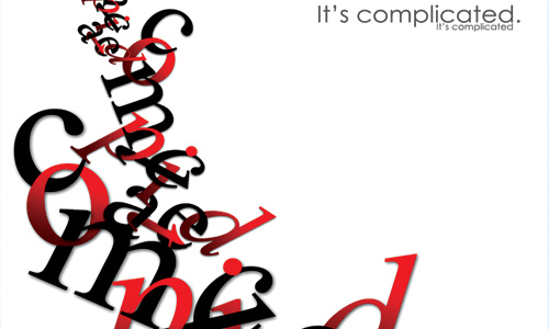
Image: mildmind2006
Avoid using too many details in your logo. Do not use so much words, taglines and many others. This won’t give a good appeal to your design.
4. Making too fancy designs.

Image: PaSt1978
Avoid using too much art and effects like shadows, bevels, textures and others. This might make your design look good but it might not appear the same when used in a larger scale.
5. Using clip-arts.

Image: Pkmahanand
Lazy designers would use readymade artworks but this wouldn’t give a unique impact to your design. Make original works for this is the main reason your client asked you to make a logo.
6. Not making a design suitable to different mediums.
![]()
Image: anasbox
In making a logo, consider the fact that it will be used in various mediums from t-shirt prints to billboards. So, make a logo that will look good wherever you use it.
7. Placing improper inclusions.
Image: Bluesky Factory
Even if clients actually do not mind if you put innuendos or insinuations like Co. or Inc., you do not have to put it in the logo.
8. Using too much abstract.
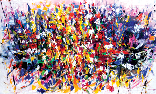
Image: zampedroni
Do not make a logo design with too much abstract for it will give an ambiguous message to many. Abstract logos actually give a good impact but do not use too much of it.
9. Avoid overdoing colors.
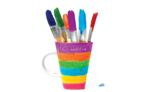
Image: LiiQa
Before making your logo, know and understand the nature of the company so that you could determine which color to use. Also, do not overdo with colors. But if your client requires you to do so, you may use many colors, just be sure to use the right combinations.
10. Typographic issues.
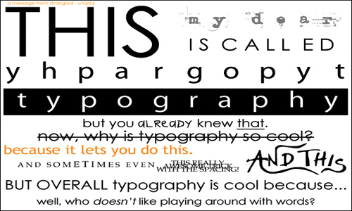
Avoid using too many fonts and weights. Do not use crazy fonts and also look into the right spacing and sizing. Use the right typography so that you could convey the right message.
11. Bad font choice.
Image: 33filtres
Choose the right font style for the business and industry you are making a logo for. Research various fonts or you may buy one from the internet and customize it. Play with fonts until you find the right one.
12. Using stock vector graphics.
Image: oxidizzy
Same as using clip-arts, stock vector graphics can be easily found and they don’t look good when used. Remember that a logo should be originally designed using Adobe Illustrator or Corel Draw and other vector graphics program. Make your own vector graphics and do not make raster images.
13. Keep it simple.
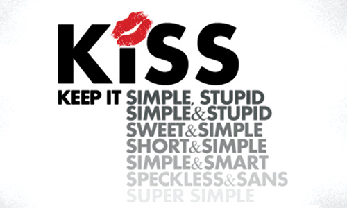
Image: 313pixel
Too much stuff in your design will only make your logo heavy and distracting to the eyes. Simpler designs look more professional.
14. Avoid visual clichés.

Image: mirc-mirc
Avoid using symbols and visual clichés like light bulbs for ideas or pencils for art. This wouldn’t make your design unique and original. You have to be creative as a designer.
15. Client issues.

Image: kgicgraphics
Instead of allowing your client to lead the way, offer you expertise. Be able to justify your design and also take into consideration some of your client’s suggestion by doing it with your personal creative touch. Another important thing is to have a contract with the client, thus, making sure that everything you have agreed before the start of the project will be done. This includes ensuring that they will pay you on time.
Indeed, some of the things mentioned above are sometimes taken for granted by some of us. But we need to be careful so that we could continuously satisfy our clients. You should also always put in mind the real purpose of having a logo so that you could make your designs based on that purpose. So, are you guilty of any of the abovementioned mistakes? Or do you have other logo design mistakes to add?


So should I avoid overdoing colors, or is it a mistake to avoid overdoing colors?
Hi there pcdaddy. As mentioned in the article, if your client ask you to work with lots of colors, that is fine but you have to make sure that you will use the colors correctly by considering color psychology and by using the right combinations. Overdoing with colors is not really a mistake if you know how to use colors properly. Remember that the most memorable logo designs are those which are most simple. Thanks for reading!
Also consider, the more colors used, the more expensive it becomes to produce that logo in print. General rule of thumb is never more than two colors so that clients can keep print jobs down to a 2-color printing cost. I was taught to first design logos in black & white, and only if they shine in that arena, can you begin to consider adding color. But look at the most widely known logos out there–most are 1-color.
Number 6 is a good one to remind people of. I see a lot of logos that were designed just for digital use, with no print design in mind. I like to design in black and white first, then move into color once it looks good in black and white.
Great article.
Client issues are the worse. I think I will be showing every client I have this article
Thanks for sharing good ideas with us..
I think it is also important to listen to what your client will be using the design for. You could make the most beautiful unique logo ever, but if there is 40 colors in it, its going to cost a fortune to make something as simple as business cards. This is a great list of things not to miss though.
Thanks,
Nathan Marcarelli
Small Business Web Design
Maybe I’ve had mistakes like some of these, but it’s up to the client to decide what kind of a design to accept, but thanks for the reminder…
Most of the times, you cannot argue with the client. No matter how one tries. But it is still not up to the client. We should try our best not to give in to what the client needs. If the client wins because he wants what he wants, then okay fine. Many times you end up not showing the resulting product…
Regarding this point (number 4) “Avoid using too much art and effects like shadows, bevels, textures and others. This might make your design look good but it might not appear the same when used in a larger scale.” It is not just about looking good or not. To print with such effects mostly require full color jobs. Aside from the cost aspect, this might affect the consistency in the identity of the company. CMYK printing can vary from printer to another, even from one printing time to another at the same printing press. I personally prefer the choice of pantone colors. Simple clean designs that are one color, 2 color jobs…
Full color jobs are more suitable maybe for the web, or for logos applied in a specific place; where you don’t have to worry how it would look like if it is to be on a bigger or smaller scale or printed on a different medium…