
404 page is a dead-end in your website. Landing on this error page can cause a bad user experience for your readers. This may cause them to go back to your homepage with dissatisfaction, or go to other competitors’ websites, or worse, avoid your site entirely.
It goes without a saying that these instances should be avoided, and yet it happens to the best websites out there. So, it would be wise to have a workaround to this in order for you to deal with its effects to your visitors and your site.
In this article, we will guide you through 404 page (what it is and why it occurs), how to deal with it, and show you beautiful examples at the end to give you some great perspectives on what an effective 404 page would look like.
Understanding The 404 Error
To start off with our guide, let us first understand what a 404 page is and when it can occur.
What Is It?
In technical terms, 404 error messages indicate that the client was able to communicate with the server, but the server was not able to find what is being requested.
In other words, the website can’t find what is being searched for by the visitor.
When Does It Occur?
An error 404 may occur when…
- • A page has been removed from the website.
- • A page has been transferred to a new URL without redirecting the old one.
- • The URL has been renamed.
- • The visitor mistyped a URL.
- • The page or file is temporarily inaccessible due to maintenance or server upgrades.
These are just a few of the many causes of having a 404 message.
When users land on a 404 page, there’s a high chance that they would leave your site immediately. This will increase your site’s bounce rate and affect your Google search rankings, not to mention losing a potential regular visitor.
Creating An Engaging Custom 404 Page.

As a designer, this is where you’ll do best. You have the power to lessen the bad user experience for your visitors and help them get to where they want to go.
But before we tackle on what makes a custom 404 page effective, let’s first discuss why you need to have it in the first place.
Why Is It Important?
1. It can offer assistance to an unhappy visitor.
Of all the reasons, this is the most vital.
Surely you have experienced a time when you opened a link on a website to see something interesting, and then, boom, a 404 error message shows up telling you that it’s no longer available.
Remember the feeling? That’s what your visitors will feel when they experience this on your site. That’s why it is important to have a custom 404 page that will help them get to where they want to go or else they will leave your website in a snap.
2. It is an opportunity to show your website’s personality.
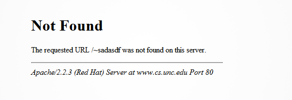
Imagine your visitors will be brought to a page with only this image. Not only does it show a dull and lifeless design, it will also definitely make them feel confused, disappointed, or plainly annoyed.
You can avert or at least mitigate this by having your own custom 404 page. It will tell a clue on what your website is all about.
For example, if the website is for a company, the 404 page may be designed to look more professional and related to their business.
Empire CAT
Here is an example of Empire CAT’s 404 page. It has a background image of their factory that gives you an obvious hint on what their business website is all about.
It also includes helpful elements that we will discuss later on.

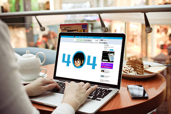
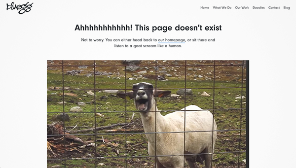
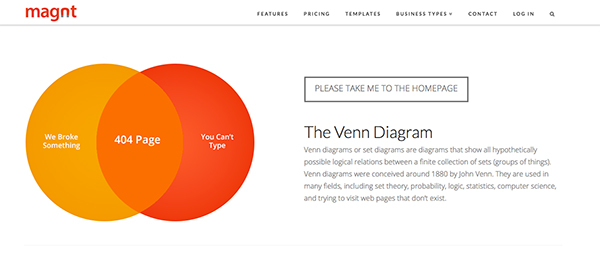
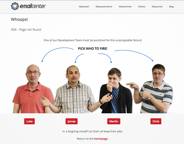
For websites that are into humor, the 404 page may have some puns and funny jokes to lessen the feeling of annoyance and disappointment.
Here are a few examples:
Bluegg
Magnt
Emailcenter
Our main goal in creating a custom 404 page is to keep the visitors from going out of your website or at least mitigate their annoyance and not-so-great experience.
The Essential Elements For An Engaging Custom 404 Page.
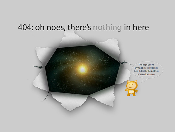
1. A friendly error message
You don’t want the visitors to see a page filled with jargons that are hard to understand. This can make them confused, or worse, panicky that they will immediately head to the back button of the browser.
Instead, go for a message with a human touch such as ‘Uh oh’, ‘Yikes’, etc. You can even put apologetic words such as ‘sorry’ for the bad experience.
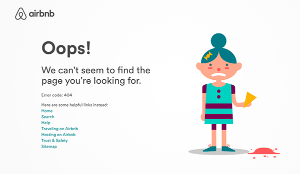
Examples of 404 pages with light-hearted messages:
Modcloth
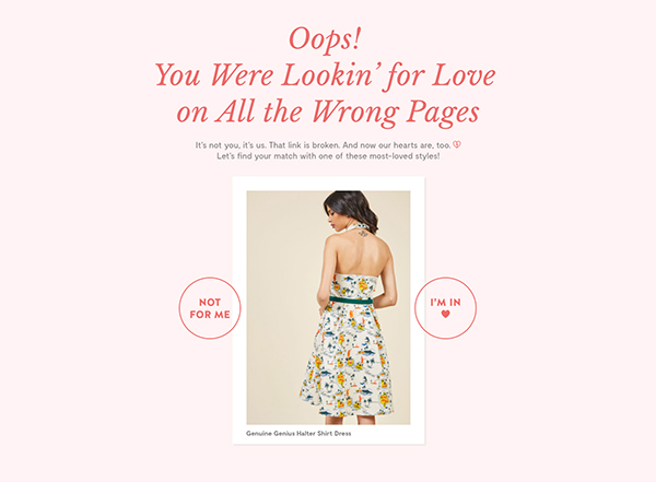
RPZ
Airbnb
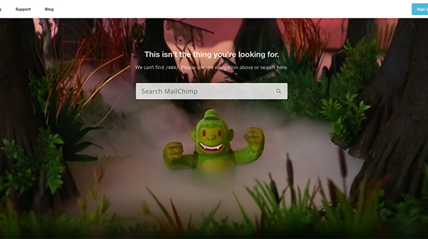
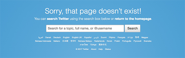
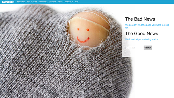
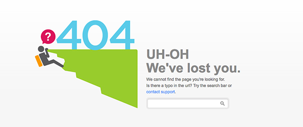
2. Search bar
Your search bar will simply give your visitors an option to continue browsing your site (to find what they are looking for) instead of them going away. It must be located somewhere that’s easy to see and also add a message that encourages them to use it.
Examples of 404 pages with search box:
MailChimp
Twitter
Mashable
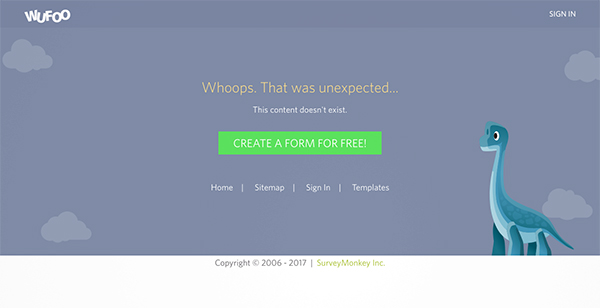
3. Other useful links
You don’t want your visitors to leave your site after a 404 page landing? Point them somewhere else in your website. Your homepage, about page, portfolio, popular/recent posts, and archives are a great start in helping them to reengage to your site.
Add these links in a neat, suggestive manner so they can have some useful links to work on.
Examples of 404 pages with useful links:
Wufoo
Flixelpix
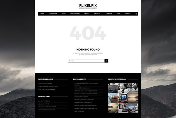
Duoh
4. Contact Options
Also, let your visitors get in touch with you by adding a contact link on your 404 page. There they can submit their report on a broken link, which is good for you as you can be aware of the problem and take action.
This can also help them relay their concerns and complaints. In a way, it can be an outlet for them to release their feelings from the unhappy experience.
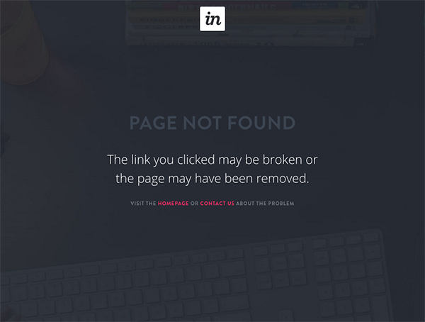
Examples of 404 pages with contact/report options:
Invision
Fitbit
Good Old Games (GOG)
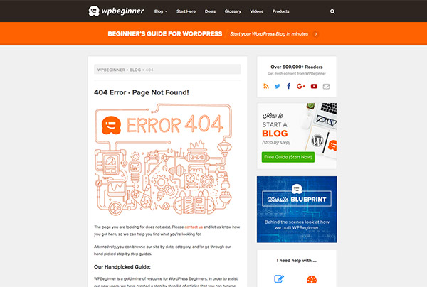
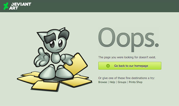
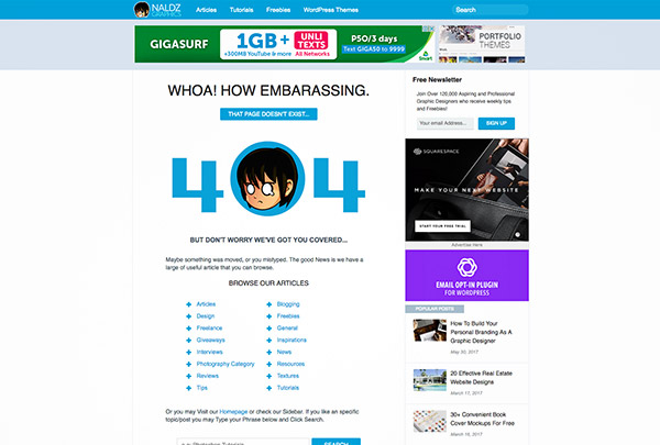
5. Resemblance with your website
Default 404 messages are generic, ugly, and upsetting for most users. This alone is enough reason to create a custom error page for your site.
But in doing so, make sure that its design should still look like its still part of your website. This will lessen their confusion and dismay.
It should contain the same color theme, logo, and main navigation of your website to make them feel that they’re still on the page and not thrown out to some white world of the 404 void.
Examples of 404 pages with resemblance to their website:
WPBeginner
DeviantArt
Naldz Graphics
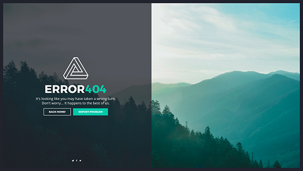
10 Creative Examples Of 404 Page Designs
Now that you have a good grasp on what an proficient custom 404 page is, it’s time to show some creative examples that have striking aesthetic designs. Enjoy and be keen on what elements each of the examples use.
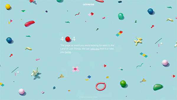
Universe.com
Universe is a social marketplace for events. Its 404 page is designed with a playful background pattern of balloons in various colors. This makes the error page less daunting and easier to deal with. It uses a light-hearted message and puts on links to its support center and homepage. Also, it still has its logo on the top-center portion.
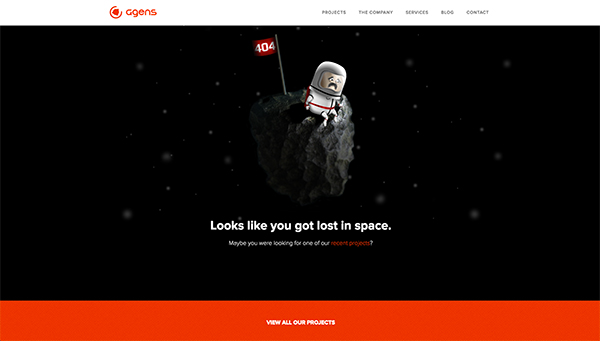
Agens.no
Agens’ design shows an astronaut being lost in space with a ‘404’ flag. It still retains its header bar that contains its logo and other navigation links. It also offers an option for their visitors to check out their other projects.
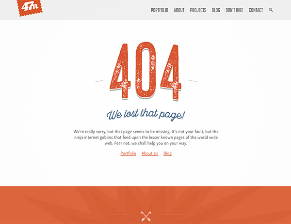
Fortysevenmedia.com
Here Fortyseven Media shows us that a simple design can also make a 404 page less intimidating. The typography design in the ‘404’ is similar to its website’s standard design – eroded, grungy texture in orange fill, making it look like its part of the site. It also preserves its navigation bar and includes links to its portfolio, about page, and blog.
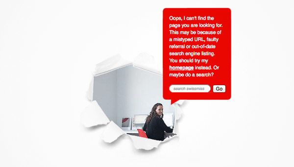
Swiss-miss.com
Swissmiss is a design blog owned by Tina Roth. Its error page also has a very simplistic yet creative design. It shows her behind a ‘torn’ hole in the page delivering a friendly error message as well as offering a link to the homepage or using the search box.
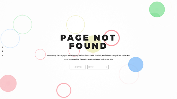
404
Here you have a pack of 404 templates designed with various background animations. It contains a friendly and apologetic message followed by options to go back to homepage your use the search box.
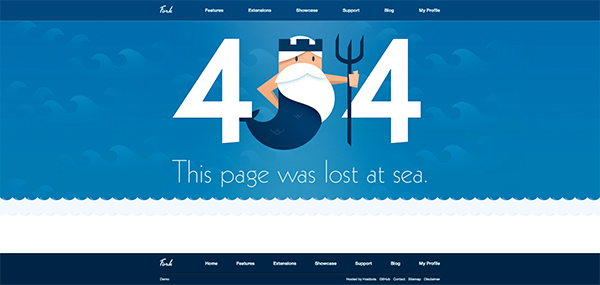
Fork-cms.com
Fork is a great example of making your error page similar to your website’s design. It totally uses its brand by using the site’s color scheme, background image, and its mascot.
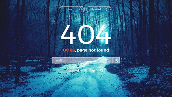
Lost In Forest
This one is a beautiful aesthetic template that will definitely make your error page stunning – in a good way. It offers various options to the visitor such as homepage, return back, search box, and social media links.
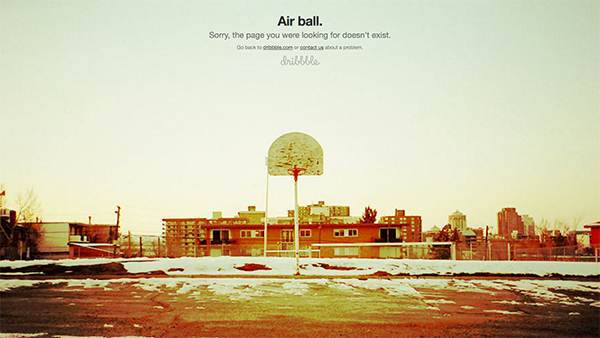
Dribbble.com
Dribbble comically correlates its error page to its basketball-associated jargons. It has a background image of a basketball court and uses the term “Air ball.” Instead of the standard “page not found”. It also includes suggestions to go back to its homepage or contact them.
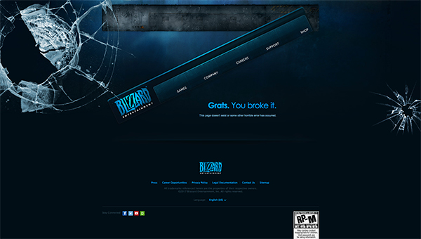
Us.blizzard.com
Blizzard humorously displays a broken screen as a metaphor to the broken link. Though the navigation bar seems it be out of order, it still works perfectly.
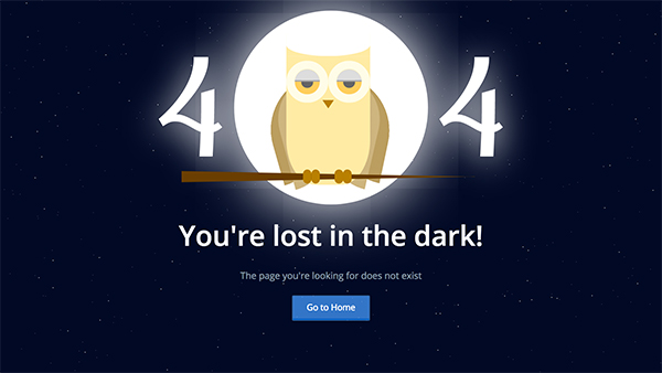
Animated Animals
This premium template pack is built in pure CSS for a very fast loading speed. It includes 2 animals (dog and owl) with unique and amusing hover animations.
Going Forward…
Having a broken or missing link is almost impossible to avoid in a site with a lot of contents. But that doesn’t mean there’s nothing we can do about it.
Examine the elements and examples that we have shared above to help your visitors avoid a dead end when faced with a 404 page. Turn the situation around by giving them a pleasant aesthetic design and other options to help them find what they need.
Do you already have your own custom 404 page? Or you have helpful tips to contribute? Share it on our comment section. We’d love to see it!


