It can be a challenging task in thinking of ideas to create a niche web design for vineyards and wineries that are venturing online. Everything has to be considered such as its visual design, UI layouts, responsiveness, etc. It can easily become overwhelming especially if you have to start from scratch and have no idea where to start. Luckily, there area a number of ways to overcome this difficulty, and one of them is looking for great web designs that can give you fresh ideas and fill up your inspiration tank to get you going.
So we have ran through the web to look for the best examples of Vineyard and Winery Websites that will give you such designs to admire. Alas, we were able to found them and put them together in this post for your easy viewing. Scroll down and check them all out below. Come, take a peek, and engage your creativity and imagination.
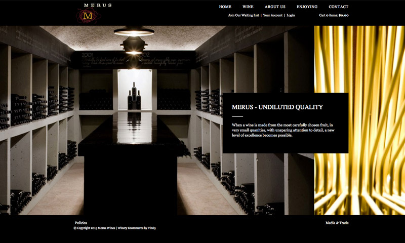
Merus Wines
Merus Wine is a winemaking company and this website is powered by Vin65, a winery ecommerce firm. The web design incorporates a large image background of a wine storage. The dark setting makes the site’s ambiance more elegant and sophisticated.
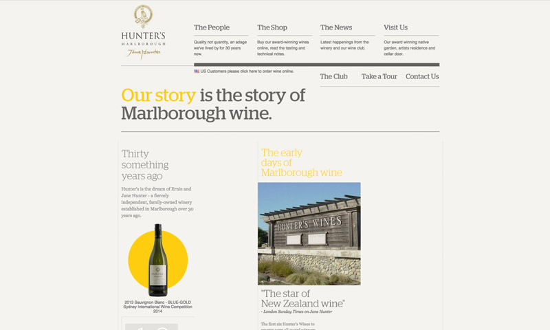
Hunter’s Wineshop
Hunter’s Wineshop exhibits a light minimal outline design in its website where the homepage tells the story of the business’s history. The storyline illustrates how they started and how it came to be with supporting images.
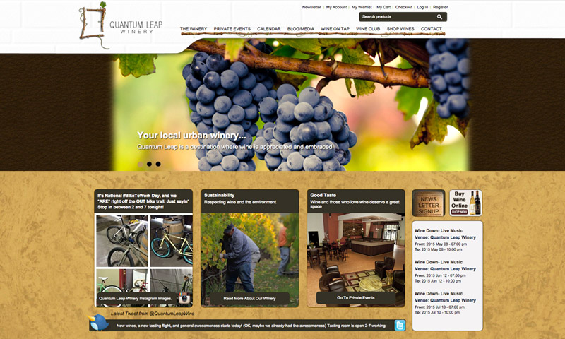
Quantum Leap Winery
Quantum Leap’s website design utilizes various elements such as textures and patterns, which adds some depth and accent as background fillers. It also has slider element that displays catchy photography.
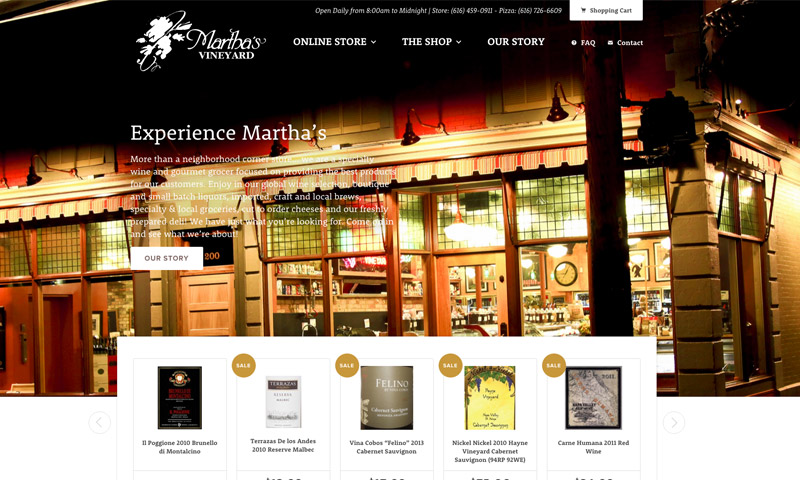
Martha’s Vineyard
Martha’s Vineyard incorporates large background image of their store. Just below it is an ecommerce slider that displays their products along with their respective prices. Its online store is designed in a minimalist ambiance and a grid-style layout for the products.
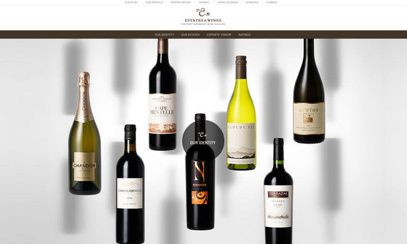
Estates & Wines
This website has an age verifier that asks for the visitor’s Age before entering the homepage. This makes sense as wines are also alcoholic beverages, and it is mostly for adults only. In its homepage, it has a screen-wide slider that displays images of its wines and vineyards.
Wente Vineyards
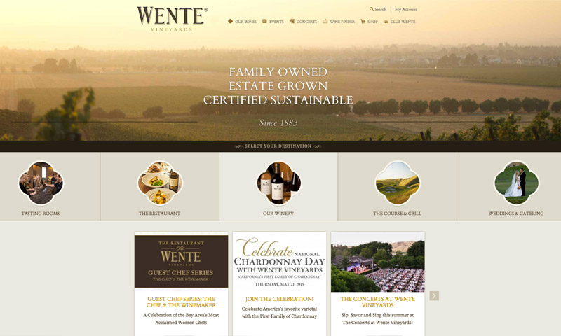
Wente Vineyard is a family-owned wine business that offers their many products and services. In their website, you’ll find a brown-themed web design that features a big background picture of their vineyard at the top of the page with a selection of their available services, and a slider that presents their upcoming events and as well as their many achievements.
Gainey Vineyard
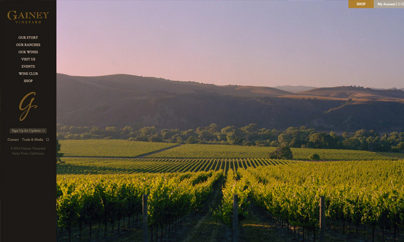
Here is another example of vineyard website that uses a big photography of its vineyard as a background that covers most of the page. The navigation bar is placed at the left side of the screen to help you browse through the whole site.
Blue Mountain Winery
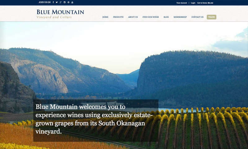
This next site is packed with a huge slider presenting big background images of vineyards with textual introductions for the visitors. Blue Mountain Winery also uses parallax scrolling with the images and ends with a map showing their location at the bottom of the page.
Jackson-Triggs
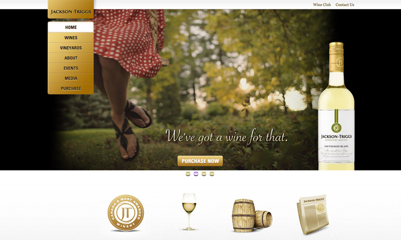
Jackson-Trigg’s winery website has a classy vintage ambiance with the help of vintage icons. At the top of the page, you’ll see a slider showing images and wine bottles, as well as the navigation bar that hangs on the left part.
Casa Larga
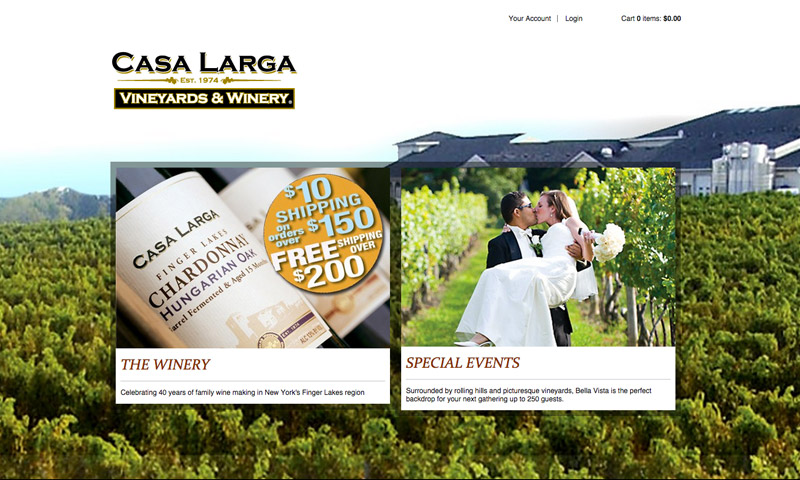
Here is another vineyard and winery website with the usual background image of its vineyard. It is a relatively simple design with the navigations located at the bottom in a solid black background.
Franklin Hill Vineyards
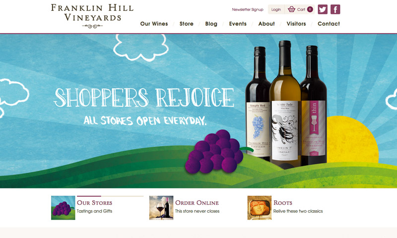
Franklin Hill Vineyards’ website has a clean and elegant design with a slider at the top displaying its products. Below it is a horizontal scrolling ecommerce layout that presents the wines, which are categorized red, white, and other. It also contains featured articles from its blog about wines, recipes, etc. At the bottom is the contact information with the location map.
Jax Vineyards
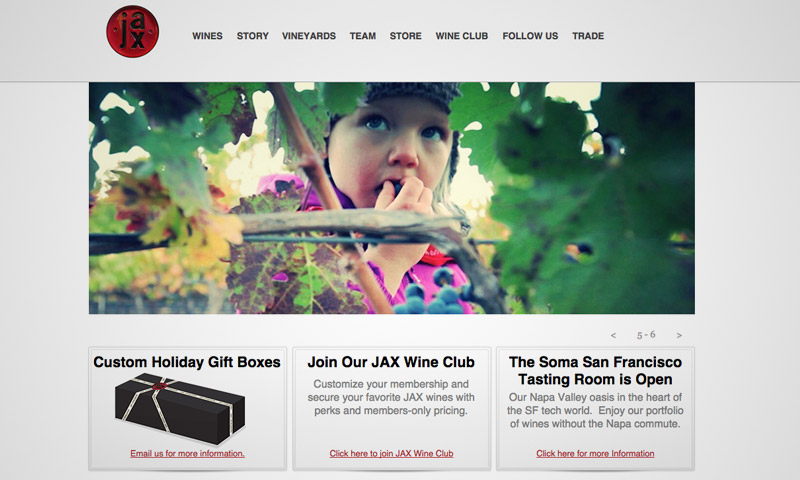
Jax Vineyard has a simple web design only using a set of images for the slider, a navigation bar at the top, square elements with call-to-action buttons, and a footer that contains its contact information.
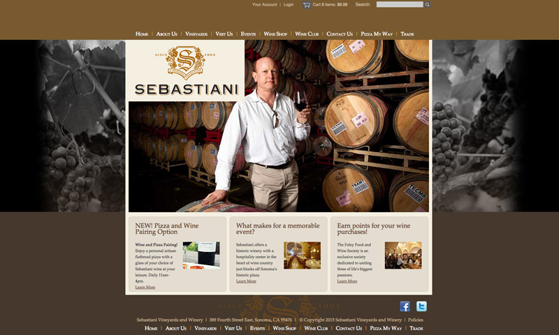
Sebastiani Vineyards
Sebastiani has a brown-themed website that has a slideshow of images that displays the lovely vineyard and warehouse where wine barrels are stocked. It also
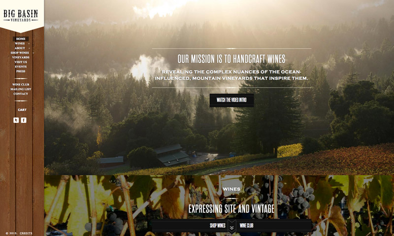
Big Basin Vineyards
In this website, you’ll also see images of lovely sceneries being used as an effective background. The navigation bar is located at the left part of the screen. At the top, a link to an introductory video is available for new comers.
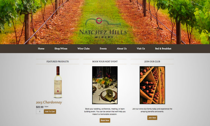
Natchez Hills
This next web design has its vineyard photo placed in the header of the page. Just below this is the navigation bar where visitors can browse through the shops, wines, clubs, events, etc. At them bottom is a sitemap for the readers’ easy access to the website’s pages.
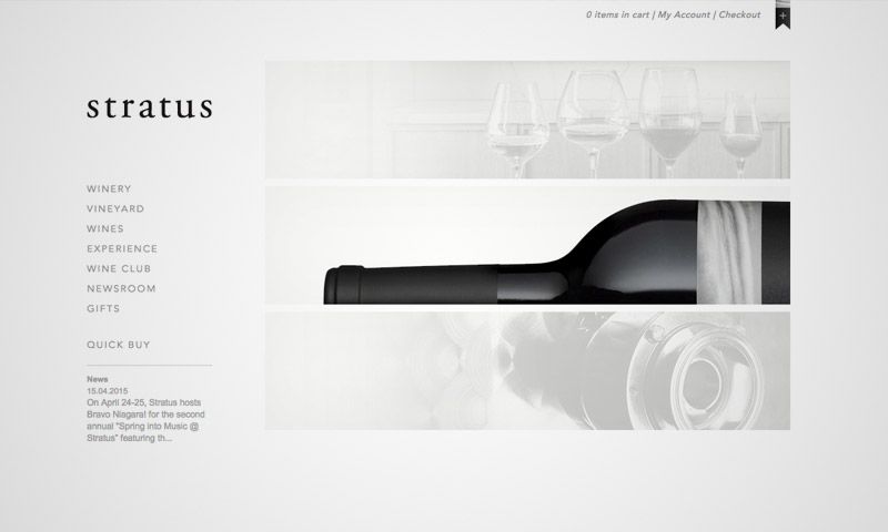
Stratus Vineyards
Stratus demonstrates a winery website with a clean and minimalistic design that readers can admire. It also has its navigation bar at the left side with three images that can be expanded to show texts that further promotes the brand. The overall design exhibits a classical and elegant ambiance for its visitors.
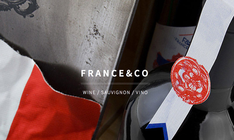
France&Co
Here is a French-inspired web design for a winery website. It consists of a full-screen background image with an interesting vertical scrolling layout that shows the product along with its picture gallery. The bottom part is where the contact information and social media icons are placed.
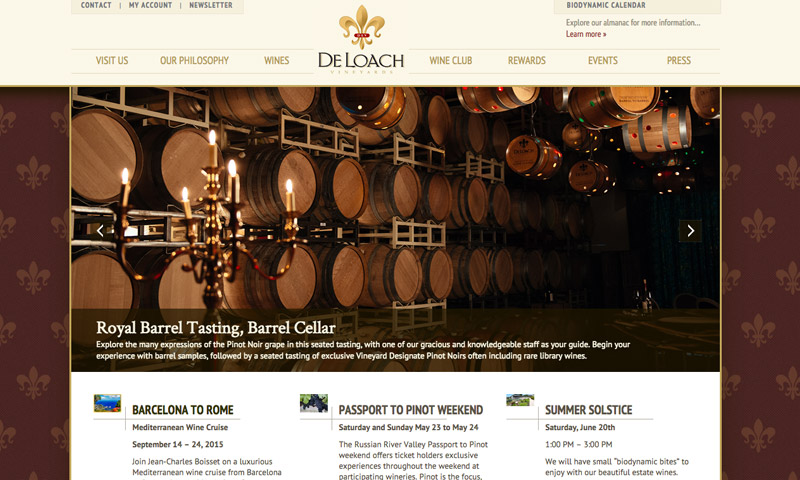
DeLoach Vineyards
Deloach Vineyards is also using a slider at the middle of the page that shows various images related to wine. Also, a navigation bar is at the top with drop shadow effect, and a fleur-de-lis pattern as background filler, which gives a more sophisticated feel to the design.
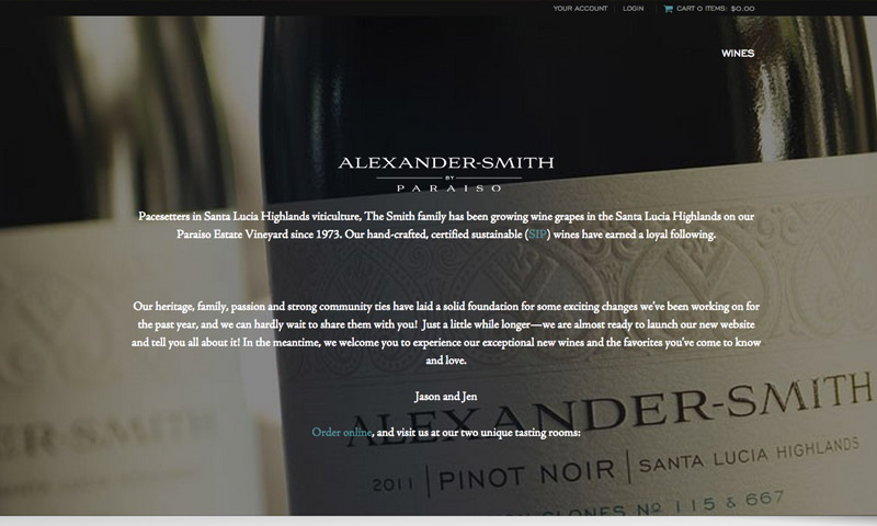
Paraiso Vineyards
This website has a nice big image of its wine bottle that is used as a background filler. On it is text paragraphs that tell a brief story about this family business’s history. Below it shows the location of the tasting rooms.
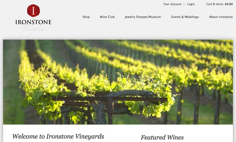
Ironstone Vineyards
Ironstone Vineyards’ website also goes for a clean and minimalistic design. It only contains the fundamental elements including the navigation buttons, logo, a layered form in the middle with a drop shadow.
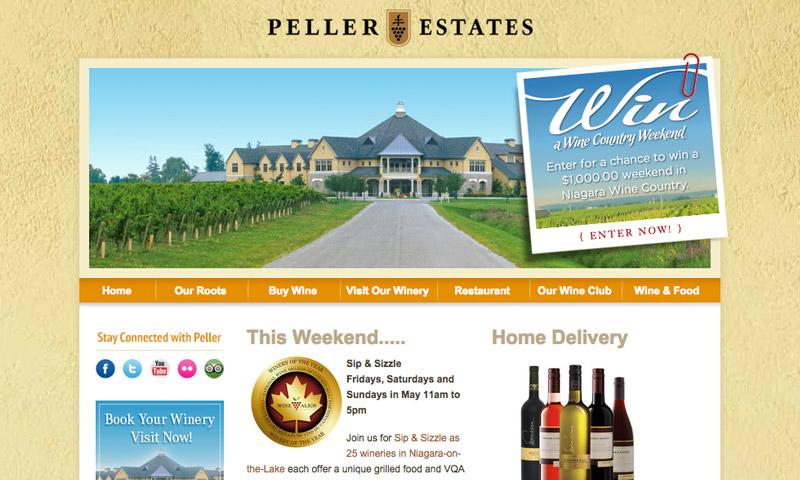
Peller Estates Winery
For this site, a dark radial gradient is used in the background, with a page template that consists of image slideshow, navigation bar, and a grid layout that displays events, wine products, and wine clubs.
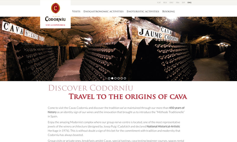
Codorniu’s Cavas
Codorniu has a clean website design that utilizes a wide slider with historical images and also incorporates a gird layout for its images, products, and events.
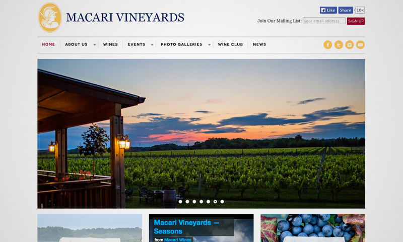
Macari Vineyards
Macari Vineyards’ design also has a clean design with nothing but only white background. However, the layout is using a knolling method that makes the design neat and organized – ultimately making the page more appealing to the eyes.
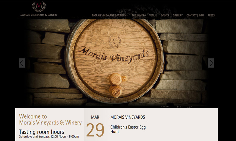
Morais Vineyards
The top part comprises a large slideshow of lovely photos that are made more mesmerizing with a zoom-in effect. When you scroll down, you’ll see a parallax effect being used as you approach the bottom page where a contact form is in place.
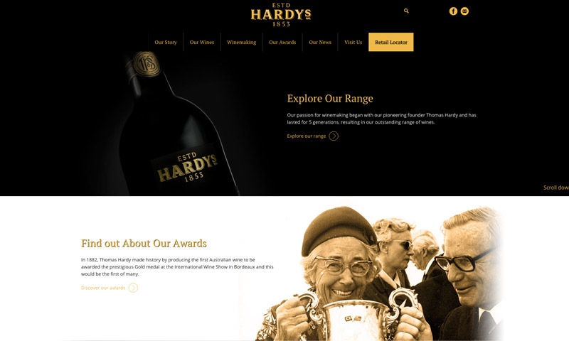
Hardys
Hardys Wines’ website also requires the visitor’s birth of date and location to verify the age before getting in the site. The page is divided into portions that are designed with images in different color themes and a brief caption for some information. Some of the fonts are colored in gold that fits well to light and dark backgrounds.
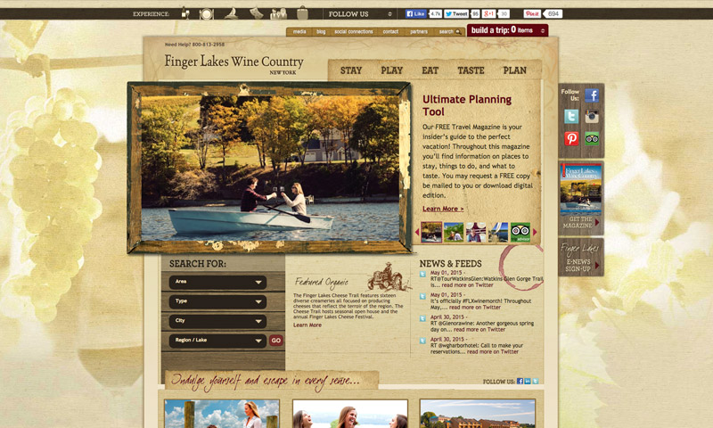
Finger Lakes Wine Country
Here is a great example of a vintage-themed website. It utilizes a photo background with a faded effect and also uses wood textures and frames that fit well to the theme. It also contains a photo gallery and a list of the events that is scheduled on the venue.
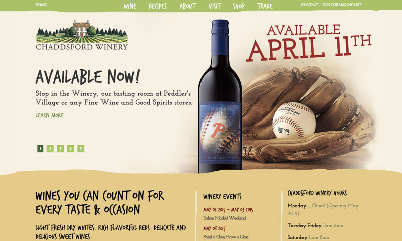
Chaddsford Winery
Next feature is a fine flat design website with wine stains as backgrounds. At the top of the page is a cool slider that presents their events, products, and reservations. The site also uses handwritten fonts to make it more pleasurable and personalized.
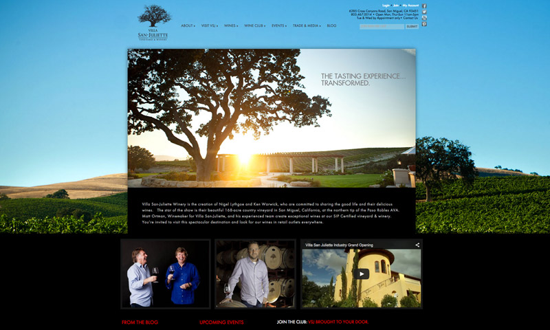
Villa San-Juliette
Villa San-Juliette presents a vibrant website thanks to its background image of its vineyard under a bright blue sky. At the middle is another image of the vineyard and a brief description of the company below.
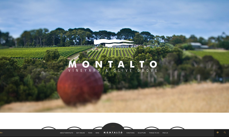
Montalto Vineyard & Olive Grove
Montalto has a modern website design that will greet you with a beautiful image of their vineyard in a nice tilt shift effect, with an overlay font of their company name. Scrolling down, you’ll see screen-wide layouts that show a preview of their various products, online store, events, and more – each designed with topic-related background images that add aesthetic value to the website.
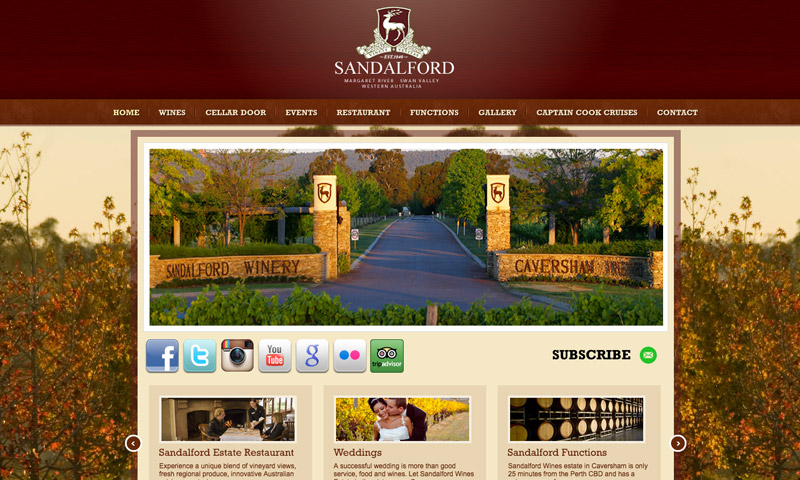
Sandalford Winery
Sandalford offers a wine and vineyard website that uses a polished wood texture and a wide image of autumn trees for background, which give a classy ambiance to the site. It also has an image slider and another slider that shows their products, events and amenities.
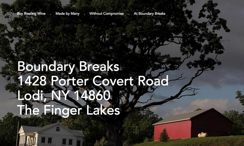
Boundary Breaks Vineyard
Boundary Breaks has an imaginative web design that utilizes a progressing and regressing time-lapse of the image background, depending on the movement of your mouse. Overlaying the background is a big white font of Boundary Breaks and its address.
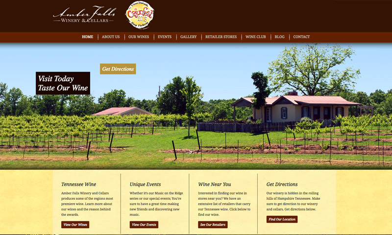
Amber Falls
Amber falls has a rather simple yet classy website design. It has the navigation bar at the top, a slideshow of its vineyard photos, and selections of their products, events, and location as well.
Cambria Estate Winery
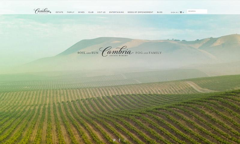
Cambria Estate Winery’s website is another great web design example that uses a big image background. The layout is kept simple with the navigation bar at the top of the page and the social media icons and contacts at the footer.
Louis Martini Winery
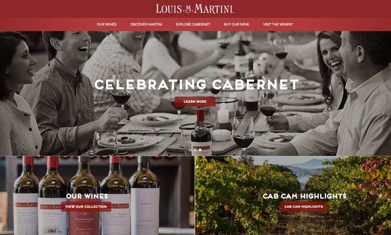
This website has a red-themed design that suits their product pitch. The body consists of 3 partitions: The top being a slider for their wine products, events, and their history; their wine collection, and their highlights.
ARA Wines
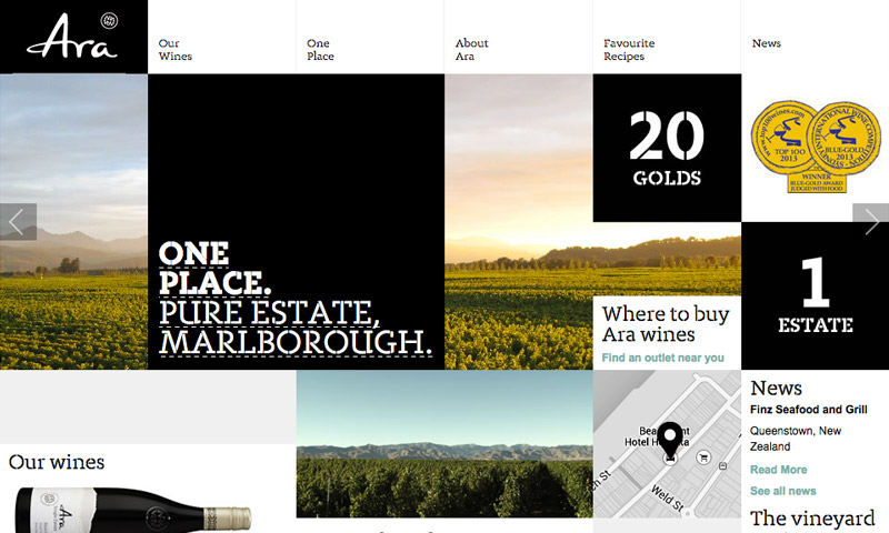
Ara Wines displays a website with a peculiar slider that demonstrates a “parallax effect” whenever you navigate through it. It is basically in black and white theme with added pictures to make the page more pleasing to the eye.
Note: All visual content above is copyright to its respectful owner. Please read the Terms Of Use of these resources before using to prevent unwanted occurrences. NaldzGraphics does not claim credit nor responsibility for any images/videos featured on this site unless otherwise noted.
Have something in mind related to web design, freelancing, and other awesome stuff? Let us know and maybe we’ll feature it on our next post. All your comments and opinions are appreciated. Let us hear em up in the comment box. Thank you and see you again mate!


