An email newsletter is a publication which is regularly sent through email that tackles on a main topic. The topic of the newsletter arise interest to a group of subscribers who have signed up in a website and have given their email addresses. Since email has grown popularity these days and is more convenient and cost-efficient, it is the most preferred manner of sending and receiving newsletters. Hence, it is recommended for businesses to have an HTML newsletter to reach their clients constantly.
Most online business companies and individuals would seek for the help of a graphic designer to make a great email newsletter. Some graphic designers also make their own email newsletter to give updates to their subscribers. To make the newsletter more effective, here are some tips that could help you in designing it.
1. Know your purpose.
In anything you do, you should always know for what purpose it is. The same with designing online newsletters. It could be for your own business, for a cooking website, for an organization or whatever purpose it may serve. You have to be an expert in the field you are writing for or you should be a good researcher. Good research and proper understanding of what you have researched could help you to make an effective way of informing and educating others. Knowing the purpose of the e-mail newsletter makes it easier for you to think of how it should be designed and presented.
2. Use customized design.
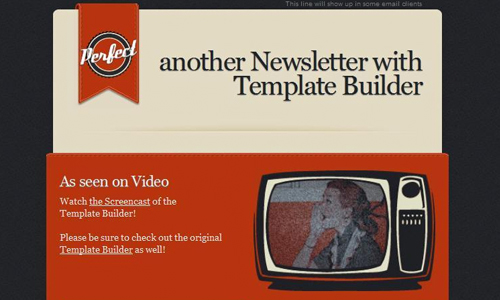
You are a graphic designer and you should show this by making a great design for your e-mail newsletter. If a client ask you to make one, you should also make the design good. Do not use templates for it will look less professional and there would be a mismatch between your template and your type of business. You wouldn’t be able to have an effective branding if you do that. You should be consistent with your design and layout. But if you do not have enough budget for a customized design, you can use the simpler available template. Then as time goes along, you can change it with a customized one which will surely be more effective.
3. Branding for your newsletter.
Since you already have your own business name, logo, and other stuff that gives you your own branding, you can use that in your newsletter. Also, giving your newsletter its own design will make it more effective and easier for the client to recognize whenever they receive one from you. Make a design for your header and footer and then provide a code in plain HTML to make your newsletter flexible since you will use it every time you have something new to send.
4. Make a simple design.
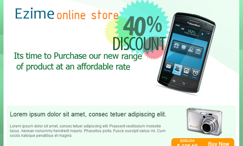
Source
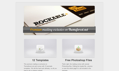
In designing a newsletter, make it simple. No one would have enough time to read everything that you will place there. Make the message short, straight to the point and clear. Once the reader sees it, he can immediately get the point of your newsletter. Make use of graphics and clip arts sparingly. Choose those which are eye-catching.
5. Observe the use of negative spaces.
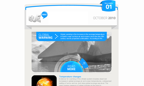
Negative spaces or white spaces can make your e-mail newsletter look better. It gives direction to the eyes of the readers and it makes your newsletter more professional looking. A crowded design will easily tire the eyes of the readers and they might not want to continue reading anymore especially if it is too lengthy. Using negative space allows the eyes to relax and makes reading more comfortable.
6. Use simple newsletter code.
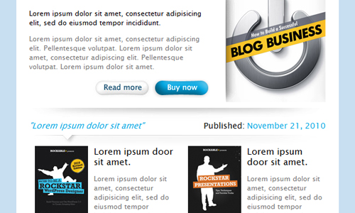
Source
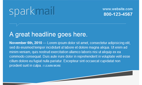
If you want everyone to view your newsletter, use simple HTML. Complicated codes and CSS designs do not display in other reader’s emails. Hence, you will lose a significant number of readers. Always remember that your newsletter should be designed and coded with the basic HTML.
7. Use interesting images.
Source
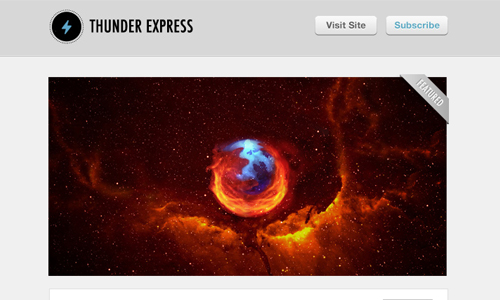
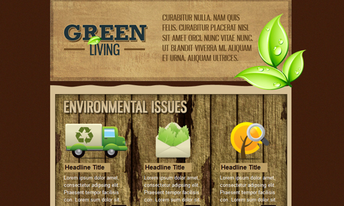
To make your newsletter look more interesting and attention-grabbing, use images or clip-arts that suit the theme or concept of your newsletter. It will look boring if you used text only. Add some spark and energy in it by inserting pictures. Also, if you choose pictures which can speak for the newsletter, that would be better so that some readers who were busy that moment could easily grasp the message by simply looking at the image. This will retain in their minds and would go back to check it later when they are no longer occupied.
8. Make use of highlight boxes.
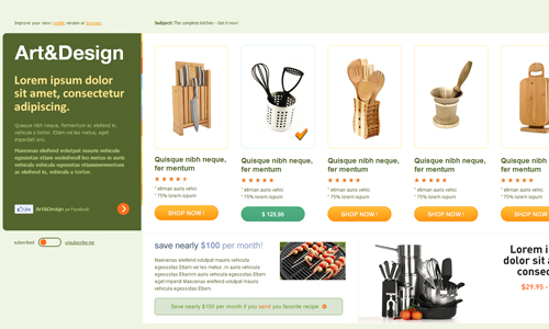
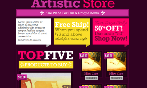
You may make use of boxes to highlight some parts of the newsletter especially for promos and calls to action. The reader’s eye will easily be directed to these highlight boxes and they will get the message right away. This will result for the reader to take some action in response to your newsletter.
9. Provide perks.
Make your newsletter interesting and fun. You can offer contests, coupons, prizes, and others that will make them love your newsletter. For sure, if you have something new every issue, they will be looking forward for your email now. Another benefit is, they will visit your website and might want to do business with you. So, think of some ways that will make the reader come back for more.
10. Keep a publication schedule.
Even before you have started designing a newsletter, make sure you have decided on the schedule of publication. Since it is an online newsletter, think of the schedule when you will send it to your email recipients. It could be weekly, monthly, quarterly or bi-monthly. Making a schedule ahead of time will allow you to plan what your newsletter contents will be. Always be on time when sending your newsletter. Some of the readers are actually waiting for it.
Although there are email newsletter templates you can find on the web, it’s still a good step to start your own for education purposes. The tips we have given you will help you make your newsletter look more memorable to the readers. This will also help you in reaching your clients and prospect clients. An email newsletter is actually effective if it is used and done well. Do you have other tips to share in designing an email newsletter?



Very good points, thank you Kareen
What should the standard size be for an email newsletter when designing it in photoshop
Yeah, great stuff. I like, cause I do all of our Newsletter in company I’m working for. Greetz from Germany!
oh! thanks,
@ Darryl – it is better to have a 600px maximum width for the newsletter, and the height must not be too long. 🙂
Useful tips, thanks…
Many thanks Kareen. Very useful.