If you’ve been to a lot of websites lately, you may have noticed that gradients are cunningly coming back in web design. They may be seen as background fillers or in other element design, either way, they are there, and they are looking pretty good.
Though flat design is still up in the current trends, gradients are making a potential return, but this time with a combination of flat elements, background photographs, and such – making it very versatile in web design.
These websites that we have gathered below will show you that gradients are still looking strong even in today’s modern design. Check out these 15 excellent examples of web designs with gradients in them. Come, take a peek, and be inspired!
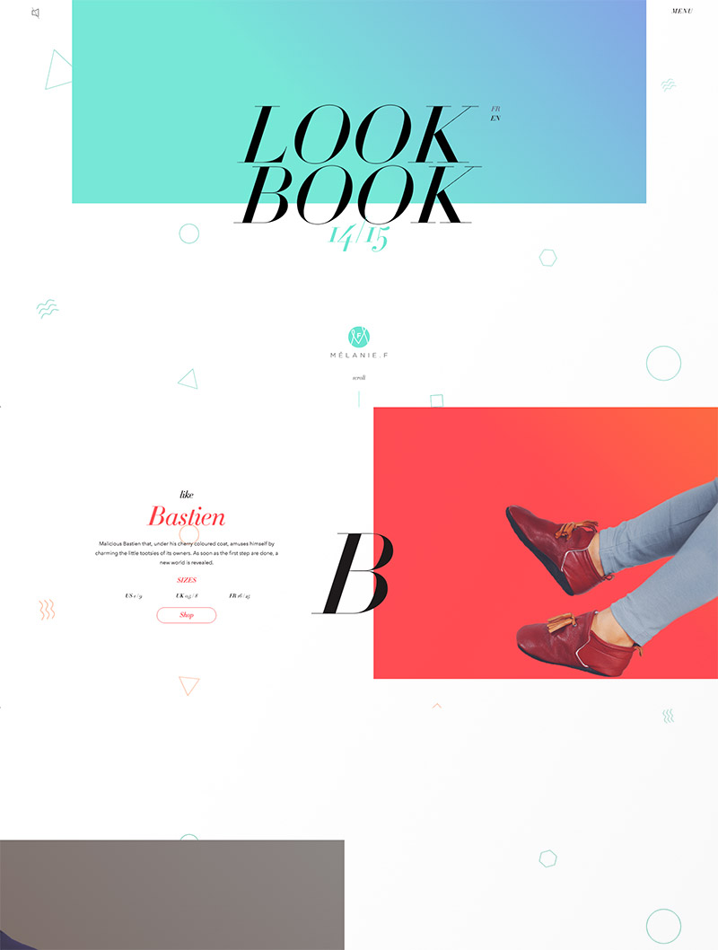
Melanie F.
This website has a beautiful design with a mesmerizing parallax effect and gradient backgrounds that makes the images more stylish to the eyes.
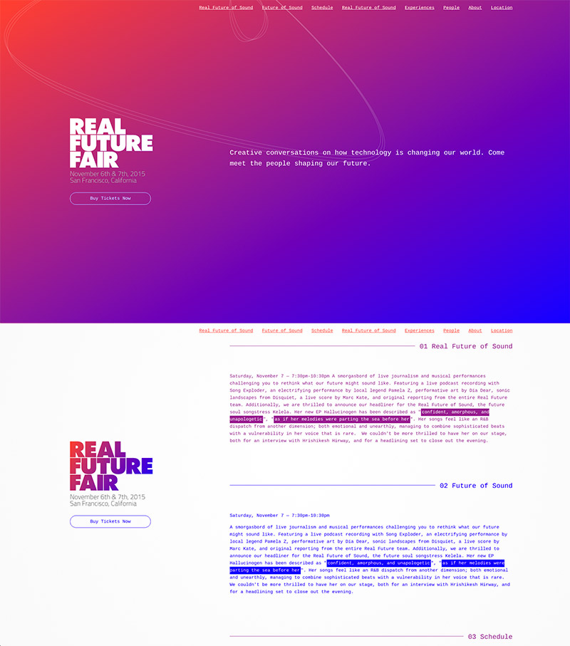
Real Future Fair
Real Future Fair utilizes a fullscreen background with red-violet color gradient in diagonal angle.
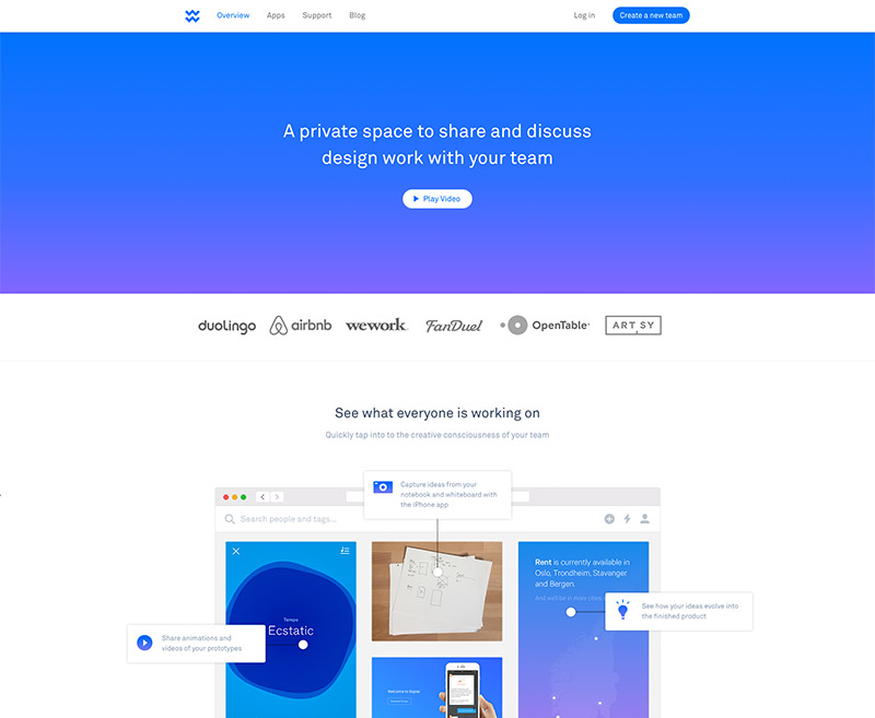
Wake
Wake on the other hand has a more popular blue-violet gradient theme that is trendy in the current design world.
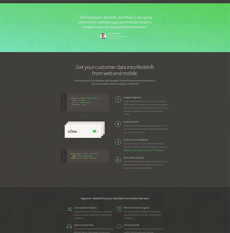
Segment
Segment beautifully combines grey backgrounds with green gradients that are used in logos, segment background, and icons.
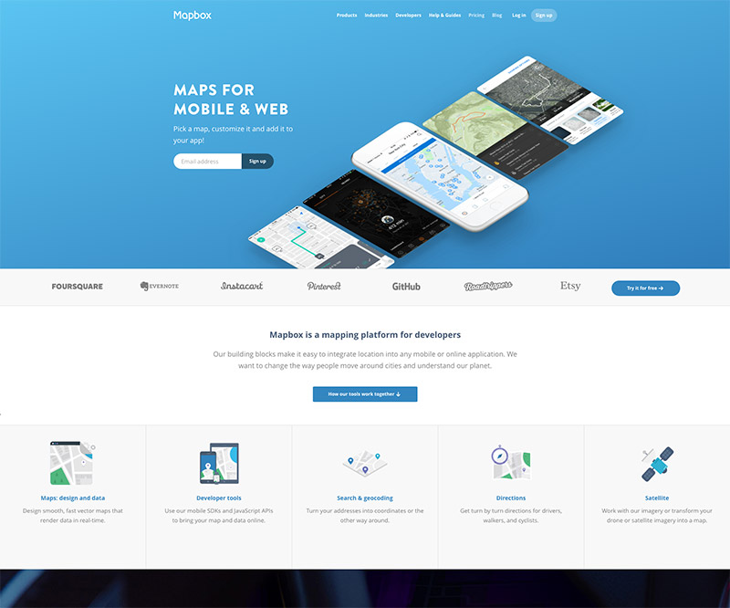
Mapbox
Mapbox displays a beautiful hero image with a blue gradient in diagonal fashion.
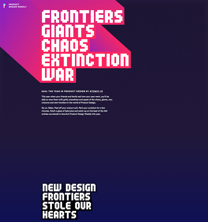
Product Design Weekly
This website incorporated various gradients for its hero image as well as the overall background.
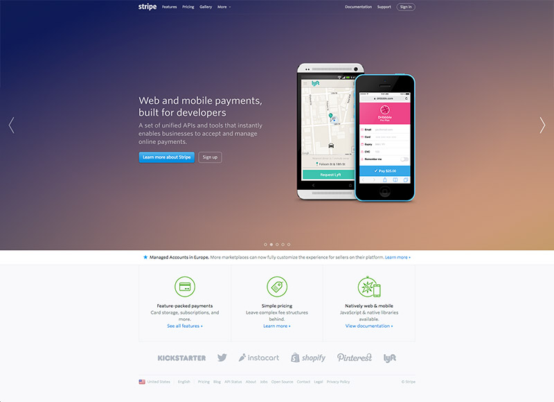
Stripe
Here is another beautiful diagonal gradient design used in a hero image. It puts an elegant and artistic ambiance to an otherwise simple web design.
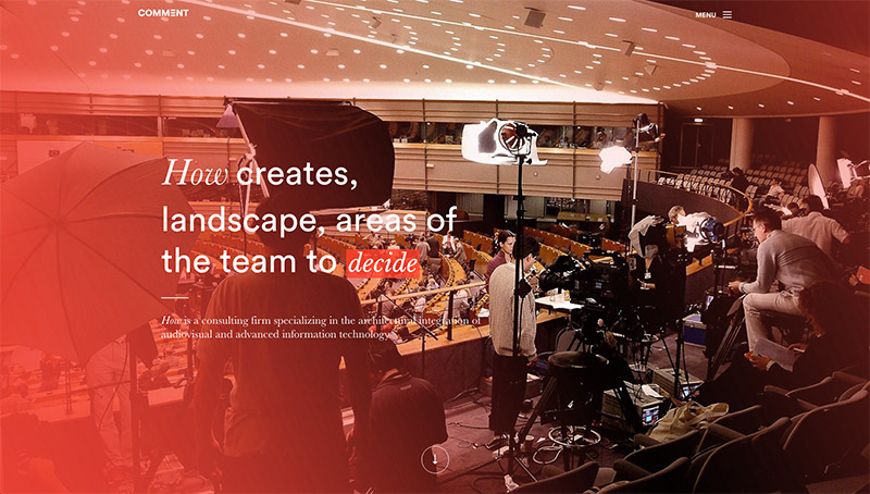
Comment
Comment overlays a semi-opaque gradient to its background image. It displays a red shade transitioning into its transparent part at the middle of the page, adding more flare to the background.
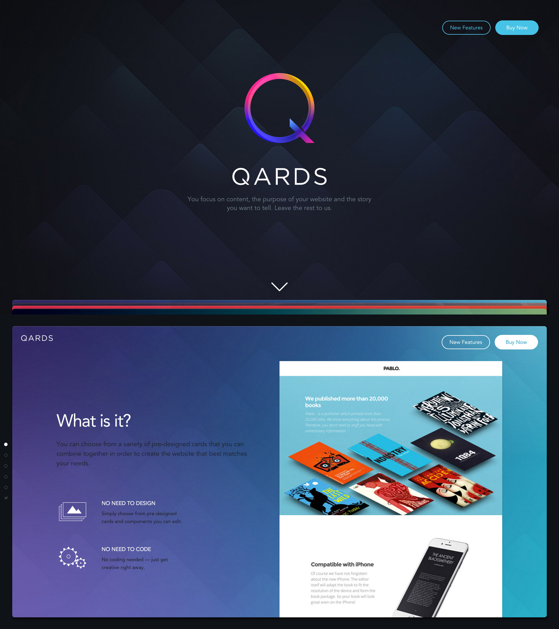
Qards
Qards delivers various gradient designs that make the page segments more artistic and enjoyable to the eyes.
Inc
Inc overlays a subtle blue gradient to its hero image, making the section more clean and collective.

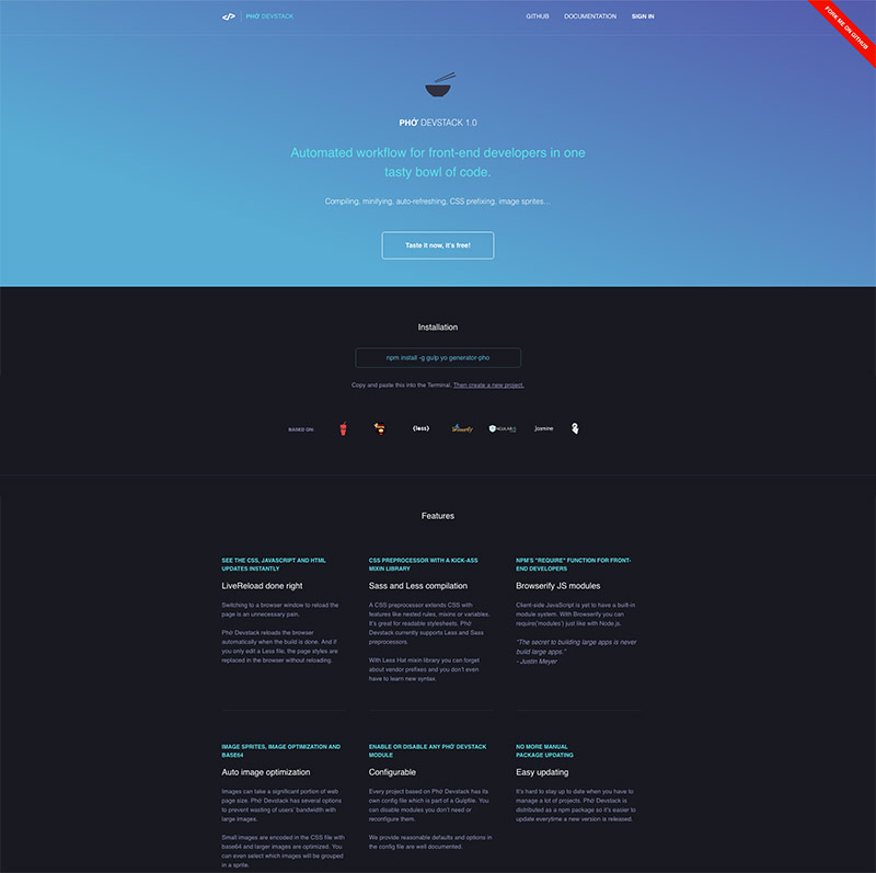
Pho
This one has a more cleaner gradient playing with various blues.
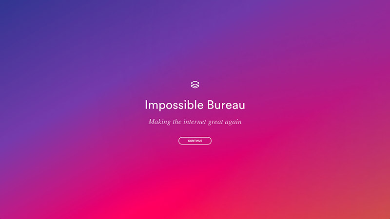
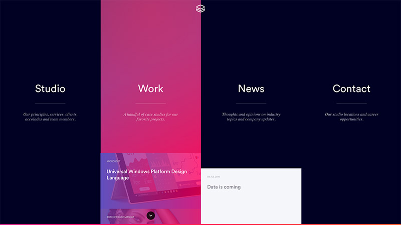
Impossible Bureau
Impossible Bureau uses a dusky gradient that is displayed in full background during the loading page then transitions to its homepage where its elements and background show similar design as hover effect.
Webflow
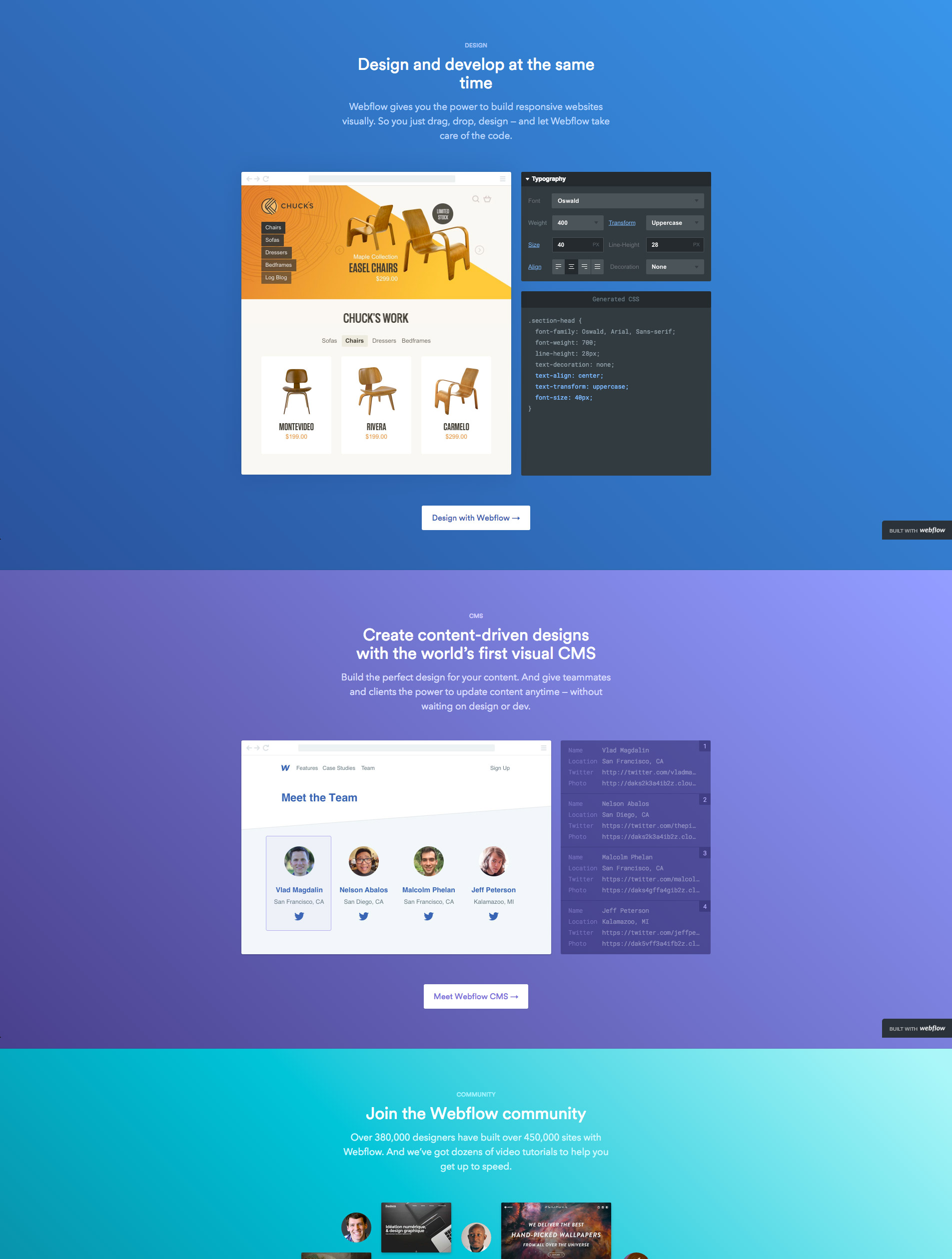
Webflow also utilizes a set of full-width background gradient that beautifully displays various segments.
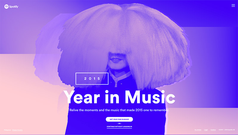
Year in Music
Spotify is also one of the sites that uses gradient for web designs. This is their Year in Music feature.
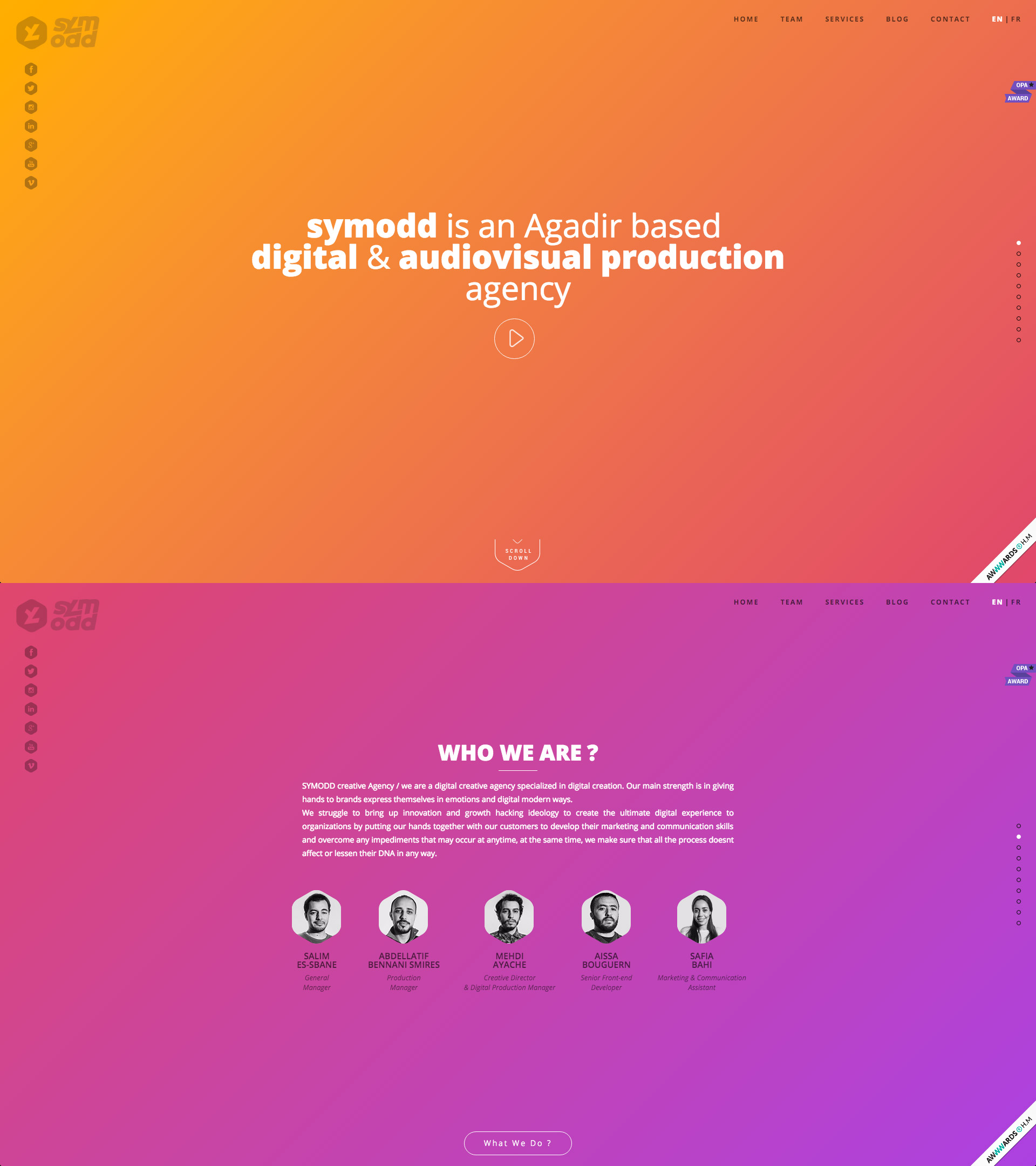
Symodd
Symodd’s segments are filled with gradients that it looks both minimalistic and artistic.
Note: All visual content above is copyright to its respectful owner. Please read the Terms Of Use of these resources before using to prevent unwanted occurrences. NaldzGraphics does not claim credit nor responsibility for any images/videos featured on this site unless otherwise noted.
Have something in mind related to web design, freelancing, and other awesome stuff? Let us know and maybe we’ll feature it on our next post. All your comments and opinions are appreciated. Let us hear em up in the comment box. Thank you and see you again mate!


