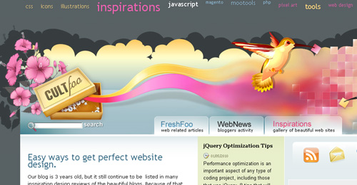
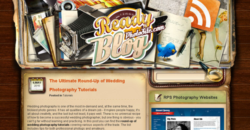
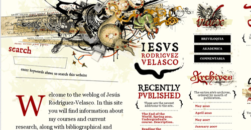
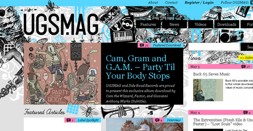
In viewing a website, the first thing that we notice is, of course, the header. It is actually the portion that catches the viewer’s notice first before the content most especially for random searches or viewing. In one of our previous post, we have showcased several cool and interesting footers for websites. As a follow-up to this post, we have come up with a collection of the footer’s counterpart in web layout.
Here is A Showcase of Effective Headers in Web Design that you can look into for new ideas on successful headers. Check out these items and be inspired in creating your own outstanding header!!!
You may want to take a look at the following related articles:
• 40+ Examples of Horizontal Scrolling Websites
• 30 Beautiful and Illustrative Website Footers
• 35 Inspiring Watercolor Effect in Web Design
• 45+ Excellent Examples of Flash Websites Design
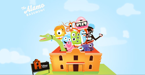
The Alamo Basement
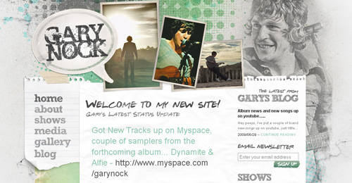
Gary Nock
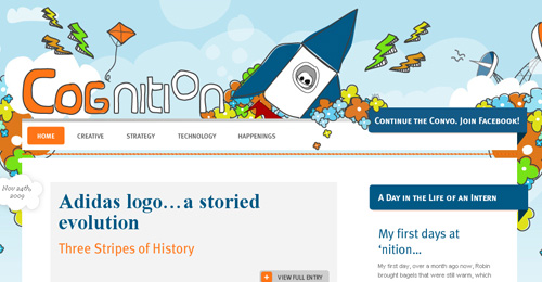
Nition Design
View Site
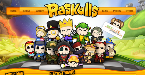
Raskulls
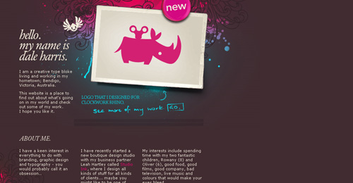
Dale Harris
Aya Kaito

View Site
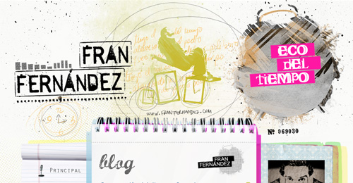
Fran Fernandez
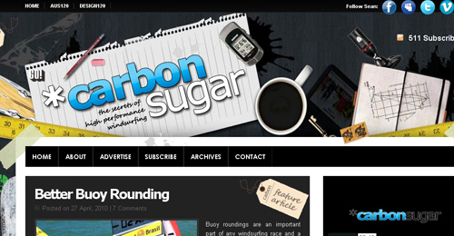
Carbon Sugar
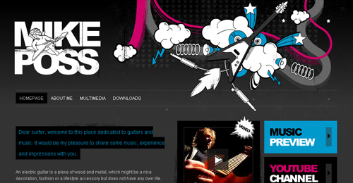
Mike Poss
ICFF
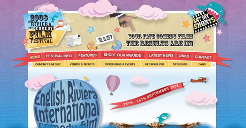
View Site
By Land Sea or Air
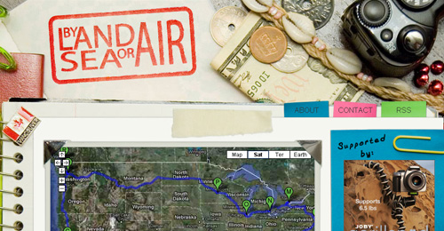
View Site
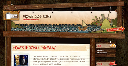
Brown Blog Films
The Pixel
Allananova
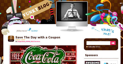
Vunky Blog
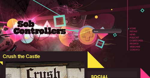
Sob Controllers
The Rox

View Site
Black Moon Dev
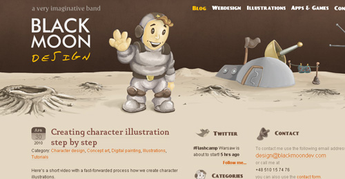
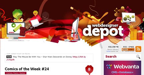
Web Designer Depot
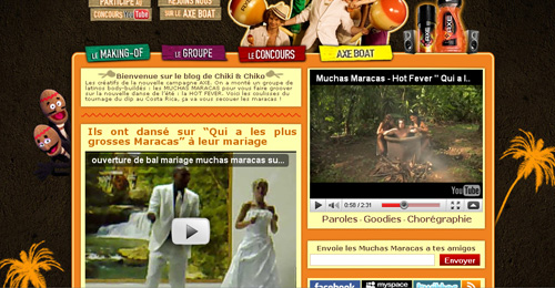
Muchasmaracas
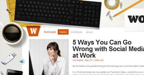
Work Awesome
Cult F
Ready Pphoto Site
Hey Josh
Smooth Piece
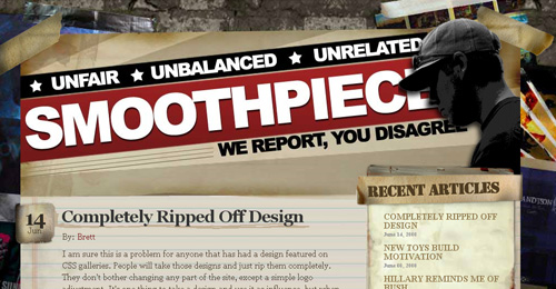
View Site
JR Velasco
Bei
Ug Smag
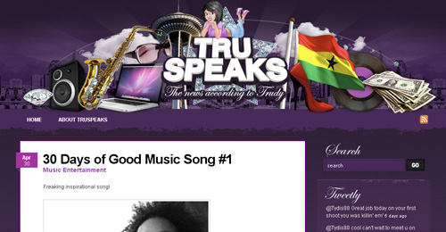
Tru Speaks
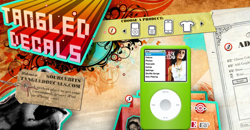
Source Bits
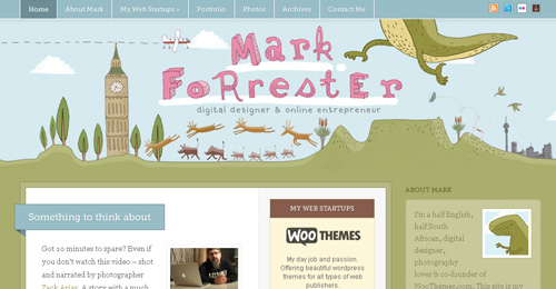
Mark Forrester
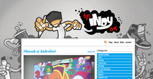
Hey Indy
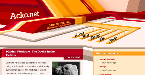
Acko
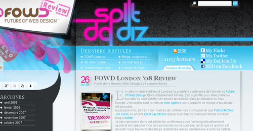
Split Dadiz






Another inspiring post. keep up the good work naldz
Good choice there.
I’m going to have to disagree on this one. Most of these headers are pretty, certainly image heavy, but not especially effective. Most of them you have to hunt around for navigation. Amd, some are so large that the content is completely dwarfed.
Great compilation of some elaborately designed headers & the websites they are home to . I know several of them , and there are a few I have not seen yet – which I will do so now 🙂
Thank you for your effort in putting this together for the community’s inspiration ! 🙂
M.?
I really like the style of Gary Nock and Acko. All of these show great ingenuity.
Acko almost has a Trom feel to it. Great designs all!
Great collection! thanks for share!
Good collection, but what makes an effective header? I came expecting ideas and tips and examples. This is more ‘sexy headers’ or ‘stylish super designed headers’!
Some really great looking websites here. Every time I think I’m happy with ours site I see something else that makes me want to tweak ours some more! Gotta love it!
I like these hugely but they all seem to be blogs or similar. How about a collection of effective e-commerce headers or manufacturing company headers for balance and contrast.
Keep up the good work!
Amazing headers!
These headers are very inspiring. I love the illustrations in many of these.
Nice post!
I’m going to agree with barbara. While stylish and image intensive graphics can be effective for capturing attention or displaying your work, some of these take up excessive room without displaying much useful content. Not effectively balancing their use of screen real estate.
However, many of these _are_ very effective headers by displaying things like navigation, logos, and artwork that establish or are consistent with the look and feel of the website.
Overall still a great post!
What about inspirationfeed?
wow, that kind of Graphics Design I am going to use to my website.
nice work keep up..
Some really inspirational header designs, but in a stride of showing up the creativity the importance of content has been compromised and this is something serious for profession website designs.
What do you mean by “effective headers”? For me those headers are overloaded. Ok I admit they all look pretty cool. But my eyes want to look at the header all the time. So the content don’t get the attention it deserves…
Hope you understand what I mean (I really hope my english will get better some day…)
Great list – love the inspiration of these. Thanks~
Can you do the same thing with real company website examples ?! I don’t think so.
Beautiful and very inspiring designs.
amazing concepts you sharing in this article. thanks
Awesome collection… truly inspiring…
Thanks for sharing this inspirational list
After viewing these examples
I started thinking about the meaning of the term effective…
@Marc
I was just about to say the same thing. Flashy and creative headers. No so much on effective. Nice collection still. Thanks.
Thank you so much for such true inspirational examples! I am definitely a fan! keep up the good work!
Nice headers need to improve my creativity to match this type of work.
Those are really inspiring, very creative designs.