Designing a website is not a simple task for you have to make sure that with visual design, utility and usability combined, the site will be effective and successful. There are indeed so many things to consider in order to come up with a good website design. No wonder why not all websites could get into their goals because not all would really study well what they need to consider in designing a website. A designer should always bear in mind that it is not just the visual appearance that matters but also the usability of the site.
Since everyone would like to ascertain that they are having a good website design, we will try to help you by giving you a checklist of items to take note of. In this post, we will give you some tips on how you can make sure that your website has a good design. When we speak of good design, it means that your website can be effective and successful. Here are twelve things for you to look into.
1. Choose a color scheme.
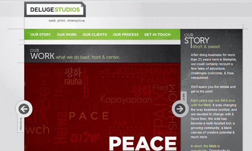
Image: Deluge Studios
A certain company would use a particular color scheme which is part of their branding. You can also make use of these colors for the web design. Or you can choose a color that would complement to that. And then you have to be consistent about it. You can also look into other websites and check what color schemes they use to serve as your inspiration.
2. Have a good navigation.
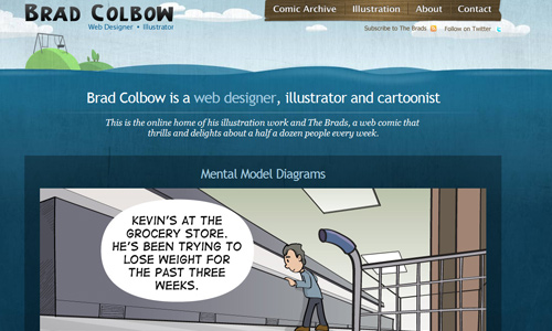
Image: Brad Colbow
As always, it is part of having a good website design. You need to make sure that the navigation system you are using is simple and can easily lead the users into where you want them to be. See to it also that the users can easily find what they are looking for. Usually, websites display their navigation bar on the left or at the top. You can also follow that since that is the kind of navigation that users got used to.
3. Have a sharp design.

Image: Let It Bleed Book
It is important that every single detail in your website is sharp. Having a sharp design can make your website look clear. No one would like to browse a website that is unclear especially to its headers and texts. Work well on your web design in Photoshop and it will come out perfectly after it is coded.
4. Make design look orderly.

Image: Safe Driving Academy
You can do that by looking into the website’s alignment. See to it that the elements in the page are not scattered and cluttered. Make it look organized and orderly. No matter what type of layout you intend to use, you can still achieve good alignment if you just do it.
5. Choose a good background.
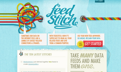
Image: Feed Stitch
There are many ways on how you can work on your background. It could be a large picture, a texture, a pattern and other. Some designers just use plain colors which is also fine. Just make sure that your text , images and links will be seen no matter what background you use.
6. Use good typography.
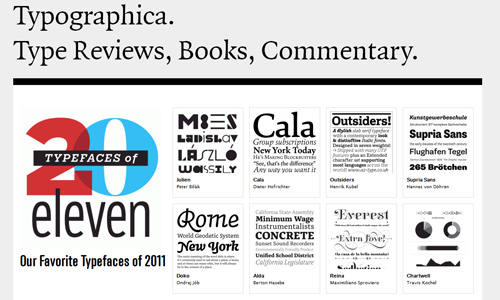
Image: Typographica
Aside from the colors, text is also very important because it is what the readers read. Hence, you have to see to it that you are using a good font style that reflects the personality of the site. You should also use a font size that is readable with proper spacing, line length, paragraphing, and color. Typography for websites is very much significant in designing a good website.
7. Look into the use of negative space.
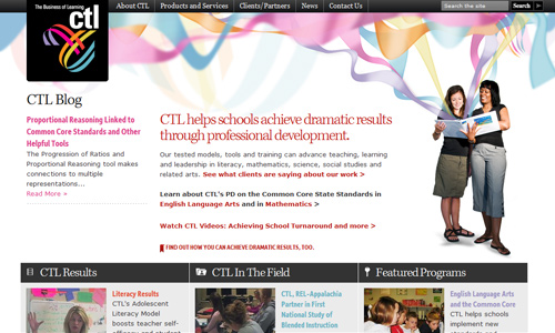
Image: CTL Online
Negative space is also called white space but it does not necessarily have to be white. This is the space that gives balance to the entire website. It is like giving a breathing area for the elements in your design. Using negative space makes the design look better and friendlier to the users.
8. Be consistent.
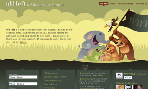
Image: Old Loft
A website can appear as one if you are consistent with the elements in it. Be consistent with your heading, font style, design elements, and many others. Doing this will make the entire design look coherent even if you transfer from different pages. You will only mislead and confuse the users if you are having different designs in each page.
9. Consider padding.

Image: Plant with P urpose
Padding refers to the space between elements and text. There should always be space between them so that they will not touch each other. Having a space between the text and other design elements make it a lot easier to read and would also be lighter to the eyes.
10. Direct and guide the user’s eye.
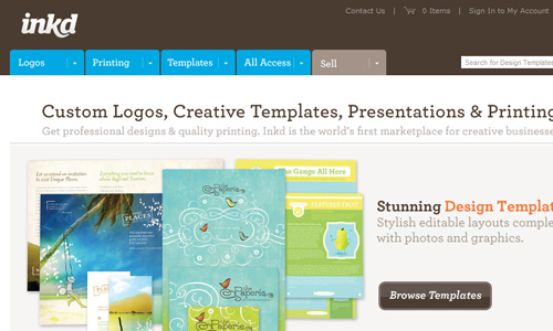
Image: Inkd
It is also significant that you are able to lead the user’s eyes to where you want them to see. Most users judge a design by how much they can see on one look and how valuable are the things that they can see. With that, you should be able to have good positioning in the layout of your design elements.
11. Group alike elements.
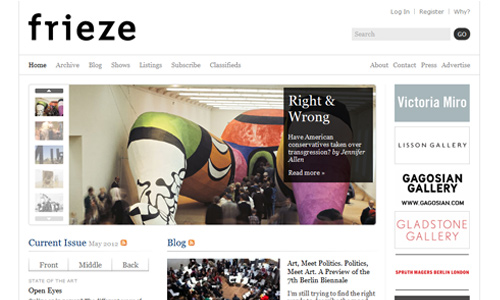
Image: Frieze
Do not confuse the users by having a circus like layout. You should make it easy for them to find what they are looking for. You can do that by grouping like elements together. Like if you place “Recent Post”, near that should be “Archives” or “Most Popular Post”. Do not separate them because it will look confusing for the users.
12. Have good contrast.

Contrast not just refers to your use of colors. You can also observe contrast with your images. Place a large illustration or graphics next to smaller texts. Do not place large texts with large images. It will make the design look bulky and heavy to the eyes. Observe contrast with fonts, too. You can do that by using different font sizes or font styles
It’s Your Turn Now
Having a good website design is very important in order to make a name in the internet world. You would not want to waste your time designing a site that will not achieve its goals to convey information to others or to make some income for you. So, see to it that you could take note of the items above so that you will be able to have a successful website. Would you like to add some tips aside from what we have mentioned? Feel free to do that.


Thanks for the useful guidelines.
Very good summary. i have to tweet it!
Ebrian,
As per my point of view not all things ascertain for making good website design. I liked the most are:
Have good contrast.
Consider padding.
Negative Space
Sharp Design
I want to add one more thing in it is font style, font size and color.
Hi Ebrian, i have only 7 months of experience in webdesigning. . and i love to read articles about designs! your tips are great and very helpful to me as a beginner, thanks a lot.
by the way im from philippines also.