There are so many manners and techniques in designing a website which we can see in different web design trends. The use of ribbons became a trend in web design and it seems that this will be used by designers for a long time. You will find many websites that made use of ribbons which are concrete evidences that these uniquely shaped flourishes have made a mark in the web design world. Ribbons had been used in different ways to add more appeal to the design and to achieve different purposes.
The use of ribbons became popular because it can draw the user’s attention to some critical information in the site by giving it an illusion of depth. It tends to bring out the contents that you want to be emphasized. Aside from that, a ribbon can be more attractive when done with 3D effects and when it bears contrasting colors. To give you some web design ideas in using ribbons, here are some tips to serve as a guide.
1. Use it for navigation.
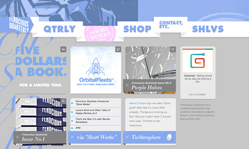
Image: Ferocious
Ribbons are effective for navigation for it easily gets the attention of the visitors and you will be able to easily guide them through your site. They will not have a hard time looking for your navigation buttons. It is always important to have easy and well-placed navigations so that a visitor will know what to do.
2. Apply it on headers.
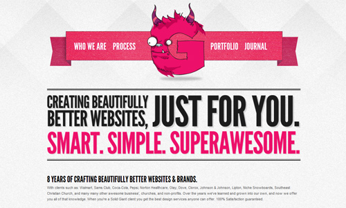
Image: Solid Giant
When used as headers, ribbons can add appeal to the site and could also give emphasis to your site name and logo which you would place in the header. Use a color that complements with the rest of the page or you may opt to use a color that will make it stand out. Either way, you will still find ribbon an effective way of getting the attention of the readers.
3. Create noticeable labels.
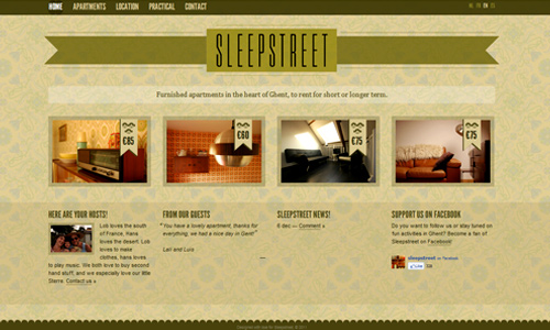
Image: Sleep Street
For one thing, you would like to place labels in your website in order to guide the readers and tell them which is which. There are actually various usages of labels. It depends on what type of website you have. Since you are placing labels in order to make things clearer for the visitors, the use of ribbons will surely be a good way to do that.
4. Have impressive backgrounds.
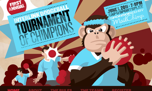
Aside from little parts in the page, you can also use ribbons to give emphasis on some parts of your background. When you use a ribbon, be sure also that the design of the ribbon is suitable to the concept of the page. The color will also greatly affect on your usage of this unique shape. Indeed, ribbons can add a big deal of appeal to your site.
5. Placement for logo and site name.
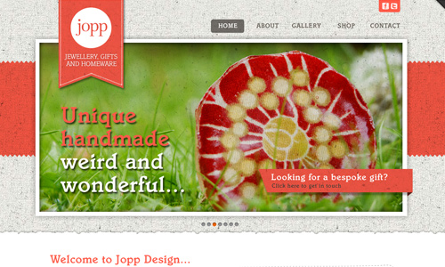
Image: Jopp Design
Some designers creatively use ribbons letting it bear the site logo and name. It is a good manner of using it for it can minimize the use of space when used in a way similar to that of our example above. When a visitor comes to your site, his eyes will surely be guided toward your ribbon which is of course your aim in using it.
6. Use it for footer.
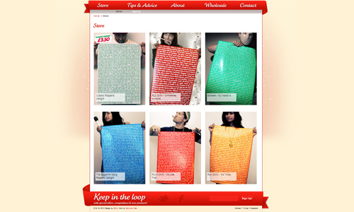
Ribbons are effective as headers but it is also good when used as footer. Consider the web design above. It used ribbons for both headers and footers. It certainly made the site look appealing especially that the contents are also colorful. The use of a red ribbon made an impression of being boxed or framed which easily directs the eyes of those who see it.
7. Make eye-catching call to action.
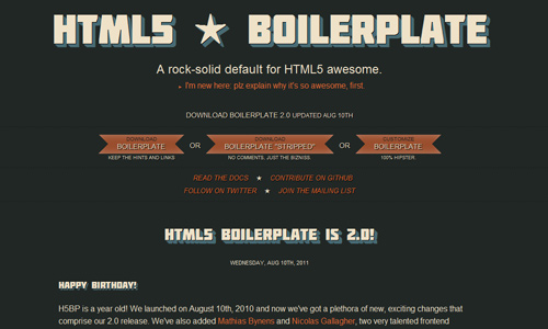
Image: HTML5 Boilerplate
For sure, there are some things that you would like your reader to do. Every website bears a call to action and each has different ways of doing that. A ribbon could be an effective call to action for it is eye-catching.
8. Use large ribbons for more appeal.
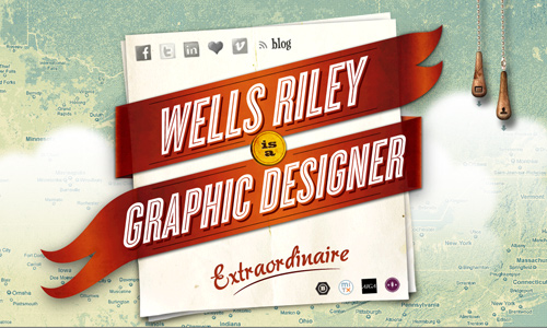
Image: Wells Riley
You never thought of using a ribbon for you think that it looks feminine. But when you saw the site we have above, you could have changed your mind. Large ribbons can add appeal to the website and can give it a distinct look. The impact depends on your type of ribbon and the color you use for it.
9. Consider using many ribbons.
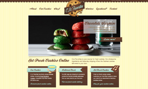
Image: Fresh Cookies Online
When some websites use only one or two ribbons, some use many ribbons. It would even seem that the design concept of the site is the usage of ribbons. If you think that using many ribbons can ruin the design of the site, you are obviously wrong. It can even bring your design to the next level and will give your site an inviting look.
10. Use ribbons subtly.
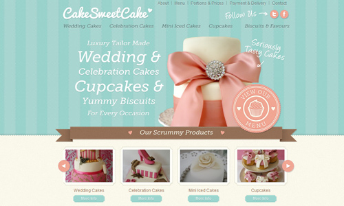
Image: Cake Sweet Cake
If there are sites that use large ribbons and many ribbons, there are also websites that use it in a subtle manner. A single small ribbon could already be enough to add beauty to the web design. There are even some that uses a very tiny ribbon but still manages to shine and be noticed by the visitors.
It’s Your Turn Now
For sure, you already have enough ideas on how to use ribbons for web design. Use the websites as inspiration if you are planning to apply the usage of ribbon for your next design. It surely added beauty and appeal to a website making it look more creative, impressive and welcoming. Have you tried designing a site using ribbons? Or have you come across a website using ribbons? Share it with us.


Thanks for sharing these tips!
That’s an interesting overview, have to admit I noticed the ribbons popping up across the web, but never gave them much thought. I think I may give them a whirl in on my next site. Thanks, nice selection.
I love ribbons and I tend to use them really often in my webdesigns projects ! Great article 🙂
Great article! I have added this to my collection of interesting articles to read on my blog.
Wonderful ribbons effect..Good examples. I like this list.
I agree with Dawn Yz. keep it up guys!
Ribbons are just preppy! lol
No wonder my friends keep on posting this on facebook. Great articles you have!
this post has been bookmarked! thanks!
Posts here are always great 🙂
I guess ribbons are fashionable these days…
Ribbons have always been something that makes one look interesting
Shared this to my friends!
Catches the attention of most of my clients 😀
wonderful post! ribbons are cute on web designs!
love it, i was looking for something like this for a long time, i get a new ideas