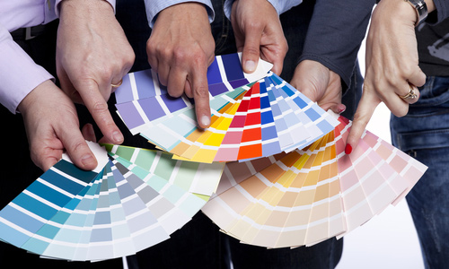
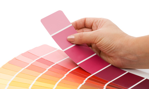
No matter what design you are doing, it surely uses colors. Both screen-based and print-based design uses colors. Actually, you don’t just use colors when you are designing. You use it every day. You even use it to choose what clothes to wear and which shoes to pair with it. Color is important to everyone, most especially to designers who create designs for companies and organizations.
Color is indeed one of the important factors in attracting clients. It has to be eye-catching. This is the reason why choosing a color scheme isn’t easy. For designers, you will certainly want to learn how to pick the right color palette but aside from that, it is also necessary for you to know the things that you need to consider in choosing the right color scheme for your designs.
1. Consider the company.

Image: shutterstock
Know what the company is. Dig deeper into what they do, what services they offer, what products they sell, what are the company’s principles, and others. It is important for you to know this so that you could choose the right colour scheme that reflects who they are as a company. Try to look at the logo they are using, the color choices for their office and many others. They might even have a particular color that they want you to use.
2. Consider the taste of your client.

Image: shutterstock
Try to know what the company’s big boss really like. You can actually get this by merely look at things that they are already using and had been using. Look at the uniforms, the logo and others. Companies really have certain colors that they use to represent themselves. Make sure that the color you will choose will have certain commonalities to the personality of the company and its employees.
3. Consider the nature of the project.

Image: shutterstock
Of course, this is important. You need to know what the project is and what it is for. It could be a web design, a logo design, a brochure and others. You also need to know if it is print-based or screen-based. Ask how many colors they would use and what are the contents they want to use like images, illustrations, graphs, etc. Know if you are suppose to use a color that will allow images to shine or to enhance some text. Make sure that you will know everything about the project during your first meeting before you start making it to avoid major revisions.
4. Consider the company’s competition.

Image: shutterstock
As a designer, it is your job to make the company stand out. So you have to know who the competitors are and what color scheme they are using. That way, you can choose a color scheme that will shine from the rest of them. Remember that good designers always conduct research regarding the market and the competition before creating a design. Same is true with choosing colors. Do your research well.
5. Consider the target audience.

The target audience is very important since the design you will make has to attract potential visitors from a particular segment of the population. Determine the appropriate colors for the visitor’s age, gender and geographic location. Certain color combinations look more appealing to men while others are more appealing to women. If you target children, it would also be different. You can also consider some people who are color-blind.
6. Consider project’s time of usage.

Image: shutterstock
Try to know for how long the project will be used. Know if it is merely for a specific occasion or for a long time usage. Corporate identities like logos should remain fresh over the years while a poster or a publication just made for a certain event could vary in color. It also depends on the type of event it will be used. You might make give-aways for Christmas or a magazine that follows a particular trend.
7. Consider the impact to the audience.

Image: shutterstock
It is important that you consider the impact your color choices will have to the audience. It needs to have a positive meaning to the industry and to the market. Choose colors that are associated with positivism. You need to know the significance of color to an industry. For example, for a company that advocates for peace, they would opt to use white but if they use red, it could represent war and blood. Meanwhile, a flower company could use red for it is associated with roses.
8. Consider the emotion it reflects.

Image: shutterstock
Every color has its own meaning and emotion. You need to reflect the emotion of the clients and the company towards their target audience. If the business is dynamic and has a high energy, use bright and clear colors. If it is serious and complicated, you might want to use complex colors like maroon and its tones. There are certain moods for your design. So, you could list down the emotions and the kind of atmosphere that you would like to create. You can use your list as your guide in choosing colors.
9. Consider attractiveness and accessibility.

Image: shutterstock
Any color scheme should be attractive but mostly accessible. You have to make sure that the color scheme you will choose will impress and attract most people. There are people who have eye problems like color-blindedness but they belong to a small population only. But still, you have to consider them, too. See to it that even color-blinds can read the text and could get the message you want to relay. It should be accessible for everyone to see and understand.
10. Consider its contribution to companies’ success.

Image: shutterstock
The colors you choose can facilitate the company’s success. You can do that if you consider the companies’ goals, mission and vision. Remember that the colors you choose have a great impact to that. Make sure that the colors you choose will give the items from 1 to 9 because if it does, it can surely help bring up the company.
In the absence of writing, colors can speak for your designs. We cannot deny the reality that colors really have a great impact and significant effect in marketing, designing and to other aspects, too. If you have any additions to the list above, please use the comment section. You can also add your opinion if you want to.


really Color & Client !! its hard … becuse many of our client haven’t idea about what we do !! that is hard untill we make them to blive we are right and we do modern and Creative Idea
Color makes the whole thing look fascinating! These tips are really essential! Thanks Kareen
Wow! This post is really helpful! Thank you
I have encountered a problem with regards to Tip No. 2 in the past. But now i’ve learned. Thanks for sharing this.
Designs doesn’t have to be full of colors. You just have to have a know-how. Way to go for this site!
There must be patience when considering all these tips especially when giving importance to the 7th tip.
I have always liked to play with colors. What best combinations have you tried Kareen?
I love colors and im always having fun with it!
Great stuff! Thanks for the share
Imagine life without colors… what a bore. lol
In design, colors make the world go round
To match colors with the client is really hard. I agree with mazin.
I agree with Grace and Mazin. I had a recent case where my client had so many requests about the color combinations but patience is needed when it comes to jobs like this.
pliz explain 4 me about the phrase that u said that each colour has a meaning