The best part of using Adobe Illustrator especially when creating logo design is that all your works are saved in vector files. Which means you can adjust the size of your logo without sacrificing the quality of your design. Today, you will learn how to create a logo design with adobe illustrator.
This tutorial may help you to create a logotype for various kind of food products and concepts: candies, juice, cereals and so on. The sort of type treatment used in this tutorial is ideal to bring to the consumer an incredible need to eat and drink!
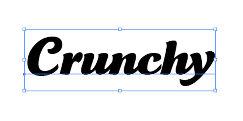
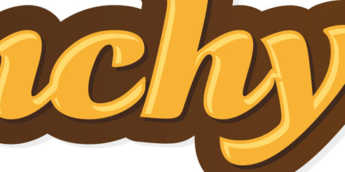
Final Preview

Below are the steps to create a crunchy and nice logo, clean and legible (like the logo above).
Step 1
Start with choosing the right font. For this example, we will use Tartine Script. Have a look on the Pillowy Soft Scripts very useful for this.
Once your word written, vectorize the text.
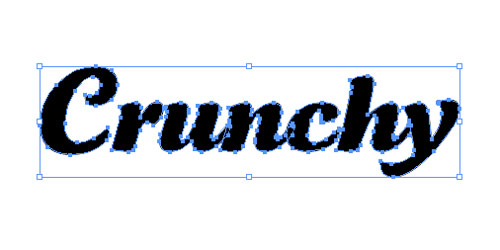
It”s important to have a single form to proceed, so we”ll have to clean the uneeded anchor points.
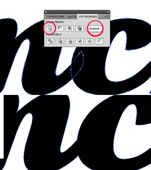
Step 2
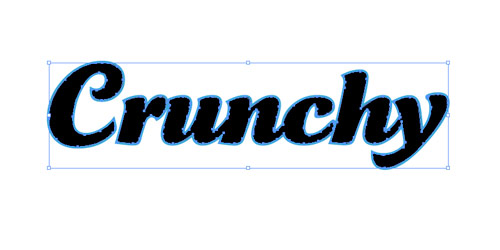
Once selected, press Cmd + Shift + G to ungroup, select the Make Compund Shape in the drop down list. In the Pathfinder, click the button on the left, and then, decompose.
Step 3
It”s time to create the stroke path of the word. We need to duplicate the word and paste it right under the other : Cmd+C , Cmd+B (Paste Under). Then, choose a stroke color, (blue in the image below) and nothing for the fill color.
At this point, we have a first word with a black as the fill color, and right under, a second word with blue as the stroke color.
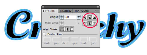
Step 4
Increase the size of the stroke until you think it looks awesome. Then click the rounded end and the rounded angle button. Then to the Object menu > Path > Outline Stroke
Step 5
Now choose your colors. Here, let”s imagine a cereal bar with chocolate, okay ?

Step 6
Details are important, let”s make a first shadow just under the yellow word. Cmd+C > Cmd+B to copy and paste it right under, then with the arrow keys, move the word until you think it”s appropriate for a shadow. We”ll choose a darker color than the chosen brown.

Step 7
Add a slight grey shadow under the whole word. Copy and paste the brown element under the whole thing, select a light gray and move it in order to make it look like a shadow.
Step 8
Lastly, add a few crunchy effects! It”s easy, just cut a few pieces of the yellow word, and apply the 3D Extrude and Bevel effects. Careful to select a small extrude depth. Then, it”s done, you have done your first web 2.0 / cereal bar logo!
Conclusion
Don”t hesitate to try the same with other fonts, and other colors. Add a slice of orange, a few water drops and you”ll get a perfect Orange juice logo, there is an infinite number of choice to get to a cool result, so enjoy!


I like it! Thanks for the tutorial.
crunchy list ! great tutorial !
nice work, but the dl file is 404 😉
Hey, GREAT! tutorial. I was wondering though, how did you get that shine effect on the word “Crunchy” as shown in step 7?
simple and best tutorials. I always like your photoshop effects.
Hey~ I’m not so understand about the step 7. >.<
Yeah, step 7 needs a second look for continuity please. Thanks!
Well this is really helpful tutorial, thanks for share..
thanks for sharing… but you left out really important steps at the end!
How did you make the highlights on the text???
Thanks for the time you put into this tutorial!
How did you highlight the text? its not clear in point 7?
I don’t understand how you made the highlights in the text. Can you elaborate?
i loved the crunchy, word texting thanks, seen i was already use to illustrator iv done it like its baby food but thanks thoe. im really bad at font choosing and this really helped me to understand the chooing of fonts.
Step 7 – and other issues…corrections and additions.
I just tried following the tutorial and step 7 includes several missing steps, not just the highlight effect. Luckily I’ve been using illustrator for over 10yrs but really don’t get to use it for this type of work on a day to day.
Highlight –
1. Create a duplicate layer of the gold “Crunchy” and set your highlight color. Name this layer “highlight”
2. Then create a secondary layer right on top of that with the original color. Call this layer “the cut” for reference.
3. Now comes the magic…there are two ways to achieve the highlight I’ve noticed.
method a –
a. Lock all layers except “the cut” and “highlight” and slightly offset the top “the cut” layer until a little highlight color peeks through. When it looks right, use the “Divide” tool in your Pathfinder and delete the excess.
method b –
b. Shrink or slightly distort “the cut” layer until enough of the highlight layer shows like a highlight and again use the divide tool to cut out your highlight.
How did he get the type on a slant?
1. Use the “Shear” to accomplish this effect.
2. Apple the tool by clicking on your selected assets until you achieve your desired look and feel.
Outline the stroke
If you’ve used illustrator for awhile, you know that if you resize a stroke it starts to look odd at smaller or larger sizes. To correct this.
1. Select the stroke
2. Go to Object–>Path–>Outline Stroke
Not sure why the author left out these details but otherwise it’s a stellar tutorial for getting this effect done quickly
hmm… but how to male it with 3D Extrude and Bevel ?