There are various website designs that you could see in the internet. These designs use different concepts and ideas depending on what the website is about and depending on the taste of the website owner. Colorful websites are usual for it attracts the viewers through its colorful elements. But why don’t you try viewing and designing a less colorful website?
Monochromatic design is also used in web designing. When we say monochromatic, it means that the design uses one color. You choose a base color and then add white or black to change the shade of the color. There are different art works that use this kind of color scheme and had been successful in taking the interest of the viewers. Same is true for web designing. Monochromatic color scheme also gives a good impact to the readers of the website.
Here is an example of a monochromatic palette with the base color at the center. The left shows a darker shade of the color while the right shows a lighter shade of the color.

Image: stampersquest
Well, some of you might wonder why some designers and web owners opt to use monochromatic colors for their websites. In this post, we will unveil to you the reasons why monochromatic websites can be good that the more colorful ones. Come and take a peek!
1. Easy to design.

Image: jameslaicreative
Of course, working with a lot of colors is sometimes taxing for you need to make sure that you’ll be using the right combinations. That is why a monochromatic palette is much easier to make. You simply have to choose a color and then add white and black to it to attain different shades.
2. Colors can never clash.

Image: homedesignfind
Since you are using only one color, the colors never clash. No one can say that you are using the wrong color combination. It is always safe to use monochromatic color schemes especially if you have trouble looking for the right colors.
3. Design is more minimal.

Image: bidsketch
There will be no competing colors in your website which makes it simpler to look at. The simplicity of the color schemes gives a simple impact to your website design. Peacefulness builds in the design and it even looks better than those with flashy colors and lots of elements on it.
4. Allows you to emphasize important elements.

Image: absolutebica
The use of monochromatic colors makes it easier for you to emphasize the more important elements. You can use contrasting colors for some elements in order for it to be easily noticed. It wouldn’t be hard to choose the right contrast, too. And it wouldn’t be hard to notice those elements when done this way.
5. Emphasizes the content.

Image: winter.tnvacation
Upon landing on a website, a viewer or a reader would look into the flashy items in the website. This results into diverting their attention to other things instead of the content of the website. But if you use monochromatic design, the readers will immediately look into the contents of the site.
6. No distractions.

Image: lealea
For sure, there wouldn’t be distracting items in your websites. No rainbow of colors and fancy colorful elements that might distract the readers. Others won’t be able to finish reading your post because their attention will be driven to those items. But in using monochromatic, they’ll read without interruptions and will be able to appreciate your website even more. It is not just the design that matters, it is the content that is most important.
7. Accessible to people with color blindness.

Image: designsvn
In a monochromatic website, the design uses different shades of color and not different colors. Hence, it is more accessible to people with color blindness. Contrast of colors is still the same whether the person could see the color or not. This means that you are not limiting your website to those who could see colors well but also to those who couldn’t. Everyone could read your website which is a good thing for you.
8. Easier to remember.

Image: Liptongreenmint
Your website is easier to read and is also easier to remember. Some users dislike websites that uses too may colors. You can observe that more effective advertising uses monochromatic scheme for it is easier for people to remember it. Take for example the website of Lipton Green Tea. They used the color green which is associated with the product. Hence, it will stick to the mind of the viewers that when it comes to a delicious tea, green means Lipton Green Tea. Even one glance at it will make them remember the product easily.
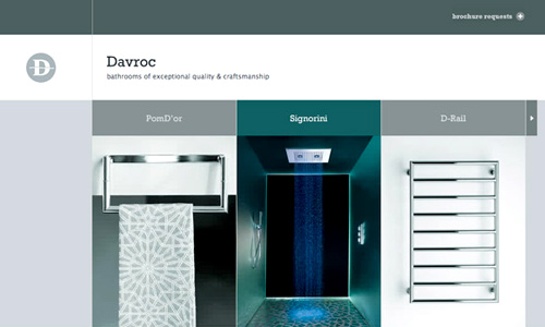
9. Looks elegant.

Image: interiors.davroc
A monochromatic website doesn’t need shinny colors in order for it to look elegant. There is really that elegant touch whenever you use this kind of color scheme. Others look at it as classic while some view it as more modern. It depends on how a viewer looks at it but one thing is for sure, it will always look elegant.
10. Easy to the eyes.

Unlike a website with too many colors, these type of websites are easy to the eyes. Readers prefer websites that are light for it is easier to read. It gives a more clear direction to the eyes and it doesn’t tire the eyes easily. That is why some people prefer monochromatic websites.
11. Easier to choose text colors.

Image: silverbackapp
You will also get away from the hassle of choosing the right color for your text in order for it to be readable. You can actually choose black or white or a darker or lighter color of the color you have used.
As you can see, even if it is not that colorful, the websites still look great. Some may say that it is monotonous and boring but as you look at the websites, it doesn’t look that way. It really depends on how you work on your designs. Web designers use different base colors for their design. It could be green, red, purple,orange,yellow, brown,blue and many other colors. Have you tried making a website with a monochromatic color scheme? If you haven’t, why don’t you give it a try?


I’m not saying this is true, but I’ve heard that monochromatic colors make things collide with each other, which essentially give websites a soft feel.
Excellent post.. It would be better if you add more examples.. thanks Kareen Liez..
Excellent listing of mono site. Makes very good sense to go that way
Excellent job done…….(-_-)
Very good roundup of mono website designs. The colors looks great depends on how you use it.
Very nice article, thanks!