Proportion is usually unnoticed until something is out of proportion. When the relative size of two elements being compared seems wrong or out of balance it is said to be “out of proportion”. For example if a person has a head larger than his entire body, then we would say that it is out of proportion. Most of the time, we can only value proportion when we see designs or things which look distorted and are therefore not pleasing to the eyes.
The human body is the most universal standard of measurement. Things in nature are also used as basis in proportioning. Designs and other stuff that doesn’t arrive with these standards may look ugly in the eyes of many.
In architecture and interior design, we consider proportions in creating spaces between rooms and furniture. We do not use a big chandelier in a small dining room. We also do not use a very huge door for a mere bathroom. This is done this way to make the designs look friendlier and more comfortable.
Hence, every designer will try to make his works proportionate in order to satisfy himself, his clients and those who look at his designs. In this article, we will give you a few tips on how to make your designs look better by using proportions.
1.Use the Golden Ratio.
When we speak of proportions, the Golden Ratio is usually used. The Golden Ratio is also sometimes called the golden section, golden mean, golden number, divine proportion, divine section and golden proportion. The golden ratio (symbol is the Greek letter “phi”)is a special number approximately equal to 1.61803398874989484820… (and so on). It appears many times in geometry, art, architecture and other areas.
It is called “golden” because it is said that whenever the phi value is used, the outcome is the most aesthetically pleasing design. The golden ration was used in the Parthenon, Leonardo Da Vinci’s Mona Lisa, the Great Pyramids of Giza and many other artistic works.
For designers, you may want to use the golden ration in your works. Take a look at Wes Pack ‘s tutorial on Using the new Divine Proportion tool in CorelDraw.
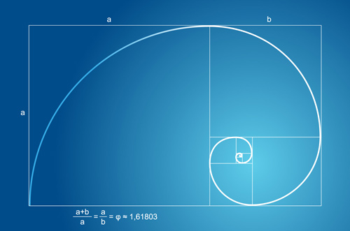
Below is what we call the phi bar. It is shown how the golden ratio is used by dividing the entire length of a and b with the width a which is equal to phi or 1.618 which is also equal if we divide the shorter length b with the width a. Of course, the width and the longer length is of the same distance. Remember, we are speaking of proportion here.
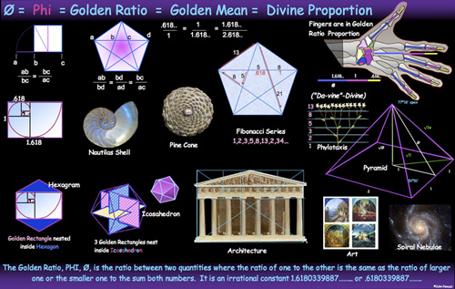
Below are more examples where in the golden ratio is being used. We can see the human hand bones, the pyramid, the golden rectangle and other art works based on this proportion tool. For you to have a more in depth information, you can find sources at the end of this article wherein you can gain more explanation about the divine proportion.
2.Use the body and face tutorial.
It is said that the basis for proportion is the human’s body and those found in nature. Some artists are having a hard time to think if their work is really proportioned or not. Take a look at the picture below and use it as a guide in making proportioned bodies and faces.
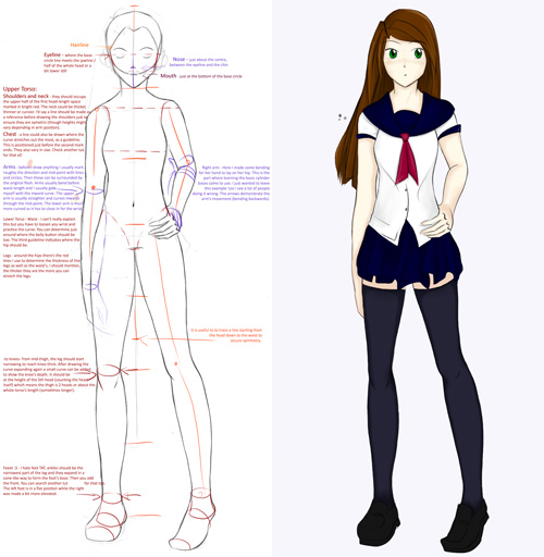
Image: hikaru-ki
3.Consider the relationship of one element to the size of another element.
In making designs, sizes vary. The sizes of the elements we use make our work proportional. Consider the advertising poster below as an example which made use of this principle. The huge leaf was being carried by ants. Of course, ants are smaller and the leaf is bigger. Other than the size of the elememts, we can also observe that what makes the design proportional is the number of ants carrying the leaf. If only one ant carried the huge leaf, then it is not proportional.

Image: REGGDIS
4.Consider the height, width and depth of one element to another element.
Aside from sizes, we also look into an element’s height, width and depth. The poster below shows a tall big jar. Inside it are of course tall type characters which gave emphasis that they were inside the jar while the type in smaller size seems like merely printed on the surface of the jar.There are actually many ways in applying this principle especially when you deal with tall or long objects. There is a tendency for long elements to look smaller on the farther part and bigger on the nearer area.

Image: scottrichardson
5.Put similar elements together.
It is always a principle that similar elements should be placed together. Hence, in considering proportions, elements similar in character and elements which have a common feature should be put together. The design below shows a woamn wearing a pink blouse with square pattern prints. Blue squares in different tones overlay the blouse. On the other side, a flower whose petals are given emphasis thorugh thin lines is shown.Thus, thin lines were also used to overlay it. As we can see, squares were combined with squares and thin lines with thin lines.

Image: adheeslev
6.Make areas in your design.
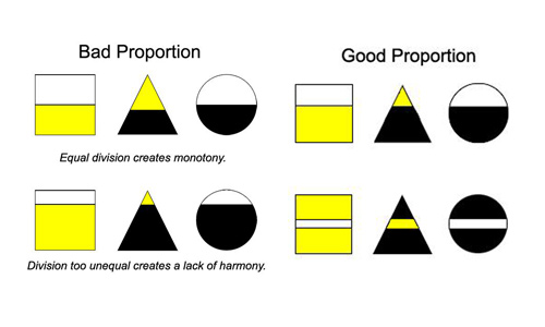
Areas are essential parts of a design. Make use of areas that are not monotonous. Use major and minor areas to make a better output. The figure below shows the difference of using a bad and good proportion when we speak of areas.
7.Give a dynamic eye direction in using areas.
Spaces should be arranged in a manner not composing or halves, quarters, thirds, etc. Make your designs more dynamic by giving direction to the eyes but still creating a relationship between the areas. A page layout shown below is done in a manner that it won’t look boring to the readers. Instead of perfectly dividing the page into halves of thirds, the layout artist made irregular sizes of the areas and even inclined the entire layout. This is a smart and creative way of layouting.
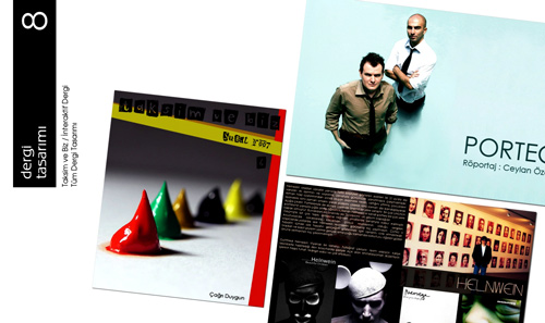
Image: ceylanozdemir
8.Consider the relationship of size of one area to the size of another area.
In using areas, as mentioned in number 5, we need to make use of major and minor spaces. In this manner, we will be able to consider the differences of the sizes of areas. We have to be careful not to make too much difference in areas for this will make them unrelated. Big difference in areas may also ruin the harmony of a design. In the web design below, you can see that the designer used various area sizes. This is an effective way of separating some of the parts like the smaller colored rectangles on the top which signifies the menu while the parts that go together were placed in one area. But despite that, we could still see the whole design is together and in harmony with each other.
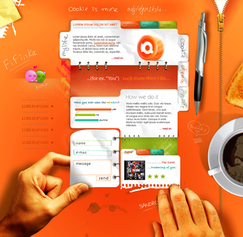
Image: Fedrick
9.Use harmony.
Harmony is an agreement between the shapes that stresses the similarities of all parts. We have to make sure that shapes fit in its proper positions and spaces adjoining other elements in the design. The business card shown below used shapes whose harmony was maintained because of its usage of lines and curves. Though they come in different colors, they still fit together.
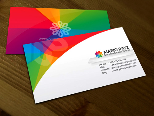
Image: Lemongraphic
10.Used to determine distance.
The use of proportion is also important in determining if the elements are near or far from each other. It shows a sense of isolation. This way, we are considering the amount of spaces between two or more elements. The advertising poster below shows a mountain which is far from the man. This is obvious because the man is larger than the mountain and the letters on top of the mountain are also smaller. This is how we deal with elements if we want it to appear near or far. Nearer objects are bigger while farther ones are smaller.

Image: KyleBebeau
Sometimes, it might not be easy to use proportion especially if we try to stick with the rules. But we don’t really have to compute everything so that it will be equal to phi. By merely looking at our works, we could easily determine if it is proportioned or not by comparing them to the things in nature or the human body. When you work on a project, keep in mind that proportioned outputs look more pleasing. Though, some people choose to use distortions which is another form of art.For now, before you try distorting, try working with proportions first. More people can actually appreciate proportions for it is what their eyes are used to look at.
Artists and designers out there will surely agree that proportion-as a principle in design- is truly very much important to come up with a totally great project!
- Source:
- Guidelines for good design by Mark
- Proportion
- Principles of Design
- A Guide to Good Design- Pleasing proportions borrowed from nature by Graham Blackbur


Very useful!! thx a lot!!
Great tips, thanks for sharing this useful info..
Great tips thanks for sharing will try implement the tips here in my next projects.
Great tool list, thanks for that!