Colors are vital elements it web designing. It can make a site look visually attractive. It is important for web designers to consider colors for it can greatly influence the site and the visitors as well. The choice of colors has different effect to a person. That is why one should think before choosing the color to use. Every color has their meaning. This is known as color psychology.
Different colors influence the mood and state of the human mind. We might not be fully aware of this but colors really play a vital role in conveying a message to the readers. In today’s post, we will give you some examples of how color psychology is being used in websites. Try to see if the color could help relay their message.
1. Red.
The color red is considered as the hottest and most dynamic color. It evokes strong emotions that is why it is associated with love, passion and even anger. It is an intense color that can also show feelings of sexuality, intensity, determination, courage, and excitement. It also shows warmth and comfort. It is also used to warn people and show danger. For web design, red can be used minimally. You can choose other colors like white and silver to be an accent for red or you may also use red as an accent in order to give emphasis to important elements in the site.

Finer Home uses red as its primary color and is made even more appealing with the use of floral patterns.

Also using patterns and two shades of red for its stripe background, Holiday To Go succeeded to make the site look more inviting for costumers.
2. Orange.
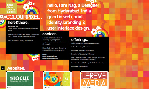
The color orange can show comfort, creativity, celebration, fun, youth, and affordability. It is vibrant and energetic with a friendly and inviting feel. It is not as overwhelming as red which means that you can use this for sites that shows energy. You can also use it to promote food and snacks. Orange is highly acceptable to young people. So, if you target the youth, you can opt to use this color. This can also help in making your site look inviting.
Colourpixel managed to use different shades of orange for their site which make it look creative and vibrant.
A darker shade of orange is seen in Traffik giving it a more serious and professional look.
3. Yellow.
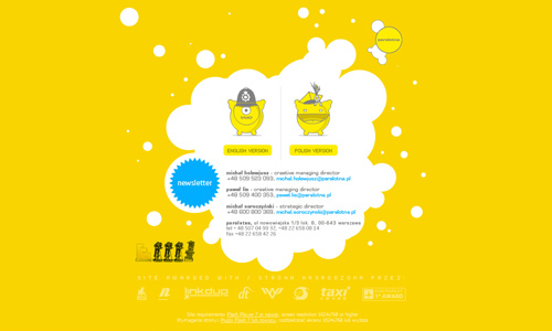
The color yellow is the brightest color that depicts curiosity, playfulness, cheerfulness, amusement, comfort, liveliness, intellect, happiness and energy. It is attention grabbing and makes one feel excited when seeing it. That is why most stuff for kids has the color yellow for it is exciting for them. It can be used for websites for kids for it gives the impression of joy, cheer and friendliness. When you use darker shades of it, it can give a vintage touch.
A very attractive bright yellow website that shows liveliness and would enocurage curiosity to the visitors.
Surely, the Honey Defender will come to rescue your sweet tastebuds with this playful and amusing orange site.
4. Green.
The color green is associated with money, nature, animals, health, healing, life, harmony, durability, reliability, safety, honesty, optimism and freshness. It is known to relieve stress and have that soothing effect that will surely make you feel relaxed. It is also said that green can help someone learn new things easier. You can use this to show balance and harmony in your website. Darker shades can show stability.
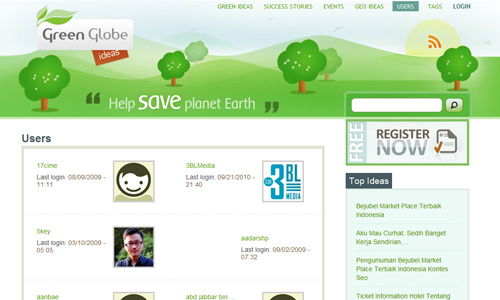
Green is the coolr of nature. Hence, it is just right for Green Global to use this color in advocating for the preservation of the planet.
Like the other website, this one also speaks of the environment that is why they used the color green.
5. Blue.
The color blue is associated with trustworthiness, success, seriousness, calmness, power, professionalism, depth, stability, loyalty, reliability, honor and trust. It is a cold color that gives a cool and calm impact. Lighter shades can be used for websites that shows friendliness and would like to reach out to the people. Darker shades are more appropriate for business designs.
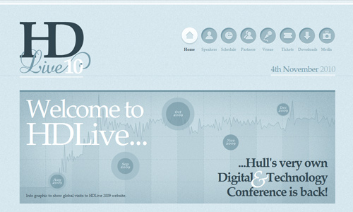
The look of this site shows calmness and friendliness which will surely make you visit it.
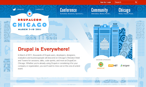
Great usage of patterns and graphics with a cool and professional touch due to its shades of blue.
6. Purple.
The color purple shows royalty, justice, ambiguity, uncertainty, luxury, fantasy, dreams, power, nobility, mystery, elegance and magic. Lighter and softer shades of purple can be used for websites that is associated with spring and romance. Darker shades can be used for designs that would like to show wealth and luxury.
The subtle use of purple gives the site a touch of mystery and elegance.
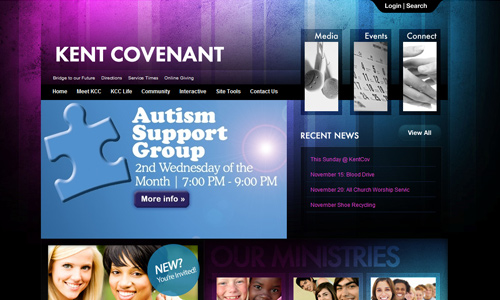
Shades of purple and blue is used in this site which advocates support for autism.
7. Pink.
The color pink depicts softness, sweetness, innocence, youthfulness, tenderness and femininity. Pink is usually associated to young females but not at all times. The color can surely make you think of candies, bubble gum and other sweet stuff. When used for web design, it can be applied for the entire website that gives it a totally calming, soft, playful and sweet impact. Darker shades can also be used for more serious websites.
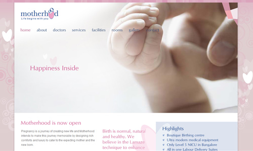
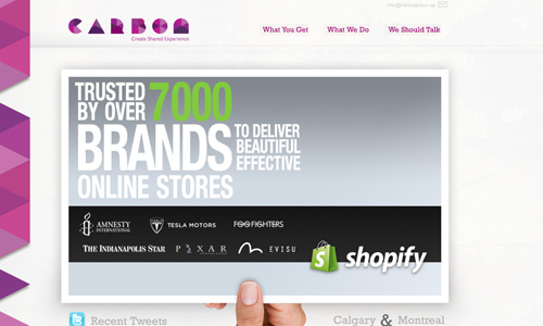
Gentle love and genuine care is seen in this site for the greatness of Motherhood.
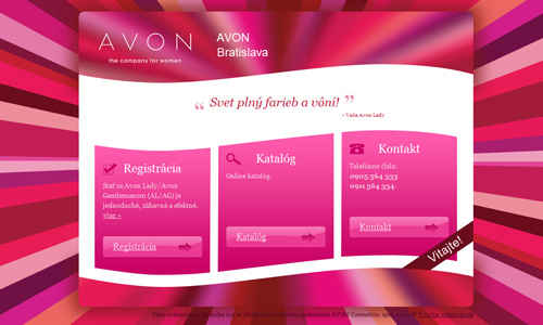
Avon has various items for women. Thier site with different shades of pink gvies a strong impact and would really make one understand that they are more of products for females.
8. Grey.
The color grey is associated with conservatism, traditionalism, intelligence, seriousness, neutrality and indifference. It is usually used as background to give emphasis to some elements in the site. There are times when it is subtly used but there are also instances when it is used for the entire website making it look monochromatic.
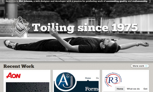
Grey is the primary color for this site giving it a minimalistic look with a touch of intelligence and seriousness.
The grey color of most parts of the site gives emphasis to its important contents. Neutrality, intelligence and conservatism is seen in the choice of color.
9. Brown.
The color brown is relaxing, confident, casual and reassuring. It is associated with nature, and some tribal or primitive stuff. It can be relaxing when used in designing. Different shades of brown can be used in web design. Like grey, it is also used as background for websites. It could either be used for the entire site or it can be used for chosen areas of the website.

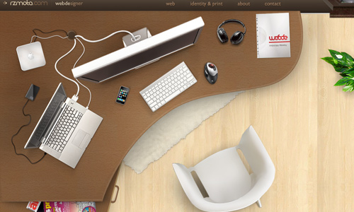
As you get a cup of coffee, you will surely feel relaxed. Same as the color of the site which is relaxing and casual.
Confidence of the site’s owner is seen in his choice of brown shades for the design.
10. Black and White.
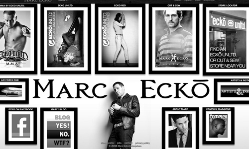
Neutral colors black and white are widely used in all websites. Black shows elegance, sophistication, formality, strength and mystery. White shows cleanliness, purity, newness, virginity, peace, innocence and simplicity. Some minimal websites only use both colors for their website. Most of the time, these two colors are used for fonts and types for they can easily be seen and recognized.
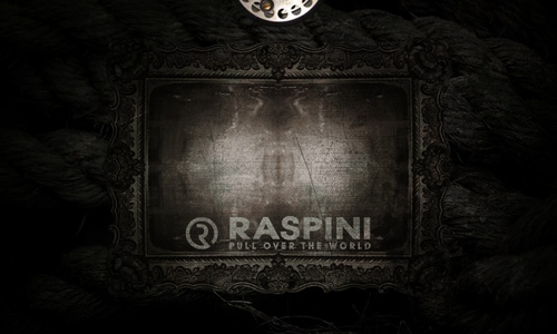
A textured black website is certainly attractive!The site looks elegant with the touch of mystery and strength.
A minimalist design using black and white giving the site a look of cleanliness and formality.
It’s Your Turn Now
Color is indeed very important not just for adding beauty to the site but also in giving the right message and perception to the visitors. If you have seen other sites wherein you had a good impression in their website color psychology, feel free to share it with us.







Marvi, this is a brilliant post, thanks you for it.
For some reason I have a real problem with anything that has to do with colors and this post gave me the knowlege I needed.
Now I can start improving the appearence of my sites.
Thanks again.
wow ate..this is just a great collection..
Getting educated with this is just very important. Thank you for this post.
this is just great!!!
Nice collection !
Hi, I think this post is very good and on the right track, but it would’ve been nicer if you would’ve given more background as to WHY we perceive of those colours that way either psychologically or culturally. Perhaps a follow-up post?