When promoting a product, service or a company, a landing page would surely be a good option. This is so true when it comes to online business marketing especially that most of us are browsing the internet everyday to get information. Landing pages can reach thousands and millions of people around the globe which can be very helpful for your promotion. For this reason, numerous landing pages are seen online and it also became a challenge on how each one can effectively get the attention of their target audience.
Well, your landing page will fail if you are not able to grab the attention of the readers and let them set their eyes on your contents. You will also fail to give them a good offer that would be helpful for them and for your company as well. You will also fail to lead them to your website’s homepage on on other pages of the site. So, to help you come up with an attractive landing page design, we have here some points for you to ponder on. These 10 things could be the basic points that will help you attract your target audience and might even by your key to a successful business. Remember that part of having an effective landing page is by making it attractive. Read on the tips below:
1. Have a good layout.
Layout is how you place all the design elements. Make sure that it will work and would be effective in conveying a message. Do that by having a good layout which includes proper placement of images and text. Observe balance and be sure that they are arranged in a manner that the reader can determine which one is more important. Avoid a cluttered layout because it will only confuse the readers. Make it look organized and neat to aid for good usability.
2. Create a clean look using white space.
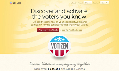
Some may not really understand the value of white space but it is very much important especially when we speak of getting the attention of the readers. White space is very powerful in making a landing page and other layouts very attractive. This makes the entire look easy and friendly to the eyes. So, use ample white space by placing it around the important elements of the landing page. White space or negative space gives the landing page a cleaner and fresher look.
3. Make it colorful.
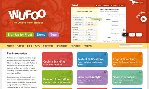
Most people are attracted to colors. Use that for your landing page. But see to it that you are using colors that are relevant to the page and the company it represents. Also, take note of color psychology and how it can affect the visitors. This way, you will be able to use the right colors and attract the users at the same time.
4. Use contrasting colors to highlight elements.
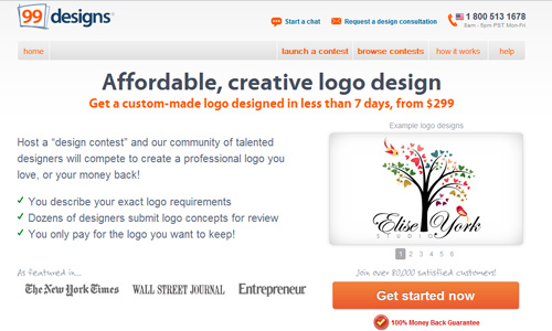
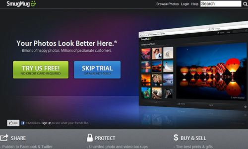
There could be some elements in your landing page that you would like to give emphasis like your call to action. You can do that by using contrasting colors. This can let your text pop and would attract the readers to it. The readers can easily see your call to action if you make use of contrasting colors. Aside from your call to action, use contrasts on other parts of your design.
5. Guide the user’s eyes by using a cartoon.
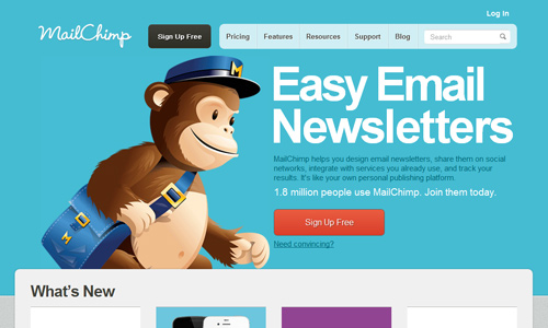
You can place a character or a mascot to areas that you want your readers to look. Let that character stare at that part or point at that part so that the reader’s eyes will also be guided towards it. Just be sure that the character you will use is relevant to the landing page and not just any character.
6. Be straight to the point.
Avoid running around the bush. Be direct on what you want to say. This can immediately give the users an idea on what your landing page is about. Also, it wouldn’t be a hassle for the readers that they would need to reader much stuff only to find out that it is not actually what you want to say and they will only get what you mean at the bottom part. Avoid doing that because they will only feel like you have wasted their time.
7. Build trust.
If you fail for this point, you will also fail to get that client. Every user sees to it that they will not get involved with anything that would cause them harm or my compromise themselves. They always want to make sure that the information they leave are safe and that they are doing a transaction that is also safe. So, build trust by the time the user lands on your page. You can do that by following the tips on how to increase trust for a landing page.
8. Place images of good quality.
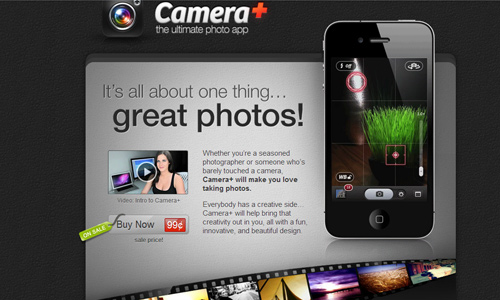
When you place an image, choose those that have high quality. Be sure that it looks sharp on the page and not blurry. If you place blurry images, it would decrease the landing page’s value and would even look cheap and unprofessional. Also, when you choose images, be sure that it is something that can help you relay information relevant to the landing page. Place them on the right spots. images also play a great role in attracting the target audience. Bear in mind also that when you use https://naldzgraphics.net/wp-content/uploads/2012/06, it has to be small in size but of good quality and is attractive.
9. Play with typography.
Well, this does not necessarily mean that you will just use whatever type you want and place them wherever you want. While you are being creative, see to it that you also consider proper balance and placement. Also, make use of the right typography font that would convey the right information. Some landing pages uses minimal images and more on typography but they still work well. This is because of the right choice of type and the right layouting.
10. Have a clear call to action.
This is one important factor. If you want the landing page to be attractive, then you have to place a clear call to action. You do not need to place many calls to action. One call to action could be enough as long as you designed it rightly. Use a color that is not used on other parts of the page and let it appear above the fold. You can also read more tips on how to design an effective call to action.
It’s Your Turn Now
Having an attractive landing page could give countless advantages to you and your business. You will not just impress the users but you will also get good conversion and less bounce rates. For sure, when you create an effective and attractive landing page, you will be able to get to your goals. Do you see other landing page designs that you find attractive? You might want to share those us.




Really good post with great points! It got me thinking and I can make my landing pages even better
No matter how amazing a landing page is, if no one finds it on google then it is useless.
Hey!
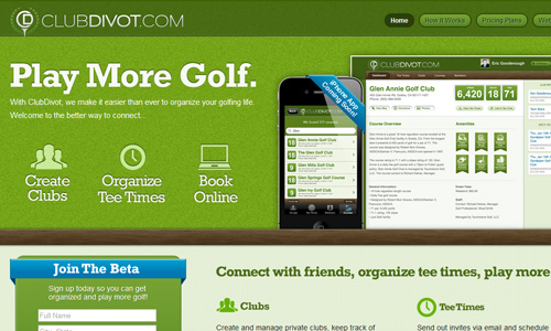
Thanks for featuring clubdivot.com! It’s an honor to be on the same page as some of those other great designs. Our designer is awesome and always does amazing landing pages.
Thanks again for the shout out.
Cheers.
-eric