Good company logos last for many years, great company logos last for a life time. Business services firms, consultants, insurance companies, accountants and mortgage brokers want a professional corporate logos but they also want to distinguish themselves from their competition and ensure their logo design doesn”t “feel out-of-date” a year after they print their business cards. One way for corporations operating in these traditional industries to distinguish themselves from the competition is to position themselves as a modern, fresh and cutting edge company; and a fresh logo and corporate identity is one way to establish this in the customer”s mind.
Below are 30 corporate logos (created for “bricks and mortar” corporations – such as insurance companies, consultants and recruitment firms) that are fresh, modern and upbeat.
2014 Update:
For this new update, we have expanded this collection of inspiring logo designs for you to see and have some ideas and inspiration in making your own designs. Scroll down and check them all out. Come, take a a peek, and enjoy!


Conclusion
Using bright colors (greens, blues, oranges, reds and purples – sometimes all at once), gradients, grey shadows beneath icons and transparency overlays can give your corporate mark a fresh, dynamic and modern feel.


Great Selection of logos! Congrats!
These logos suck….aside from being extremely generic solutions, the majority of them are far too complex for a logo, and show no creative thinking whatsoever.
Really nice selection, some very good inspiration here, thanks.
All of them are not very good though
look more like stock logos
Nice collection of logo design, thanks for the inspiration
Very fine colection. Thanks.
Some original logos! Thanks for sharing
Poor selection, non impressive.
Show me the Web address of these so-called “logos.” I want to see them actually being used by a real company. LOL. Yeah, never mind.
This is a celebration of stock-art put to use.
Nice collection. Good use of font as a design element. Thanks for sharing.
A lot of these definitely seem like stock logos or (hopefully not) clip-art. The only ones that jump out to me as original and successful are Full-Time Employment Agency, MediaWire, and SOAP.
These are awful. Some of these don’t even look like real companies. “Your I.T department”? Most of them look like something someone threw together after doing a tutorial because they thought the effect was cool, not because it fit the business.
Pretty terrible selection. Most of them don’t seem to have any connect with the company they’re supposed to represent.
I think some of these logos are pretty creative. I do second the comment that a few are too complicated, but great inspiration non the less! Thanks for the post!
What’s with that “Matrix” logo being in the Mary Tyler Moore Show font? It’s a bit before my time, still it reeks of the 70s. I can see how a younger designer wouldn’t have any idea what he/she has done, but what about the client?
Those are too far from “modern corporate”. Just simple dumb web 2.0 trendy logos which aren’t memorable nor original.
Awesome collection. Very creative design logo. Thanks for sharing this nice post. 🙂
Sure, they’re okay (if really, really generic and stock-like) in color, with the fancy gradients and whatnot, but most of these logos are going to look terrible if they’re small and in black and white. You’ll lose everything that makes the logos even vaguely interesting.
Logos should not rely on color, and they need to look great large or small. Most of these do not meet this criteria. There are so many big corporations who have timeless logos that haven’t even been mentioned. These are small start-ups with cliche marks.
Not an impressive collection at all. Mildly pretty, yes. They look like they were fun to do, yes. And I’m sure they didn’t cost much, because nobody did any industry research or investigated the competitive marketplace.
In fact, it’s apparent to me that nobody took the time to understand what these companies actually do – what their products and services are, who the customers are, who the competition is, what the advantages and disadvantages are in the marketplace. Granted, it’s hard to balance all those considerations and come up with a simple mark we can all still recognize when it’s only a cm square, silkscreen-printed on the barrel of a flash drive. Or at 16 pixels square, rendered as a favicon.
Which is why I also agree with a lot of the folks who have pointed out that too many of these marks still need to get a lot simpler – their delicate thicks and thins won’t work at those very small sizes.
(In fact, I generally design the favicon separately from the logo – 16 x 16 is so small that to make an entire identity work at that size would force every brand to look way too chunky at bigger sizes, imho.)
But there is one piece of good news in this post: if you have clients – or friends – who are wondering what’s wrong with stock logos and the 99-designs concept, now you can send them here! This page speaks more eloquently than the most polished professor of design or any PR representative from AIGA, the official professional organization of the graphic-design industry in the US.
100% YES
I like this article. In the author’s defence “corporate logos” are a difficult area to find inspiration. I would say these are all “modern” but not necessarily “creative” or “inspirational” to look at (but nowhere did the author claim that these examples were creative – so what’s everyone whinging about?).
@Mary Baum – it is ridiculous to claim these designers did not understand the companies they created the designs for without yourself understanding the companies and their respective markets. To be honest, I checked out your portfolio, I could make the same criticism of your designs but that wouldn’t be fair without understanding your clients or the brief the designers were given.
While I agree that some of the logos are indeed slick and trendy, most of them rely too much on color and their size to really work as abona fide logos.
I would not go so far as to be all hater like James, but a lot of them are ‘stock’ like..but you know what? someone had to design those ‘stock’ logos as well!
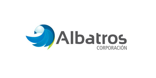
The one that stood out to me was the Albatros logo, as that would easily work in a single color at any size with a small amount of tweaking.
That being said, I would have to agree with Steve-O on Mary Baum’s critique. I am not sure how she ever hopes to support her argument that the logos’ designers never did the depth of necessary reasearch required to truly capture the essence of the company or the the good/service they provide, unless she actually talked to the designers and specifically asked that question to each.
Like Steve-o i had a look at her site and her ‘two decades of logos’. Unless she meant that the span was from 1989-1991, which does take two decades into account. I was underwhelmed to say the least. Of the selection posted, the Frontenac, Visions, Artesys, and her own logo are the best of the bunch.
I could make the same argument that perhaps Ms. Baum did not entirely capture the essence of the companies that she was doing the work for either. However, I know a little better, and instead say with way more certainty that this was not the case at all but rather, as most designers must do if they hope to remain in business, she aceded to the wishes of the client, even if she knew that that the client’s choice was wholly unflattering or would not really work as a logo, like the “First Draft” logo.
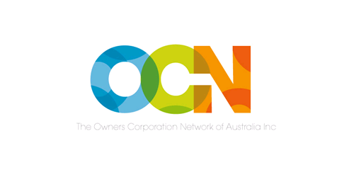
These are pretty great and I totally love OCN and Fulltime the most!
great collection
Most of these are not original and look like your traditional stock logos for made-up companies. In fact, I think I’ve seen many of those shapes/icons in several other logos before. Good try though.
Thanks guys – appreciate both the positive and negative feedback (validates and improves my views).
Feel free to follow on Twitter to discuss @adamarbolino
amazing collection … very inspiring,thanks for share…
Cool logos, but some of them i want to see in black-white (it is impossible), and also try to make it small – some logos will be like a piece of.. But some logos – amazing
What I think needs to be emphasized here is that these are “corporate” logos. I would love to be attached to a corporate project where they simply look at me and say “oh, we totally trust your judgement. Yeah, go crazy. Be creative and most importantly, be sure to come up with something unique and original.” These are CORPORATIONS. Half the time they are actually getting their inspiration from stock photos and gasp! clip art. Most of your time in a corporate art environment is spent trying to spin the absolutely horrible idea you just received into something at least mildly digestible.