Before we start I just want to thank the people who give a link back to my site on my last post tutorial on Create an Artistic One Eye TV Man in A Grunge Vector Design. I really appreciate it. In this tutorial, you will learn how to create a realistic Graffiti text with image on a wall. You will learn more on how to use vanishing point, cloning and displacement. So here’s a quick glimpse of the final result of our tutorial for today.
Final Result

So to start our tutorial we need an image first. We will gonna this wall and you can download this in HERE. After you download just adjust the contrast to 15. go to Image>Adjustments>Brightness/Contrast.

Now that we have our wall image. All we need to do now is to get that broom out of the image first. We will gonna use Vanishing Point for this. To use vanishing point go to Go to Filter>Vanishing Point. On Vanishing Point, choose Create Plane Tool (C). Select on the direction where the vanishing line are directing. You will notice it on the four corner that have just pointed.

Click Stamp tool (S). Adjust Diameter to 120,Hardness to 50, Opacity to 100 and Heal On. And now start cloning the area. The same process on how you use Clone Stamp Tool.

So once your done cloning heres our wall now.it looks clean and ready to be vandalize.

Before we proceed, in this part we need to Duplicate first our image and Desaturate it. Go to Image>Adjustments>Desaturate. Copy the desaturated image to another Working Layer and save it in psd file. Name it “Wall Displace”. The reason why we did this is to use this psd on the displacement that we will gonna work later on.

Now that we are done saving the desaturated wall on the other working layer lets start making the other elements or the text and image that we will gonna put on our wall. Lets start first on the image. I prefer to work this on another working Layer.
So here;s how it done.

Now Select all the layers of this image that we have just made. Once all the layers are selected right click on the Layers Palette and chose Merge Layers. Then Transfer the image into our main working Layer.
Now for the text you can use this graffiti style font in Dafont and save it to your font folder. if still don’t know how to use the font, I’m sure this post How To Load A Font will help you.
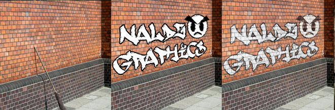
So now we will work on the text.I use Naldz Graphics as our sample text on this tutorial. Choose Horizontal Type Mask Tool (T). Use #ffffff color. for the Stroke, Go to Edit>Strokes. Adjust width to 13 pixel and color is #000000

Now that we’re done on the text and image, Put it on the right position and select this two layers by holding shift and select. right click the layer then choose Merge Layers. Name the Layer “Graffiti”.

Now in this part we will gonna use distort and scale.Go to Edit>Transform>Distort or Edit>Transform>Scale. Or you could use CTRL+T for shortcut command. Use the linings on the wall as your guide to come up a perfect transform.

Once your done,Heres our final transform.

This time we will gonna use displacement. and remember the psd we have just save a while ago? this is the time that we will gonna use it. Now click the Graffiti layer then go to Filter>Distort>Displace. Use this setting.

After you click OK another box will appear and look for the Wall Displace.PSD and click Open. The result will now look like this.

Adjust the Layer setting to Overlay and Opacity to 80%.

And for the final touching duplicate the Graffiti layer and Set the copy Layer to Hue and Opacity 100%
and heres our final result on our graffiti. Congratulations!!!
I hope you learn something on this tutorial and let me hear your feedbacks.
If you like this post, please Subscribe to my RSS feed for more updates. It makes me happy too:)
Also if you like you can bookmark this and share it with the others:)thanks for the support.


Some good techniques here , good stuff.
Nice tut, It’s look like realistic.
As usual, awesome tutorial!
Great tutorial, nice using of vanishing point.
One query though, would it not make sense to have used vanishing point to help you get perfect perspective for the artwork? It’s likely to be easier to copy and paste the artwork into Vanishing Point and then drag it into place?
thanks a lot guys.i really appreciate your comments:)
@Ben.
Thanks a lot,yes that would be nice too.My point why i didn’t use vanishing point on the main element and rather use the distort transform coz if I use vanishing point theres a chance that the main element will expand horizontally a bit. same if you us perspective transform. where as on distort i can freely transform it the way i want. I just use the line on the wall as my guide so it will still be on the right position:) I guess it will just depends on peoples choice and and practices.hehe.
Cheers.
Hehe its always the way with Photoshop, 1001 ways to get the same result.. its just remembering them ;o)
Again, nice tutorial.
Hi
Great Tut till one thing at the end.
Iam a totally noob.
i do “Adjust the Layer setting to Overlay and Opacity to 80%.”
but when i copy the graffit it wont look like urs.
it still is like red. do i have to delete one layer of those 2 then ?
i dont get the text black back.
Hi leewe:)
about your problem, after you set the layer to overlay then opacity to 80% duplicate that layer then on the duplicate layer try to adjust it in “HUE” then Opacity is 100%:)
Hi Again.
Its getting more contrast but it wont look like ur still ..here a pic
mitglied.lycos.de/leeweee/problem.jpg
greets
no its not hue/saturation leewe:)
its the hue that can be found near the Opacity
check this:)
http://img391.imageshack.us/img391/3452/qwlb6.png
I hope this help.
great tut, thanks ronald
i always learn about ur tut.
be success
WowZa Wow! That’s a great tutorial 🙂
Thank ya for sharing.