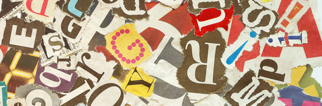
Printed materials are still used these days despite the wide use of digital materials. This is because not everyone could access technology easily and immediately in a local community. Hence, when there is a need to reach a wider range of audience locally, posters and billboards are used. Up to this day, these are very useful especially in promoting and advertising. That is why, graphic designers will never run out of jobs because businesses would need their service and talent in designing posters and other graphic materials.
But if you are just new in the field and you need some guide in designing a poster, we will try to help you through the tips below. Also, this will help those who aren’t graphic designers but would need to design a poster for whatever purpose they need it. We are certain that with the simplified tips we have for you, you will be able to come up with an effective and catchy poster design. But before we talk about designing, we will first give you the different types of posters and in the end, you will see some samples of well-designed posters for your inspiration.
Types of Posters
Posters are printed papers which are designed to be attached on a wall or in any vertical surface. It contains graphic and textual elements to convey a message and serve a particular purpose. Posters are always eye-catching and informative. They also come in different types.
You can see posters anywhere and everywhere. Taking a walk around your community will introduce you to different types of posters. These posters are being categorized depending on the information it gives.
1. Advertising Posters. From the name itself, these are used for advertising. Products and services are printed on them in order to attract clients and customers. For sure, you are familiar of this type because these are seen in most public places where there are many by passers.
2. Corporate Communications Posters. Posters like this usually come from the government or a company who wants to create a good impression and reputation. It bears the company’s logo and uses images that would portray their policies, accomplishments, values and philosophies. These posters are placed in offices and administrative places but can also be placed in public areas. Other types of corporate communication posters are propaganda posters used during elections in order to campaign for certain candidates.
3. Public Service Announcements. These are posters that spread awareness and information about certain issues like environmental protection, child abuse and many others. They also have information as to what certain organizations and foundations you can contact if you want to join the cause. The information from these types of posters is relevant. Most of the time, they use one catchy image and then include more details about it in some texts. You can see these posters everywhere.
4. Subject Posters. These are designed for a particular subject like for a band, famous personalities, an event and others. The subjects are the star of the posters showing their pictures in them. They are designed more artistically using various colors especially that fans would collect these types of posters. It can be seen in personal areas like bedrooms and offices.
5. Affirmation Posters. These are posters that contain inspirational and motivational messages. It’s like giving people reminders and strengthening them in their daily activities. It contains quotes or images too. Posters like this can be seen in personal rooms and also in offices in order to motivate the workers.
Tips in Designing a Poster
So, if you are ready to design your poster, here are some tips to help you create one that would be effective. In making it, always make sure that you will be able to convey your message well. Here are some tips for you:
1. Decide on the application to use.

If you are not good in using Adobe Photoshop or Adobe InDesign, you can try creating your poster using Microsoft Word, Microsoft PowerPoint and Microsoft Publisher. It is much easier to create one using these applications which we use in creating documents. Choose which one you are most comfortable.
2. Choose images of high quality.

Of course, you have to choose the right image first and then look into its quality. Avoid using small images because there are chances that it will look blurry in your design. images have to be clear and big enough for the audience to see. There are many websites where you can get free stock photos. You can try check on some websites that offer high quality images.
3. Have a hierarchy of text.
This means that you have to use different font sizes so that it would be easier for the viewers to determine which one shows the most important message. Also this is vital in driving the eyes of the readers. When using type, think of what you want the readers to see at first glance to your PSA. You should be able to convey your message on their first glance.
4. Use color combinations well.
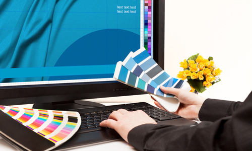
Before checking on color combinations, determine the colors that best represents your subject for the PSA. Let us say it is about nature, then green would be in. Then choose other colors that would complement with it. Do not overdo colors because it will be heavy for the eyes. For the background, use white or muted colors but you can also try dark ones as long as you observe contrast by using lighter texts. Read about on the Things Designers Need to Know About Colors.
5. Consider white spaces.
A white space or negative space refers to the spaces around your type and images. Be sure that you do not overlay images over one another without considering white space. White space is like a breathing space for design elements. The generous usage of white space is effective. Check on the Reasons Why White Spaces are Good in Graphic Design.
6. Choose font style and type face wisely.

Don’t be confused about fonts and type faces. When we say font it could be boldface, roman and others but when we say typeface it is either serif or sans serif. It would be better if you know more about typography before you try designing something. It is important to choose the right fonts and typefaces because each character in your type tells a different story. Like if you use Arial Bold (Sans Serif), it look strong but if you use Times New Roman (Serif) it look softer but more formal. These characters speak for themselves just like how sophisticated Palace Script looks and how creepy Chiller appears. Your type has their respective personalities. Still confused on how to choose the right font for your design? We have answers for you at How to Choose the Right Typography Font for your Designs
7. Mind your text sizes.
The readers should be able to see the text in your poster even without getting near it. The title text should be readable 6 meters away; you can do this by using at least 48-point text. Meanwhile, the body text should be readable 2 meters away using at least 24 point text. Bear in mind that what you see in your computer screen is not the exact size of your poster because it will be blown up when printed.
8. Layout matters.
Your layout is also important. This refers to how you arrange all the elements in your poster. In doing that, consider the flow of the audience’s eyes. Is the arrangement easy to read and understand? Are the important points emphasized? Also, observe balance in your layout. Do not place so many images on top or on one side because it will seemingly pull all the other elements to it. You also have to make sure that the flow of information is clear from the layout.
9. Use minimal words.
Posters are meant to convey messages in one look at it. Hence, it is important that you keep a low word count. Doing this will make it easier for the readers to understand your point. Also, a crowded poster will no longer be effective unless it is done really well.
10. Know the poster size.

Depending on what your poster is for, the size will also vary. The biggest size for a poster is either 26×39 or 24×36. The most common sizes are 18×24 and 16×20 which also depends on the printer because not all printers could feed large paper sizes. You also need to mind the paper’s bleed if we speak of sizes. Bleed is where the print or the image runs to the end of the paper when printed. It is important that there is a bleed to make sure that everything will be printed on the paper.
Other Points to Consider in Designing a Poster
Aside from the points stated above, there are a few things that you need to bear in mind while you work on your design. This will make your poster more effective.
1. Keep audience in mind. Think of your target audience. Can they relate to your poster? Are the text and images you used easy to understand? Make sure that your efforts will not be wasted. Your audience should be able to discern your message at one glance.
2. Focus on the message. What is the purpose of your poster? What is the message you want to convey? See to it that all of these are clear to the audience. Avoid creating ambiguous designs because these will just confuse the audience and might misinterpret your message.
3. Keep it simple. Well, you can add some creative and artistic touches to your poster but you have to keep the message simple. Like only use a single image to be supported by a simple title text. Your body text will then speak of some more details that you want to deliver.
Cool Poster Designs Samples
Since we have already given you the tips in designing a poster, you could work on your own designs but it would be better if you will get some ideas and inspiration from successful poster designs. We have collected some poster designs which could surely inspire you with your project.
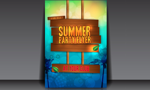
Promotional Poster
We are sure that you will agree with us that this poster is designed well and could tell us exactly what it is for.
Image: CityState
Stel Christian Cambas Poster
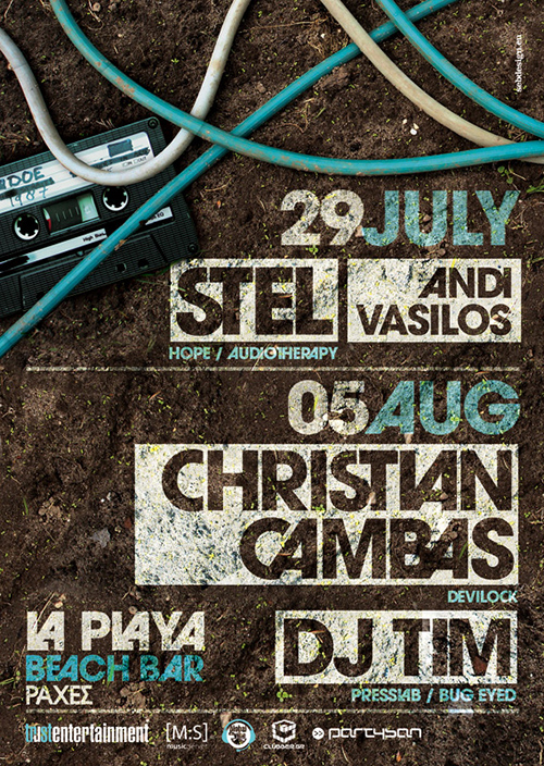
The use of texture for this design is really good especially with the combination of texts in low opacity to reveal some texture beneath it.
Image: SeBDeSiGN
Depression PSA I
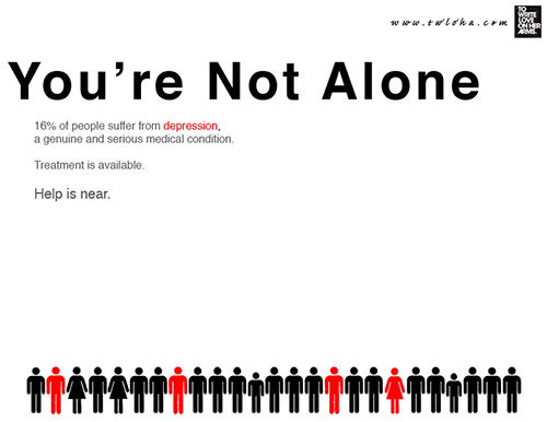
This one is a PSA on depression. It encourages us to help people who are depressed especially that they are growing in number.
Image: Namelessblob
Funke – Terry Francis Poster
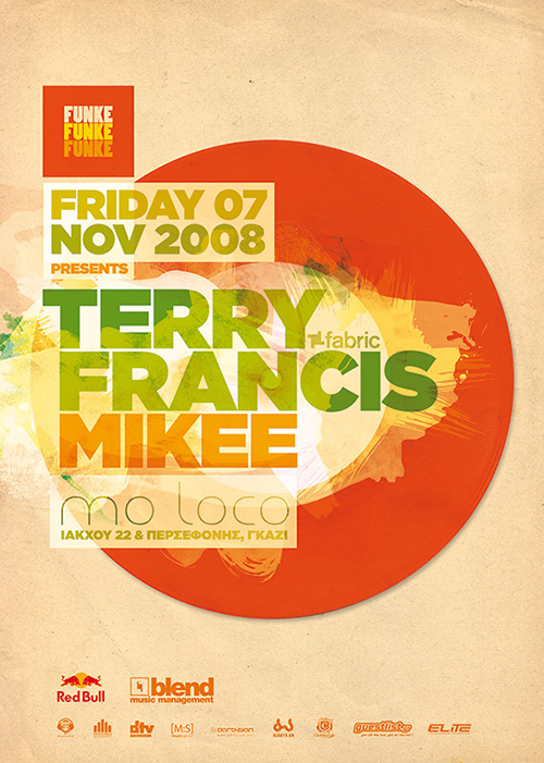
The combination of colors here are very good and eye-catching.
Image: SeBDeSiGN
Nothing More gig poster
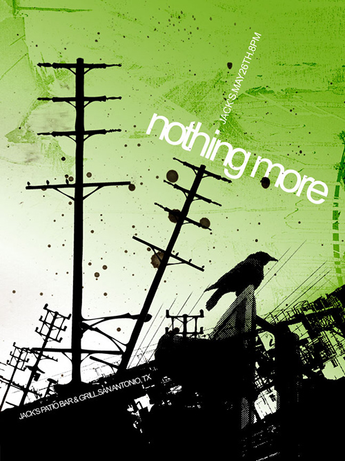
Silhouettes can indeed be strong graphical elements like what you can see in this poster.
Image: Jake10684
Procrastinate Not
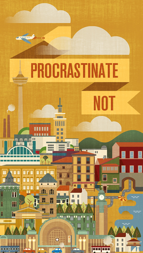
A simple message with intricate details for a poster- the combination of both creates a strong appeal.
Image: John Salinero
Abbie Gale Live Poster
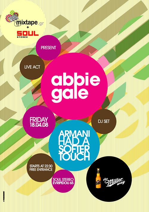
This one is designed for a live presentation. The design looks professional and the choice of colors makes it look very attractive.
Image: Poor Designers
Go Outside
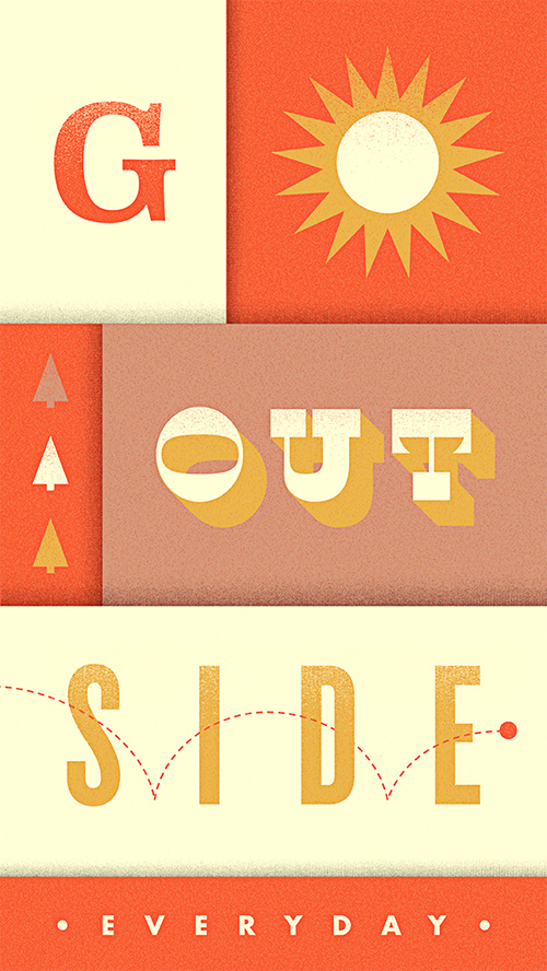
Playing with typography is one good way to create an effective poster.
Image: Aaron Eiland
Black Swan
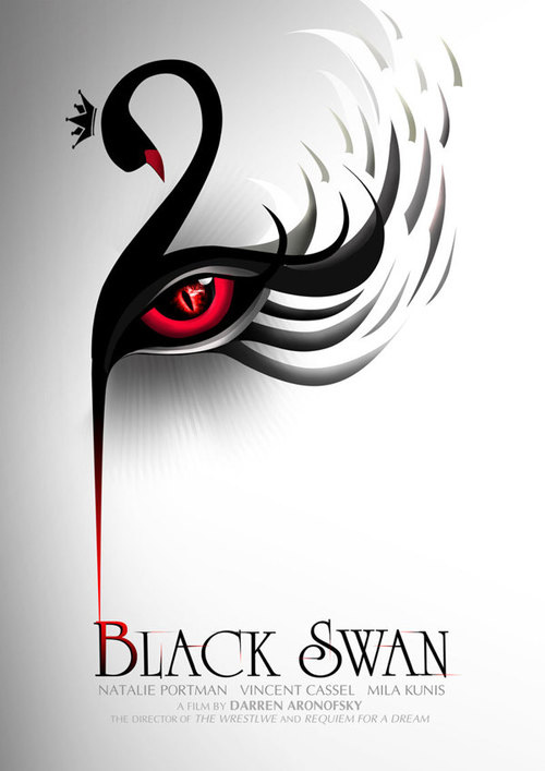
You can really see the beauty of a black swan in this poster with flowing curves and striking combination of black and red.
Image: mustbeprinted
Smoke
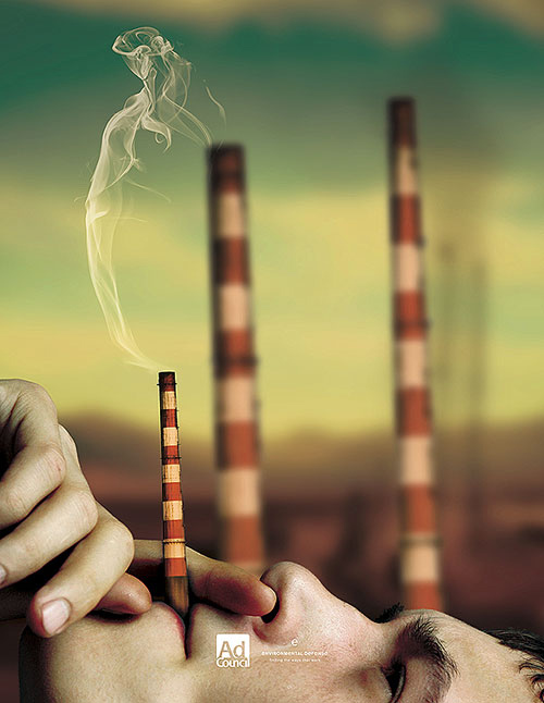
Stop air pollution. This is the message of the poster. Air pollution is caused not just by plants and factories but also by humans through cigarettes.
Image: mustbeprinted
Prudential Bring Your Challenges
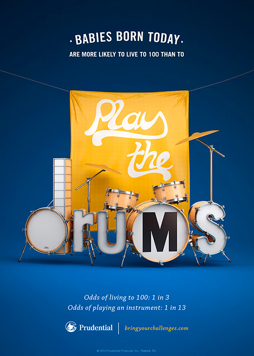
This one is cute. The rest of the posters in this series with the same “babies born today” theme are super cute. This tells us how unique an individual could be.
Image: Chris LaBrooy
Poster for Eventbrand
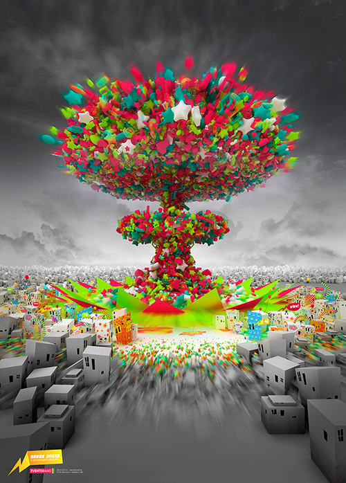
The details in this poster are very impressive. A closer view of it will surely impress you. A splash of colors and life from the product gives an exciting impact to the audience.
Image: Myshli
Amsterdam Open Air Festival
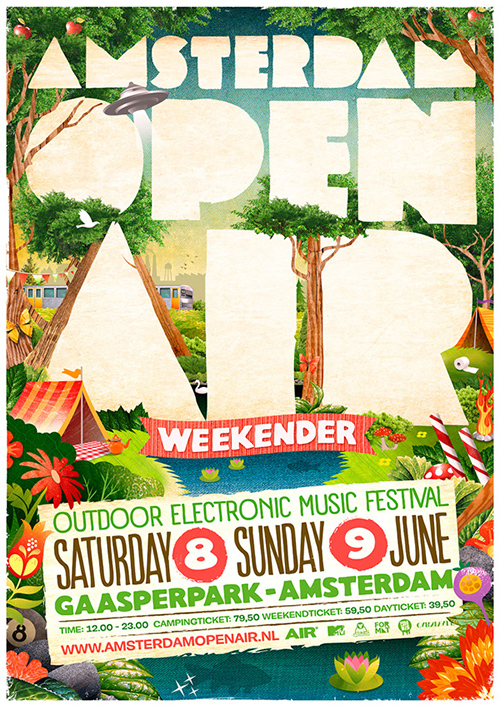
Check on how the designer played with type and colors. The use of large type is effective coupled with lively elements of a park.
Image: Danny Merk, KGB and Zender
Past.Present.Future Party
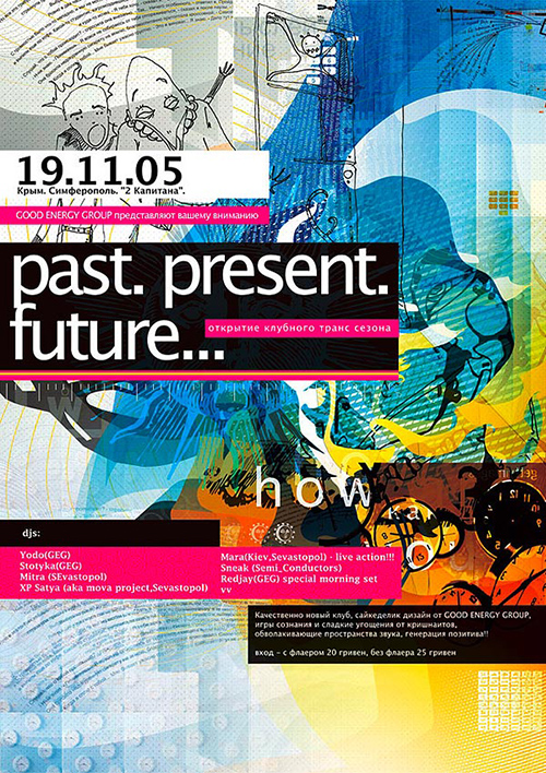
An abstract poster for a party announcement. The work is filled with textures and colors and you’ve got to stare more to see what other elements are there.
Image: Myshli
Stay Green Go Red
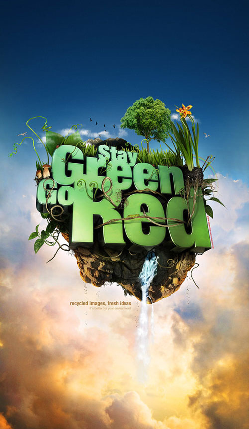
A campaign for the environment wherein green is for nature and red is for recycle.
Image: Seventh Street Studio
It’s Your Turn Now
Designing a poster could be challenging at first but if you will just keep in mind the tips above, you will be able to come up with an effective poster design. Don’t worry if you feel like your first output is not exactly what you expect to get because you can still improve with more practice. Also, after creating a first draft, refine your work by checking on what points you can still improve. You can also consult others by letting them see your design. Get their feedback and check on what you can do to make your poster look better. Now, tell us what you think of this post. We would be glad to hear from you.


Very informative and I like the contents of your post.
visually communicated
Your samples of poster designs are very entertaining and encouraging.
Thank you for the ideas on how to create an effective poster.
Great!