
In the recent word where people are engulfed with everything about the internet, the use of this became more available and accessible. Most people have internet access from their homes and are updated with the current issues and trends worldwide. Of course, there would also be access to the internet when one is at the mall, in school, or in the office. Since people find it hard to be away from internet access, even mobile devices can already have direct connection to the internet. That is the reason why mobile websites were designed in order to satisfy the mobile browsing needs of the users.
Designing a mobile website is not easy because of the so many considerations one should make. But with the brilliant minds of web designers and developers, they were able to look for solutions in order to make is easier for mobile users to access various websites and that is by creating mobile websites. To help you design a mobile website for easy browsing, here are some tips for you.
1. Use a fluid layout.
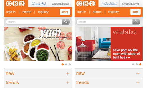
Site: CB2
Every mobile unit has different screen sizes. The only way to make sure that your website will be viewed well is to have a fluid layout. One has to do this because mobile device screens are small and the available space needs to be utilized. Also, there are different screen resolutions that you have to consider. Using a minimum of 320px will already look good even for high-end mobile devices especially that some has retina displays that can scale it to fit the screen.
2. Redirect to a mobile version of the site.

Site: Scorpion Design
This is a good option because you will be able to create a totally different and exclusive experience for the mobile user. At the same time, you can also give a different experience for desktop users. You will have better site delivery when you create a mobile version of your website. Doing this will be a lot easier for your mobile users.
3. Use good image quality.

Site: One little Dream
You would not like to see your website’s images being so small or so big when viewed on a mobile device. Also, you would surely hate it if it your images appear pixelated. Try to use alternative high resolution images for mobile viewing. But be sure that it won’t be too large because large images eat up a lot of bandwidth. You can try scaling the images for smaller screens. This way, you can make sure that your image looks good while saving bandwidth consumption.
4. Have a simple layout.
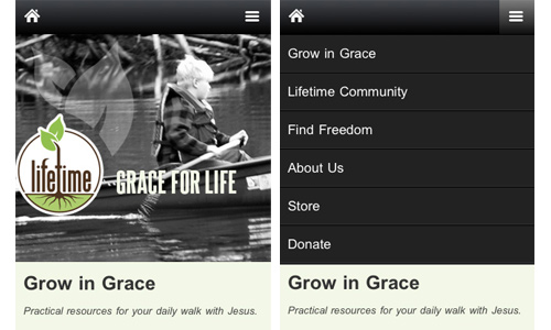
Site: Lifetime
A mobile website’s layout is a big challenge because of the variation of sizes, shapes and resolutions for every mobile device. Scrolling is also hard for mobiles especially those with smaller screens. So, to ease hassle for the users, make use of a simple layout. The users will actually not mind if your mobile website looks simpler than your website viewed on desktop. What matters to them is they’ll be able to access your site. Make use of a single column layout instead of multi-columns.
5. Consider your text.

Site: Sprite
Of course, your text content is always very important. You have to make sure that it is readable and the size is just right. You can also hide some text that might be a hindrance to the good readability. Place important text on the upper part so that it can easily be seen by the users. Place only the important contents that would be important for the users to see.
6. Design for fingertips.
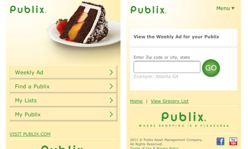
Site: Publix
Your clickable elements have to be big enough for a fingertip. Most mobile devices now are touch screens. So, make use of at least 30px to 40 px for your buttons. You should also use whitespace around these elements for easier clickability. But this doesn’t mean that you should use super large buttons. Merely add some padding to enlarge the areas for clicking.
7. Moderate video and audio usage.

Site: Disney
Mobile websites can still make use of video and audio. The users will also love to see that especially if their mobile device can give excellent audio and video quality. Do not use flash and other formats that will not work on other devices. Optimize it to save bandwidth. Avoid auto-play, you should give the users an option to play the video or not.
8. Use mobile friendly language.
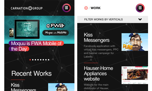
Site: Carnation Group
Make sure that the structure and code you use suits mobile browsing. Make sure that it will work well like WML or XHTML. Part of that is the consideration of cost and speed that would ease the use of mobile websites. But if you think that WML is too basic, you can simply use the regular HTML or XTML especially that most mobiles have already increased their speed.
9. Place important information on top of the page.
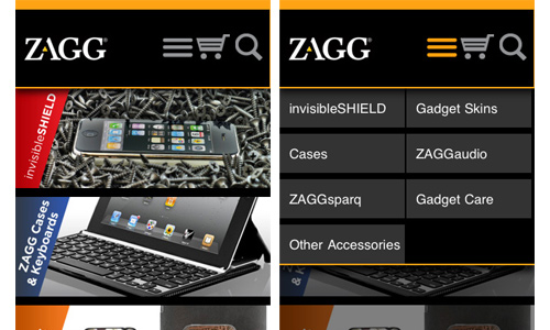
Site: Zagg
Like your website viewed on desktop, you should take note that all important information should be placed on top of the page. That includes your navigation and your search bar. This is very important when it comes to mobile browsing because it would be time consuming to browse a mobile website if the information are not properly placed.
10. Use a collapsible navigation.

Site: Save our Water
Since you won’t be using a lot of space for your mobile site, you can make use of collapsible navigation in order to place all the information. Doing this can allow you to place large information that could let the users see other parts of the website. Use a vertical hierarchy where you will place categories for areas they’ll be interested in.
It’s Your Turn Now
Once the above mentioned things are considered for a mobile website design, one will be able to have a good and successful mobile presence. It would be very easy for the users to browse their site wherever they will be. That would surely give more traffic to the site. Aside from those tips above, there could still be other tips that you would like to add. We would be glad to hear what you want to say. Feel free to write it in the comment section below.


Liez I agree with you, vertical menus, because of their ability to handle many links, dividing the links into intuitive categories can help users find links of interest quicker.
Hi Liez, very interesting article about mobile ui. I’m currently developing a mobile friendly browsing experience and I have created a navigation bar which you can utilize more efficiently than just dropdown menus that use precious screen space.