
Business cards are important to market and promote a certain company and even the skills of an individual. They come in different designs depending on the niche and industry of the company or individual it represents. One can surely express his creativity in a business card while making sure that the contact information seen on it is clear and readable. It is very important that the text is readable because if not, you will not be able to achieve the purpose of your business card.
There are so many typography fonts you can choose for your business card. But you have to make sure that aside from choosing the right type, you have also considered how it can be placed on your business card. The positioning and layout also matters especially if we speak of spacing. Space is also important to attain a business card that is easy to read. So, here are the tips that could aid you on how to use type for your business card to make it readable.
1. Use the right font size.
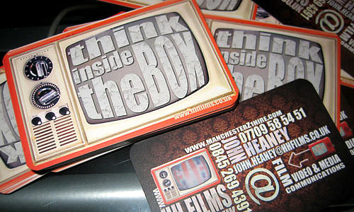
Image: John Heaney
See to it that you will be using the right font size so that it would be readable. Your name has to be larger than the rest of the text so that it can be noticed and would be easier to read. Try a 12 point font or larger. You can also try smaller points just be sure that is it readable when printed. It may appear large on your computer screen but would look smaller on print. You can also have a test print so you can check the font sizes if they are readable.
2. Use ample spacing.

Image: Megan Darrah
Spacing is also important in creating a readable business card. There has to be enough space from a line of text to the next line. You should also choose a font style that has ample space between every letter. Do not use a font style where in some parts of the letters are touching each other. This can create confusion for some people. Remember that your aim is to let the readers know your contact information. It has to be clear and readable.
3. Choose appropriate color.
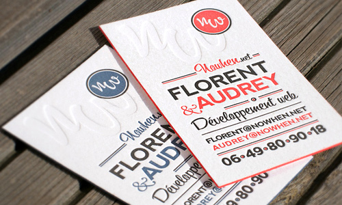
Image: Boris Forconi
Color is a vital factor in creating a business card especially if you are looking into its readability. Choose backgrounds that will not drown your text but would highlight it. Use contrasting colors for the background and the text. You can also try placing a colored outline for your text so that it can be more readable. Be sure that you use the right combinations.
4. Do not overdo your type.
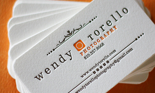
Image: Dingbat Press
Do not use too many font styles. You can combine at least two to three typefaces. If you overdo, it, it can be less readable and would even be heavy to the eyes. So, make it simple. You can still be artistic with other elements of the business card but be simple with your font style. Some people find it hard to read type that is so stylistic and decorative.
5. Match font style with theme.
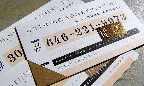
Image: Daily Poetics
You could have chosen a theme for your business card. If have done that, make sure that the font style you use matches with the entire theme so that it will look coherent. Think of what message you want the clients to get and you will be able to choose the right font for that. This can also give an immediate impression to the clients depending on the theme of your business card.
6. Make use of your space well.

Image: Nexion
You can either make use of the entire space or leave a lot a space. Work on extremes when it comes to spaces. You can leave a huge space blank and just place minimal text and elements. But you can also fill the entire space with large text. Use space effectively to relay your message and be sure that the text you have there are readable.
7. Use bold to highlight text.
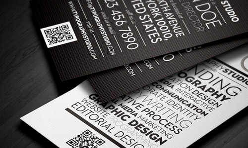
Image: Lemongraphic
Some parts of your business card can be highlighted by using bold. It would be a great advantage on your part to do that. But do not use bold to all the text. Only choose those that need to be given emphasis like the name or the company name as well. Using bold can make some text stand out from the rest.
8. Consider type hierarchy.
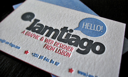
Image: IamTiago
Even in your business card, you should be able to show which part of your business card is more important. Of course, everything in there is important but you should make sure that when your client view it, they will be able to see at once the text that should be emphasized which is your name and the company name. See to it also that you contact information then follows in the hierarchy.
9. Use sans serif and serif for a formal look.
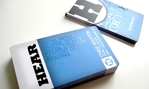
Image: Hear Agency
If you want your business card to look formal and professional, you can use sans serif and serif. Combine the two and you will not fail in getting the type of look you want. You can use sans serif for your more important parts and serif for the remaining text. This can help you get a professional and formal look.
10. Get a fun looking business card.

Image: Tiffany Smith
While still considering readability, you can get a business card that looks fun by using handwriting, calligraphic, script and decorative typefaces. See to it that even if you use these kind of font types, the texts are still readable. It would be useless if you have established a fun identity but was not able to tell the people what your contact information is because your text is not readable.
It’s Your Turn Now
Anyone would surely agree that a business card has to be readable. Hence, make sure that you will be able to use the right font style and size that are easy for the eyes. You have to always consider the clients and not just your own taste. How about you? How do you design a business card that is readable? Feel free to add some points to what we have above.


I think the type should always be kept simple and not to complicated, otherwise the consumer canno’t read your details. I also think the background colour plays a big part to, it needs the writing to stand out.
I believe your blog is excellent. i really like the way you organized your work..