Haven’t we mentioned that we will be having a huge blast of surprise for our avid readers? Well, what you are seeing right now is what we had been cooking for quite some time. With the looks of it, it turned out pretty well the way we want it to be. This redesign is just one of the few steps we are going to take in order to bring Naldz Graphics to the next level. Of course, we would always trek the road going up.
What’s New
Let us take a look at some new stuff that we have added for this new design. The new layout and look of the site might have surprised you. Even the navigation had some changes on it. With all those wrapped together, we came up with this new design. These new changes was based on the site’s Analytics and performance. Now, let us take a peep on what new things we have incorporated to this design.
Layout
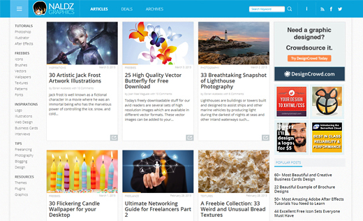
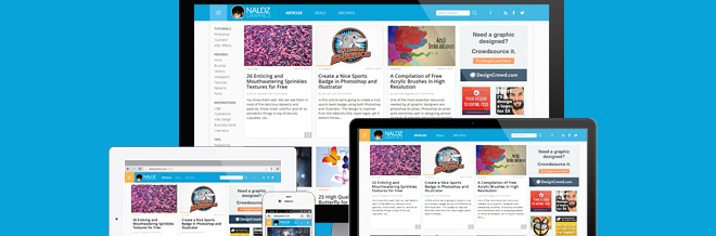
The layout of the website is a combination of a minimal design, magazine layout and blog style layout. With a wider layout, more featured posts can be seen allowing you to seek for articles that could interest you. In the homepage, you will immediately see latest posts with high quality featured images. This appears with three columns in a 1366 screen, two columns in a 1024 screen and one column in mobile. Just click on the thumbnails at the homepage and we will take you to the complete story you want to read. Upon reaching to the complete article, you will notice that it is indeed easier to read and lighter to the eyes with high resolution images.
Navigation
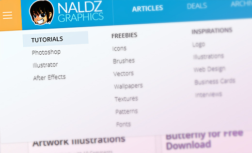
We also restructured the main menu system to give you easier access and navigation all throughout the website like having a sole category for tips that includes freelancing, photography, blogging and design. The categories were organized under an orange tab which you will see at the upper left corner. Hover your mouse to that area and you will get the navigation menus that once were visibly displayed in our previous design. The orange tab appears in 1366 px to 1024 px screens but when viewed in 1920 px and above, the entire menu can be seen vertically on the left side of the screen. You can also notice three navigation buttons at the top which includes Articles, Deals and Archives. Under Articles, you will see our latest posts while you will get free discount coupons and other great stuff under Deals. This move gave the website a neater look and easier navigation as well.
Responsive Design
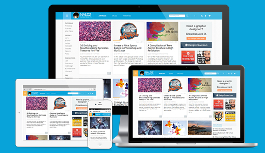
This new design optimizes the website for browsing in smartphones and tablets. This will ensure good usability for users who make use of these devices. Also, we made sure that wherever you view it, you will still get the same quality as how you view it on a wide screen. You can try checking it on your tablets and smart phones. Another feature we added is that the website can be completely viewed no matter what your screen size is, only the number of columns vary. The website also loads faster compared to the previous design despite the huge amount of images it carry.
Logo
You can also observe the change in Naldz’s look. Instead of the image of Naldz holding a laptop, we have retained the head part. Well, that could be good enough for the site’s branding. You will get the same logo from the favicon, banner and footer of this new design.
Type
Instead of using Musa for the site name Naldz Graphics, we opted to use Open Sans Pro to get a more professional impression. We used Roboto for the single post’s titles and Open Sans for the body text. We have also added a different font style and color for the sub-headings for easier identification.
Color
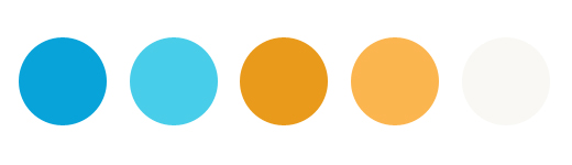
Instead of the blue background we used before, we opted to use white for easy reading and to achieve a minimal look. We also retained the use of blue and added a warmer touch of yellow orange. The entire look of the website in terms of color is simple and easy to the eyes.
But since this theme is just new, we are still hunting on some bugs and glitches that might occur. We would greatly appreciate it if you will join the hunt! Help us find some glitches so we can fix them and improve the site as well.
This had been a great day for all of us! We are grateful that you are all here to support us. We hope that this new design will give you a better time browsing into the contents of the site. Let us know how you assess this new look. Your feedback will greatly help us improve.


For a moment, I thought I landed on the wrong website. Great redesign. Impressive User Interface with a much cleaner look. Well done! Maybe you could remove the shadow of the searchbar. because it destroys the look of being clean. Cheers
The reason behind having a shadow on the Search box is to make it sort of an emphasis but yeah maybe you’re right. We will consider it 🙂 Thanks!
It is empasized already together with the icon. Add a placeholder instead like “Discover more here” “Search e.g. logo designs”. =)
The new redesign looks great! Hoping to see more awesome content this year!
I like this new design. But i don’t really like the sticky header. It decrease the viewing area of the site. 😀
But overall, I love this site. 😀
thanks bro ;). I’m not sure about mashable feel but I think it was never intended. maybe because we’re using blue as primary color? lol
Yeah ! That’s what I thought.. But wait, I get my iPhone and check yor website right away and I’m pretty impress. I like the look of the mobile version than the web. That’s weird because they have the same design. Maybe the layout? Or the footer? I don’t know but it really looks good in mobile version!
I’m hoping that I can get the same renovation in my blog 😀
The Logo part will be good in every place, even in other blog’s comment section.
It’s Elegant and Clean ! Love it bro.
Congrats for redesigning your site,it comes out in a good result.
It looks plain and simple but it’s more feasible for me.
I like how you redesign your site because now it’s more detailed.
the site looks great…. very modern and up to date…. great job!!
Noted bro 🙂 We’ll find way.
Thank you for the new Layout,it is more simpler and organized.
Impressive you’ve redesign your layout great!!But it looks like mashable,except that you are more colorful than to that site.
Thanks. I focused more on UX, beauty, performance and trends when I was designing this. And every detail was based on NG’s analytics. Also try to check the site in tablet and mobile if you have time 🙂
Oh forgot to mention, it looks good on smartphones
Great redesign ! Just one observation: I can’t find a way to scroll down on the left menu bar. I know there are more option below.
Noted. 🙂
The new layout is more precise..agree?!
I like iitttttttt!!the redesign website is more manageable than the past one.And looking forward for more improvements and I am happy that I’m part of your success.
Nice work on the re-design, been a while since i’ve seen the site. Great choice of color palette, it feels much brighter.
awesome redesign… only just came across it and was pleasantly surprised!! good work!! 🙂
quite good design
loved the clean and crispy look of your site…nicely done