Logos are used to identify a company or a product. It has a great impact to the people in showing the quality of the company it represents. It is very important in whatever business one is engaged in. Since all types of businesses need a logo, the logo design world always have some work to do. It may look easy for some but if you enter into the world of logo designers, you will realize that designing a logo is not an easy task. There are lots of things that they need to take note of to come up with an effective and good logo design.
In this post, we will give you some points to consider in order to make a logo effective. Since logo designers play a vital role for the success of a company, you should be able to help your client by making a logo that will best suit for them.
1. It conveys the requirements of the client.

Image: dougahay
One of the secrets of having a good logo is to perfectly understand the client’s requirement. You have to know what the client wants. There are instances that the client wants to match a certain existing and famous logo. They might also want a particular font and color. So, you have to get all the needed information during the consultation meeting in order for you to come up with a good logo design.
2. It has a strong visual appeal.
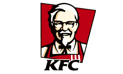
Image: mysavings
One look at the design you have made, the audience should find it captivating. No matter how simple it could be, there should be a visual impact for the logo design. Most people have a good visual memory and if it is not that captivating and appealing, it might not be remembered by the audience. Take a look at the logo of KFC. The visual appeal of the caricature truly makes it unique and captivating.
3. It is unique.
Image: blog.onlinelogomaker
No one would like to have the same logo as others have. Since the purpose of having a logo is to establish an identity for the company, uniqueness is very important. You won’t be able to help a company create their own identity and branding if you will merely imitate other’s logo. There might be logo designs they would like to match but that doesn’t mean that you make it closely similar to it.
4. It gives the appropriate message.
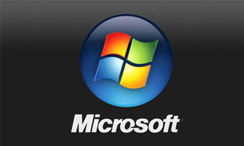
Image: cev.washington
In designing a logo, make sure that it is appropriate for the company. Do not make a childish looking logo if it is for a television station. You have to make sure that even if the service or product is not shown in the logo, it should show appropriateness for the company. But take note that you don’t have to place certain symbolisms for your logo to be appropriate. A computer brand doesn’t show computers, a food company doesn’t necessarily show a particular food and a company for appliances and equipments doesn’t show a television or a refrigerator in it. You just need to be creative. The logo for Microsoft could be a good example for appropriateness.
5. It has a minimal design.
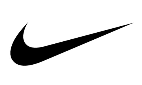
Image: soccerreviews
As we look at famous logos, we can observe that they do not have too many details and are really simple in appearance. But despite that simplicity, there is still a different impact to the audience. It is said that simpler logos are easily recognized and memorable. It is even more versatile if we speak of usage. So, do away with logos that have too much detail for it won’t be easy to use them. The details won’t be so clear when used in a smaller scale. Take a look at the logo of Nike. It is simple yet it became famous worldwide- and not just the logo but the product, too.
6. It is memorable.
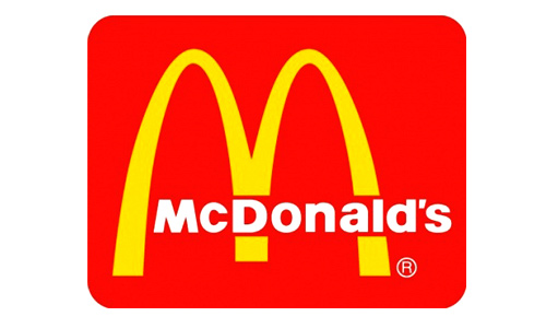
Image: soccerreviews
Of course, companies would need a logo so that they could have their own identity and be easily recognized by the audience and the target market. A logo, no matter how great it looks and no matter how it perfectly implies the companies’ goals and aims would still be useless if it cannot leave a mark in the minds of the people. It really needs to be memorable so that by the time they see it the next time, they will immediately know that it symbolizes a particular company. The logo of McDonald’s could prove that being both simple and memorable is indeed effective for it has been catering the people worldwide for years now.
7. It lasts long.
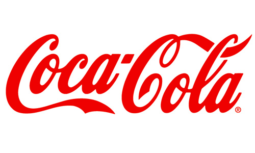
Image: demo.portfoliopen
A good logo should be able to stand the test of time. It has to be effective for years no matter how trends changes. Lots of things around you may change but these changes just come and go. Your logo design should be able to withstand those changes, no matter what the trend is and no matter how long the time, your logo will still be the same as it marks a memory in the minds of the people from different generations. Make a timeless logo and for sure it will give a different impact to the company. The Coco-Cola logo has been the same since 1885.
8. It is adaptable.
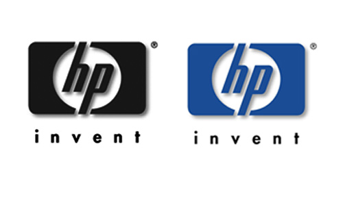
Image: Industriallogic
When we say it should be adaptable, it means that your logo should still look good and the same even if you do it in black and white. It should also work well even if you use it with a light color in a dark background. This way, no matter how you use it, it will still look the same and will still be recognized as such.
9. It is scalable.

Image: plasticoceans
A good logo should work well in different formats and sizes. It should look the same even if it is used in huge billboards or in letter heads. Bear in mind that when someone asks you to make a logo, they will surely use it in different mediums and sizes. So you have to take this into consideration. Also, it has to work in both vertical and horizontal formats. This is one of the reasons why logo designs should be done in vector.
10. It stands out.

Of course, during the consultation meeting with the client, you have inquired about their competitors. Be able to research the logo designs their competitors are using and make sure the design you will make will stand out and be more memorable to the target market.
To sum up, a good logo has to be simple, appropriate, unique and it stands out while conveying the right message to the target market. It is also important to bear in mind the requirements of the client. It has to work good when used in different color and sizes. For a logo to be timeless, it has to bear a great concept and that concept should be carried out well in your design.


•Should be visually balanced in terms of both composition and positive/negative space
•should include registration/trademark symbols when applicable
•should work against both light and dark backgrounds
•Should look good in black and white
Well 6 out of 10 is pretty good!
Feels good to have refresh info. thanks for the awesome share !
Interesting! reading this article is the best way to enhance my own logo design.
my problem of designing a logo is stated on no. 2, how could my logo look more appealing at first sight .. and will stand out of others work 😛
Good tips mate, “memorable” is my #1 when it comes to logo design, it is so important.
ITS REALLY AWESOME ! ALL THE TIPS IS VALUABLE FOR ME ! REALLY YOU HAVE DONE A GOOD JOB !