When you are working on something, there are times that you could overlook certain mistakes especially when you are very much focused in it. We really cannot do away with this. Even long time designers still commit certain mistakes in their work. We may remember certain things to take note of while working but we might not be able to remember all of them.
For icon designers, this could be like a review of what some designers forgot to consider and failed to apply. For new designers, this could help you to do away with mistakes and be able to create an effective icon design. Icon design these days are being faced with the challenge of increased screen resolutions and retaining the old pixels of small icons. Aside from that, there are still other challenging tasks an icon designer should take note of. Also, he should be fully aware of some common icon design mistakes to make sure that the icon will be effective. Let’s find out below.
1. Wrong object representation.
![]()
Image: heskinradiophonic
In designing an icon, see to it that you used the right representation. This way, it would be easy for the audience to determine what you are really trying to show in an icon. Icons need to be easily recognizable. So, if you used the wrong image, then your icon won’t work well because it needs to be recognized even on the first glance.
2. Failure to consider the audience.
![]()
Image: flamemo
This is very important because if you did not take into account the people who will use your icon, then it might give a different interpretation to them. Try to look into the cultural traditions, gestures and symbols used in a particular country. There are differences from every place. This can help you to have an icon that can be easily recognized.
3. Failure to create icons in both bitmap and vector.
![]()
Image: deleket
You might think that designing and drawing your icon in raster or vector is already enough. But you are wrong. You also need to redraw it in bitmap because you would need to scale it smaller. The icon will look crisp when made small. Meanwhile, vector icons are good when it is used for large sizes.
4. Using too many details.
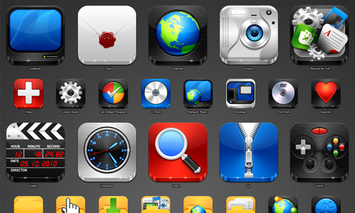
Image: treetog
Using too many details for an icon would make the icon look complicated and it would be hard for the users to understand your details especially when it is used in a very small size. Minimize the details in the icons so that it will be effective.
5. Adding elements for mere aesthetics.

Image: heskinradiophonic
Do not just be placing anything in your icon especially if it is for mere aesthetics. You can actually use lightings and shadow effects but when you place some elements like shapes, lines and objects that are not necessary, it will only ruin the design. Make sure that you will use only those that can be an important part of the icon.
6. Similar design that leads to poor identification.
![]()
Image: deleket
When one designs multiple icons in a pack, he tends to enjoy creating the designs with a similar consistent touch but fails to take note that each one should be different from the other. There are really icons that look alike and it would be hard to know what the other is for. It would even be harder to identify especially when the icons are used in a very small size.
7. Failure to impose design consistency.
![]()
Image: studiom6
Of course, when you are creating multiple icons for a pack, you have to make sure that there is a sense of consistency so that you designs will really look as one. This would include the perspective, shadows, gradient, drawing style and others. If you design each one differently, then it would not look like a set anymore. But as you apply consistent strokes in your icons, be sure that each of them has their own identity for easy recognition.
8. Using bland colors.

Image: webtreatsetc
An icon needs to stand out especially that it would be used with colors behind it. To make sure that it will be noticed, use colors that are strong. Avoid monochromatic colors and ordinary combinations. Make it look striking by using unique color combinations. Your icon will only be overlooked if you use bland colors.
9. Improper perspective for small icons.
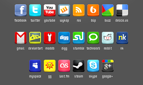
Image: voythas
When your icons have a bad perspective and would not look good when made small, then you have failed. You need to see to it that as you create your design, the perspective you used would be clearly understandable when seen on the screen no matter how small it is.
10. Skipping the initial step.
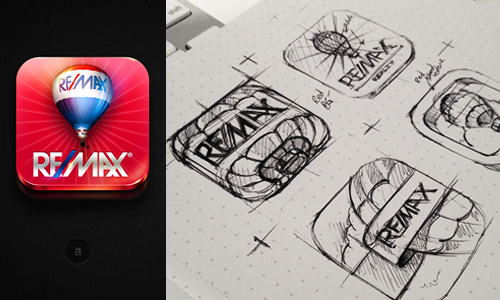
Image: v5 Design
Some designers would immediately take their seats in front of the computer and start designing. Well, you will have a more creative and well-thought output if you begin with sketching first. Create a draft with pencil and paper or a marker on a board. Anything comfortable for your draft that is not on the computer can help you think better. After sketching it, you can now start drawing it in the computer. This can also make your work more unique.
It’s Your Turn Now
Indeed, one cannot do away with committing some design mistakes no matter how long he is in the field. But these mistakes can always be corrected. The things mentioned above are just some of the mistakes commonly overlooked by designers. If you think we have missed something, feel free to add by writing in the comment section.


Very good article!
I love how these opinions are stated as facts. Sometimes blander or diluted colours can often stand out in a sea of icons.